I know I know, we were supposed to be on a break, and then these pictures came in and it seemed a shame not to show them to you. And, if you are spending the summer pondering a refurb then it’s always good to have a few new ideas wafting about while you lie on the sunlounger and then you can feel ready to get started as soon as school starts again in September and you get your house back.
Unless you have teenagers, in which case suddenly the house appears to be more empty in the holidays than it does in the term time. Funny how that changes. I have reached a stage where I can do more work in the holiday than in the term time as they are out and about with mates and sorting out their own food on the run. Anyway, for the parents of toddlers – COURAGE (said in strong French accent – vis couRAHGE not RAGE, although I’m sure there’s plenty of that too) your time will come. You just can’t see that far ahead yet.
Anyway, pink. That’s where we are today. And talking of children, did you know that pink was originally for the boys and blue for the girls? I have started a monthly column in an online travel magazine looking at the psychology behind colour (you can read it here ) and discovered this during my research.
An article in 1918 said: “The generally accepted rule is pink for the boys and blue for the girls. The reason is that pink, being a more decided and stronger colour, is more suitable for the boy, while blue, which is more delicate and dainty, is prettier for the girl”.
So stick that in your reverse sexism pipe! More to the point when men up and down the land start shouting that they don’t want their houses painted pink you have two options. One, as one of my friends did with great success, is to fix said man with a withering glare and say in an exasperated tone: “Oh for God’s sake, it’s beige can’t you tell?”.
The other is to quote this article at him and tell him that it’s all about him being decided and stronger and totes more masculine.
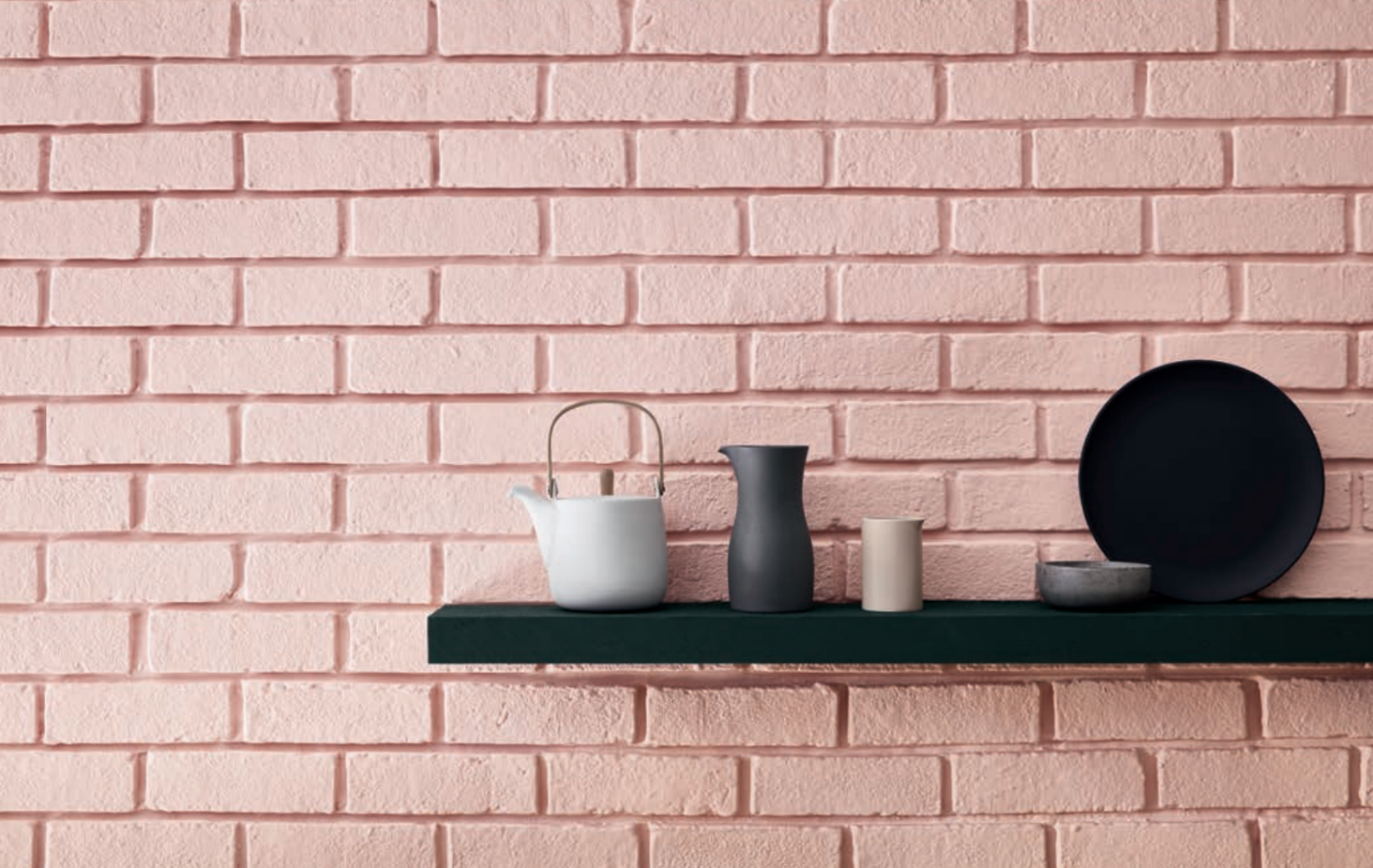
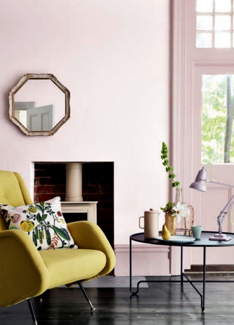
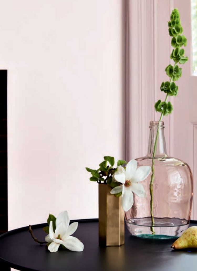
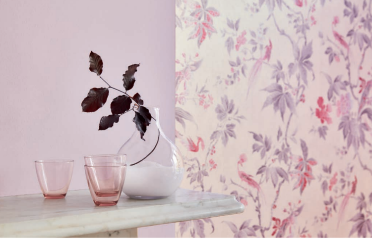
Right, so now we’ve cleared that up. This is the new collection by Little Greene, which will be available in stockists mid-September. Following on from their gorgeous blue collection and not forgetting (never forgetting) the grey card, the paint company have turned their attention to pink.
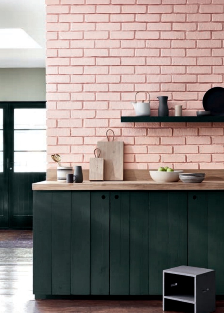
There are eight shades and the collection has been launched in support of Breast Cancer Awareness Month with which Little Greene has a long standing association, with 15 from every can of paint and roll of wallpaper during October going to a breast cancer charity. This year it is the Breast Cancer Haven.
The limited edition colour card will be available until next January after which many of the shades will be incorporated into an updated colour card launching the following spring.
David Motterhead, the managing director of Little Greene, said pink is massively on trend in both fashion and interiors and the new card would help dispel the myth that it is a difficult colour: “These versatile shades contradict the idea that pink is sugary or overly feminine.”
So what do you think? Are we in the pink?
And I’m really going now. Enjoy catching up with posts that you missed during August….


Great post! My sons favourite colour was pink which I fully embraced and supported up until he was five, when the penny dropped that it was a girls colour. He had a bright pink lunch box, pink crocs but other than that I found it impossible to find gender neutral pink stuff. Just a plain bright pink T shirt? No where. I think it’s tragic how we colour stereotype our kids. We could all do with more pink in our lives, judging my these pictures.
You’re so right Sophie. My (now 12yo) had a fabulous pair of pink swimming trunks with pasta shapes on which he wore and loved until year 6 then suddenly when he started secondary school he reacted with horror at the idea of them.
I never thought I would be but yes, I think I am in the pink. never used this colour to decorate but I have just taken on a new project where it’s all going to be about embracing ‘toile de jouy’ (which is quite a challenge as not my normal ‘thing’) so I think this little collection is quickly going to become my friend…….
it’s an odd one isn’t it re the male objection to ‘painting’ with pink but they are more than happy to ‘wear’ this colour as it still seems to be a popular shirt colour choice ‘dans la city!’
so yes I agree, bring it on and lets go pink!
enjoy your break Kate – much deserved 🙂