Well isn’t this just lovely? A five bedroom Grade I listed townhouse in Bath, Somerset (doesn’t Somerset have all the best houses) that is, according to The Times newspaper, on one of the six best streets to live on in the UK, a fact which will have worked wonders on its house prices too and this comes in at £2.4m via Inigo.
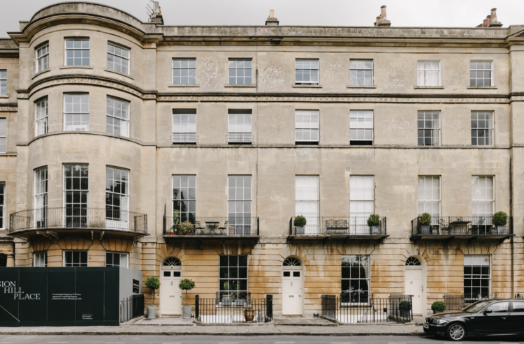
It’s arranged over five storeys and extends to nearly 4,000 sq ft including a self-contained flat on the lower ground floor – perfect for elderly parents, returning children or, depending on your circumstances, staff! There is a private walled garden at the back and communal gardens with views of the rolling hills to the front. I’m in. At least I would be if I had 2.4mill.
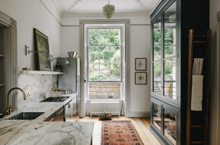
But since I haven’t, and I’m assuming most of you haven’t either, we shall have to content ourselves with a virtual look around and see what inspiration we can find that might translate to our own, smaller, unlisted places. So let’s start with the kitchen (a very good place to start – name that song) and I know that we can’t all have these wonderful floor to ceiling windows but we can definitely work with the rest.
I’m seeing an increasing number of kitchens with a large backsplash made from the same material as the worktop – this is often marble for stunning effect but don’t forget that you can use composites, such as caesarstone, which are tougher and less, shall we say, capricious that natural stone.
The marble and wooden floorboards work well together while the industrial style metal cupboard fronts toughen teh whole thing up a bit and stop it being too country kitchen – which is also a great look btw but if you want something a little more unusual then this would work well. And if you have spent all the money on the worktop (which I did first time round) then take a look at these rather fabulous metal kitchen units from Ikea – the drawer fronts are £20.
Throw down a Persian rug to soften it all and this would work in any kitchen of any size. Persian rugs are marvellous for hiding stains by the way – we’ve had one under ours since the boys were tiny and it’s taken all the abuse with no visible damage.
And if you need more storage, and haven’t got room for a gorgeous glass fronted vintage cabinet (sigh) then you can always replace the open shelving with glass fronted wall units and paint them the same colour as the wall so they recede a little.
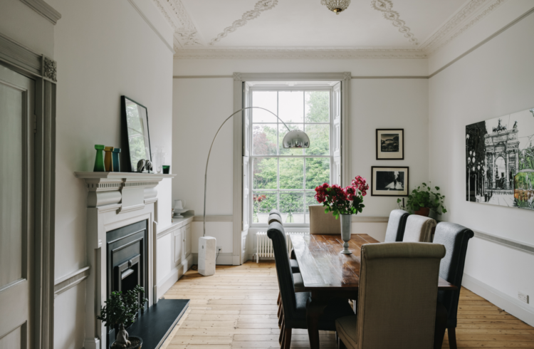
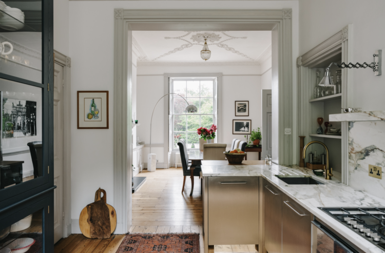
The dining room is divided from the kitchen by a peninsula which creates a broken plan look – ie there is some separation between the two rooms but no loss of light that that a wall would bring. This also allows for a stool or two and the creation of a breakfast bar – or more likely – a sit on the stool with a glass of wine watching somebody else cook bar. Always a lovely addition in any house – especially when it’s your turn to watch.
Now as it often the way with these very large posh houses, the sitting room (drawing room darling) is upstairs which, in this case, allows for a view of the aforementioned rolling Somerset hills and a tiny balcony for drinks. Or cheeky cigarette smoking by guests…
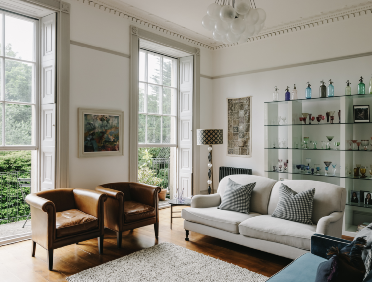
Of course this room has fabulous plasterwork and windows and shutters so the owners were right to keep the furniture very neutral but what I want to point out in here is a) the low hung picture – perfect as that means you can actually see it. Pictures are often hung way too high and they lose their impact. Much better to make a statement and keep them low and b) the glass shelves which almost disappear into the wall and allow the objects on them to stand out. That said, this room is large enough and light enough for wooden shelves but if you have a small space then this can be a good idea.
You can also, of course, add a glass coffee table although I would counsel against this. When I was filming for my online course (yes I am mentioning it again – there’s a 15 per cent discount on pre-orders you know) we did a segment in the Artist’s Residence Hotel and I think all four of us (me, the producer, the cameraman and the hair and make-up artist) all tripped over it several times. At least shelves are against the wall rather than sitting invisibly in the middle of the space.
In the sitting room as well as this room above, note how the furniture is all on legs which allows the light to pass through and adds to the airy feeling. You might think with high ceilings and tall windows this isn’t necessary, but it stops it feeling heavy so, if you can, it’s worth doing in your own spaces, especially if the rooms are smaller and darker.
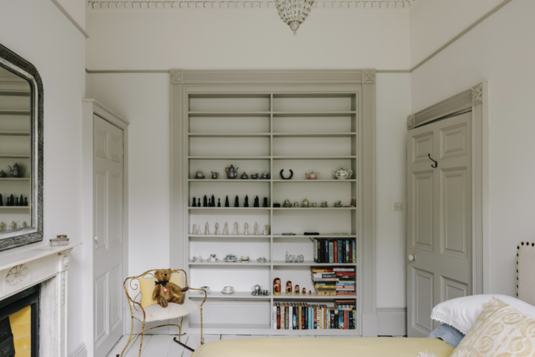
If you have alcoves for storage you may have already filled them with shelves – I have – but adding architrave is a good tip as it makes them look more “finished” and also more original and as if they have always been there. I’m quite tempted to do this with mine, which is full of shoes. Here the walls are a different colour from the woodwork – nice reversal of the traditional white wood, coloured wall, but if your room is small try using the same pale colour for all (including the ceiling) and it will make the space feel bigger and calmer and sort of declutter it all. By this I mean declutter it from all the architectural features – doors, skirtings etc and allow your possessions to really stand out. It’s known as the gallery effect and makes sense when you think of it like that.
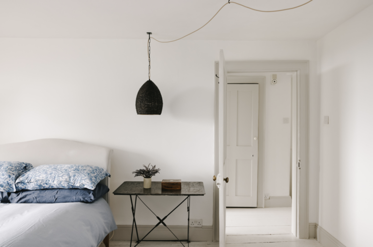
Above is a good example of trailing a light across a room which I have often talked about but it can be hard to find pictures. This is easier than moving the electrics and means you can put the lamp where you want it just by extending the flex and adding a cup hook in the ceiling. Of course, if you want it to work really well as a bedside light you need to move the switch so you don’t have to get out of bed so it’s not necessarily a cheaper solution to a pendant in the wrong place just a different one! That said, if you drape two pendant lights from the ceiling to either side of the bed you create a sort of four poster canopy effect which can be pretty.
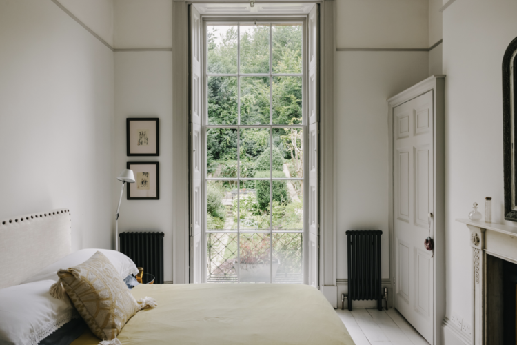
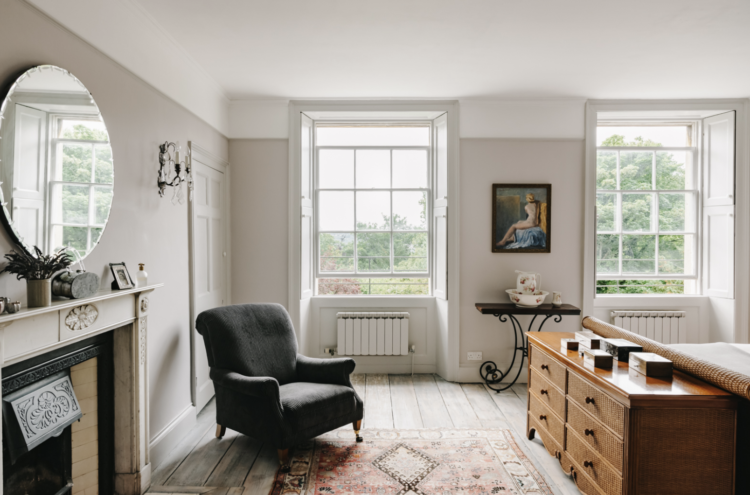
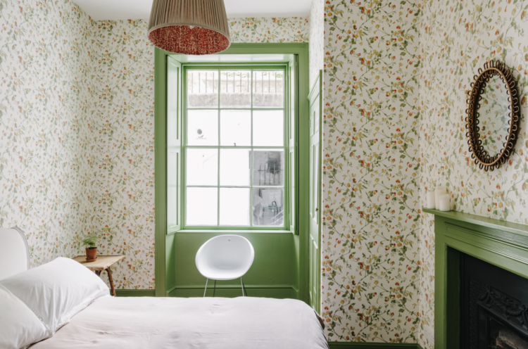
Couple of bedrooms for you here. One very plain where it’s all about the view through the window and one where the view is less so the country has been brought inside by the floral wallpaper and green window frame. Simple and clever. This is a very small room but the paper and paint combination gives it real personality.
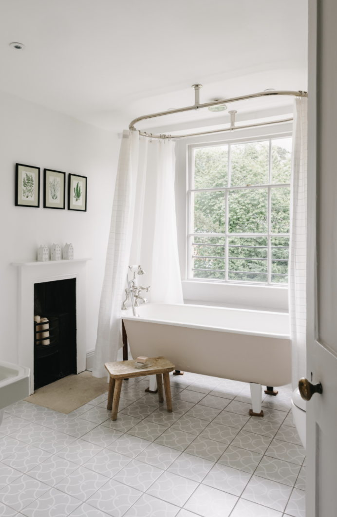
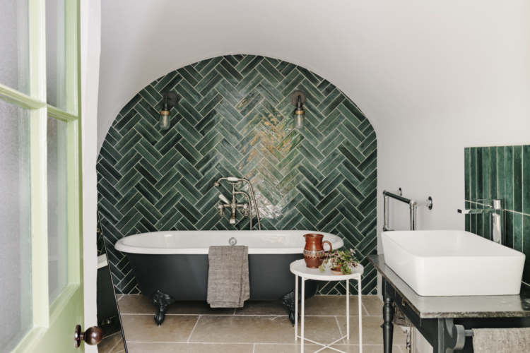
It’s a similar story with these two bathrooms. One is all about the view through the huge window so the room is fairly plain while the other has a rather fabulous tile feature behind the bath. It must have been a nightmare cutting those tiles in such a large curve but you could keep them in the natural zig zag formed by the pattern if you wanted. Note the same tiles have been used as a splashback behind the basin but laid straight up and down.
So there we have it. Don’t forget to go to Inigo to see the rather fabulous yellow kitchen and pantry and do, of course, let us know if you put in an offer so we can all come round for a proper visit. Wishing you all a lovely weekend.


A thought about those glass shelves displaying pretty glass ornaments and drinking glasses. If mirror glass is placed behind the shelves it would enhance the glass on display. The unit would come alive so to speak.
But a b****r to keep clean!
It’s exquisite. My only complaint living there might be the disruption from the constant Period dramas that surely must be filmed in that street!
When you read you begin with A-B-C
When you sing you begin with do-re-mi…..
Fantastic! Thank you Kate. Think I love your analysis more than the house!
In my dreams I bought the one just down the road in Melksham: https://inigo.com/sales-list/shaw 😉
I’d love to read your take on this one as there is ALOT going on here. Makes the Bath house look very restrained in comparison.
Catherine – thank you SO much for pointing out the Shaw house. I am on the floor after looking through it. I am both overwhelmed by all the STUFF and by inspiration. The dark walls, the stark contrasts, the moldings, that picture of the empty (especially compared to the rest of the house) staircase with the striking symmetry of the entry way and the alcove painted dark with the mirror making it look like there are two entrances (and all with the lovely wood), the twisted stair balusters. Just all of it!
And also, I’m consumed with curiosity about the owners. Do they run a tall room screen and round table manufactory? I’ve never seen such an assortment, everywhere, and even layered one in front of the others. And this is definitely a British house and real estate company; in the US they would never let you try to sell a high end house with plates laying out over every available surface, including the window seats. It’s both brilliant and insane. I’m under a huge tight deadline for a work project today and now all I can think about is getting back to that listing and spending an hour looking at the craziness. And then implementing some of that in my home!
Shaw House is by Anouscha Hempel