To Royal Bath Spa this week and a three bedroom flat on Great Pulteney Street and, since we are in the area, we’re going to pop our heads into another, smaller, apartment at the other end of the street. Seems a shame to waste a virtual train ticket after all.
First up is this, which is a duplex courtyard maisonette (fancy way of saying two floors with a small garden). It’s on for £750,000 and is around 1888sq ft, which for the record is bigger than the four bedroom house I have just bought which s three bedrooms and a loft bedroom at around 1,400sqft. I mention this just to give you a sense of size.
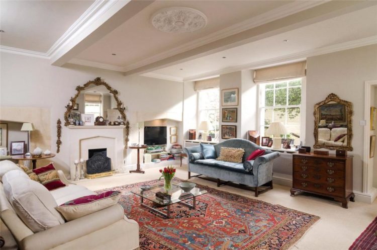
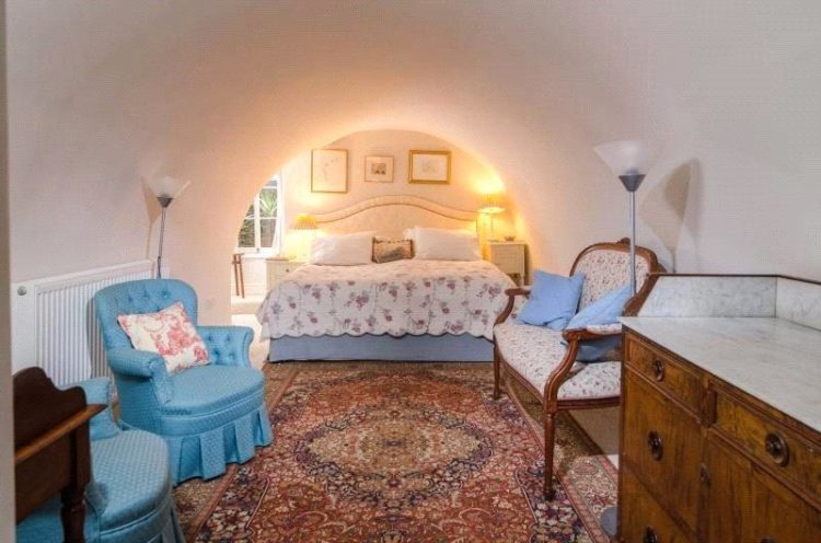
This is a fabulous Regency property which is well-located in the city and the ceilings are high and the rooms are large. But, and here’s the first point; it’s great to have big rooms but can you actually imagine having a conversation in this arrangement above?

You’d have to shout to be heard. Bringing the sofas closer together so the coffee table can do its job – allow you to reach the coffee – would create a much more intimate and conversational space. It would also avoid the rug island in the middle. The key is to use the rug as the zone, bring the sofas on to it and have all the space round the edges instead of putting the furniture round the edges and making it look like you are all sitting around waiting for the show to start.
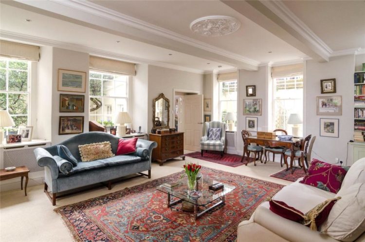
This is the other end of the room and the strange thing is that the table feels squashed against the window, the armchair is blocking the door and the rug is neither marking the dining area or denoting a small sitting area. At 21ft by 18ft this room has room, as it were, for it all and bringing the furniture in from the walls will not make it look smaller.
In fact, you create the opposite effect. In smaller rooms keeping everything round the edge only highlights what is left in the middle. Bringing it forward – even if it’s only by a few centimetres – immediately makes the brain think – oh look it’s not at all squashed in there they’ve even got spare space round the sides and back of the sofa. It’s a small point but it’s a question of illusion. Blank, or negative space, can make a room look larger and airier than it actually is.
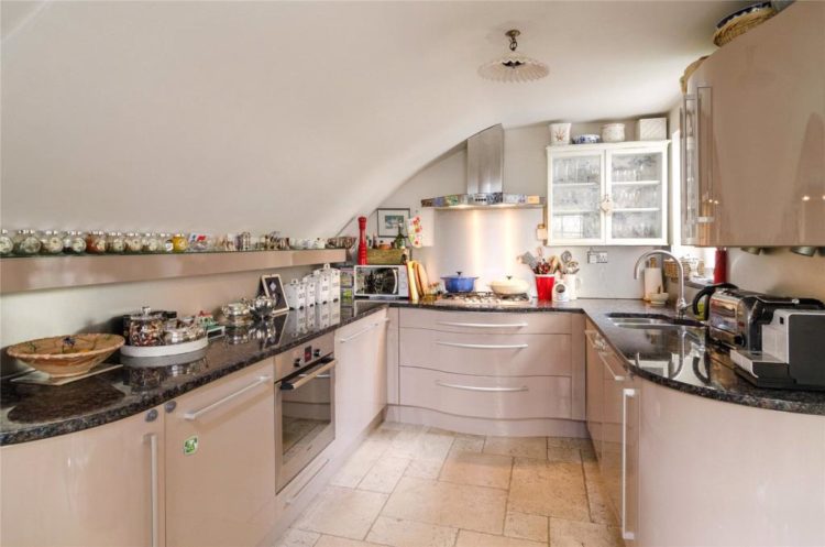
Coming into the kitchen, which is accessed from that partially blocked door, and you can see it’s a small space but the owners have made the most of every inch by adding that long narrow shelf that is perfect for their spice collection and it fits neatly under the sloping ceiling.
Normally I’m not a fan of curves in kitchens – I don’t know why, I’m prepared to accept it’s completely irrational but it is what it is. However, in this case I can see why it works. The ceiling is curved and the design flows from that. I think the drawers also curve (might be the photography) and of course in a tight space the curving edges take up less space than a right angle would. As I say I can see the logic.
Remember if you are planning a small kitchen that a standard cupboard is 60cm deep and wide. So be aware that you need to have enough space to be able to open the oven, dishwasher, or fridge. If it’s tight you need to keep them all on the same side so, if necessary, you can open them all at the same time and walk past rather than have doors fighting with each other and blocking the central path. And, speaking as the mother of a 21yo who once tried to get out of the way and fell backwards onto the open door of the dishwasher thus snapping it off and necessitating a new door, I know of what I speak.
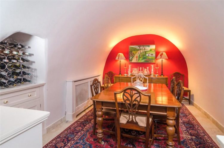
This is the dining room which leads off the kitchen and has no windows. So you’ve got to go cosy in here as it’s always going to be under electric light. Now this is one instance where a feature wall can work if you want it as the wall is an architectural feature so it’s reasonable to highlight it.
However, in a small windowless room you might want to avoid white walls. White needs natural light to reflect off and bounce any available light around. As there isn’t any it can look rather drab and grey, or just yellow where it reflects the electric lamps.
So this is a room that calls for bold. Feature wall if you want but perhaps choose a toning colour for the other walls and the ceiling – because it’s clear that the ceiling must match the walls – there’s no end point for either. You could perhaps, paper the end wall and paint the others in one of the colours contained in it. You could wallpaper the walls and ceiling and paint the end wall. There are lots of options and all of them are cosy and dramatic and fun.
This bedroom is at the other end of the property and the same issues of colour apply. It’s hard to see from this angle if the bed fits completely into the end space but that would be the perfect reason to paint that entire end in a dark and cosy colour for sleeping and then go lighter in this front end of the room to create a zone for sitting.
If you have rooms like this with unusual features, the key is to embrace them not curse them, and work with them as you will never win if you work against them. No windows- ok it’s dark and dramatic. Low ceilings? Match them to the walls and blur the edges. Awkward shapes – highlight them in a great colour that makes you happy. Painting it white won’t make it disappear it will just make it look as if you were trying to hide it. And failing.
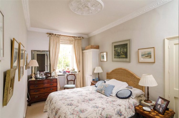
This bedroom is very sweet but there’s a table in front of a door. If you don’t use a cupboard or a door it’s fine to cover it, although it doesn’t look great, but if you are trying to sell a house it just shouts – there isn’t enough room for everything I want to put in here – so while professional house dressing may have gone out of fashion it’s worth taking a bit of time to try and take an objective look at what a buyer might notice if that’s your situation.
On a positive note, the curtains are hung high to allow as much light in as possible and to make the windows seem larger and the ceilings taller. The pendant light would serve no purpose hanging over the middle of the bed so it has been removed and the pretty ceiling rose remains.
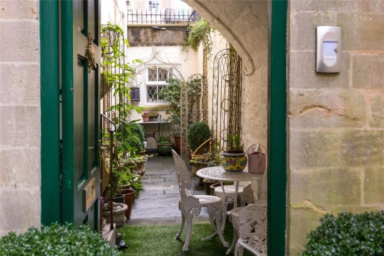
We’ll leave now, via this pretty courtyard -I’m not sure if this is actually the way out but it’s Fantasy Friday househunting so we’ll go with it and head to the other end of the street to this one bedroom flat that is on the market for £500,000.
Now this is interesting because the owners of this small apartment have taken their signature colour – cobalt blue – and run with it. It’s in the sitting room and the bedroom and on the furniture as well. And you might think that’s too much but you wouldn’t say that if it was traditional white would you?
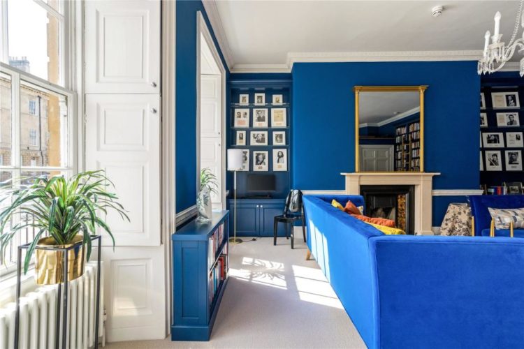
It’s basically two rooms, with a kitchen carved out of the sitting room and a bathroom created in a corner of the other. And since you can pretty much see into all the rooms from all the rooms it makes sense to unify the space. Of course, this colour might not be the one for you but you choose your own happy shade.
The other thing you can do is to mix up how you use it. So you might do the sitting room walls and the bedroom ceiling. The kitchen cupboards (spoiler they’re actually white) and the bathroom tiles. You might choose to do the sitting room dark and the bedroom in a paler version of the same thing. The point is that paint is freeing not constraining, so pick a colour you like and have a think about how to make it work for you.

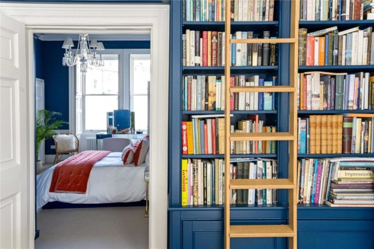
Here the owners have mixed up their accent shades, choosing yellow and gold in the sitting room and a coral in the bedroom. This helps break it up a little and, of course, all those books are a decorative feature in their own right.
Matching the sofa to the walls is another good trick in a small space (which this isn’t) as it can make it vanish back into the wall and means it won’t dominate the space.
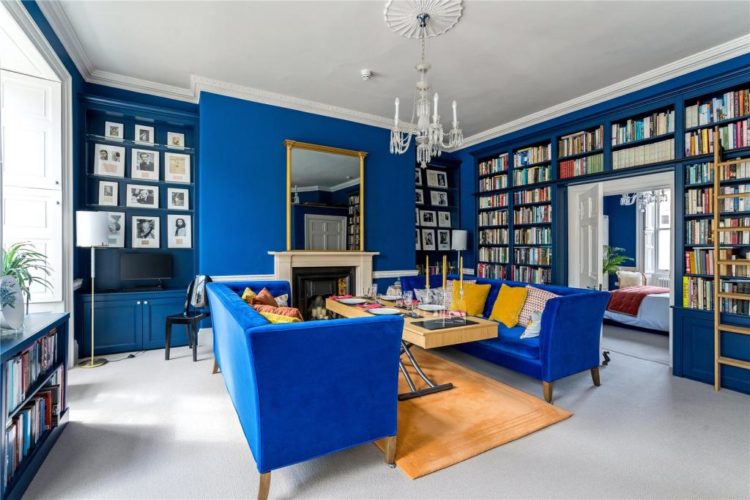
The images above and below show you how you can see everything from everywhere in this flat which is why you need a colour palette that works as you will always be looking at part of it.
And again, you can see above how these owners have done the exact opposite of the ones at the top. Both are big rooms but here the sofas are close enough to be conversational. You can walk behind the sofa to pick up a book. There is space for a console table with lamps on. The layout is grouped around the fireplace with the television off to the side but you could swing one sofa round at right angles to the other so you have an L-shaped space for chatting and watching TV and then you could perhaps have two small chairs by the window and the bookcase which would be a different zone for reading or admiring the view.
The point is there are so many options that don’t involve white paint and furniture hugging the walls. Is anyone moving to Bath this week? Or, perhaps a cheaper option – is anyone moving the furniture round?


Adore the blue! it just needs making sense of a little more. why are the sides either side of the mirror above the fireplace neglected ? Think if you go with a strong saturated colour then one has to go all the way. The beige/sand carpets as another comment by Pia, said, makes the room chicken out. It needs a bigger rug to incorporate table and the sofas, I think, as the table looks like a castaway on a desert island. I could see a large oriental rug in reds and blues here.
I’d probably paint the ceiling in blue, too, and emphasise the ceiling rose.
I could Imagine what the wonderful designer Penny Morrison would do with this room !
Perhaps beautiful plates either side of the mirror in blue and white. I don’t think the breathing space, if this was the intention, works here.
I Love this second apartment, too, books always make a room cosy, but would just take it further. After all, In for a penny (Morrison, preferably) in for a pound.
As two readers noted, the cobalt house actually feels roomier; the larger flat too cluttered.
While cobalt would certainly not be my choice, you did bring the point across that repeating the same favorite color in several rooms , can have a uniting effect.
Thanks for the tour!
I can see the second selling to someone with enough imagination to re-paint in another color if cobalt wasn’t their preference, but where I live, and with a slowing market, that first house would have to be cleared of at least half the furniture. Another photo shoot with less fisheye would also help I think. Interesting to see listings from outside our little corners of the globe.
The ugly beige carpets… In both apartments! Why!?!! It makes me sneeze just by looking at the pictures. And of cause I move the furniture around. And I am painting everything. Not white. With the nice wood floors I am going with softer shades of green. Or blue-green. or blue. Pail blue ceiling in that big room! Just after I ripped up those carpets. It is sooo much fun to dream away and decorate some other persons place even if it is just virtually. Thanks!
Unless the TV in the first flat is on a hinged bracket, it’s basically unwatchable!
I much prefer flat two – it might be smaller, but it feels roomier.
My pal lives on Great Pulteney St., which is Listed in its entirety, with very restrictive planning permissions. The ‘vaulted’ rooms are ancient underground brickwork cellars (which lie under the road itself) & therefore have no windows. As you rightly mention, these converted vaults can feel very claustrophobic. They can also be dark & damp (tank with DPM).
(They are similar to many of London’s basement flats).
Your advice for these type of properties is so relevant, and your tips on where to locate furniture in quirky spaces is invaluable.
My pal uses lots of mirrors too, to bounce light around the rooms.
The pretty verdant entrance in the photo is indeed the only way in, down a v. steep staircase from street-level. Lots of basement flat owners on GP St. ‘decorate’ this outside space with greenery, to grab a teeny weeny extra outside ‘room’.
Thank you for highlighting quick-win solutions to quirky spaces….off to help my pal move her sofa!!
Chapeau Kate, a Fantasy Friday masterclass!
I love Great Pulteney Street. If I were to come back to Bath, this would definitely be one of the places I woukd like to live. Beautiful Georgian houses with a level walk to town on one end and the Holburne on the other. Perfect!
Saying that, I can’t do vaults as rooms, that’s too claustrophobic for me. I much prefer the second flat. I love the way the bookcase frames the door to the bedroom. I’d paint over the blue with a nice green though. To each their own.
Thank you for those inspirational choices as always.