So turns out you don’t like the maximalism of the Wow!house then. I had thought it might provide colour inspiration rather than a wholesale adoption of a look, but perhaps you had to be there. Therefore, in contrast, today we’re going minimal with this four bedroom modern house in an award-winning regeneration area of west London.
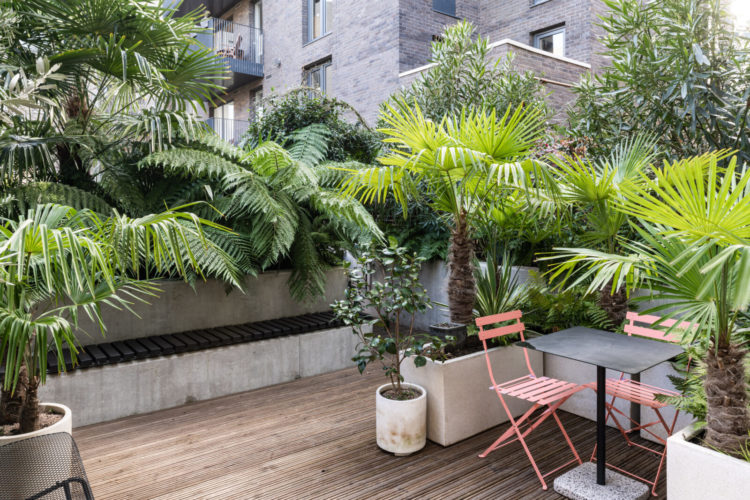
It’s on with The Modern House for £1,050,000 and was designed by Angel O’Donnell, whose work has featured on these pages before. Shall we sit here on the roof terrace for a moment? Yes it’s lush and green but those pink chairs are a perfect splash of colour out there. Perfect for those who might crave the colour of flowers but lack the time and skill to maintain them. Now come inside…
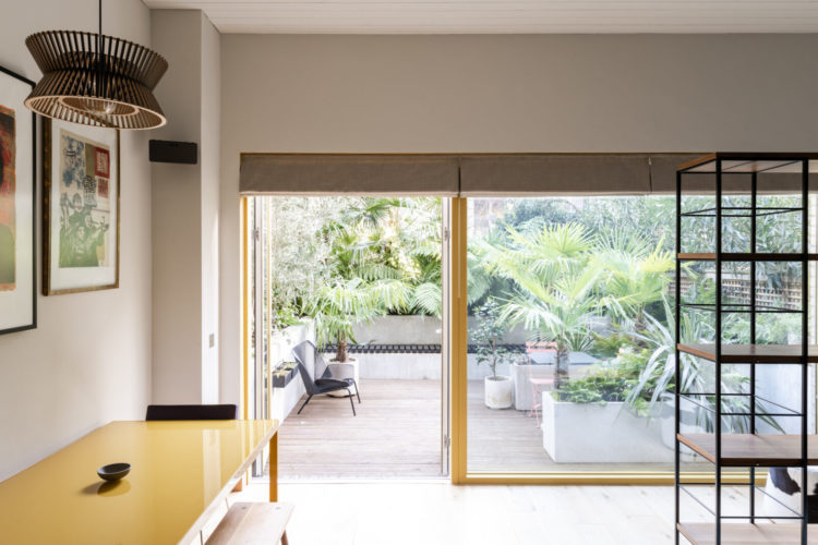
And just look at those doors. A splash of sunshine yellow that links in and out and brings you to the matching table. And I have noticed on instagram recently, for this is where these things start nowadays, a slight shift away from the classic black crittall dominance of recent years. Now it’s a classic so don’t panic if you have it (and I do for one) as it will always frame a view and look beautiful, but this is, perhaps, the next stage for some – the rise of the coloured crittall-style door. There has been a green set floating around on the ‘gram for a while, yesterday I saw a blue version and today this. Earlier this week I posted the wooden, small paned extension of Good Bones London, which is cream and Around Robyn has opted for cream aluminium doors. In short it’s not a rule, but an idea and one that you can adopt or not as you fancy. I’m just here to show it to you. And I think in the depths of a London winter it’s perfect. Blue might feel a little too seaside for an urban roof garden whereas this soft yellow is just a splash of sunshine on a rainy day.
The glazing, by the way, has been fitted with an anti-glare UV film to protect furniture and art from damage. This is definitely worth thinking about if you have anything living opposite a sunny window. In our last house there was a wall of bookshelves on a landing with a skylight above. How lovely we thought, this would normally be a dark spot but instead the light floods all the way down the stairs to the floor below. Then we moved house and realised, when we came to take the paperbacks off the shelves that all the spines had faded so much we had no idea what the titles were. Great for that minimal styling beloved of magazines, less good if you are actually looking for something to read.
Anyway, moving on let’s look at the rest, although stopping for a moment to say why have a wooden table when you can have a powder-coated steel one that would be fine with hot dishes, wipe clean and add another material to the mix?
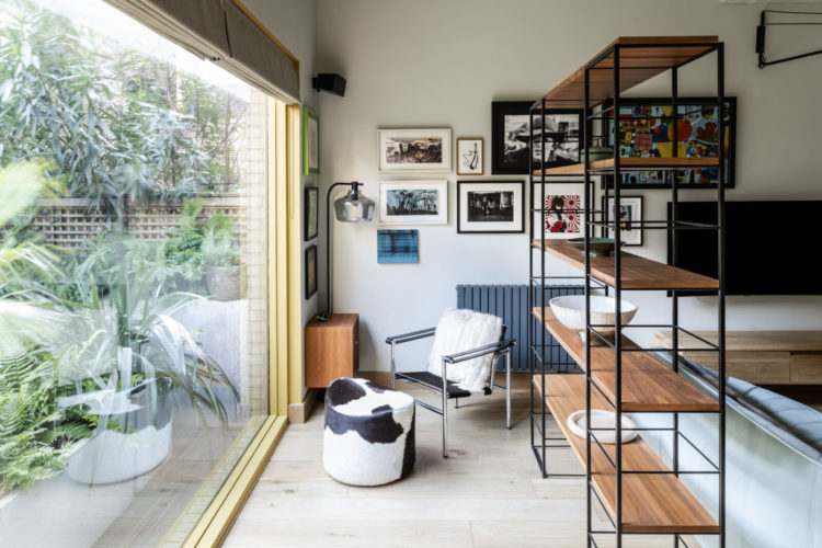
I have written many times about zoning open plan spaces with rugs – that act as flat walls if you like – but here the job has been done with open shelving which is a perfect way to create more spaces that won’t block the light. These ones are very minimally styled but imagine a few plants – linking back to that garden, as well as a few large books in piles – spines facing into the room – and the odd objet. The shelves have been arranged to create a little sitting area facing the garden and it’s the perfect place to sit and signal that you might want some quiet, non-conversational time within a large room that might have other members of the family present.
When we interviewed Julia Samuel, the psychotherapist, for the podcast during lockdown, she made the point that even in small spaces it’s important that people have a way of signalling – without having to make a big deal about it – that they want some quiet. That could be this chair. She even said that in a small flat, teaching a child that if they lay a towel on the floor and sit on it that it is a signal that can be understood by the rest of the family.
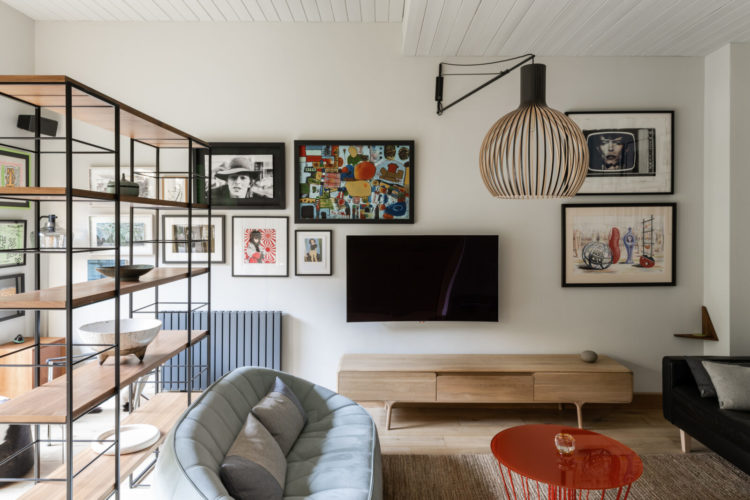
In this case, these shelves are a way of creating two seating areas out of one. One for tv and chat and one for gathering ones thoughts and reading a book. Note here also, the furniture is all on legs so you see more floor – imagine how much more cluttered it would look if it all sat heavily flush to the floor. The open shelves are echoed in the overhead lamp and the style of the coffee table. The light can pass freely around this room and there are no dark corners.
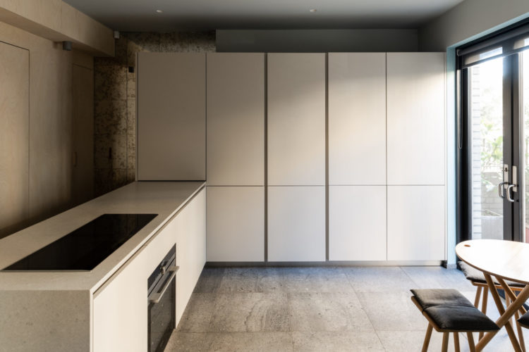
Quick look at the kitchen – now this is a tidy minimal dream. I would want to add a rug and probably a few herbs and flowers on that island but then I’m not a minimalist. Neither am I a maximalist – I suspect like most of you, most of us are somewhere in the middle. But you could absolutely take this sleek and pared back idea of a kitchen and drench it in the colour of your choice. That’s probably the halfway point – the cups and herbs and all the stuff that is needed is hidden away out of sight but the colour of the cupboards is like a shot of joy every time you walk in. And if you know what your personal colour joy is then you do owe it to your mental health to bring a splash of it into every room.
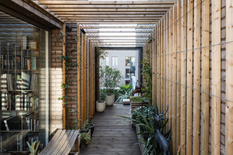
The kitchen leads out to another tropical style garden. This feels like you’ve washed up in Bali and I imagine it will be a fabulous space once it has some greenery winding its way all over. It may also end up as a sort of outdoor dining room in a dry summer as the pergola will provide shade and a layer of vines would keep a light summer rain off anything sitting below it.
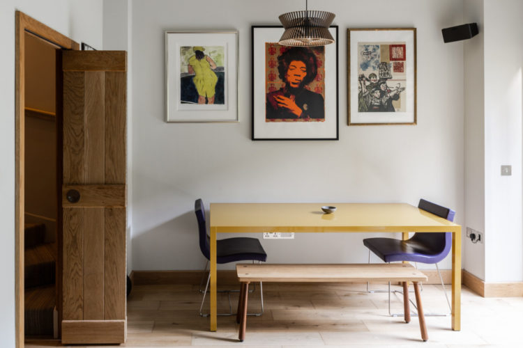
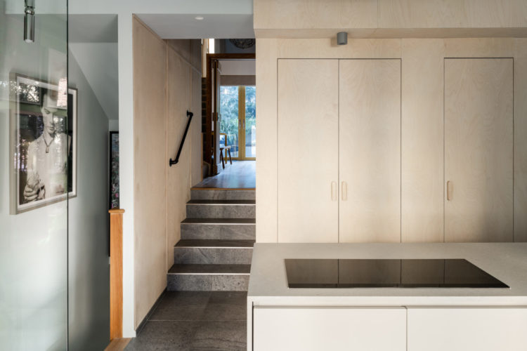
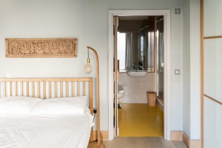
We’ll just pop into one bedroom as, again it’s very minimal in style and while not huge there is lots of storage and what I wanted to point out was the yellow floor that ties in to the yellow of the dining table and windows. This bathroom has a folding door, which is a great solution if you would like a space-saving sliding door but don’t have room. I have done this on the first floor shower room where a full size door was in danger of knocking someone down the stairs if opened in a hurry. A folding door obviously takes up less room wherever it opens. Mine goes outwards and sits flush against the small area of wall on the landing (about half a door size) this goes inside and sits against the wall in the room.
Below is a sliding door that moves along a rail (cheaper than a pocket door and easier to retro fit) and I like the porthole window. The yellow makes another appearance here on the vanity unit.

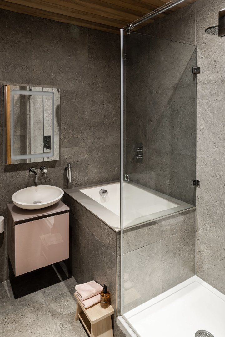
Finally, for those of you with grey bathrooms who may have been feeling a little cold faced with recent explosion of colour and pattern we have been seeing look how grey warms up immediately when faced with a little pink (or yellow). Grey is the most easily influenced colour on the spectrum and you can change the whole feel of a room by changing the colour of the accessories – so here we have a soft pink, and highly reflective vanity unit, some wood (ceiling and stool) and an even paler pink set of towels. Simply pick your accent colour and go.
Any takers for this one? There are lots of ideas for smaller spaces and using colour so I hope it gives you inspiration for your own places and spaces.


I saw the lovely pantry under the stairs from the PRETTY TWO BEDROOM LONDON HOUSE a week or so ago. Seeing the yellow crittal doors and immediately thought what a lovely splash of colour will do to my own plan of an understairs cupboard (someday).
The Maximalist one was a bit much to live in, although very on-trend. It’s nice though to see that even with more minimalist interiors we’re starting to see more personality, more colour and texture.
Love how grounded the whole concept is, but as much as the kitchen looks like it belongs in a magazine, it kind of makes me sad, I can’t imagine a family there or entertaining friends.
Living room furniture proportions are spot on and it has some personality which I like.
Oh, the kitchen here would make me sad. It doesn’t feel like a kitchen for cooks. This post, plus yesterday’s, have confirmed for me I’m in camp maximalist. My teenage boys would love this place though.
Not sure why, but seeing that yellow trim gives me the courage to paint mine the charcoal color I’ve been contemplating. Alwsys get something from your posts and look forward to seeing them in the Inbox!
This is a house which breathes space, an element to which I am fond. Looking at the tour photos, the view of the kitchen is warmer than it first appears. It faces the roof terrace with all of that natural light coming in from the southeast. The addition of colourful art on the wall and the lushness of those tropical green plants, here is where the eye is drawn. It may be that the open shelving has been intentionally left sparsely filled for enjoyment of the same view. A quiet intimate retreat away from the daily busyness taking place on the other side of the shelving while still being inclusive. A shower person by nature, I do think the plunge bath is an added treat! The subtle colouring throughout this house is just enough to add aesthetic interest and personal discovery Good one Kate!
Indoor plants or bouquets of flowers. Totally missing in this place. The greenery outside helps but still it is needed. I like minimalism but it needs to be done right. This is almost there but no zig-a-zig-ah?
A miserable looking kitchen, made worse by the combo I dislike. The oven right under the hob. Guaranteed to roast you if both are functioning.
I love the splash of colour in the bathrooms, very inspiring for my grey/white bathroom that I would like to give a facelift. I believe painting the counter pink would give it a more lively look. Or maybe just go a bit more bold in towel colours would be sufficient. Thank you for a good advice 😉
Yes, that kitchen could be the poster for minimalism. I would be craving some natural wood and colour, some pattern. But don’t stop showing us max, min, and everything in between. I value your posts, and am always delighted when they appear in my gmail. Cheers from Canada!
I love your daily insights along with the great photos and look forward to opening your email every day. I lived in England back in the late ‘80s and reading your posts takes me back. What a treat!
Also from Canada (Nova Scotia).
Love the pink with the grey, I might try that in my marble(ish) tiled stark en-suite. I can’t stop going back to the WOW house bedroom with the orange ceiling! Not my colours so not sure why I’m fascinated but I am. Keep up the good work, it’s all interesting even if we might not like some parts, of course.
Hmm…spaces seem very tight to me – narrow staircases, little space in the bathrooms. It seems a shame that for £1m you cannot get a bathroom with a window in the entire house. And is that a lav opening directly onto the kitchen? what’s all that about? But I like the use of textures and materials and clean lines.
What’s strange is that it’s 2000sq ft (~185 m^2) which is a good sized house but it seems more modest than that. There’s no hallway, it’s very narrow and the living space is split across floors which doesn’t help. Gorgeous though.