Right get your coats we’re going to Somerset. The slight hitch is that we need three million quid, but let’s worry about that when we get there. This fabulous modernist house was built in 1935 as a home for the composer Sir Arthur Bliss. It’s set in 25 acres of gardens and ancient woodland and it is, to coin a phrase, blissful and I want it.
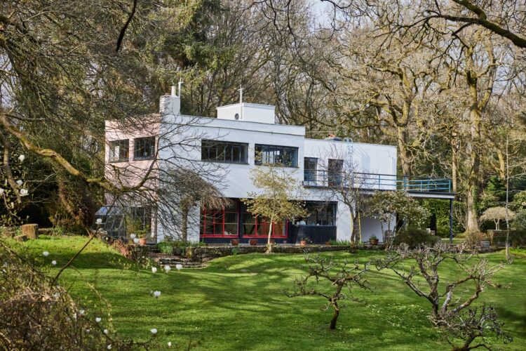
It’s on the market with The Modern House for, ahem, £2,950,000 and I think the reason it caught my eye is the use of colour and antique furniture. So often these houses are all pared back and white with hard floors and modern furniture and while that’s fine if that’s your thing, this, with its mix of blues, pinks and green is both Hollywood and period at the same time. Coming for a look?
Shall we start with the details? These are that in the addition to the Grade II listed house there is Bliss’s music room set deep in the woodland (and also listed) as well as a four bedroom guest house and it’s all around seven miles from the screamingly fashionable Somerset town of Bruton.
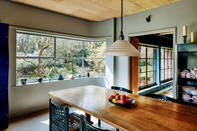
So let’s begin in the kitchen which lies on the northern side of the house and is, therefore, naturally cooler. It is quite busy with its wooden panels going in different directions, the mix of tiles and shades of green but that serves to make it look more contemporary as all the rules about matching materials have been thrown out of the window (again).
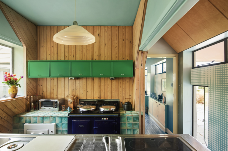
This also talks to a point I made recently about not trying to hide the idiosyncrasies of your building. There’s no getting away from all the angles in this room as well as the different ceiling and door heights. Now you could try and minimise this by painting it all out in one colour but that will still create lots of shadows so why not celebrate it by using different shades of one colour as they have done here from the bold grass green cupboards to the paler mint of the ceiling which deepens to blue on the tiles.
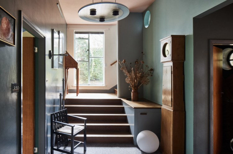
The mint blue deepens in this hall as does the blue which is a brilliant way of creating a colour scheme for a house. Hallways can be naturally dark (although this one does have a window at the end) so consider using two or three of your colours there and then take them into the rooms but use them in paler versions which will immediately make you feel that the room is bigger and lighter but still part of the whole.
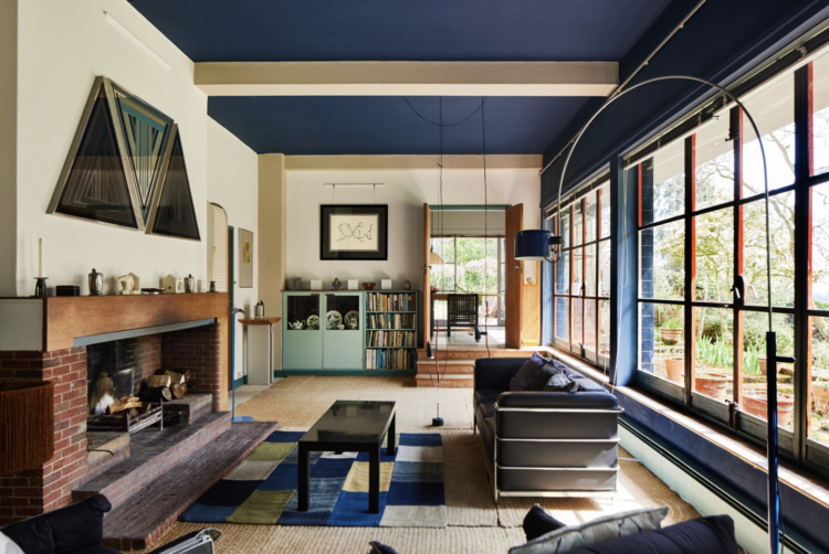
This sitting room has the darkest version of blue in it but retains the mint green in a single cupboard at the end. The darker blue is picked up in the rug which emphasises the shape of the furniture while the dark window frames draw the eye to the view beyond.
Now this is also an example of not being too hemmed in by the rules. There is a dark ceiling, a wall of window and two white walls with a couple of white beams cutting across the ceiling. On paper you probably wouldn’t advise anyone to do this as it could just look a mess but here it works. Sometimes you just gotta try and if it doesn’t work then paint over the bits you don’t like.
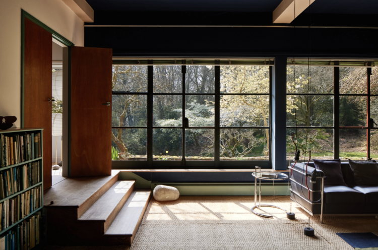
Here is a detail of the far end of the room above. An argument for dark window frames if ever there was one. The wood, black and natural carpet are all colours of nature and serve to emphasise the beauty of the view outside.
Now here’s a painting trick you might find useful. This corridor below is long and narrow. The green wall on one side highlights the greenery visible through the window on the other. But the trick is the orange doorway half way along. This breaks up the view and stops it being a tunnel. The pendant light is also perfectly framed within that orange doorway as well.
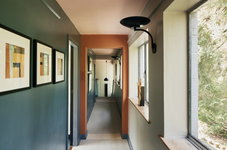
If you had wanted to make the corridor seem even shorter you could paint the wall at the far end in orange which have the effect of bringing it towards the orange door frame in the middle and foreshortening the space. It’s a good trick if you live in a narrrow Victorian house and want to make it feel shorter and wider instead of long and thin.
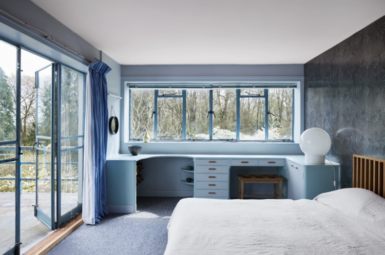
This bedroom is an ode to blue but it all works together to make the view outside the star of the show. Blue window frames in blue walls, with blue curtains and blue furniture. It’s a bold design – now called colour drenching but you can see it really works. And it would work even without the view.
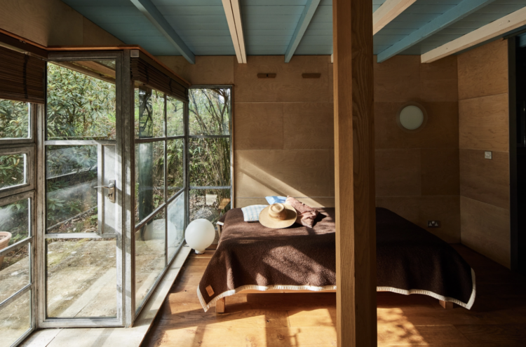
This room, on the other hand, is rich with wood and caramel tones with the blue and white ceiling. Imagine waking up here on a sunny morning. And I had to include the image below as it’s giving strong Wes Anderson vibes and that’s been huge a theme on instagram over the last couple of weeks.
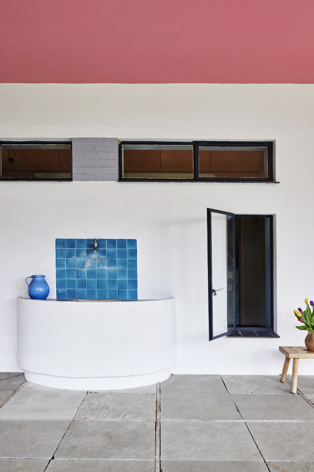
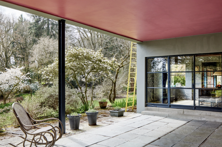
But we’ll finish our tour out here and who would think to paint the roof pink? Also did the photographer put that yellow ladder there especially for the shot? We’ve finished looking round this house but the questions remain. Mostly where can I get £3m from?
I wish you all a lovely weekend and if you’re catching up over the week don’t forget you can find out all the details of our trip to Italy here. I promise we can discuss the details of every interior in just as much detail.


That yellow ladder is in place permanently, to allow access to the roof terrace. So, whoever decorated the house chose a disrupter colour for its paint. I would like to live in the music studio, please.
What an interesting house, I love so many aspects of it, the contemporary feel but with a soul.
Really good tip about shortening the corridor space, wish I’d have known that before!
I find my initial reaction to some of these rooms is to feel a bit anxious. I’m going to sit with that and see what is is, because I love each element individually – the views, the use of woods, the colours – but together in this particular way – no. It’s a beautiful house, I can see that, and it’s good to see it through your professional perspective Kate – this one is a ‘learning what isn’t right for me’ post. It’s thought provoking. Thank you!
Yep, I’ll take it please. Although the Crittal windows suggest it could be a bit chilly in winter. Didn’t spot any radiators apart from the one pale mint green very long low level one in the sitting room, does this suggest some underfloor heating or just well hidden rads? Again I’d want some of the furniture too, oh and can I transport it all to Oxford please?
Lottery ticket bought. My absolute dream home and would want to do a deal on some of the furniture too!
The setting is just stunning, 26 acres with ancient woodland. Beautiful.
And the colours and shapes used are timeless.