Yes it’s a palace. Well part of a palace and it was named for King Ina of Wessex, who reigned from 688 to 726. His lands stretched from Kent to Devon although this house wasn’t built until the 14th century, and it’s not certain if the King even had a palace on this spot although chronicles mention that he had a temporary palace in South Petherton, where this property is located.
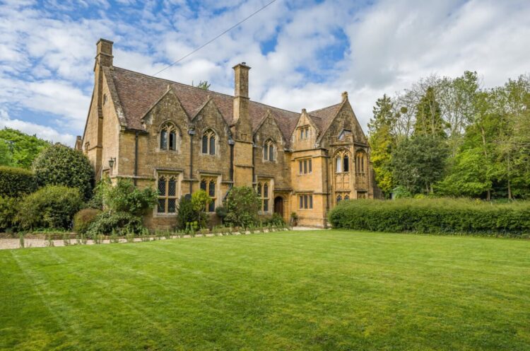
It was built by Sir Giles Daubeny whose brass effigy is in the local church. The main part of the building and the walled acre of grounds is for sale, while the gable end belongs to next door and the house, say the vendors, although semi-detached, is so private they have never bothered putting up curtains.
It’s in the middle of the village hidden by walls and the acreage.
It’s on the market with GTH for £850,00 and has four bedrooms, three bathrooms and two receptions all set in an acre of private garden. Oh and it’s Grade II listed, which is always worth knowing before you start dreaming up plans for extending kitchens and so on.
That said, one of the issues with listed buildings can be the lack of bathrooms and it can be difficult to get permission to add them in case you want to put them over a bit of plasterwork that is the reason the building was listed in the first place and there’s a danger of leak. But, this is fully bathroomed already so there’s no worries on that score.
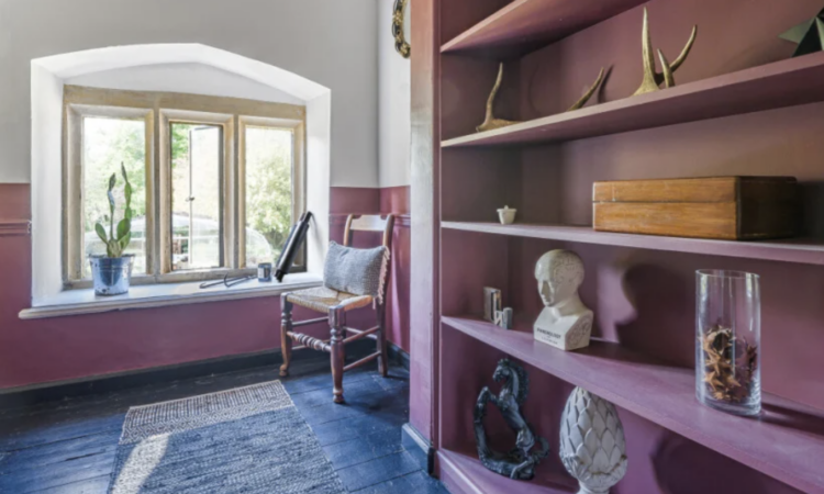
Now, as you can see the rooms are generous and the ceilings high. There’s not much point discussing how you might want to change the layout for the afore mentioned reasons so this is a decorating job. And actually those are the best kind. There’s no dust, no builders, no boxes of stuff that you can’t unpack. You can simply sit down with a colour chart and swatch away.
And that is exactly what the owners did. They started with a neutral palette and then felt that the pale whites and greys didn’t match the drama of the interiors. Now there are, of course, always two approaches and you, as the saying goes, must do you.
One school of thought says you don’t want to gild the lily so let the architecture speak for itself by keeping the colour palette restrained and neutral. That is where they started. Then: “I had seen the colour used in the farmhouse at Hauser and Wirth art gallery and felt inspired. So I added a little then a little more. I used Victorian colours and shades to a certain extent as the palace had a renovation and makeover in early Victorian times.”
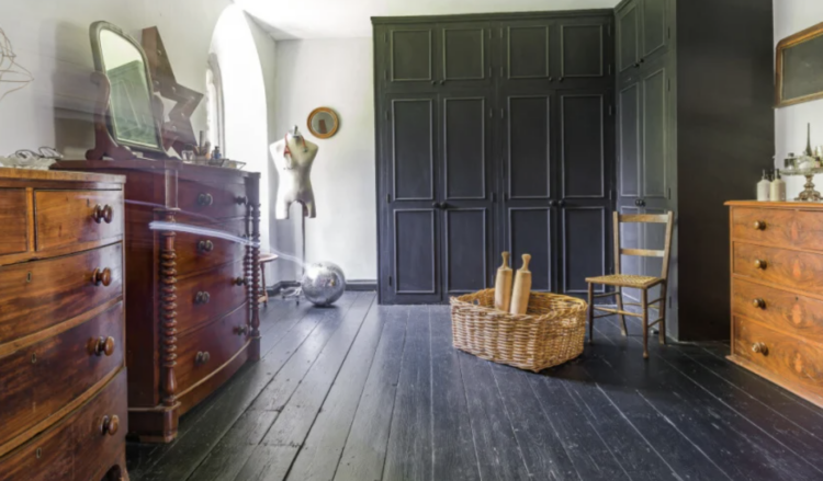
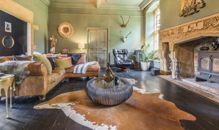
I watched one of the owners, Dan, discover the joy of colour and transform the walls and it was fascinating to see him essentially colour in the palace by degrees. He used mostly Farrow & Ball paints so the colours, while bright in places are still slightly muted and it works perfectly with the architecture of the rooms. And, of course, if you buy it and want to change it it’s an affordable thing to do.
Talking of architecture, I am often asked about sloping ceilings. Where does the wall end? Or begin? How do you choose which bit to paint in which colour. Why is why, I think, loft spaces are often left neutral as it can all feel a little complicated.
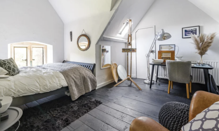
But really it’s easy. You paint the bits you want to paint. So, above, take the desk area – that sits in a natural alcove and you could zone that whole area in a single colour – walls, sloping sides and the back wall. Or you could leave that white and paint the alcove that the bed sits in. Or both. My only advice would be to pick a zone and do it all floor to ceiling. When the angles are as many and as busy as this if you paint all the vertical surfaces one colour and try another for what slopes and might be counted as ceiling you will create a more hectic space that won’t be conducive to either sleeping or working.
So either pick a pale colour and do the whole thing – as they have done here in white but you could use a pale green to echo the huge gardens outside and the sense of being in the treetops. Blue would work in the same way to connect to the sky. If you feel dramatic papering the whole room – walls and ceiling – would also look amazing, just make sure you choose a pattern that has no direction. Or stick to the zoning idea in either tonal or contrasting shades. In short this is a room to have fun in.
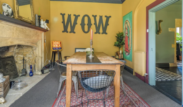
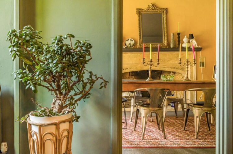
Above the yellow brings to mind the honey coloured brick work of the exterior while the dark ceiling picks up the floor. But what I love here is the detail round the door – the pink and blue architrave which works well with the rug under the table. This is a great idea if you just want a bit of considered detail but don’t want to go all out. So you could have kept the walls neutral and just done a pale blue ceiling for example. The joy of paint is that the options are limitless.
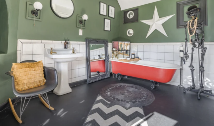
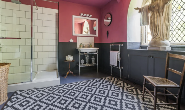
They have had fun with the bathrooms too. I mean yes it helps when they’re big with amazing windows but the bright orange bath really pops against the green walls and pink and charcoal is a classic combination. Here the rug echoes the lattice windows.
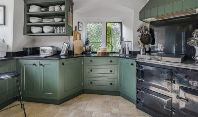
Finally to the kitchen, which, the owner says, wraps itself around you and there is plenty of workspace as well as the range cooker and a huge fridge.
So the question is who fancies living in a palace?


Me too! In every way, it’s perfect. A hearty Canadian “Cheers!”
I can imagine this house to have the most glorious feel when you’re inside it. I love all of it and love te way the rooms blend together but don’t exactly match
love all the colours but I think the loft is a missed opportunity & doesn’t look like it has any connection to the rest of this lovely home.
Me too! I wouldn’t change a thing! Cheers from Canada!
so great!!!!!!!!!!!!
Meeeeee!
I do! As long as I can get rid of the green paint ….. but what an interesting history this house has and thank you for a very interesting post