We have reached that stage of the build where you go to take the builder a cup of tea and 40 minutes later you are still deep in a conversation about exactly how wide a shelf should be and what sort of beading should go on the front of it. Then you spend 20 minutes discussing the height of the picture rail when you discover that the windows, of which there are two on one wall, aren’t level, so wherever you put the picture rail it’s going to look off. This, we have decided, will be resolved by clever placing of curtain poles and means the space between the two windows will be filled with fabric so you won’t notice. Another good reason for having curtains instead of blinds in this room.
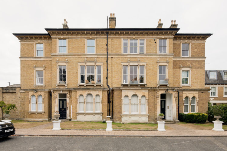
All of which is a long way of saying that today’s post almost didn’t make it to you but we’re here – slightly out of breath and leaning against the door panting but HERE. And we have a rather elegant two bedroom apartment in a Grade II listed building which was built in the 19th century on Copse Hill, near Wimbledon Common and is one of the few remaining buildings of this period in the area.
It’s on with Inigo for £900,000 and has recently been fully restored and renovated to create this lateral apartment which flows across the first floor of the building. It has two bedrooms and two bathrooms and a large reception room with a kitchen at one end.
Cleverly though, as not everyone wants their kitchen in their living room, there is a wall that extends a third of the way across the space allowing you to keep the business end of the kitchen (washing up?) hidden behind the wall while the rest of the space is open and airy and takes full advantage of the large windows.
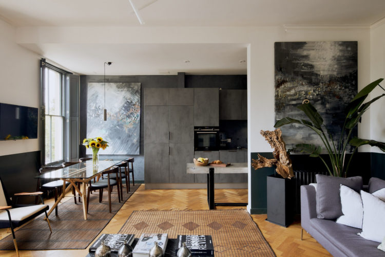
The other advantage of a partial wall is not only does it give privacy without stealing light, but it also gives you more room for furniture placement. Without this wall the kitchen would have extended into the room as a peninsula and you could, perhaps have put stools against it to create an informal breakfast area, but really, when there is enough room for a dining table, why would you bother? This way the sofa is tucked away and there’s a whole extra wall to hang a picture and a radiator and even add a plant. I’m increasingly of the view that open plan is not for me, but if that is what you have then see if adding screens or half walls can give you more “rooms” or cosy corners. Note also the mirroring of the two large paintings, one by the sofa and one by the dining room table. That links the two spaces really well. The concrete table sticking out from behind the kitchen wall also takes the eye over to the dining table and from there to the window while the half painted wall by the sofa helps zone that space.
The half painted wall carries on round this room too which helps create the sense that the sitting area is all one room. Rather than low kitchen units matching this half paint the kitchen has tall cupboards so you can see at a glance that that is a separate space.
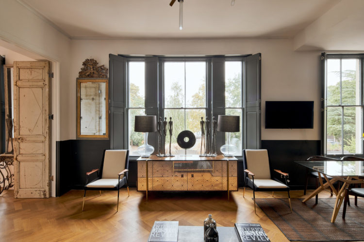
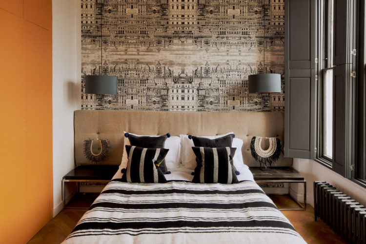
A word on symmetry – there are those who find it more calming and relaxing while others prefer to style their objects in groups of three or a varying heights. Above you can see how the sideboard has matching chairs at either end, a pair of lamps and symmetrical statues at either end. For me this is all thrown off by the gold mirror which is too close to the window for comfort but that’s easily rectified.
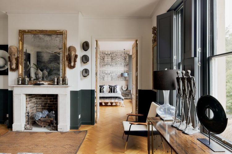
Looking down the room towards the bedroom from the sitting room and you see the importance of the views between spaces. The accents are still grey but they are paler so you have the impression of the space lightening as it recedes. This is a Georgian decor trick where when rooms led into each other the same colour was used in different intensities. I also knew of an old Dairy where the owners decorated the basement in a dark grey and went progressively lighter on each floor. This is a version of that trick and, again, is perfect for open plan living or spaces where you are constantly looking into other rooms. It’s less important where rooms lead off corridors as you tend not to linger but when rooms are directly off other rooms you might want the doors open to make it feel airier and more spacious so you need to think about the transitions and making the whole feel cohesive while still separate. There this has been done with a tight colour palette.
Coming into the bedrooms and note the calming symmetry again, then suddenly a wall of orange. This isn’t visible from the main room but reveals itself only when you come in here so it’s a joyous burst of colour. Orange may not be your joy but the point remains – pick yourself a happy little colour reveal that will give you joy when you see it. In the wardrobe which is currently being built in our bedroom ,the inside will be painted pink. In the last house it was white because I never thought about it, but white doesn’t stay white for ever and while you think you won’t see it as it will be full of clothes somehow you do. So paint it – wardrobes, walls, doors – whatever you fancy in a colour that makes your heart sing.
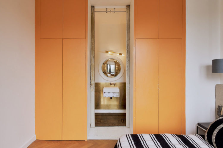
Here is it in its entirety and they are actually wardrobe doors as there is some clever hidden storage between these two rooms. The other point to note about using versions of black and white and wood for your decor (or ivory and charcoal which is softer) is that you can add any colour at any time for an instant refresh. This orange could be cobalt blue, or soft pink or olive green and it would totally change the decor for a couple of hours of time investment.
But the point of these orange doors is what lies behind. And it’s the tiniest luxiest little bathroom.
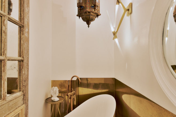
There is a slipper bath set at an angle across the space – no shower in here – but to make up for the squeezed space the owners have gone all out with a brass splashback which not only reflects the bath back and bounces the light around but is also saying – OK I may be small but I am very sexy. It’s a way of distracting from the tightness of the space. Now they could have put the bath in the bedroom as you still see sometimes – it was a sort of 90s hotel thing – but sometimes you just want to be able to lie in the bath in private, or perhaps not be looking at a bath from your bed so this was a way of doing that and using every inch of space.
In short the idea is – if you haven’t got as much space as you would like then go all out on the decor or finish – there’s less of it to buy after all – and make it look fabulous that way.
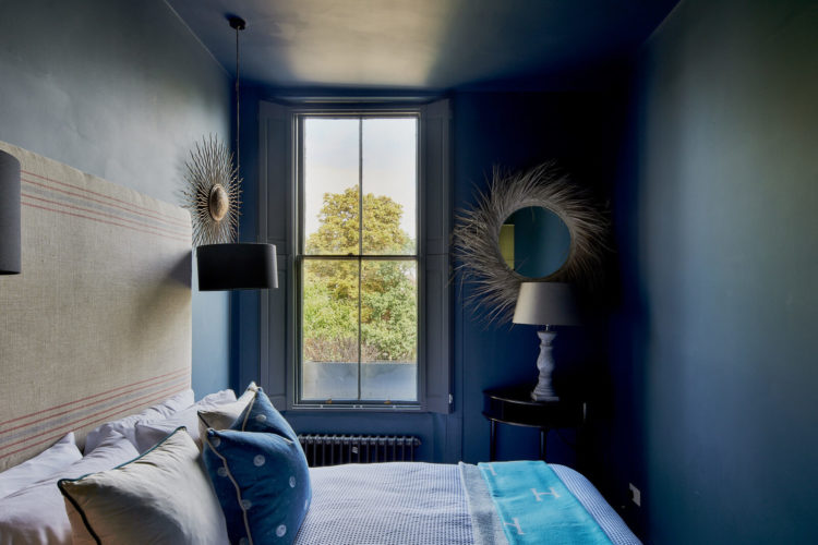
The second bedrooms, as you can see, is small so here the owners have leaned into that and wrapped it all in a deep cocooning blue – windows, ceiling and all. It’s the best way to deal with a tiny room like this and it won’t be that dark since it has a large window. Looking at the floor plan it says it’s 10ft wide but my guess is that’s the old estate agents’ trick of “at widest points” which is out of shot so this is probably less than 8ft here as beds are around 6ft long and I’m pretty sure there’s not much more than a foot or 30cm at the end of it.
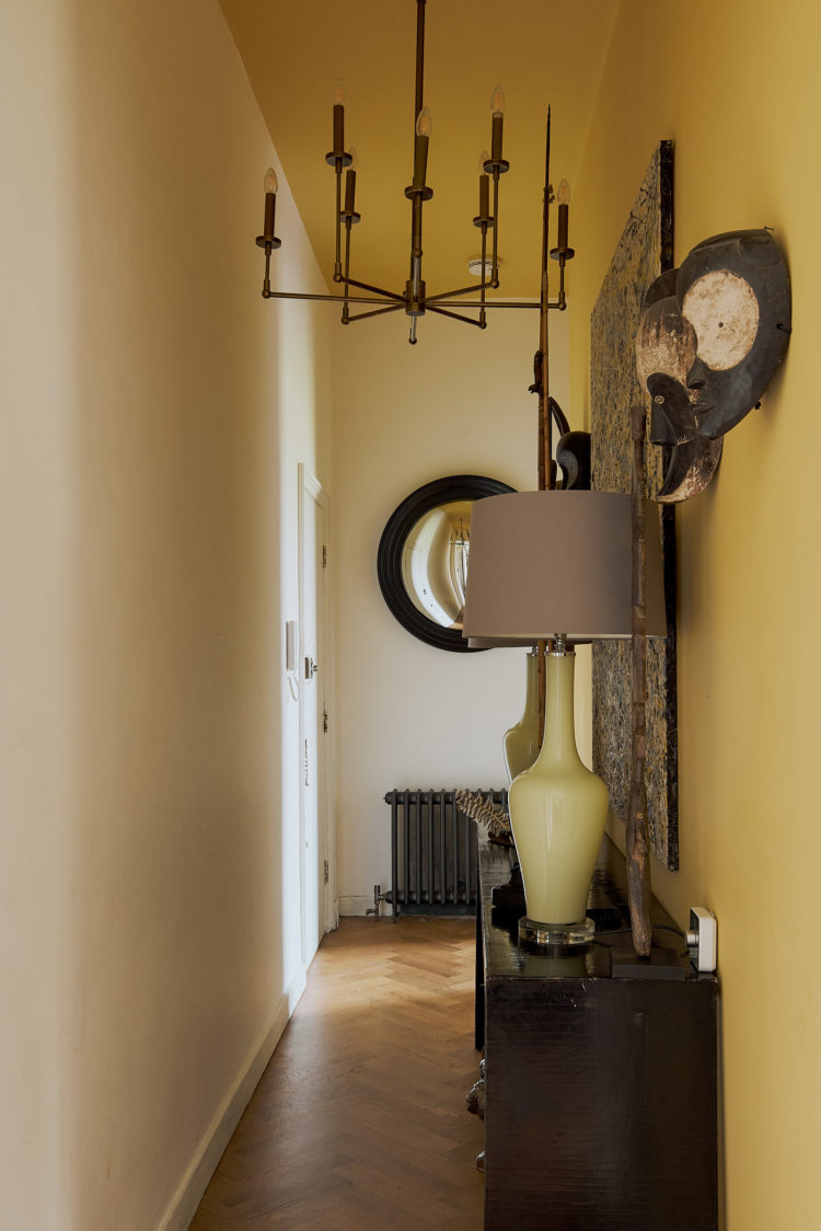
Finally, we’re back out in the hall and that’s another neat painting trick. The yellow has been taken all along the wall and over the ceiling but not on the other wall. Why? Because you can. Wrapping it all in yellow might have been too much, doing just the ceiling would have worked but perhaps they liked the colour more and wanted to see it without looking up. The point is, as this demonstrates, there are no rules. You can do whatever makes you happy. In fact there is one rule: you must do whatever makes you happy.


Sylvia, good call. Perhaps better to have radiator between windows to allow for curtain closage. Re the flat. Great bones, great interiors and amazing wardrobe bathroom! From my dishevelled cottage in Wales, great envy, but knowledge that if I lived there, great dishevelled would follow. How fortunate I am, and the flat is, that it will never come to pass.
I keep meaning to post, just to say a quick ‘thank you’ as I always look forward to your posts. Coming to the end of our renovation project (for now!) & you’ve provided much inspiration along the way & escapism on days when it’s been needed. Hope you feel & know the appreciation from your readers. Thank you!
You mentioned again about having curtains, rather than blinds, in the new mad house. I wonder what you’re going to do with the radiators, as they’re under the window. Short curtains look like thick eyebrows in a room, but then if one has proper curtains, the radiators are covered. Maybe you plan to draw the curtains only when the radiators are turned off? I’m curious to see your solution to this problem.
Yes, the symmetry is ruined in the living room, the office chairs are superfluous, and the odd carpet placement is confusing, yet what a wonderful big space! I wouldn’t turn up my nose. Cheers from Canada!