Off to East London this week to look at a classic Victorian terrace that has been extended to provide four bedrooms but has planning permission to convert the loft into a further large bedroom and en-suite, which might free up space for a home office or playroom should you need.
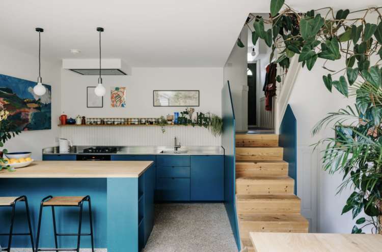
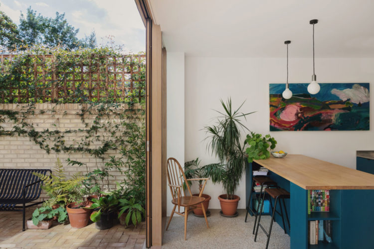
It’s on the market with The Modern House for £1,250,000 and I have to say it was the stunning blue of this kitchen that caught my eye. It’s just not a colour we see in kitchens and yet it’s warm and cocooning in winter and sings of the sea in summer. Strong blues can be difficult in this country – what looks great under the strong light of the Greek sun (when you’re three ouzos to the wind) doesn’t necessarily translate to a London terrace under a November sky. The trick is to pair with it a soft white – rather than a brilliant one – and then add warm tones of wood. This blue is also a little muddier than that classic Yves Klein, which, for me at least, might be a little hard for the UK light.
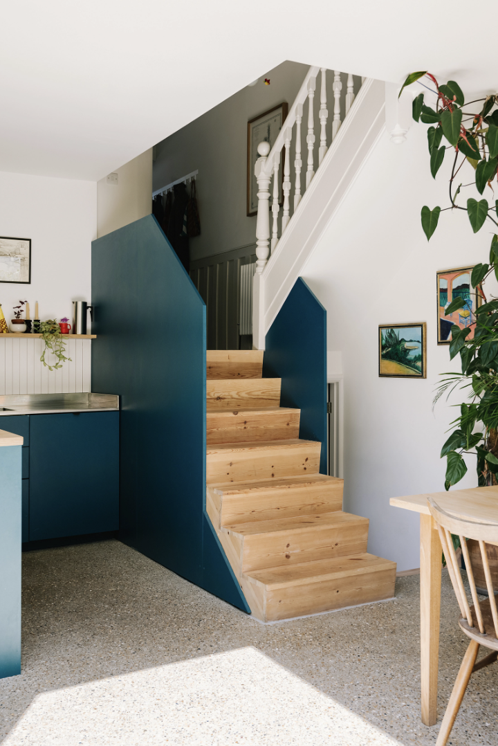
Another view of the stairs and this solid painted bannister is a good way to bring in a block of colour and separate a more open plan space from the rest of the house. It also helps tuck the working part of the room away at the back leaving the rest, as you will see, for dining and sitting and closer to the garden. It is also to make the point that you should always paint your kitchen any colour you please and not one that is sensible – unless sensible is a colour that makes your heart sing. Wooden cupboards especially can be easily repainted – it costs time rather than money.
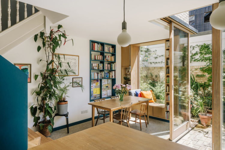
As you can see it’s not a huge space but the cooking and dining areas are very separate and there is even a window seat. Now, as you will be aware, there has been a huge trend towards glazing the whole of the back of the house with doors that open up to the garden. But the issue with this is that the number of days when you are going to open the whole thing are small. Used to be because the summers were too short, now it looks as if they will be too hot. So perhaps it’s better to divide the space and have a door that opens and might allow breeze and a window seat (or chairs) that will be a lovely spot to catch the sun in winter and make the most of the light.
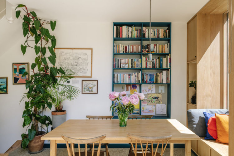
That little alcove bookshelf in the matching blue is perfect finishing off the room as well and brining it all together. Below you will see a painting on the wall that also fits perfectly. Now of course it is said that you must never match your artwork to your decor, but in the next breath it’s said that you can use an existing piece of art to inspire a decor scheme but who is to know which came first – the paint on the picture or the paint on the walls?
To unpack it a little – if you are stuck for a colour scheme then it’s a very good idea to look, as I have said before, at your wardrobe, but also, perhaps, at the pictures you have bought for your walls. To like a colour on a shirt or in a painting is to love it in an interior design scheme. The other point is that art work can be expensive and you should buy it because you love it rather than as an afterthought – that goes with the cushions so I’ll get it. That is the point that is being made. Of course if it goes with the cushions and you love it as well that’s the ideal scenario, but don’t feel slighted by any snobbishness around the idea of the art matching the interiors. Once it’s on the wall no-one knows which came first and, as with everything in your home, as long as it’s there because you love it – or someone you love loves it – then it’s all good .
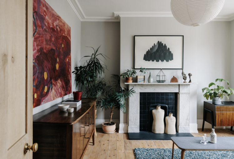
Below is a huge piece of art that, in this view at least, isn’t picked up anywhere but it goes with the dark wood and there are touches of blue that link back to the kitchen where the pink in that artwork takes the mind back to the pink in the sitting room. Sometimes you should just buy the picture and hang it on the wall and not overthink it.
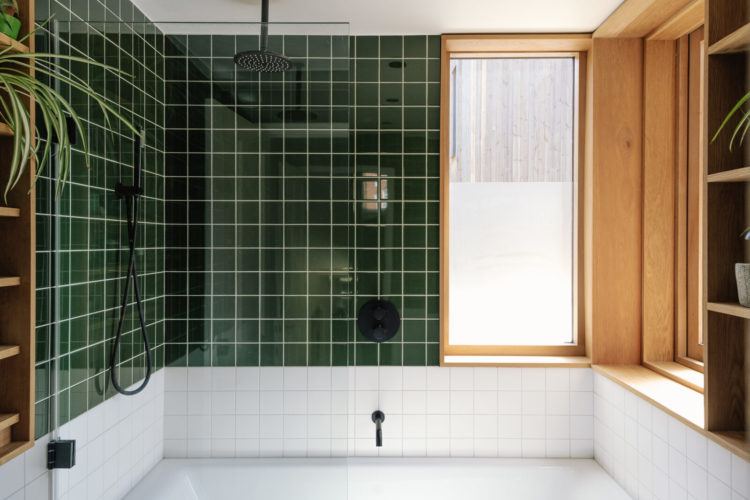
Staying with the blue and this single tap in the bathroom is the perfect detail. Coloured taps aren’t always easy to find but they are around (Dowsing and Reynolds have white and mint) although they can be expensive. But if you are going for a long-lasting neutral scheme (did someone say sensible?!) then adding a small splash of uplifting colour can make all the difference.
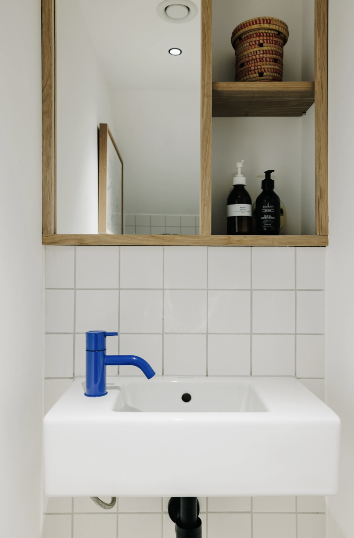
To return to the wardrobe analogy – if you have to dress for corporate life and feel that your home should be classic and something that you will never tire of (and there’s nothing wrong with that – this is ALL – about what works for you – then try, perhaps to dress your home as you would for work but throw in a few weekend or holiday touches. These colour taps are what you would wear if you didn’t have to wear a uniform.
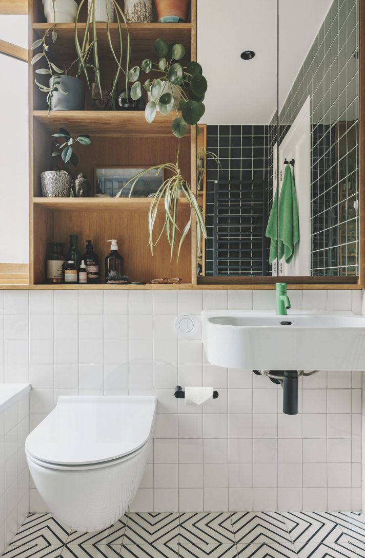
This is the other side of the bathroom and note how all the tiles are the same square shape but the colour changes. This is a great way to add a little something without worrying that it will be too much if you add in too many shapes and variation. That way works for some and not for others and the trick is to take the time to think about what’s right for you. Always look at these pictures if you don’t like them and work out what it is that’s not right for you. Then think about what would need to change to make it work. So it might be same pattern different colour, same colours, different arrangement. More colours. More tonal etc.
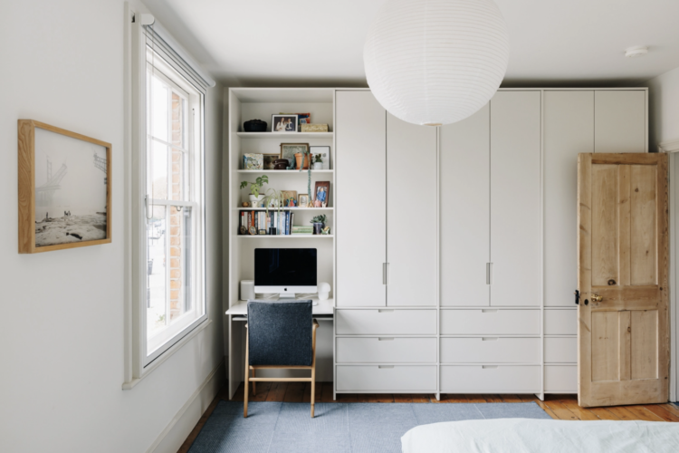
And we’ll finish with this home office set up – in a wardrobe. Now working in a cupboard may not be ideal but this one is next to the window so that helps enormously. You could also add a curtain if you wanted to close it away at night. Or perhaps a set of double doors, like the cupboard next to it, so that they wouldn’t take up too much room and block the light in the day. Then you could put the chair in front of the doors and properly signal that work is done for the day and you couldn’t get back in even if you wanted to.
So who’s moving in and what are you doing with the loft?


Kate
You are “on the money” with your comments on bifold doors. I did a massive kitchen extension in 2010, which was “L” shaped. On one part of the L, I had a huge run of bifold doors. On the other – out of necessity, because the main bifold doors were going to fold back into the same space, we had to have sliding patio door – the classic one panel fixed, other one sliding back over it.
We regretted the bifolds. As you say – hardly ever the right weather to use them. All year round – so much framing on each door that our view was visually very disrupted by the frames intruding so much. Too much black metal, not enough glass.
Patio doors – much better.
However, the best feature glazing-wise, were the three large square windows above the worktop. Window no. 1 slid back over window no. 2 and they both slid back over window no. 3, if you wanted. Window versions of patio doors, and with no external space left “dead” to accommodate the rarely used fold-out space for the bifolds (or casement windows).
Looking at the doors leading to the garden in today’s house, I think that they have done precisely this – multiple sliding doors framed in wood, sliding one on top of another. It also has the benefit of having a fixed glazed panel which allows you to place furniture against it/near it.
Phew.