Now this doesn’t happen very often but today we have a fabulous house for sale and, since I know the designer and she was mentioned in the details, I have been able to gather a few extra details from her. Emilie Fournet is a genius with colour and has featured on these pages many times before and, by the way, just because I say she’s brilliant at colour doesn’t mean you have to run away if your taste tend more towards the monochrome. There is a grey bedroom below…
So the house, Hackney’s St Mark’s conservation area, is set over three floors with three double bedrooms, two bathrooms and a garden. There is also a loft conversion and it’s on with Aucoot for £1,400,000.
Now Emily did this in 2014 which, while it may not actually seem that long ago, is a long time in decor terms and also it looks so contemporary which means she was way of her time. Indeed when she told the decorator to paint the ceiling the same as the wall – while leaving the cornicing white to make it stand out – he told her she was INSANE – her capitals!
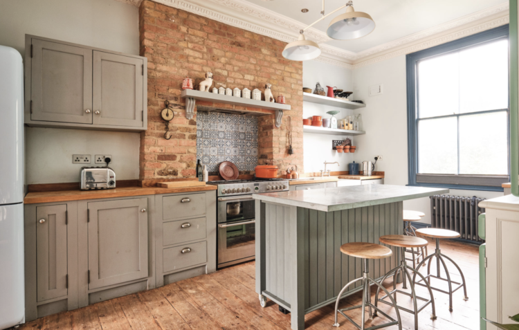
Talking of cornicing, one of the key decorative elements that she insisted on was stripping it right back and restoring it: “I insisted to have all the cornicing in the kitchen and living room fully restored and cleaned of the numerous layers of paint. Clients hate it when I suggest that, because it’s expensive, but I think you can really tell the difference. Also I can’t bear the thought of being responsible of adding another two layers of painted to an already ‘kacked’ in paint coving that’s lost all definition.
“The cost will depend on how ornate it is, if you’ve lost bits of it that will need to be recast and put back. It’s expensive because it’s literally neck-breaking work but people should do it – it’s our responsibility in buying a period property. Most Victorian/Georgian houses will have at least 150 years worth of paint on the coving. If you add up a repaint every 10 years that’s at least 45 layers of paint.
“What’s the point of having blobs of paint instead of cornicing?”
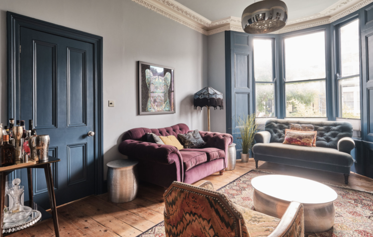
Note also how the wooden shutters are painted a darker blue than the walls to create a warm tonal look that is still rich in colour. And the shutters have been introduced to the rest of the room as the same colour flows around the skirting boards so the whole paint scheme forms an interesting backdrop to the furniture but is a feature in its own right.
The other thing she did was fully restore the stairs; stripping back all the layers of paint, fixing broken steps, filling the gaps which is a big job over three floors.
“The floor boards were all sanded and we used various stains and water based varnishes to achieved that lived in warehouse floorboard look. It’s pine and I always hate how yellow and orange comes through the pine so it’s a big job as well working out the dilution of stain and how it’s going to dry.”
To take the yellow out will be a matter of trial and error, she says. Sometimes you will need to whitewash first and then stain and always finish with a matt varnish.
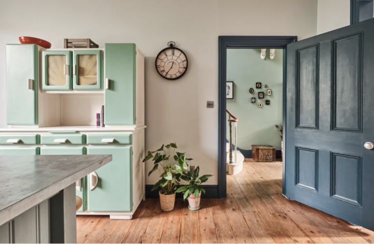
When it came to furnishing, Emilie, who is French, hired a van and drove to France to source vintage furniture. For the hall she bought a couple of Victorian silhouettes. She then drew the owners and had them cut out in the same style to add to the gallery wall. And that my friends, is a brilliant idea.
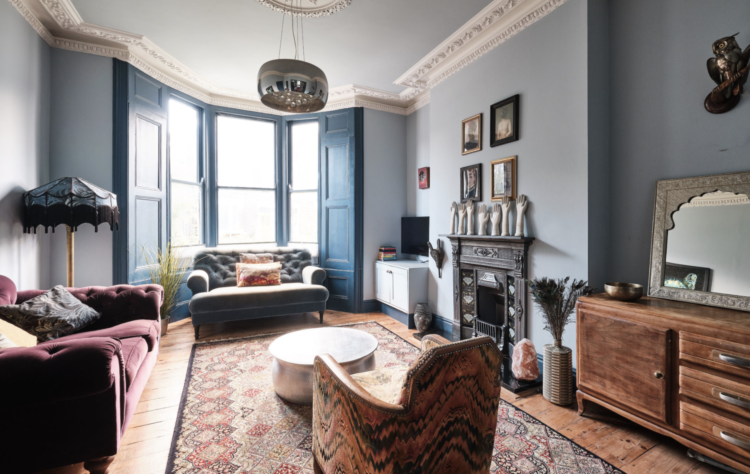
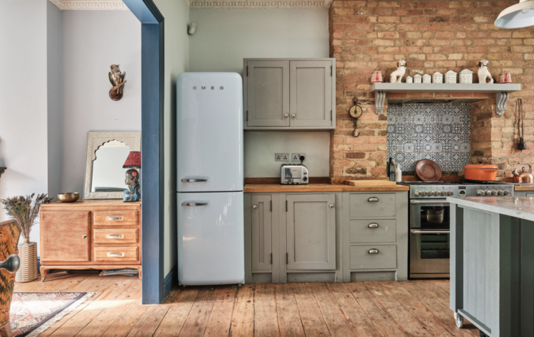
The other thing to note about this view is not just how the frames draw the eye out from the kitchen but how the hall wall matches the vintage kitchen unit and links the two spaces. This is one of the most important elements to consider when doing a whole house and one that is often overlooked or left to change and happy accidents.
Emilie exposed some kitchen bricks, which she felt, went with the relaxed and bohemian style the owners were after. You can also see how the wooden floor and bricks warm up the grey. “It was 2014,” she says.
But let’s look at that grey bedroom. It’s true it might not be the first colour scheme that spring to mind now but you could replace any of these grey elements with any colour of your choice while still keeping the natural walls and floor.
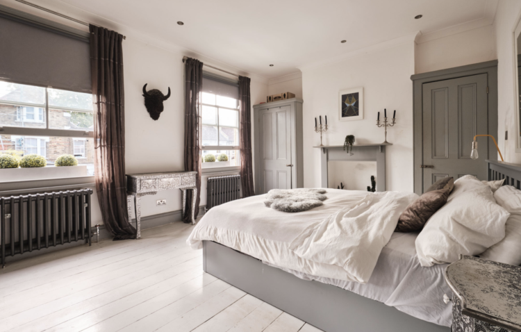
For those of you who aren’t sure about lighting in bedrooms, while I’m not necessarily a fan of a harsh downlight I’m also not keep on a central pendant swinging pointlessly over a patch of bare floor. So – spotlights around the edge about 30cm in and on a dimmer. That way they will wash gentle light down the walls and won’t dazzle you when you lie in bed – you might want to avoid the wall with the pillows against it and use bedside lamps instead. Or move the pendant. In this case it could hang low over the dressing table between the windows instead of the head (it was 2014). That way it will still light the room but it can show off a pretty piece of furniture at the same time.
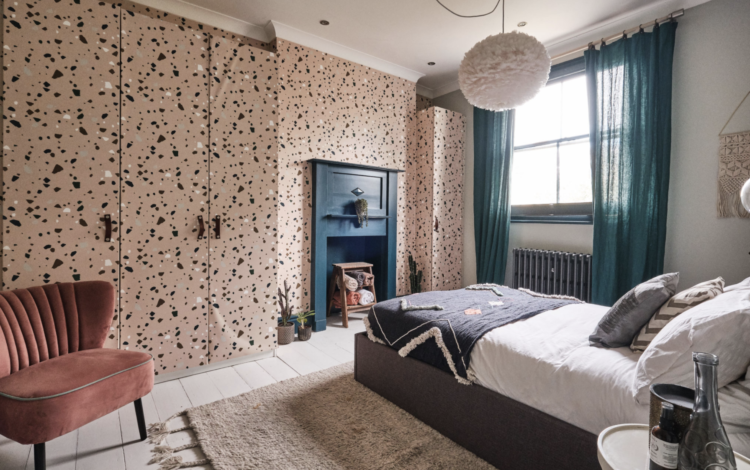
In this bedroom (note the dark blue red thread that continues throughout) the wardrobes have been covered in the same paper as the wall so they disappear and don’t dominate the space. The pendant has been moved to hang over the bed rather than the floor.
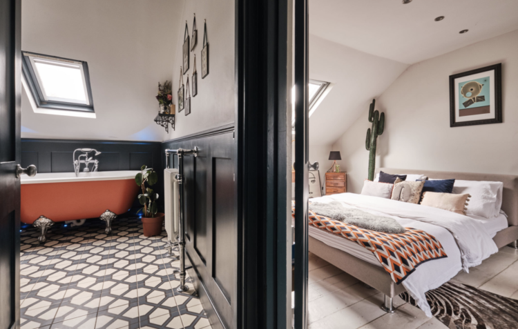
Another example of linking spaces. This orange bath (copied many times since Emilie first did it) is just highlighted by the throw on the bed in the room next door while the mix of cushions on the bed also include a dark blue one to tie back to the paint of the bathroom. Even the tiled floor pattern references the throw without being an exact match – which would ruin it. It’s about linking ideas, shapes and colour tones rather than copying from space to space.
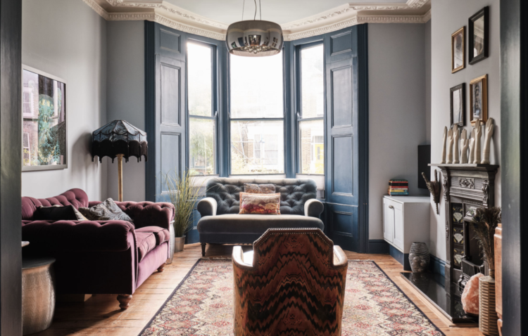
Lastly, the above picture is all about the inside of the opening. This room is open to the sitting room next door, with its blue shutters and woodwork, and by painting the inside in the same blue both ends of the room are drawn together but there is a separation between them both before the colour, which tones, changes.
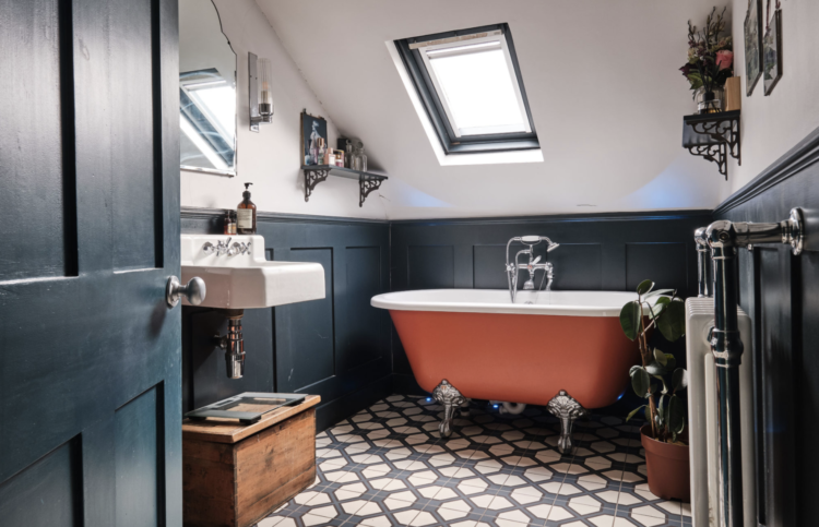
And a full shot of the bathroom. It’s small but very luxury. The wooden panelling goes up to the sloping ceiling but the window is painted dark to match and the vintage wooden storage box brings in warmth. The genius of Emilie is that it all looks very casual and simple but is actually the result of lots of clever ideas and nothing being left to chance. You can see more of her work here.


I just enjoyed 30 minutes re-arranging my sitting room thanks to the first photo! I’ve moved my House of Hackney lamp to the side of my velvet Chesterfield so I have enough light to actually read rather than squint with my table lamp. It seems so obvious now! Funny how the most obvious things are sometimes not obvious until you see someone else do it.
A lovely house, so imaginative and couldn’t agree more about the layers of paint but yes the work involved!
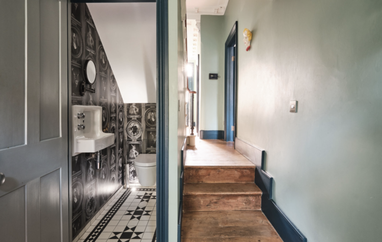
I love the understairs cloakroom as well, it looks so crisp and clean.
What do you think of that rug in the living room Kate? Though not an island, as in a small size rug, it doesn’t anchor the sofas, which bother my eyes a bit. Just to be picky on a scheme that is, overall, rather lovely!