So many of you have asked me to feature cottages and it’s difficult to find ones that are pretty enough to show off but with valid ideas that might inspire those of you who are struggling with low ceilings, small windows and sloping floors.
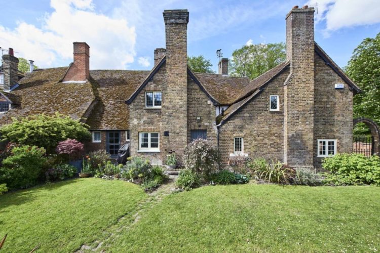
But I have found one. This former village hall may not be the archetypal country cottage – it has five bedrooms and it’s Grade II* listed – but it does have many of the same issues so let’s have a look. It’s on the market with The Modern House for £975,000 and it’s in Buckinghamshire, in case anyone’s already rummaging down the back of the sofa for lost premium bonds.
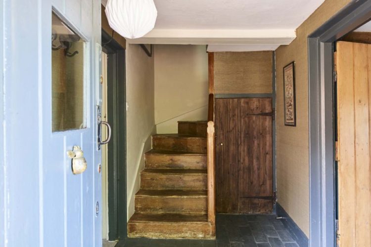
Just in case you weren’t convinced by the outside, here is the entrance hall and you can see that the ceilings are low and the staircase is small and twisty. Downstairs there is a drawing room to the right and dining room leading to a kitchen and pantry on one side and a second sitting room from the other. There is also a downstairs bedroom with ensuite.
Upstairs there are four more bedrooms, one of which can be accessed from the master, which has its own, large bathroom. In other words this is classic cottage layout – lots of rooms some of which lead into others and some of which are quite small. It’s also not a layout that anyone would plan, but it’s utterly charming if you’re not 6ft 5ins.
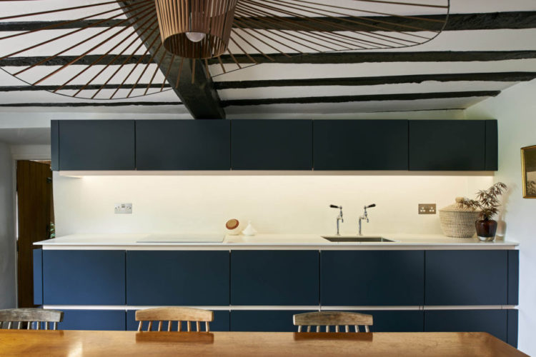
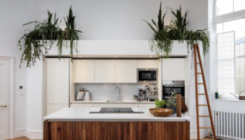
That said let’s have a look around shall we? Into the kitchen first and this just shows how you can mix old and new to great effect. Instead of the standard country cottage, which is the default, the owners have chosen a sleek, flat fronted handleless kitchen which works perfectly with the low beamed ceiling. And you can see from the picture below how much the door slopes across the top so this has not been an easy install.
So that would be my first tip – an ultra modern kitchen can look fantastic in a period property. And if you want a pendant light then this – the petit friture – works really well and doesn’t mind hanging on a very short cord, which some of them do and can end up looking a bit stunted.
Now let’s go into one of the sitting rooms. It’s not huge but the curved sofa works brilliantly in here. It allows access to the storage behind and provides a counterpoint to all the straight lines. Curved sofas are popping up all over the place now, and those of us who live in narrow Victorian terraces can only look at them and weep as we can never do that in our spaces.
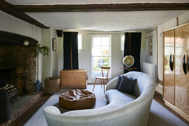
Before we leave this room, let’s talk windows for a second, which is another issue that comes up again and again for cottages which often have small windows. Above there are three windows in one wall and rather than make it fussy with lots of curtains, the owners have simply opted to cover the whole wall in curtain. In a rich velvet this will be a fantastic draught preventer (and trust me, in a house like this if it’s anything like the 14th century one I grew up in, there will be howling gales coming through some of the rooms) as well as adding a rich warmth to the decor.
Upstairs, there are blinds on the windows, which is the perfect way to maintain a sleek modern look as a counterpoint to all the beams and architectural busy-ness. Blinds also cut out less light than curtains and somehow feel less dusty. To allow the most light hang them high above the window.
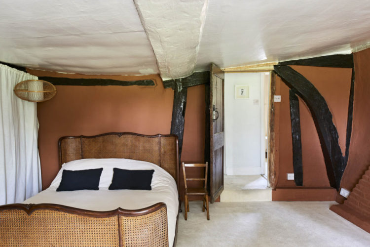
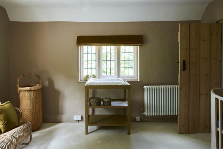
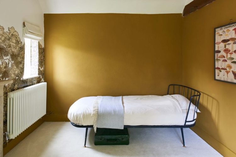
Now we seem to be upstairs so before we go back down again just look at the slope in this room? My Grandmother’s house was similar and in one of the rooms, which was always kept free for my uncle (a Gurkha who returned to the UK only sporadically) his bed had to be propped up on bricks on one side otherwise it would have rolled across the floor and crashed into the wall at the end. Some of you will find this charming. The others will be shuddering. I always rather liked it although at 6ft 2ins he wasn’t that keen. Perhaps that’s why he ran away to join the army…
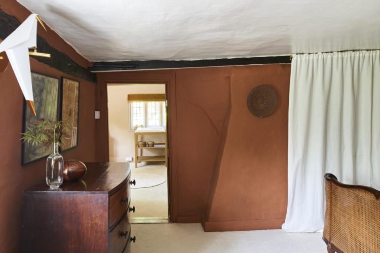
Anyway, before we leave this room, look at the colour. Who says you can’t paint cottage walls? My Grandmother for one but let’s ignore her. The owners have opted for as series of richly pigmented earth tones and it looks great with the co-ordinating furniture.
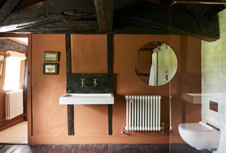
One more general point is that a round mirror is usually a good idea. You can see, especially in this room, how it contrasts with all the squares and rectangles and softens them all a bit. And yes it goes with the loo too. And if I haven’t mentioned it before (well I have, but if you missed it) a wall-mounted loo is another good idea. The floor is easier to clean, the dust doesn’t collect at the bottom of the pedestal (and stain the grout and silicon) and it will make the room look bigger as you will see more floor.
Another strongly coloured room with wallpaper too. Wallpaper can be tricky in houses like this with all the beams but if you have a free wall there’s no reason why not.
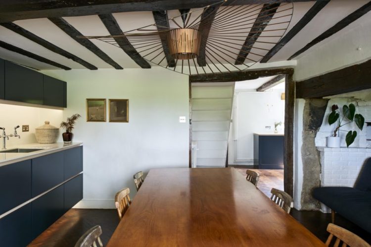
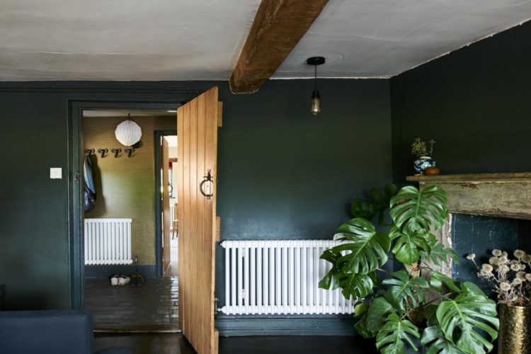
Back down to this lovely dark room (yes the radiator but it’s of the old school variety so not quite such a design crime – I’d still paint it mind) and what you can take from this is that you don’t need to have a pendant light in the middle of the room. Now I suspect, in this case, that the beam prevented it from going in the most obvious place so I would have moved it properly into the corner and hung it down really low – perhaps over a side table or something – and created a feature of light that way. Otherwise? Wall lights are your friend. And there are masses of really good ones around now so they’re not the horror they used to be. In fact, let’s look at wall lights next week.
So there you have it – some solutions for low ceilings and country cottages: modern is good, very good, paint the beams white on the ceilings to “raise” them where possible, colour is also good, stick a curtain across a whole wall or go for blinds, and either put pendant lights in the corner or think about wall lights. If you like brown furniture (see yesterday’s post) that is great, but you will need to mix it up in a country cottage or you will end up with a sort of Richard Curtis Notting Hill London cliche style. Not that there’s anything wrong with that romantic view of a cottage, but you can create a much more dramatic and stunning interior if you create a few juxtapositions and unexpected pairings by mixing old and new.
Right, as you read this I’m off to Paris to the trade show that is Maison et Objet for 24 hours. I will report back.
Amazing designs and decor!!!
WOW Nice Blog… Amazing Designs and Decor
We’ve just finished the lengthy labour-of-love renovation of a 17th Century apartment (!) and can identify with many of the issues here. We ended up shortening the legs on one side of a bed to avoid rolling Gurkhas and tongue-and-groove paneling the bathrooms to simplify the beam situation. Bertoia and Jacobsen chairs have worked surprisingly well with Georgian pieces. Phew!
http://www.instagram.com/cotswoldsplace
I agree about the mustard room looking sparse. I jsed to have a 17th century cottage and yes, cold and draughty (and loveable), and that spartan bed just increases the sense of cold mornings. I think that’s why traditional decor really does work in a cottage, all those layers of flowery fabric look a lot cosier.
Not what I was expecting when I saw the exterior. To my eyes the muddy colours and sparse mid century furniture make these look like the “before” photos of a cottage for sale that hasn’t been renovated since the 1950s.
I think this is another one of those houses that tries not to be enslaved to the architectural period, but ends up being totally unsympathetic to it. If you love the mid century style, I don’t know why you’d buy this.
Oh I really like parts of this. I quite like the sparseness of the mustard room – i’d like to see what’s on the other side. The kitchen doesn’t do anything for me. The design reminds me of the kitchen the council put in to my childhood home – melamine light down doors with a dark brown plastic recessed handle along the entire top of the door. The lines created by the doors and handles are just the same. But I absolutely love the curved sofa in this setting! It’s such a good idea for fitting storage behind.
I find the placement of the mirror very weird, why is it directly behing the loo and above a radiator instead of the sink?
And the mustard-painted bedroom looks very sparse, just begging for a gallery wall above that bed (by the way, many good scandinavian interiors have just that, but tend to overdo it with very strong prints, I’d love to see both ideas merged here).