This week we’re looking at a maisonette in south west London that is on the market with The Modern House for £1.2m but, as usual, we’re not interested in the price just what they’ve done with the space. This is a slightly unusual maisonette as they tend to be arranged over two floors – known as Duplex in the US or Triplex – you get the idea, but this is a, erm, Quatroplex? Not sure that word exists because they are very unusual. It’s basically a house with a separate flat but the flat is on the ground floor although this property has the garden with an office at the bottom of it.
Be that as it may, it’s a four bedroom home despite the slightly confusing layout. And talking of confusing my apologies for the posting mix up earlier in the week. Wednesday’s post went out on Tuesday as I muddled the dates and didn’t realise till I started receiving comments on the post. I suspect, like many of us, the brain hasn’t been entirely focused on the job in hand. But it’s Friday and the schedule is back to normal.
Now part of the reason for the layout is that this house is accessed up a flight of stairs which means you arrive on the raised ground floor. I have seen various attempts to make this layout work as a house and it nearly always involves a bedroom either on the ground floor or in the basement which, if you have small children isn’t ideal.
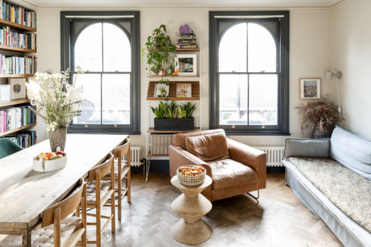
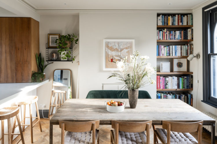
Here there is a bedroom and sitting room on the raised ground where you come in, with an open plan sitting room and kitchen on the first floor and three more bedrooms on the floors above.
So let’s start on that first floor and the first thing is the painted windows. Admittedly they are rather gorgeous arches but the owners have made a real feature of them by painting them dark. This draws attention to their shape and also to the view beyond. It’s a classic example of making the most of what you have. To come back to the ever-useful wardrobe analogy – if you have a tiny waist and big chest you might dress to highlight one and distract from the other. If you have amazing blue eyes you might wear make-up to enhance their colour and so on.
In here the fireplace has been blocked off, there are few other original features – some coving at the front but not at the back, and a certain amount of boxing in to hide pipes etc in the kitchen. So if you can’t hide those things (or the lack of) you have to look for the good points and bring the eye to them instead.
So painting the windows is a perfect idea. So often we leave them white and forget about them. Of course you can dress them with blinds and curtains but, at least in the kitchen above, there’s no room for curtains. So if you’re looking round your home and feeling that it’s lacking any stand-out features then you have to work a little bit harder to make the most of what you have using paint, or lighting or furniture.
The next thing you can do is look at the flooring. A good floor will elevate cheap furniture and make it look better. A bad floor will bring everything down to its level. So here the owners have installed a parquet floor and made the most of their windows – not all of which are feature arches by the way.
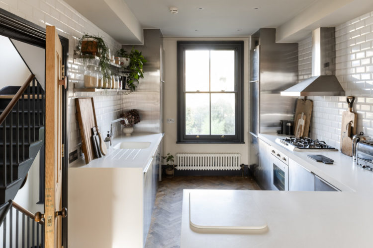
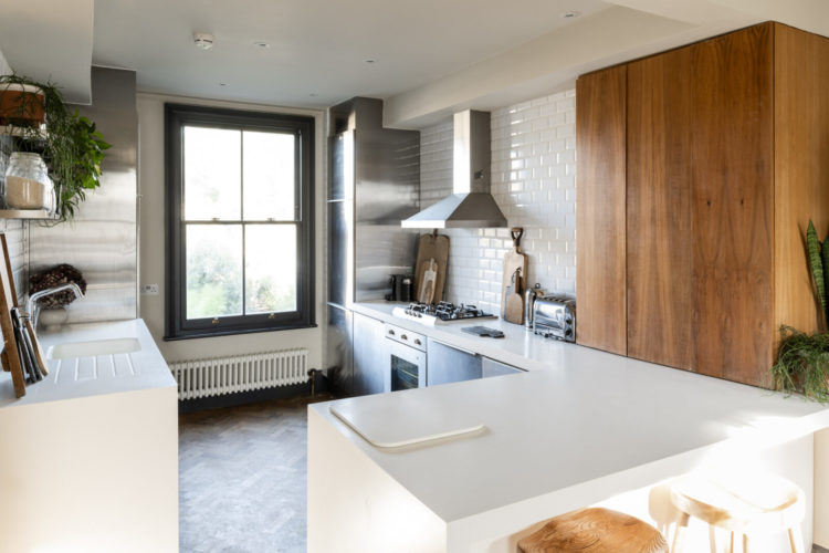
The kitchen, as you can see is at the back, in what might be a bedroom in a traditional layout. It’s not huge but, again, work with what you have – everything is handy to reach. I have written about the joy of the galley kitchen for The Sunday Times Home (I’ll let you know when it comes out) and how to make it function well and look good.
Now you can see there are these pipes along the top which might be, on first instance, annoying but actually the windows and radiator draw your eye and you barely notice. Also the window means the sink can’t go in its traditional under the window spot, but as many people have dishwashers now that fixation with having a good view while you wash up is a little dated. Here the sink is white to match the worktop and almost disappears from view so it doesn’t stop your eye travelling to the window at the end and the garden beyond. Still making the most of what we have here.
A final point on this room before we leave is the counter to ceiling tiles. Two schools of thought – aren’t there always – you just have to pick the one that works for you. In an open plan room you can either minimise the tiles and the general sleekness of the traditional fitted kitchen to create the “unkitcheny” kitchen that looks more like a room where you cook, or you can use the textures to zone the space and make it separate from the dining end as they have done here.
The all white counter top and tiled walls helps “disappear” the kitchen and, as I said earlier, helps your eye to glide over the kitchen parts to the view beyond. A wooden worktop would have been less kitchen but would have interrupted the view. It’s up to you to decide what are your room’s best bits and how you want to highlight them.
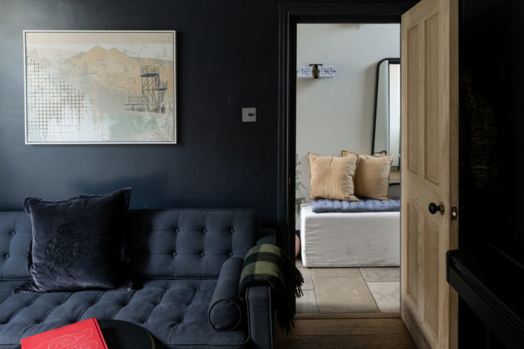
To the raised ground floor and this is the first room you come to – that’s the hall you see through the door above. Now this room may not be dark but there’s a sitting room upstairs – by the dining and kitchen area – so this may well be the evening sitting room that is used mostly under electric light so it’s a great place to go dark with the decor.
You can see how it makes the tv disappear and also how this is a room that can also be used for chatting as there is a seat below the television. Now I have said before that hanging a tv over a fireplace is too high for your neck and also really makes the television the focal point of the room as it will be the first thing you see.
Here, it has been hung high enough to allow a seat to fit under it (still lower than over a mantelpiece) and that gives the room more functions. It’s not just a tv room but a sitting room with television in it. The fact that the room is dark means the tv is also not the focal point of the room but a sort of incidental activity, like reading for example that can go on in there too.
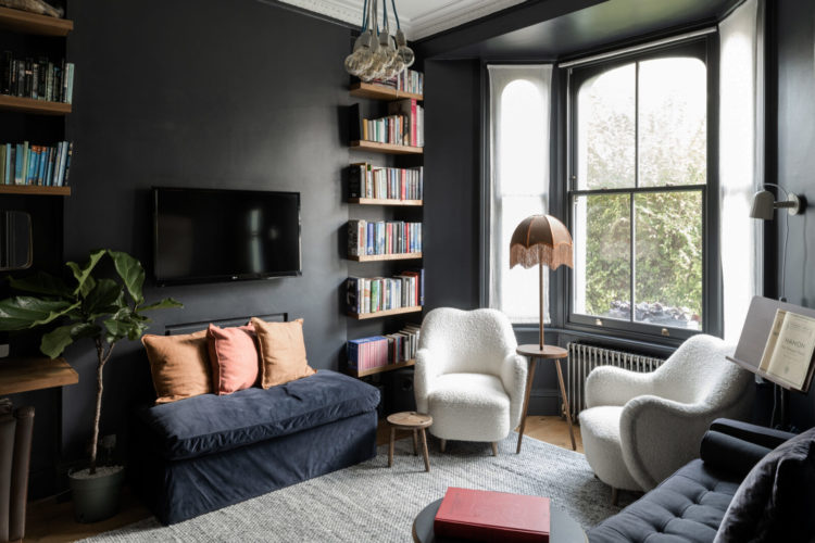
When it comes to dark paint you can, of course, take it up over the ceiling as well, although that may mean it’s a room you never want to sit in during the day. And while white can be too high contrast with a dark colour, here it works because there is a pale rug and two white chairs. So rather than it looking like the ceiling is white because ceilings just are, it’s a scheme. My dark sitting room has a white ceiling but it also has a white floor so there is a symmetry to the room that makes it all look like it belongs together.
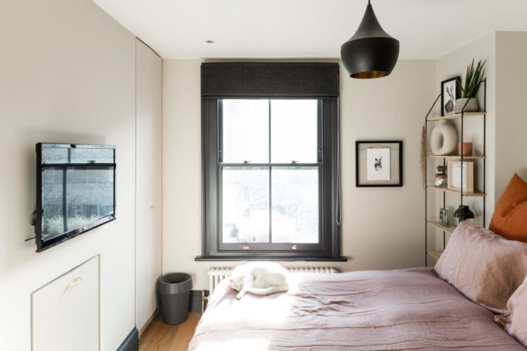
Last week we didn’t look at any bedrooms and while there are more pictures over on The Modern House site, I know you like a bit of analysis so let’s go upstairs. Again the windows have been painted to create focal points – there’s a reason they’re called “frames” but maybe it helps to think of them as picture, or view frames, rather than frames for panes of glass.
Again, this bedroom has no features to speak of; the fireplace is blocked off and there is a wall of storage so the window has the work of adding the interest. The blind matches the frame and, therefore, doesn’t distract from that view but you could also use it as an opportunity to add more colour and pattern. A set of curtains that pull all the way across the wall and cover the whole thing – rather than just the window can be a fabulous statement in a room that pretty much just has space for a bed.
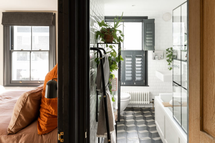
And still making the most of what you have, in the bathroom the crittal style shower screen echoes the panes on the windows and the floor is bringing the decor to this space and adding interest. It’s not a big bathroom – they very rarely are – so there’s no space for a chair and you probably don’t want curtains (although you can – it’s not traditional but can look great to bring softness) so the floor and the window are the opportunities and you need to make the most of them.
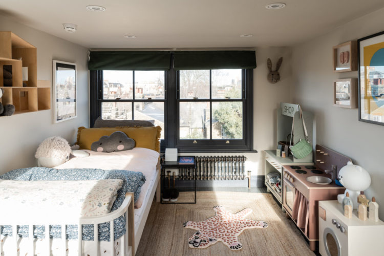
Last two bedrooms and this one up in the eaves – same window trick and this is even more important up here as the ceiling is low so there’s no space for a dramatic pendant light as a focal point. The walls are a soft neutral grey which works really well with the palette of mint green, blush pink and yellow ochre. It’s a child’s bedroom but there are no shouting primary colours here – and no shade if that’s your thing but for anyone who wants their offspring’s bedroom to decoratively join up with the rest of the house – this is a colour scheme that works well from all ages. When they’re tiny it’s for you as they don’t notice, when they go to school you can probably still exert some level of influence and by the time they go to secondary you will have none but the windows, floor and walls provide a soft backdrop to whatever death metal thrash posters they want to stick over the top.
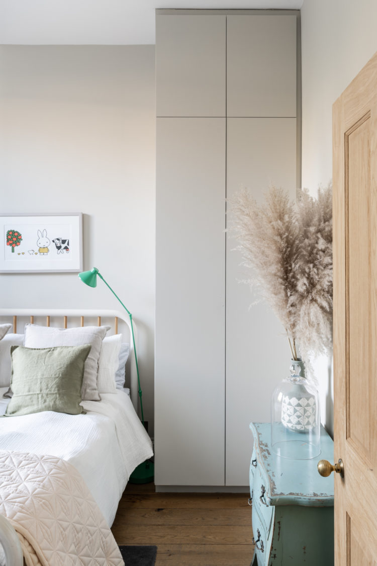
The bedroom below is a similar neutral shade but look how the mint green lamp pops as does the painted blue chest. All items that can be swapped to other rooms – that mint light would look great in the navy blue room – or repainted. The cupboard matches the wall and recedes into the background – not entirely in this picture as it’s a picture of the cupboard, but from a different angle you can imagine it would. The handleless doors help with this as does taking it up to the ceiling to avoid the dust trap of things piled on top.
So what do you think? I hope this has encouraged you to look at your own places and spaces and see what could be enhanced – if only to draw the eye away from aspects that you don’t like – so you can truly make the most of the rooms you have.


Very interesting iteration on the usual layout for those of us living in victorian terraces and semis. Always a conundrum knowing how to use a lower ground floor, as rooms so often get isolated and unused, this nicely side-steps that problem. Must be a bit gloomy for whoever lives in the basement flat though!
A really interesting post – I love the windows being painted throughout the house – what colour do you think the paint is? I have used Scree by Little Greene on my stained glass hall window but I find it very cold looking especially with white walls. This green looks really warm – maybe Downpipe?