Staying in London this week as this lovely three bed maisonette perfectly illustrates a few of the things we have been talking about recently so I thought we would have a little nosey round. It’s on the market with The Modern House for £985,000 and has a very pretty front garden.
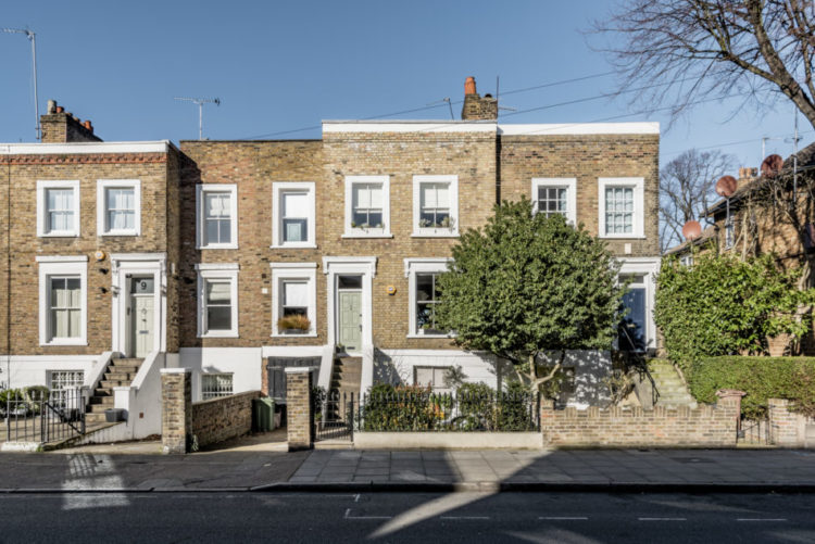
It’s arranged over the top two floors, which means no outside space although there is a very pretty front garden to look at. It’s also double fronted which means there is a double reception room, a kitchen and a shower room on the raised ground floor and three bedrooms (one tiny) and a bathroom upstairs.
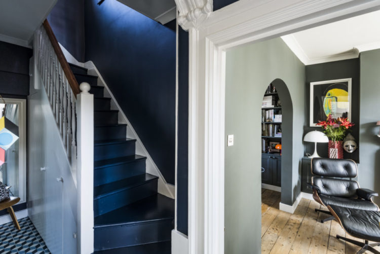
Let’s go in and you will see the vendors have gone for this wonderful inky blue on the stairs and up the walls which makes complete sense when it’s already a dark space – might as well embrace it with a colour you love. It will also make the rooms leading off it seem lighter, as you can see from the picture above.
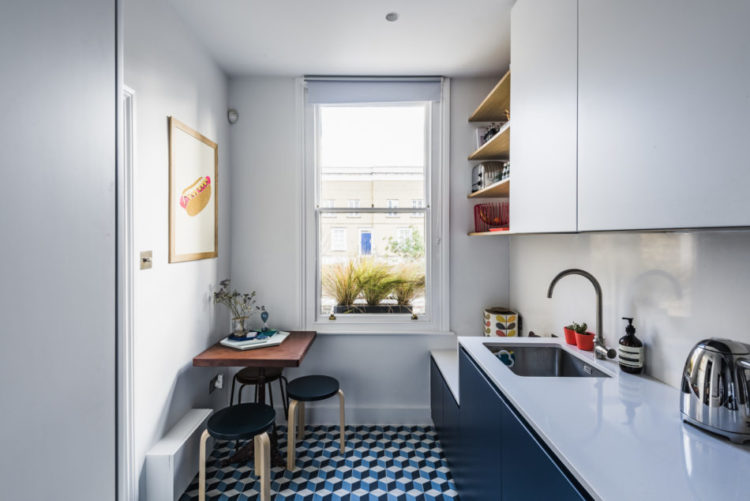
The patterned tiled floor has also been continued into the kitchen which will make the spaces flow together and also make them feel slightly bigger as you aren’t drawing a boundary between the rooms.
The sitting room has a different floor but it’s the same at both ends and they are divided by this arch. Here the owners have cleverly used two shades of grey to both link and differentiate between the two rooms but the dark grey on the far wall brings it closer to the foreground and prevents the tunnel-like effect that you can sometimes have with long and thin London houses.
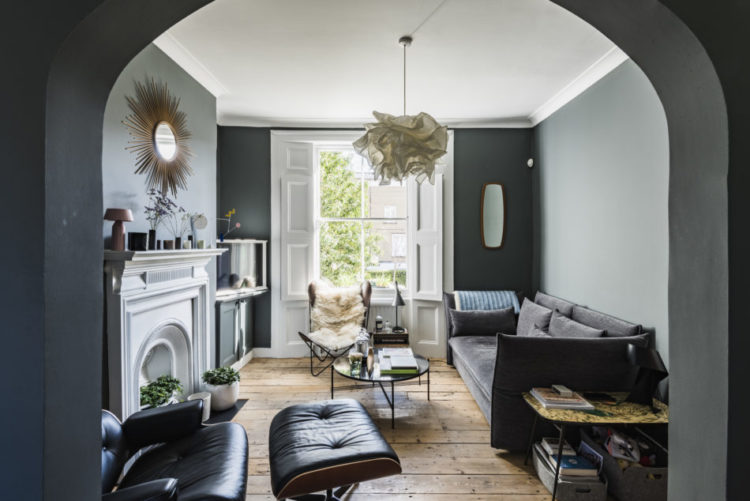
If you read yesterday’s post on tips for arranging furniture you will see that it’s not possible to pull the the sofa away from the walls but that the Eames lounger chair goes halfway across the arch and acts as a soft divider between the two spaces. The fireplace is clearly the focal point while the television is tucked to one side. The coffee table stops there being a pointless empty space in the middle of the room and yet there is clearly enough space to reach the chair in the bay window where there is also a coffee table at arm’s length.
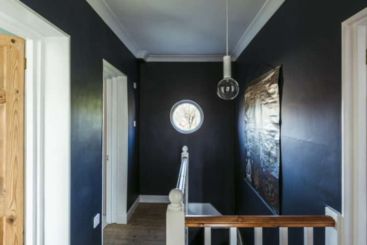
Just a tiny point but note how the simple light bulb just echoes the round window on the landing. It’s remembering to look at tiny details like that that will make all the difference to your finished house. Of course we don’t all have a round window, or a window on the landing, but if you have an unusual feature it can be worth considering how you might enhance it.
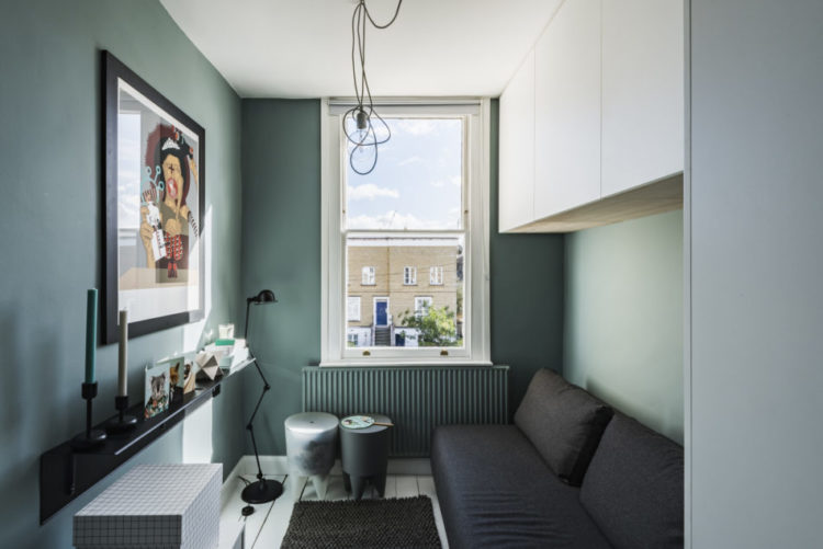
The third bedroom is, as you can see, very small and there’s not much you can do about it. The radiator has been painted to match the walls which helps to hide it and I would probably have painted the cupboards and the ceiling to match as well. That way you don’t draw attention to the edges of the room but create a more seamless effect.
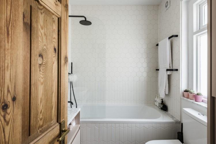
Finally, let’s take a look at the bathroom. You have to look quite closely but this is a brilliant way to introduce pattern and texture if you don’t fancy lots of colour. I think it’s really simple and effective. I found the chevron (or arrows) tiles here and then you can just add hexagons on top at the height of your choice. There’s something about it that reminds me of knitting for some reason,
That’s all for this week folks. I hope it has given you some ideas for your own spaces. Tell me tales of rearranging furniture in the comments below.


I also love the more traditional or rustic woods to balance out the dark colors and saturated paints and fabrics.
I love that detail about the lightbulb complementing the round window. Something I would have never noticed or considered. Thanks for flagging it up Kate, it’s made me really want to consider the small details in my own home!
Oh I really like this weeks pick. It looks much more liveable than some of the other more aspirational homes. I love the green colour they’ve used on the tiny bedroom. It does look like knitting- the arrow tiles at the bottom look a bit like a ribbed band at the bottom of a jumper. I’m usually all about the marble but I’m not keen on the tiny strip they’ve used at the end of the bath. I’m sure it’s supposed to tie in with the sink ad windowsill but I think it would have been better to continue with the white tiles because it really draws your eye and it’s a strange area to draw attention to.
Picking up on the strip of marble is interesting – This is a typical problem when bringing together various materials into an area that isn’t quite the right shape or size. Here they had to deal not just with the gap behind the bath but also the thickness of the bath edge. Tiles would be the obvious choice, but the width of the tiles probably wouldn’t fit the gap, so lots of awkward cutting. The grout would also soon look pretty grubby and you still have the thickness of the bath edge to deal with. You could get some corian made up in white to match the bath and tiles, but it would cost a bit and as it is by now nearly at the end of the project, would take too long to sort out. So what do you do? The marble guy is on site, its the right thickness, easiest solution is staring you in the face….. Job done. Harsh reality of design ideas meeting deadlines and budget restrictions! I have yet to see a building project where some compromise hasn’t crept in at the end. Still agree that it jars a bit though.
Such an interesting comment and so true. We’ve all been there at the end and just thought – do something quick and easy and go!
Yes, it makes perfect sense now you’ve put it like that. My own house is definitely full of things not quite right because I needed to be realistic about budget. I have tiles at the end of my bath and the grout is awful. Family members keep using it as a place to store wet items no matter how many times I tell them it’s not an appropriate place 🙂