Right then after last week’s million pound extravaganza we are going to the other end of the scale this week. Well, relatively speaking anyway. This is a narrow three bedroom townhouse, a short walk from Brighton beach, which is on the market with The Modern House for £875,000.
Located in a former art gallery, there is 1,677 sq ft of accommodation spread over four floors with a roof terrace on the top. The key thing to note is that it’s a narrow house – 11ft 6ins maximum or 3.5m. So yes it goes back a long way but it’s long and thin and you need to find ways to work around that.
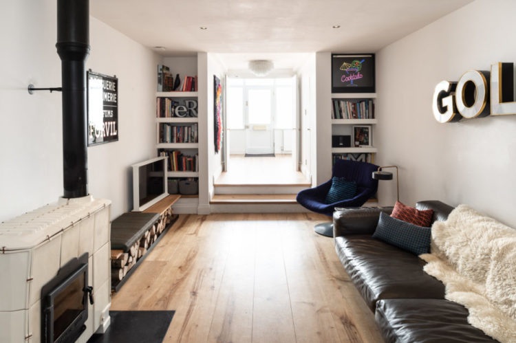
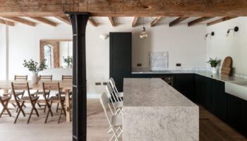
I have spoken about this before, but in the image above you can see how the bookshelves at the end frame the view to the study – which is at the front by the way. If you don’t have/want bookshelves then painting that wall a darker colour would bring it forward – and make the space beyond seem lighter and brighter.
Note also the clever log storage under the television shelf. That also doubles up as spare seating. The owners have chosen to forgo a coffee table but there probably is room for a small one. Make it round or square. The key in a long rectangle room is to avoid more long rectangles.
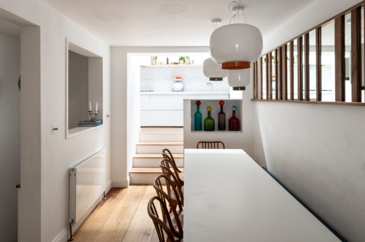
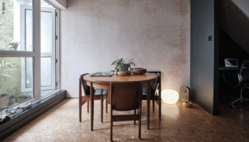
The dining room is at the other end of the sitting room. Another thin space. But the wooden struts bring in more light as does the window on the other side. You can see from the picture how the kitchen at the back appears lighter. Now having just said avoid rectangles, there’s not much you can do about that in a space like this so you’ve got to roll with it.
I might have fun with paint here though. It’s in the middle of the house, it’s not that light and white is going to find it hard to do its job of brightening the space as it needs natural light to bounce off. I might paint the wall behind the table in a strong green (for example) along with the wall at the end with the vases in and then may outline the window frame as well to tie the two sides of the room together without making the whole thing too dark.
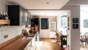
This in the entrance as you can see the front door. Hanging a curtain is a different way to add colour and warmth to what might otherwise be a cold and slightly echoing space. Or maybe there’s just terrible plaster behind it. If you’re going for a look round remember to check out what’s behind.
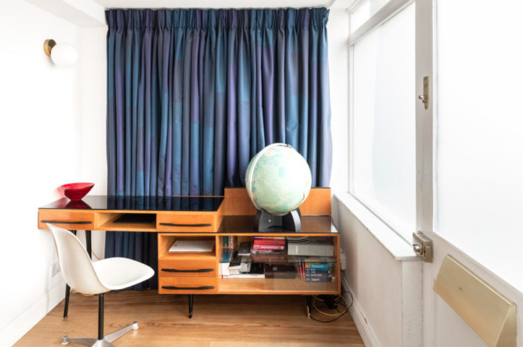
It’s probably the lightest space in the house to work and it does mean that at the end of the day you can walk away from it and leave your desk behind, which is harder if you work at the dining room table or in the sitting room.
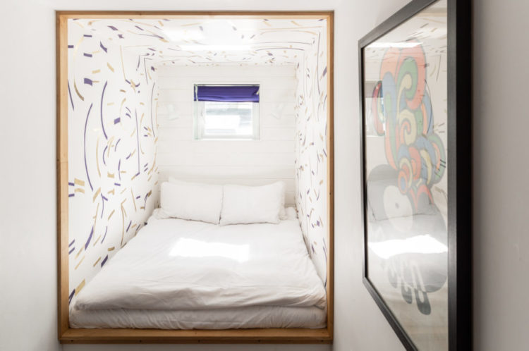
Moving upstairs and I will admit (for once) to an element of bamboozlement with the floor plan. It’s billed as three bedrooms. There are four marked on the plans with a fifth – sleeping area – pictured above. And one of them is 7ft 8ins by 6ft 4ins although it does have a window. So I’m not going to tangle with that – anyone who wants to buy it can go and have a look and let us know. Two of them are doubles.
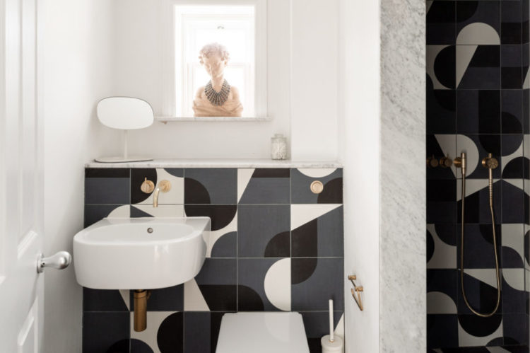
But look at that bathroom. The tiles are by Barber and Osgerby, the handles by Jasper Morrison and the switches by Buster and Punch. Which is a long-winded way of saying that the vendors have really paid attention to the details. Which, as you know, is key. You can hide a multitude of sins with some good details.
And below the bathroom may be decorated in the classic white metro tile, which is one of the cheapest and most classic styles you can buy, but they have been laid in herringbone style. And then there is the yellow grout. If you’re late to the grout party, then just know that Mapei make grouts in so many different colours so you can either match or contrast with your tiles. And remember that white grout on the floor is a disaster as it will get dirty and discolour in no time and in a shower it will turn brown from soap scudge so sometimes opting for a completely different colour is a good plan.
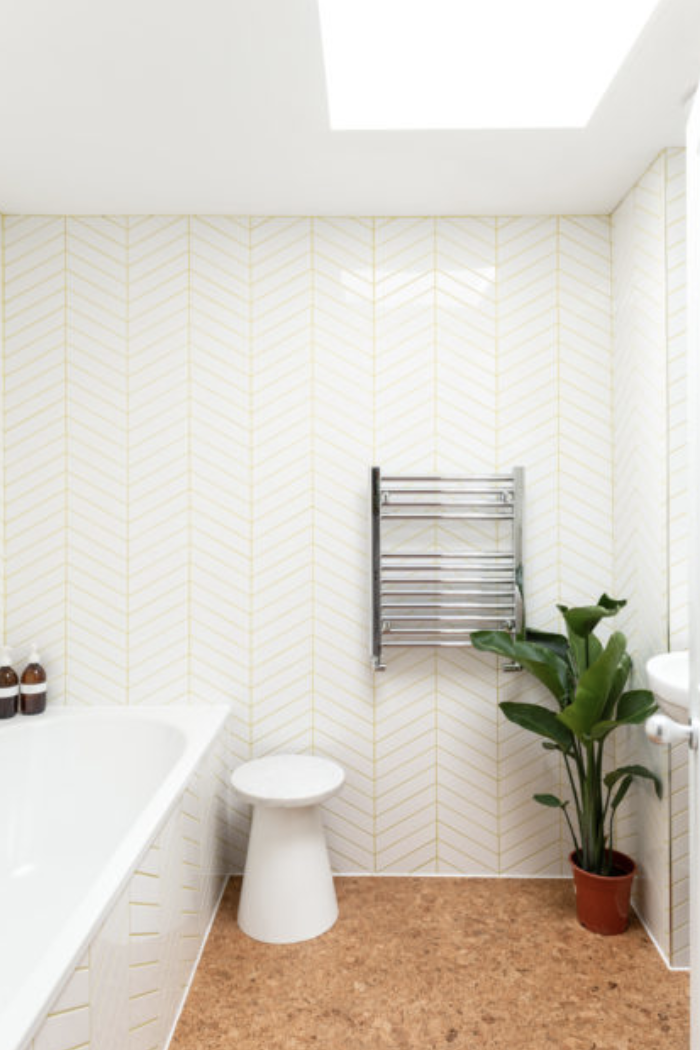
As a final point tiling the bath to match the walls will make the space feel bigger too as it will create a more seamless finish between bath and wall. Cork is great for acoustics as it absorbs the sound and yes they could have bought a flower pot.
Until Monday…
Those grey bathroom tiles are gorgeous!
Had a chuckle at this being the lower end of the price scale… just did a currency conversion & my house in country Victoria cost approximately 1/10 of this one.
In my book, not bothering to disguise an ugly, plastic plant pot is a design crime – no excuses!!