And it’s Friday and to celebrate that we’re going to have a look round this 1920s house in Hampstead Garden Suburb, an area of north London which was designed as the perfect suburb with hedges instead of walls, wide tree-lined roads and to cater for all classes and incomes. As you can imagine in north London it no longer caters for all incomes but it is lovely and there’s no harm in having a look.
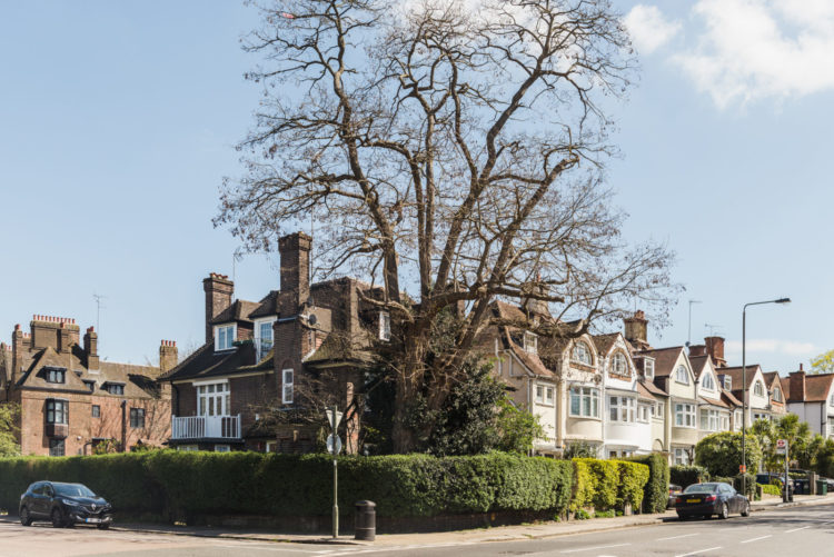
This is actually a three bedroom apartment on the ground floor of this house and is on the market for £1,100,000 with The Modern House. It was designed by George Coles who later became known for his Art Deco cinema designs, including the Everyman Theatres (Everymen?) in Muswell Hill and Crystal Palace, the Bromley Picturehouse and the Cineworld in Leicester Square.
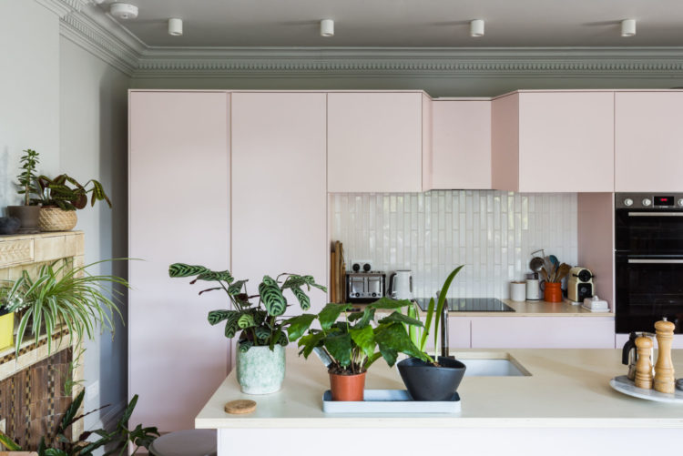
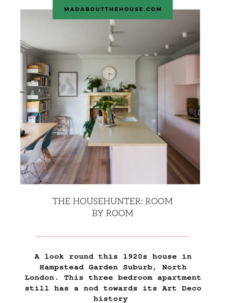
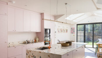
The property has been recently renovated to create a large sitting room with a bay window on one side while the matching room on the other side has a large kitchen diner. And yes it’s pink. And that’s the main reason we are looking round here today.
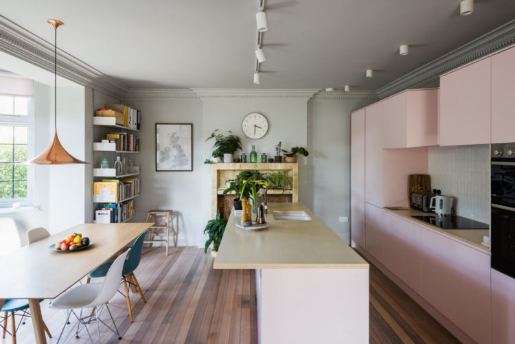
There’s endless talk of colourful kitchens (listen out for our take on this on the podcast next week) and we discussed it at the start of the week, but it’s rare to see a pink one. It seems that we aren’t averse to colour in the kitchen but we tend to go bold whereas this pale pink must surely be a less intimidating choice than going full colour?
Is it because it’s pink? Pink has become a gender neutral colour in recent years and the grey ceiling in here offsets it as well. I’m dying to know what you think?
After I saw this I immediately started looking at our open shelves in the kitchen which are painted chocolate brown with a pink back… I haven’t mentioned this to The Mad Husband yet as I suggested pink kitchen chairs on Monday and received a marital veto (doesn’t happen often but when it does…. ) so I might have to bide my time before I suggest this to him.
Would you go for a pink kitchen?
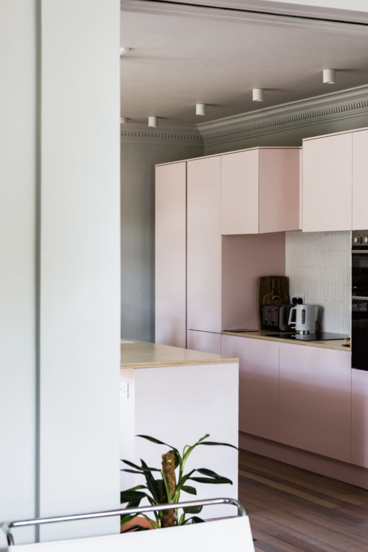
This is the other end of the room facing towards the dining part and it’s all fairly grey and neutral to offset the pink.
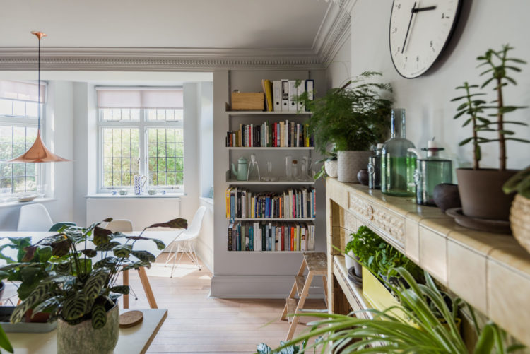
Behind these two front rooms are the bedrooms, although as it’s a corner plot they don’t look over the garden which is to the side of the building.
And then there are features like this. Growing up my Grandmother had a small inglenook fireplace which had a couple of stone benches either side. She used them for logs so we could never sit there but these pewlike seats are clearly designed for that purpose.
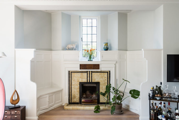
That said I can also imagine it’s the kind of original feature that you love when you look round and once you’ve moved in you feel like the whole room has to be decorated around them and you might love them a little bit less? I think I’d take the “can’t beat ’em join ’em” approach and paint them a strong colour with lots of cushions and really annouce their presence rather than trying to quieten them down a bit.
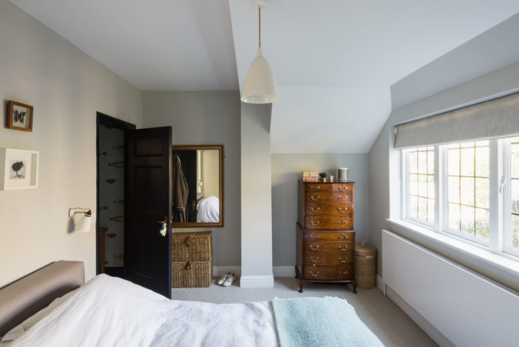
The master bedroom has an en suite bathroom while the two other, small, share a family bathroom.
So what do we think? Pink kitchen or no?

I’m feeling the need for Pepto-Bismol, and who knows, perhaps the cabinet colour was chosen the morning after the night before …? Pairing the pink with a soft green on the walls (one that works with the warmth of the tiled fireplace) could have softened the effect, whilst bringing the outside in from the garden view through the beautiful bay window – I’m thinking more Biophilia than bilious here. I can’t imagine stumbling in there bleary-eyed of a morning, or sitting around the table with friends for supper of an evening – not unless frosties and arctic roll were on the menu. Pink done well can be a triumph, but unless those flimsy-looking cabinets are paintable, the lot would be coming out before I moved in. And the pew-like seating around the fire? If the natural wood’s not much cop, it’s dark, dark, dark for me. Luckily we’re all different, and if it makes you happy, go for it. But making such a statement on an expensive element like a kitchen if it’s not likely to be your forever home is something to carefully ponder.
I love the pink kitchen, and I like the lights and the visible cornice. I like the fireside benches as they are although some cushions would make them more comfortable
wow its an old house but still in a good shape… pink kitchen looks cool and I like that old vintage vibes…❤️
The pink kitchen units look so cheap and nasty. Just placed without thought in the kitchen. We are talking over a million pounds and THAT is the kitchen???
The nicest pink kitchens that I have seen have pink walls rather than pink units. Sophie Conran (her daughter chose the strong pink paint) and Skye McAlpine , in her London flat that was up for sale. It had soft pink walls and a bright pink Smeg fridge. See thegracetales.
Actually I like it, although I would have preferred the colour on a shaker style unit, I think this style will date too quickly in this colour. What amazing fireplace, that and the hall would have been a show stopper when looking at the property.
The pink in that kitchen would put me completely off my dinner, and even thoughts of any cooking. Pink marshmallow anyone? Not for me. I would take it back to white and highlight other features instead.
A lovely house with some outstanding features. Yes I do like the pink kitchen but I expect it will take some getting used to, just because it’s different, the decoration around it blends well. I could live here.
Love it cos it’s not too much pink n quite pale anyway. I like that you can see the cornice but I’m afraid those protruding lights don’t do it for me… recessed would have been better as these, along with the cornice, make it all too busy up there!! I’d make those church pews more comfortable tho. Then you’d have a nice relaxing comfy reading nook! Love the hallway with that glass.
I love it!
Wow, I love it!
I’m currently planning a new kitchen & I’d love to do it in a muted pink (setting plaster or P&P Desert Rose currently up for consideration). Husband on board, however we aren’t planning to be here long term & I keep wondering if it’s a risky colour?
I’d style those benches with lots of plants, greenery and baskets (assuming you’re not going to light the fire too often) and a row of books to make a mini library
Not fan of the pink. Could look dated in a few years and I don’t know about you but I don’t replace my kitchen as a fashion statement. Saying that of course we have been stuck with the ubiquitous grey for quite while now. What did seem a great shame was painting the inglenook benches white. They would probably have been oak and had a lovely warm cosy fireside feeling, strewn with a few rich textured cushions they would have looked more inviting
I love the pink – but then Im about to install a pink kitchen! At least part of it will be pink. Funnily enough the husband was all for it whereas Ive taken slightly more convincing! Seeing it in situ though has really helped me feel more confident about our choice. Fingers crossed!
Oh I love the pink units, they are very beautiful indeed! I wish I had a courage to have such a kitchen! You have given me something to think about😊. Especially lovely to see the way they use the church benches around the fireplace, oh how clever! And I like that they decided to keep them look simple and white, I would not want cushions there weirdly, this way the whole ensemble looks exquisite.
Yes,yes,yes to the pink kitchen – love it!
Shame about the gap above the wall units, but the cornice is a beautiful feature.
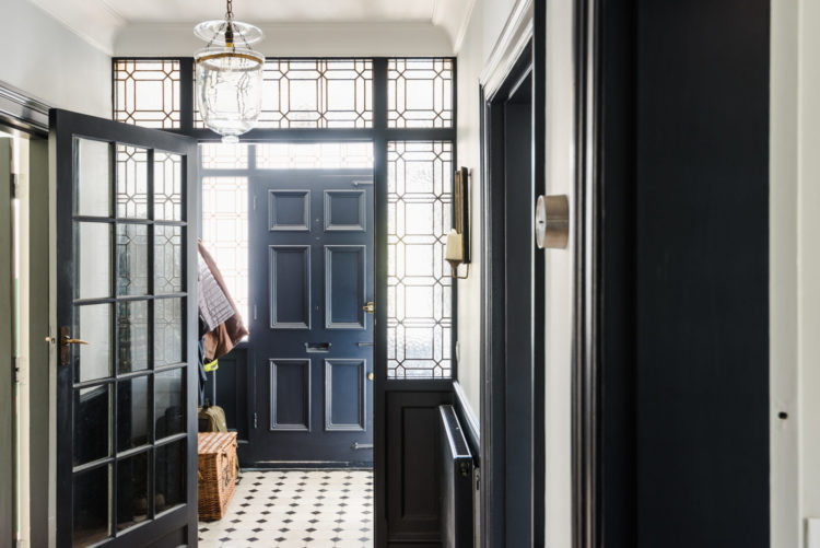
That entryway stole my heart, I’m surprised there’s nothing about it’s strong navy and the art deco window in the post 🙂
Pink kitchen – the colour, yes, maybe, but what bugs me here is the cupboards that don’t go quite to the ceiling and the strong sharp corners also clash a bit with the ceiling decor.
Master bedroom looks very sparse as well, of course, I’m a bit biased as a plant lover, but a couple of plants would make a whole lot of difference here.
This kitchen’s colour scheme reminds me of Planchonella house by Jesse Bennett, I wonder if it was the inspiration? If they were trying to work out how to work with that beautiful (but challenging) original tiled fireplace (which I see they’ve reflected in the worktop), then Planchonella is a good example of making that taupe concrete colour work in a modern scheme, without looking like your auntie’s house from the 50s!