Happy New Year – again. Are we still saying that? Some people are still on holiday yet while others have had to go back so I think we are technically still saying it until Monday when, we assume, everyone is back. Greetings anyway. I wanted to share this house with you not because it will necessarily provide an in depth styling lesson for your own homes (although it might for some of you) but just because it’s lovely and a perfect example of its kind.
And that kind is modernism. Modern is a word that gets bandied about to mean new but it actually refers to a specific architectural style that began in the early 20th century and grew until around the 1950s when it became mid-century modern. It’s about the marriage of form and function, clean lines, neutral palettes and natural materials.
Contemporary, which is often interchanged with modern means present day design. So there was a time when modern was contemporary but these days contemporary design is not modern since that refers specifically to a period of time that has passed.
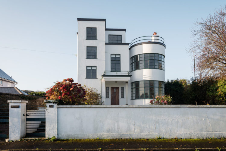
Now that that’s cleared up let’s have a look at this Grade II listed house in Devon that was built in 1935 and is on the market with The Modern House for £650,000. Despite its age I think it feels very contemporary – as in of the moment.
In the Victorian, or period properties, in which so many of us live, there has been a tendency to paint doors and windows white because the rooms are small and the houses are dark. Here, where there are lots of large windows and the rooms are larger and squarer (actually curved in many cases) there’s no shortage of light and they can remain in their original wooden state. Which, as we have discussed before, frames the view and draws the eye to what lies beyond.
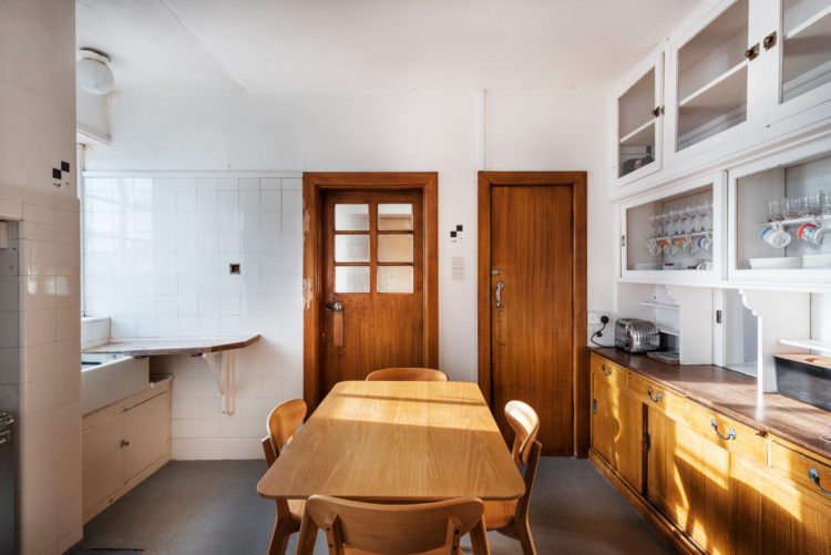
I also love this kitchen, which actually, does embody one of the current trends (see yesterday’s post for my interior design predictions for 2020) and that is of the unkitchen kitchen. This is a look that has been gradually gaining ground over the last couple of years.
There are always a number of factors why a look grows in popularity and one of the reasons for this particular one is, I think, the fact that many of us live in smaller, often open plan spaces and even if we don’t, the kitchen has become a another living room – in the literal sense. We don’t just go in there to cook but it might be part of the sitting room, it might have a table in it. All of which means we are in there chatting, drinking coffee, preparing food with family and friends and so a desire to make it more of a living space has taken over. No more rows of sleek fitted cupboards but more reflective of the personalities and people who live there.
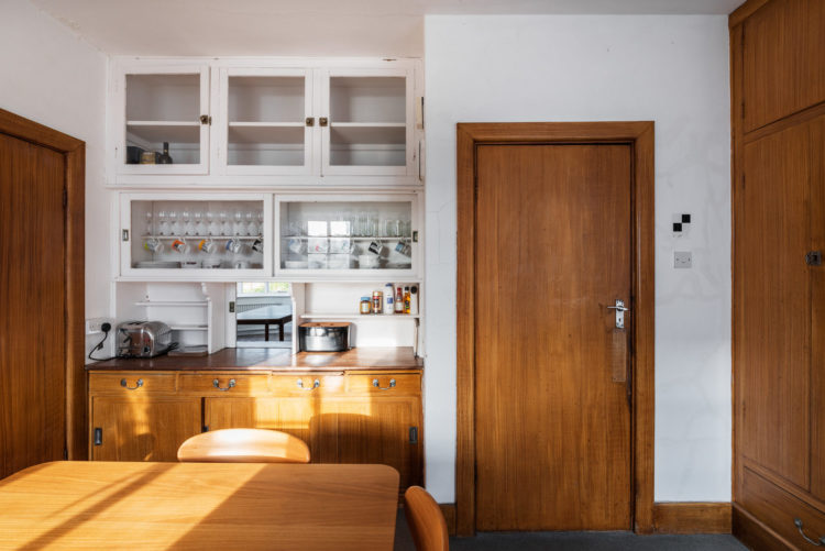
So this modernist kitchen, with its warm wooden base units, and mismatched cupboards embodies that look perfectly. Not to mention the wooden cupboards tie in with the doors while the white ones recede into the walls making the space feel lighter and bigger. Glass doors – another contemporary kitchen trend but make them reeded, allow you to see what’s inside while keeping the dust and grease off.
I’m not sure the kitchen hatch will ever make a comeback mind you. I would be tempted to close this and increase the worktop space of which there never seems to be enough.
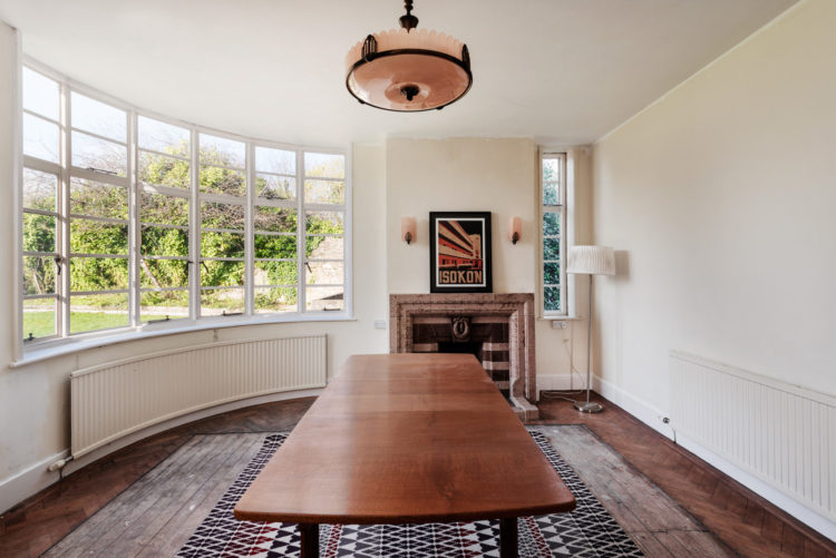
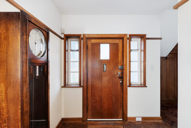
This is one of two reception rooms with large curved windows. I just hope that radiator works because it will be an expensive replacement. Note also the tall thin window on the side which is another feature of which there are many. The house belonged to the same family for 80 years and the vendors have carried out some restorative work. So the wooden staircase is a beautiful feature in its own right along with the chrome handrails, original panelling and parquet and crittal windows.
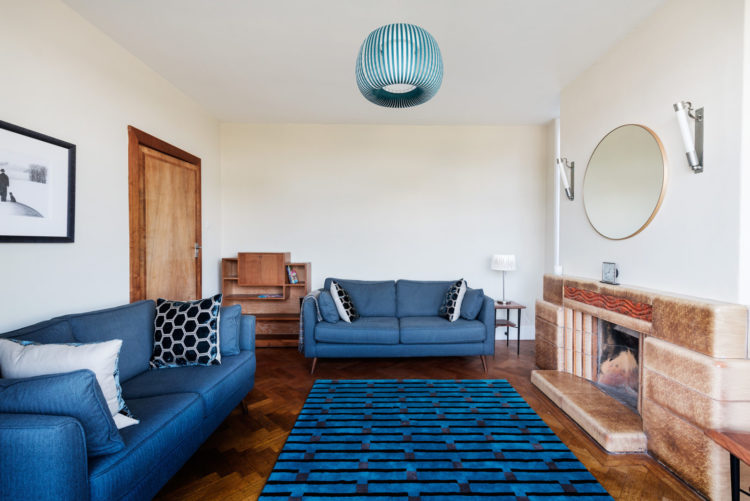
This sitting room picture is taken from the other curved bay window and there are two large bedrooms above that match the shape. There are two more, smaller bedrooms on the floor above and on the large roof terrace as well. There is also a small study next to the family bathroom and the logical thing (planning permission depending) would probably be to turn the study into a dressing room leading to an en suite and make the smaller bedroom into the main bathroom.
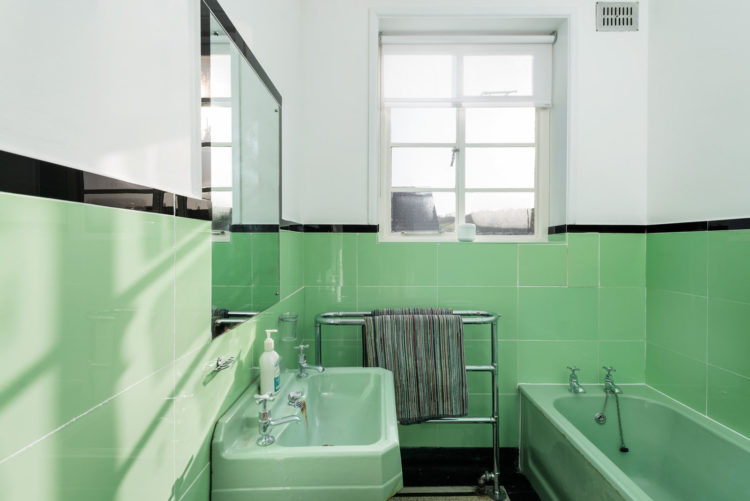
Mind you when it looks like this original masterpiece, it might be a shame to change it. That said this colour is going to be huge for 2020 although my guess it will be toned down to a softer and easier-to-live-with version might be too much. The challenge would be to find a way of reinterpreting it to suit the house and the century we now live in. The obvious thing would be to add a white bathroom and basin and keep the colour of the tiles. I’m going to suggest doing it the other way round. Mind you if you don’t want the coloured suite there are plenty that do so you could sell it and probably pay for a new one with the proceeds.
I hope you have enjoyed meandering round this house. Even if it’s not to your taste it’s a masterpiece of craftsmanship and a lesson in interior design style. What do you think? Could you, would you live in a house like this?


The reception room design is amazing !! Thanks for sharing.
So many features and things to like in this house.
We have recently moved house and the kitchen needs renovating. It has a hatch. Everyone who has visited so far has said we should keep it as it links the kitchen and dining room and it is actually rather useful! I have been pondering this and wondering whether glass doors – particularly bespoke stained glass – might work. It could be both an aesthetic feature and useful?. There would be plenty of counter space and the doors would open into the dining room.
I’d be grateful for comments and ideas please.
I could! I have two similar curved radiators in my own 1930’s home … and yes, they both work!
I love all of this house — minus the bathroom. I know neo mint is the new color, but it’s too much for me!
Absolutely gorgeous! And the prize is more than fair. Such a pity that I live in Zurich, Switzerland, where the real estate market is crazy.
I love it, pity I can’t afford it. I hope that the new owner keeps the old features, it’s those that help it to be what it is. My parents moved to a lovely stone build house in the late 60’s which I grew up in. We had a green bathroom very similar to that. To some it may seem dated but it has stood the test of time and usage and still looks good. Large curved windows are so interesting and indeed the tall thin ones.
There was a serving hatch at our house that we used until my parents had some fitted display cupboards built in the alcoves where it was. They are useful but as you say more worktop is more advantageous.
I like parts of it but not others. The kitchen cupboards themselves look amazing but the overall feeling of the kitchen is horrible. It feels institutional. The curved room looks beautiful but I don’t understand what’s happening with the flooring. It looks as though it would smell musty and I suppose it might, because the wood will have absorbed a lot of smells over the years, particularly in the kitchen.
The unfinished part of the floor is meant to be covered by a rug. Don’t know why they’ve put that undersized one under the table unless the former owners took the nice big one with them.
Thanks, I didn’t realise that was a thing, I always assumed flooring was consistent throughout a room. Was this commonly done at the time?
WOW! What an incredible space. I especially love the un-kitchen and is that bathroom close to neo-mint..?
Thanks for sharing.
I love it, especially the bathroom!
(why would it smell musty?)
It just reminds me of homes with older kitchens, admittedly in much worse shape than this and needing refurbishment, where the kitchen units themselves have absorbed smells over the years and you can’t get rid of it. My old kitchen cupboards smelt this way at around 30/40 years old, as do vintage wooden items I’ve bought. I think I get used to it after a while and stop noticing it.