I’ve had to hunt about a bit this week to find you something you might think it was worth getting your virtual coat on for (not to mention shoes – what even are they and how do they feel?) but this is a very pretty house in north west London that is on the market with Knight Frank for, ahem, £1,800,000. But remember this is our fantasy lottery money so who’s coming in?
I chose it because it fitted with the earlier theme of the week – post pandemic design – when I wrote about the theory that after this is over we will see a return to white interiors, viewed as more hygienic, and an end to maximalism as it’s harder to keep clean. Who knows whether that will be true. Personally I think maximalism might be here to stay as it’s cosy and cocooning and we might want that more than anything. The white is an interesting theory though. Do have a read here if you missed it and see what you think.
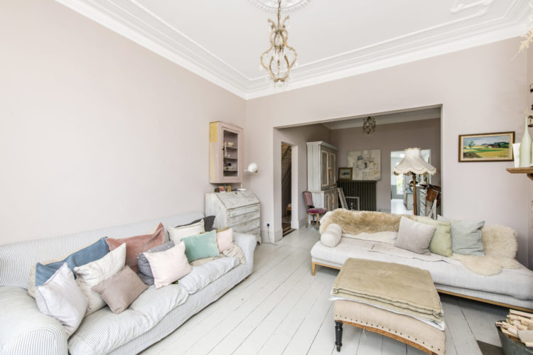
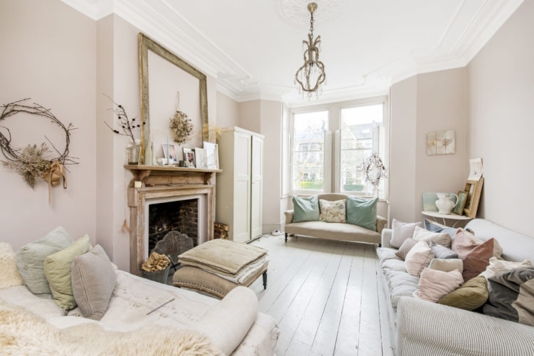
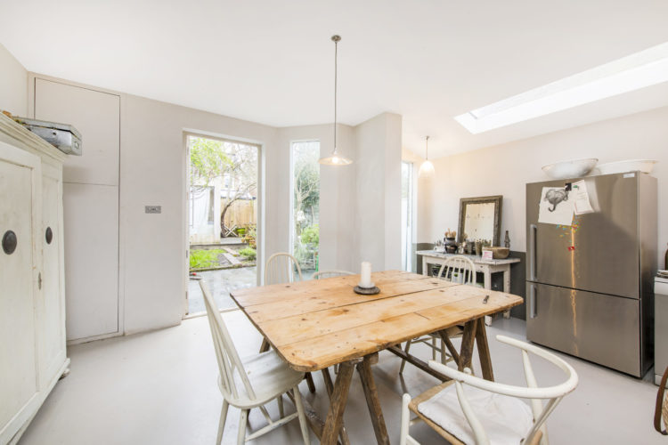
So this is a four bedroom period property with a double sitting room, open plan kitchen with dining area, three bedrooms and a bathroom on the first floor and a loft conversion with a bathroom and bedroom under the eaves. There is also a ground floor shower room.
At first glance it does seem to be mostly white, but it’s one of those houses where it’s all about the textures and materials. There’s a world of difference between while tiled floors, white walls and lots of modern appliances and a painted floor, layers of vintage furniture, lots of linen and cotton and different shades of white.
This is how you can create an all white house and not have to worry about kids and pets – because it’s not that perfect to start with. The sheer variety of materials (hard and soft) and the subtle variations in shades means it will stand up to family life better than you might think. It’s also full of character.
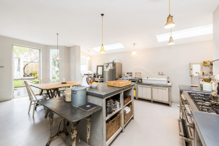
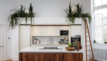
One thing I did want to point out though, if you live in a similar property, is the lack of spotlights in the kitchen. Many people hate them, for all sort of valid reasons, but often there’s no alternative. Here, however, since the ceiling is high, the owners have opted for lots of pendant lights and, as they are pale in colour they aren’t dominating the space in the way that a forest of dark ones might.
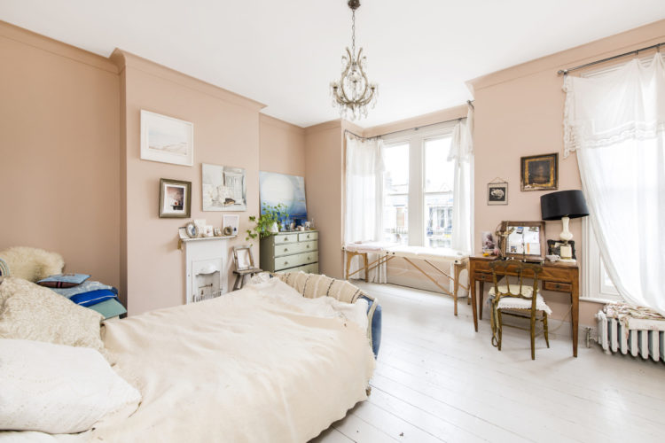
Talking of ceiling lights though; this one in the bedroom sums up everything I always say about checking the placement of your pendants. This is clearly in the middle of the room, which might seem logical when the room is empty, but when the bed comes in, the light is now hanging somewhat pointlessly over a patch of bare floor at the end of the bed. Lengthening the flex (you should use an electrician for that) and fixing a cuphook in the ceiling (you can do that bit) where you want the light to hang will make it more useful and more attractive instantly.
This goes back to what Sally Storey said in the last podcast episode about rooms being designed from overhead floorplans rather than from people actually being in the room and looking up at the walls and ceiings. It makes sense to put an overhead light in the middle of the ceiling when you are looking at a 2D plan but as soon as you are in that room in 3D it might be completely the wrong place for it. So if you are redesigning a house, or a room, do try and think about where the furniture will go before you draw the lights on the plan.
In this case I would suggest hanging it over the dressing table – perhaps to one side which would not only look pretty but would also free up space and mean, at least here, that you could remove that lamp that looks like it’s balancing rather precariously.
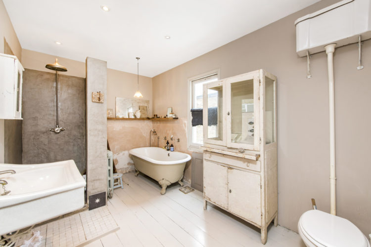
This is a perfect example of the non-fitted bathroom which is gaining in popularity at the moment. Some of you will hate it – for the aforementioned cleanliness reasons – and some of you will love it. I fall somewhere between the two. I like a bathroom that looks like a room in which you bathe as opposed to something ultra sleek and modern which can be a little too clinical for my tastes. That said, this one does look a little unfinished – there’s a fine line between plaster pink walls and, well, plaster. But that big cupboard is brilliant. You always need more storage than you think in a bathroom and the mix of open/glass shelves where you can display the pretty stuff and the cupboards below (for hiding the loo roll and the bleach) is perfect.
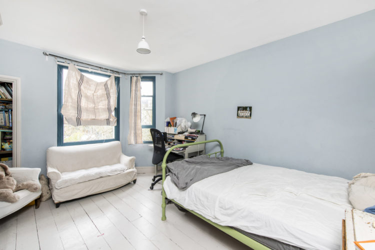
Lastly, I wanted you to see this bedroom – ignore the blinds I’m not sure what happened there – but look at the window frame. That’s such a pretty effect to paint the walls in a pale shade and do a darker version of the same colour for the windows. You could do the ceiling as well to really finish it off. But as a decor tip for something you might be able to do yourself (and this lockdown is increasingly about the DIY) consider that as an idea to keep in your little black book of decorating ideas. I think it’s really effective. Maybe that’s why the blinds don’t fit – so you can see the pretty window frames….?
I just can’t get past the number of cushions on the sofa in the living room. I’d have to fling half of them to the floor to get comfortable or maybe that’s what the daybed is for: a cushion repository?
I loved the sitting room where the French shabby chic look worked well, but I agree that it worked less well in the bathroom (or the kitchen) where I felt it looked all a bit unfinished and bitty.
Here’s a question for a future column, Kate – if you would like to instil a bit of light and white but without abandoning your darkly cocooning rooms, how do you make them work together? I did feel that the blue bedroom looked very cold compared to all the shades of pink, which was the common thread everywhere else, and even with a warmer blue it would have stuck out like a sore thumb with a lack of continuity. It really made me wonder how to achieve a house with elements of both and whether you lose the red thread.
This house could be described as having a lot of potential, but at that price I would expect it to be a presented in a finer way. They need a good house stager.
I think it is great to see a house that is lived in and hasn’t been styled to within an inch of its life.
I absolutely love these househunter descriptions – it’s like you are ‘training’ us to look objectively at things which is brilliant. Many a time , I find myself saying ‘oh yes, didn’t notice that’ as you highlight or point things out. We are being trained by a master – thank you!
i think it might look more interesting if it was literally all white. At the moment it looks a bit of a hodge podge, with a putting together of what was available approach, rather than going all out on the interior design. Maybe the value of the property creates a false expectation of budget and style? (And also…that bedroom blind?!!!)
And re white, every house mag this month seems to be showing off homely homes with white walls, filled with sunlight, plants and lovely things. And lemon yellow! It’s all very appealing!
Although I may not want to adopt their style, I do love this house as it actually looks like the people who live there are not too precious about things and value a homely, comfortable environment. Kate, although I very much take your point about placing the ceiling light where you need it most, this wouldn’t work for me as I like to move the furniture around from time to time. Apart from the kitchen and bathrooms, we don’t have dedicated areas for specific functions and I would feel trapped if I could only have the bed in one position because that is where the ceiling light has been placed! A combination of light sources is my compromise.
I agree with Jade, the bathroom looks like a before photo. I can imagine this whole place has been designed with French vintage shabby laissez faire kind of chic in mind, but the effect is rather underwhelming as lacking structure and visual poetry. Charming features and a prettey property none the less!
I so wanted to like this but it all looks a bit unfinished and kind of wishy washy to me. I don’t know whether it’s the way the photos are taken, but a lot of the rooms look like a huge expanse of bare wall and cluttered furniture surfaces. That said, I do like a lot of the individual furniture pieces, just not all together. It leans too “shabby chic” for me. And that bathroom just looks grubby (sorry owners!). I’m sure it’s not but it reminds me of a bathroom halfway through a renovation filled with dust and tools. The house itself looks to have beautiful features and huge rooms. And the kitchen windows looks really unusual, much better suited to the house than huge bifold doors.