It’s the last podcast of the current series and today we are talking about the top ten trends following the announcement of the Dulux Colour of the Year. Remember you don’t have to follow trends unless they are right for you and this is partly why we have identified 10 as they range from pale pastels to earthy shades with warm neutrals in between so there’s bound to be something you like and, let’s not forget, while trends are a marketing ploy they are also what’s going to be in the shops so if you do like any of them (or always have done) now’s the moment your choices are going to expand.
First up then Dulux Colour of the Year and it’s called Bright Skies – a soft pale blue. Interestingly Graham and Brown announced theirs too (too late for our recording) and that’s called Breathe and is a similar soft blue. Which tells you all you need to know – it’s as much about a mood as a colour. It’s also worth noting that Dulux always releases an entire colour palette around its COTY and Bright Skies has been put with both pastels and earthy shades – keep reading!
Bright Skies has no grey in it; it’s a warm visual breeziness rather than a fresh colour which will make small rooms appear bigger. It’s great for ceilings as well – a change from the default white. Essentially, it’s a very liveable neutral that’s a good background colour. And remember just looking at blue sky makes many of us feel better.
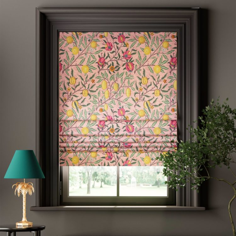
These blues play into a bigger trend of Pastels – and let me say right up front that this one is not for me but it might be perfect for you. We have had lots of strong corals and emerald greens and all those shades which are often bracketed together as jewel tones. But the pendulum must always swing back and now it’s about those ice cream colours that are cleaner and paler and, for some, easier to use. We are seeing them everywhere. It feels young, fresh and youthful and that fits with the mood as well.
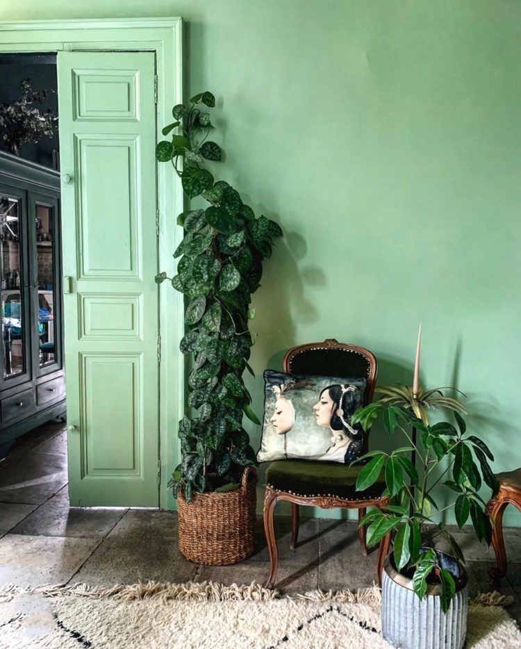
Next up and it’s house plants which is a massive thing at the moment and sales have gone through the roof over the last year. I guess because we were all at home to water them! Bathroom plants is a hashtag that has been used over 25,000 times and it’s all part of the biophilia movement, not to mention the purification of the air, which, with all the screens that were on at home during those lockdowns perhaps felt more necessary.
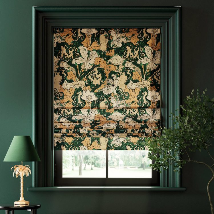
Now another trend that’s not new but not going anywhere is Maximalism. I’ve written about this many times but Sanderson has just released a wonderful archive collection, and, of course, I showed you the Liberty Modern Collector range too. So, if you’re not feeling the pastels (*looks at self*) then this might be the one for you. It’s retro patterns in rich modern colours. It’s also simply about more stuff – layers – tablecloths, place mats, chargers, napkins etc but you can do this with a minimal colour palette – I would do this tonally rather than lots of high contrast. As with all trends there are ways of doing it to make it work for you.
In complete contrast to that ( I did tell you trends were all about picking and choosing) we come to Soft Industrial. I thought we were done with the industrial look but actually this is a Pinterest trend which is interesting, because it’s not about what’s coming, it’s about what is happening in real time. These are real pins by real people rather than what companies want to sell us. So we have moved on from that industrial warehouse look (seen in every trendy pizzeria for the last ten years) of exposed bricks and piping, rough boards and bare light bulbs to something softer. Now there are velvet cushions and deep pile Berber rugs, black accents and the bare bulbs have been covered with a sort of black mesh. Still metal but more elegant – less rough round the edges. If you like your interiors a little tough but still neutral, a little punk but still comfortable this is the one for you.
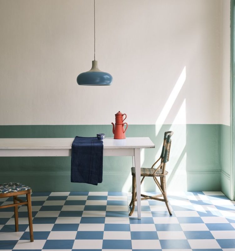
Staying with colours and there’s no escapting the Yellow Accents (see the blog from Monday for this one). Its not about using yellow on the wall but as an accent – a curtain or a cushion, a vase or picked up in a rug. I think it’s more of the mood thing like Dulux again.
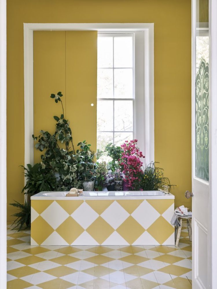
This ties into the Farrow and Ball colours of the year (they’re all at it!) which is a palette of five shades including Babouche – a soft mustardy yellow. They aren’t new colours, but it’s a whole palette with schoolhouse white, breakfast room green (sagey again) and stone blue which is a like a deeper Bright Skies and Breathe and Incarnadine – a rich crimson which is hugely popular at the moment. It’s very much earth tones not jewel tones and this is the one for me.
Remember also the other day when I said you could spot upcoming trends by the styling of the advertorial images used by brands? Well just pointing out the checkerboard floors in both of these Farrow & Ball images….
These natural tones lead us to lighting and while lighting isn’t a trend as such (obviously we need it all the time) autumn is always a good time of year to look at the new collections and this time there are lots of natural textures (to go with the earthy colours). Look out for raffia shades and rattan bases. And if you were nervous that rattan might be a passing trend in furniture (it isn’t it’s a classic that’s having a moment) then a light is a good way in.
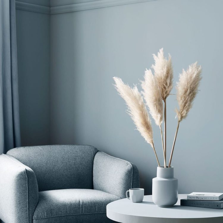
The final colour story is another familiar one that is warm neutrals. When we launched the podcast three years ago our first episode put forward the theory that grey was dead. Well Sophie wished it to be, I said it was merely having a lie down. Now she reckons it’s “six feet under” and I would say while it’s always going to be a classic it’s nodded off during its lie down. By all means use it if you love it but I now feel it looks cold and I’m currently more drawn to the creams and linen shades.
It’s all part of the Modern Farmhouse look which is all about vintage wooden furniture with lots of natural textures and tongue and groove panelling. It’s comfortable and homely as well.
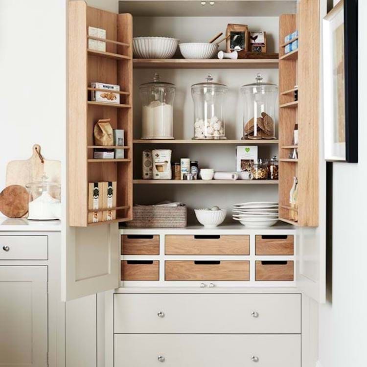
Tying in with that, because it’s a sort of kitchen look, is another big trend – or perhaps addition to the wishlist is hardworking spaces and this pantries and larders or larder cupboards which are hugely fashionable at the moment. It’s about organisation and making the most of the space you have. If you haven’t got room for a pantry cupboard then it’s about having lovely storage jars and labelling them so they look pretty.
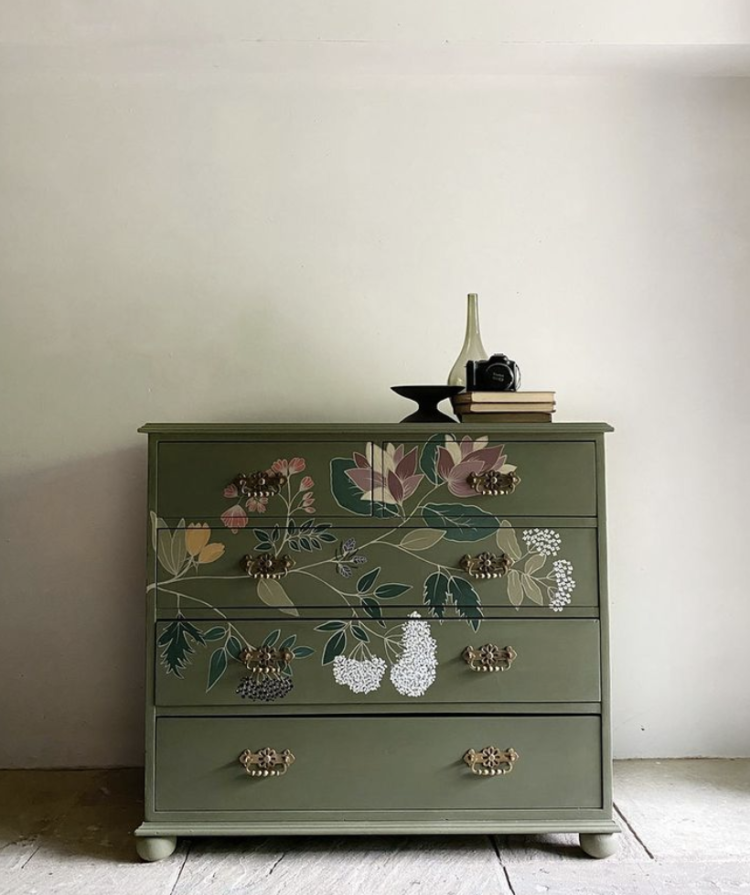
Finally crafting and painted furniture, but it’s no longer enough to paint that table. Now it needs a pattern on it. It’s the Bloomsbury Revival and it includes block painted wallpaper (see Molly McMahon’s course from Create Academy – same place as mine) and Lucy Tiffney’s wallpaper and fabric designs. It ties in with maximalism but it’s also the new Scandinavian trend – remember what has been labelled as Scandinavian for several years – the pared back grey is more Danish in style. This new looks is more Swedish country – think Carl Larsson.
Do have a listen to the rest of the show where I interview Sharon O’Connor of Vintique Upholstery about what names to look out for if you are buying furniture on eBay as well as good places for affordable fabric. She also runs mentoring courses for anyone looking to get into this industry, which has exploded in recent years, and points out how it’s much more sustainable to reupholster rather than add to landfill. S
Remember that shocking stat from yesterday that each house will add up to 8 sofas to landfill during our lifetime.
With huge thanks to Geberit for sponsoring the podcast this series. We are taking a small break – Sophie is busy filming a tv show and I am launching my online course so we will be concentrating on that for a few weeks before coming back with a mini series before Christmas.


I recently painted an east facing room in a pale blue, which really shocked everyone until it was furnished with rich greens, turquoise, bright airwork, and aged leather chairs. I too prefer moody dark palates with jeweltones but the Mediterranean sun doesn’t allow this except in my south facing dark bedroom. I found the right pale blue color modernizes rustic wood and leather furnishings and ties together my beloved jeweltones (and many earthtones) while keeping the room bright and in keeping with our sunny climate.
I’m totally with you on this one, pastels are definitely not for me. I don’t think I would even consider a pastel vase or cushion. I love jewel and neutral colours. I’m just about to have my kitchen done and the cabinets are being sprayed obsidian green which is a very dark green, but will be lifted with white quartz tops and wooden rustic shelves and flooring with brass accents. I think trends are interesting to read about, but I would have to really love the ideas to add them to my home.
I agree with you Karen. My kitchen sounds very similar too! A mix of dark green and white ash units with neutral Caesarstone worktops and brass handles. It feels calm but with so much character too. I’m not a fan of pastels preferring dirtier colours. It’s good that we have so much choice!