So last week’s property had a mixed reception. Love the outside, less keen on the inside. So we’re going a little more traditional this week – more of your classically handsome well-dressed kind of thing. This is the one for me. Show me a floor to ceiling in a Georgian sitting room and I’m all yours. Oh and a pantry with an internal window.
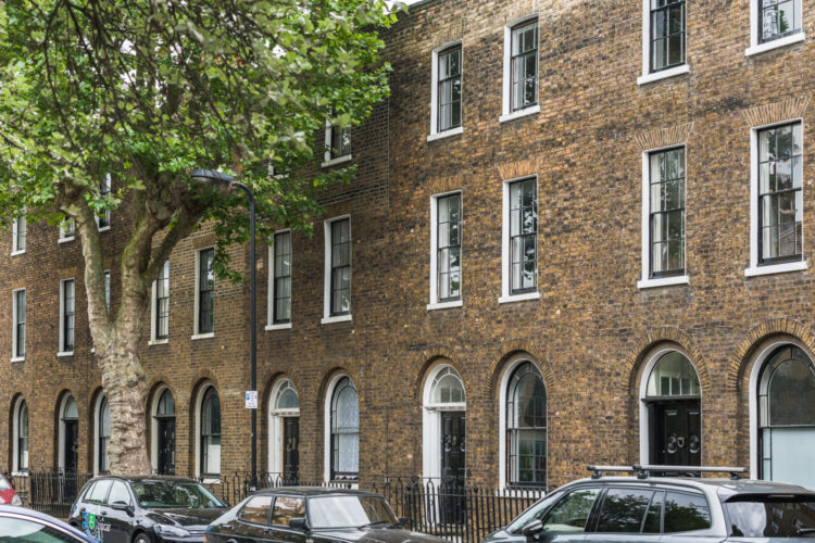
This is, in case you hadn’t noticed from the exterior, a Grade II listed Georgian house in east London. It has four bedrooms, a fabulous extension, a walled garden and is on for a pound under £2m with The Modern House. But never mind the money, fill your fantasy boots with a look around.
It was renovated (and extended) by Chris Dyson Architects, who were able to retain all the original shutters, panelling, cornices and door frames throughout.
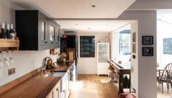
It has also made for some interesting layout so the fourth bedroom is behind the kitchen and there are two dining rooms. Still, you don’t have to keep it like that if you don’t want to. Or maybe, once you move in, you fall in love with the strange quirkiness of the rooms and opt to keep them like that. I once bought a house because I fell in love with a set of triangle shelves across the corner of the kitchen. I filled them with fruit and thought it was brilliant because it was a toddler height but the reality was that the ones at the bottom didn’t get any light and air and went mouldy and soft very fast. So we used it for post – which didn’t work as it was the wrong shape and less aesthetically pleasing. So we removed them. Not sure if there’s a moral in there but there’s a point to ponder at least.
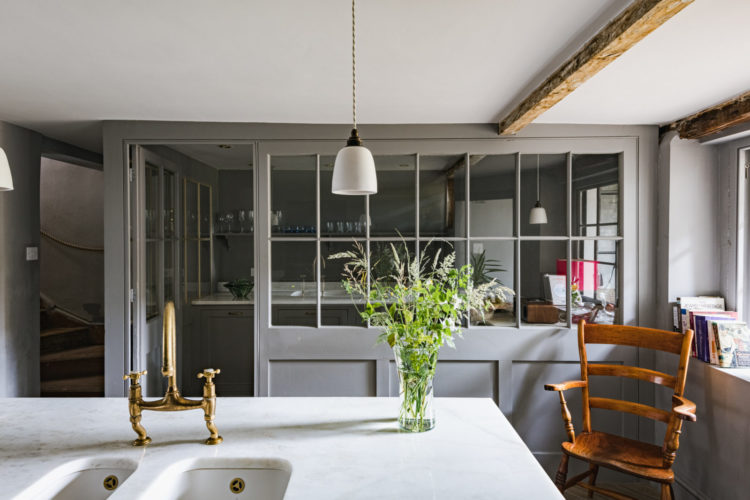
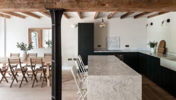
Anyway, kitchens with pantries. I’m in. That’s my dream scenario right there. Those stairs on the left, by the way, lead to the extension. The fourth bedroom is next to the kitchen on the right. It’s actually probably perfect for a teenager who can come in way past curfew, raid the fridge and creep up to bed with no-one being any the wiser.
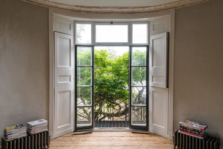
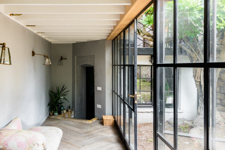
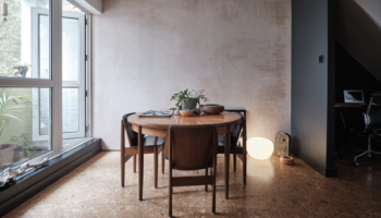
That window in the sitting room is all we need to say about that. This is open to another large room at the back of the house, which has been labelled as a dining room. Both are on the first floor as is the tradition in houses of this period.
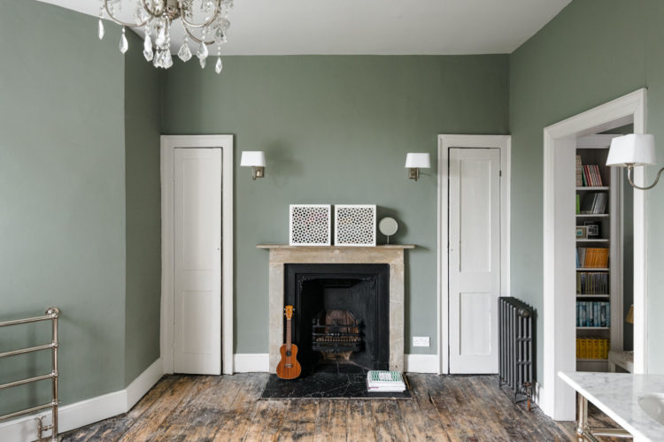
Below is a glass extension leading to another dining room. This oddly positioned fireplace backs onto the kitchen. It’s funny how often you find fireplaces off-centre or in strange corners. Either the walls have been repositioned over time or it’s about how they were located for practical reasons rather than aesthetic ones.
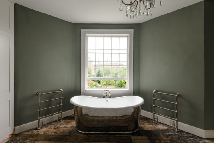
Upstairs to the bathroom belonging to the master bedroom. It’s at the back of the house so you can see it’s pretty private and the loo is through that door just seen on the left, which is a clever idea if you want to have a little more privacy and have more than one window in a room. If you look at the floorplan you will see it’s just an angled wall that has been placed across. Although it was possibly also created because of a small extension as it’s a different shape from the room below. The architects apparently restored the original layout of the house though so perhaps it was a natural thing to do.
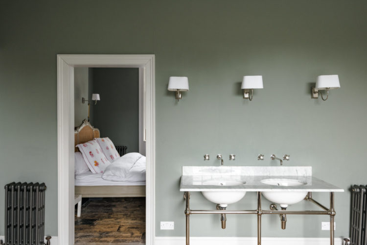
This is the other side of the room with its twin basins. No there’s no mirror. Perhaps it wasn’t ready when the photographer came. The wall are a gorgeous colour though – try Farrow & Ball pigeon for a similar greeny grey that looks gorgeous with white (I’m talking about the sanitaryware not the skirting boards).
And the other side of the room. These original cupboards are so pretty and, for once, symmetrical. How many of you live in Victorian, or period properties, and are constantly frustrated by one alcove being wider than the other, or having one cupboard and one alcove. This is pretty. Although I imagine the storage provided is minimal. Mind you the joy of bathroom storage is that although you might want lots of it the items themselves are usually quite small.
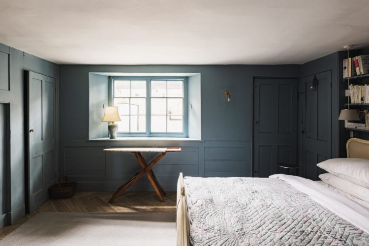
Moving up to floor above and this rather gorgeous blue bedroom. Although doors. Way too many for one room which makes furnishing it tricky but it’s very pretty nonetheless. This is what I mean about the quirkiness of original layout and period features. You want to keep them but they might drive you mad.
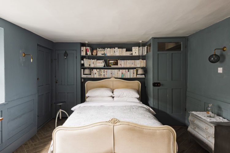
On reflection this might be the fourth bedroom downstairs. I can’t make sense of all the doors and cupboards but I do know that if I had two million quid down the back of the sofa I would spend it on this. You?
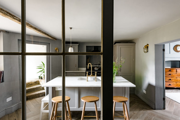
I see a fair bit of Crittall-inspired screening/glazing here, Kate.
How long do you see this trend lasting?
Cheers
Who knows – I think it might just become classic as it has become more affordable and it’s not something that people replace often so you will see it more and more and either you will like it or you won’t. I would still like to replace my bifold doors with it and I love the way it frames the view but yes maybe if I wait long enough it won’t seem like such a good idea!
It’s lovely, but this obsession with four bedrooms has led to what should obviously be the family room/den being used as bedroom 4!
The interior appears unfinished and the floors are a mess of light and dark varnish, it’s as though using the sanding machine became too much of a chore!
I think it’s a house with potential and as London house prices are supposedly falling, you could bag it for under £2,000000 perhaps and have money to spend on finishing it?
There is so much restraint with this design, making it work. I could never do it.
Absolutely love this, but then love anything Chris Dyson does…and Devol(think they did the kitchen?!)
How could you not include the room with the crazy cat picture Kate!? Absolutely love this house-I’d just have to add a bit of pink.