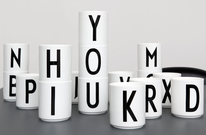
These gorgeous alphabet cups are part of a collection of crockery and melamine with letters designed by the famous Danish architect Arne Jacobsen.
The architect, perhaps better known for his Swan and Egg chairs, as well as many other design classics, came up with the font in 1937 and the Danish company Design Letters, was recently given permission to revive it on a series of mugs, plates and bowls.
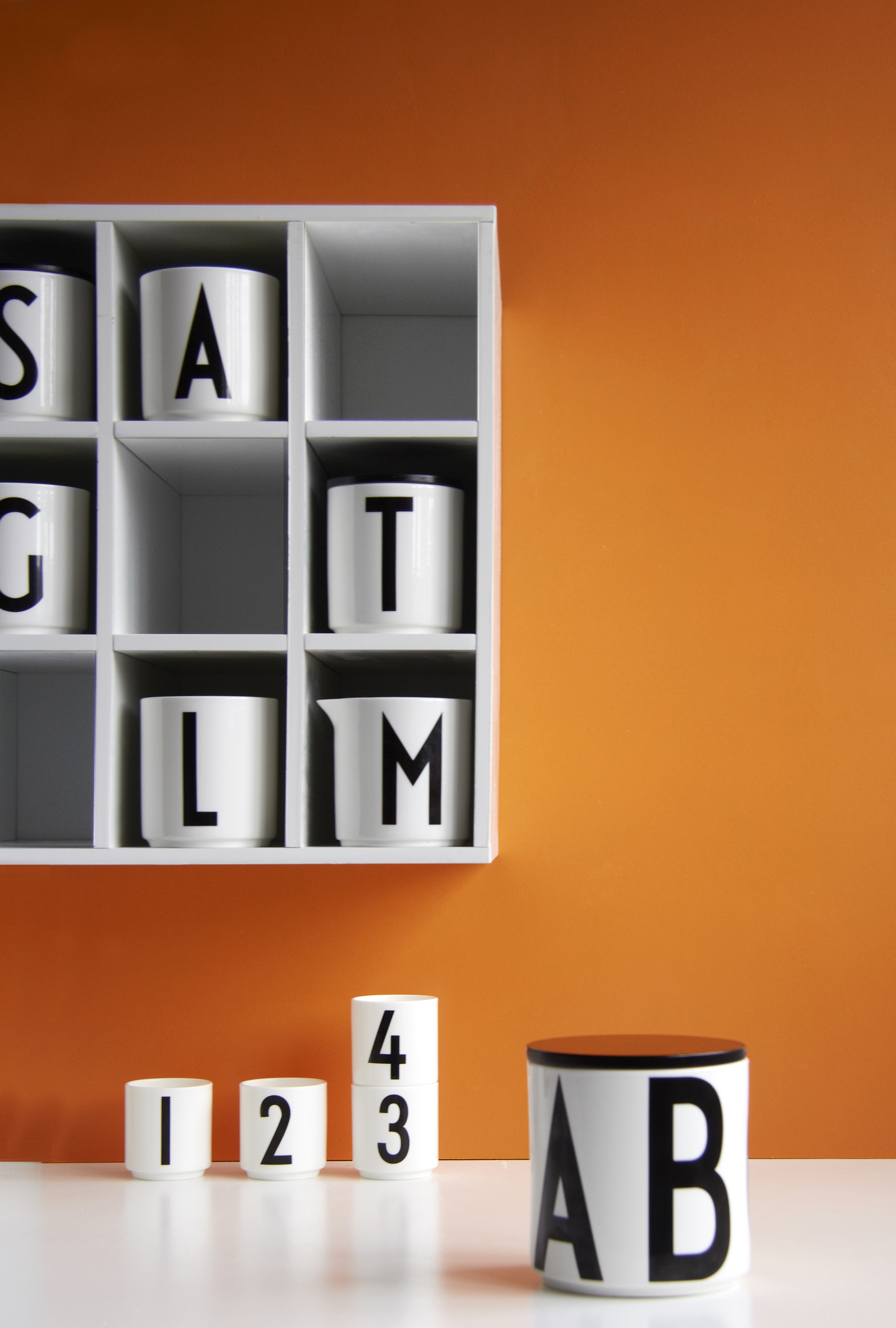
The range now includes a set of melamine cups and plates (for those elements of the family who might be inclined to drop things on the floor) as well as porcelain.
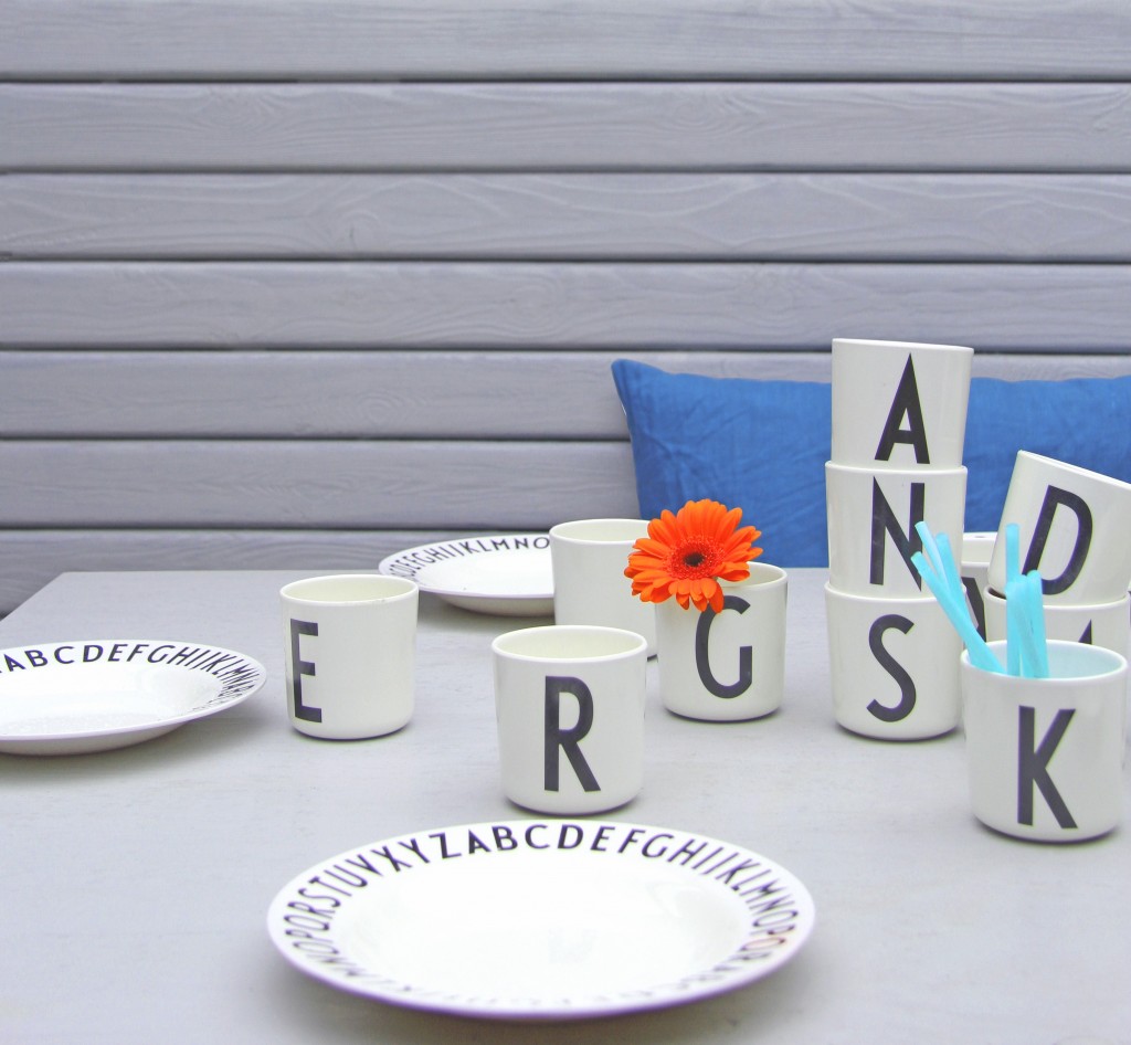
In addition to all the kitchenware, which also includes jugs for water and milk, as well as sugar, there is also a rather fabulous duvet cover.
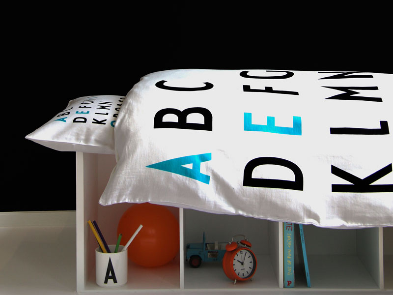
All of this appeals to my love of monochrome. If you like it to click the images to be take direct to the shops, which are mostly skandivis and nordicelements .


HA! that’s very funny, I hadn’t noticed that but of course now you mention it. Subtle, and clever, signposting to the country of the master of design.
They look pretty cool in their understated design. I wonder if it’s a coincidence that the word ‘dansk’ was the first thing that jumped out at me on the third picture?