Now I’m not for a minute suggesting that we’ve gone off grey (not with the book I’ve just written going into edit this week) but there is a new kid in town. And it’s blue so grey better not get too complacent because feast your eyes people. FEAST.
Following on from Little Greene’s Grey card a couple of years ago, the paint company has just created Blue which is due to launch on 21 September and includes 21 shades of which 17 are new. For anyone who has dismissed blue as a cold colour before, this is the perfect opportunity to think again.
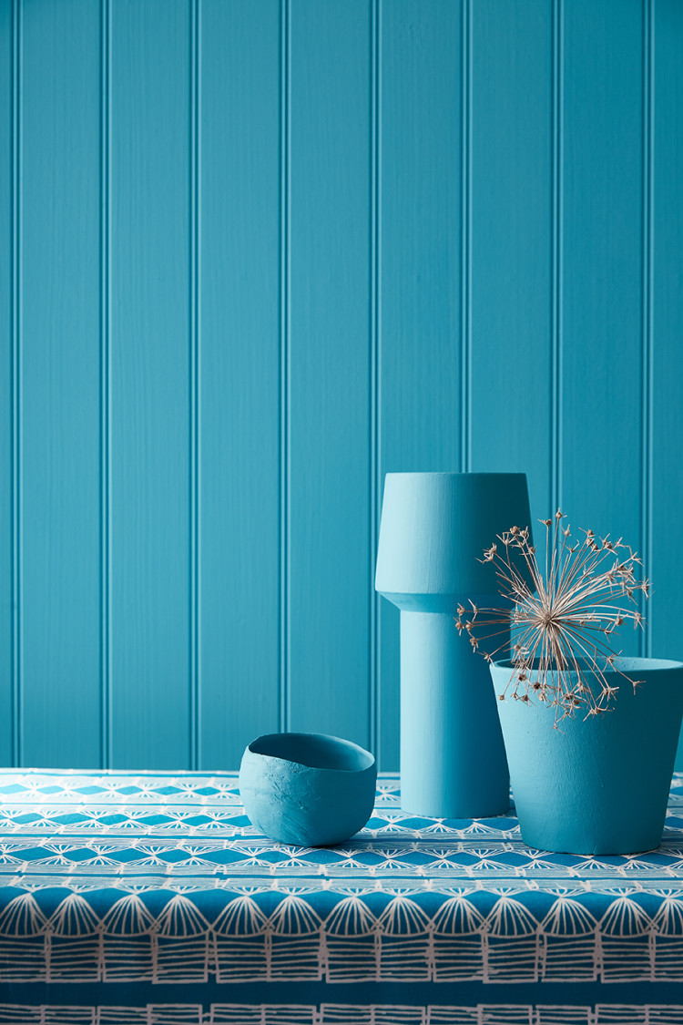
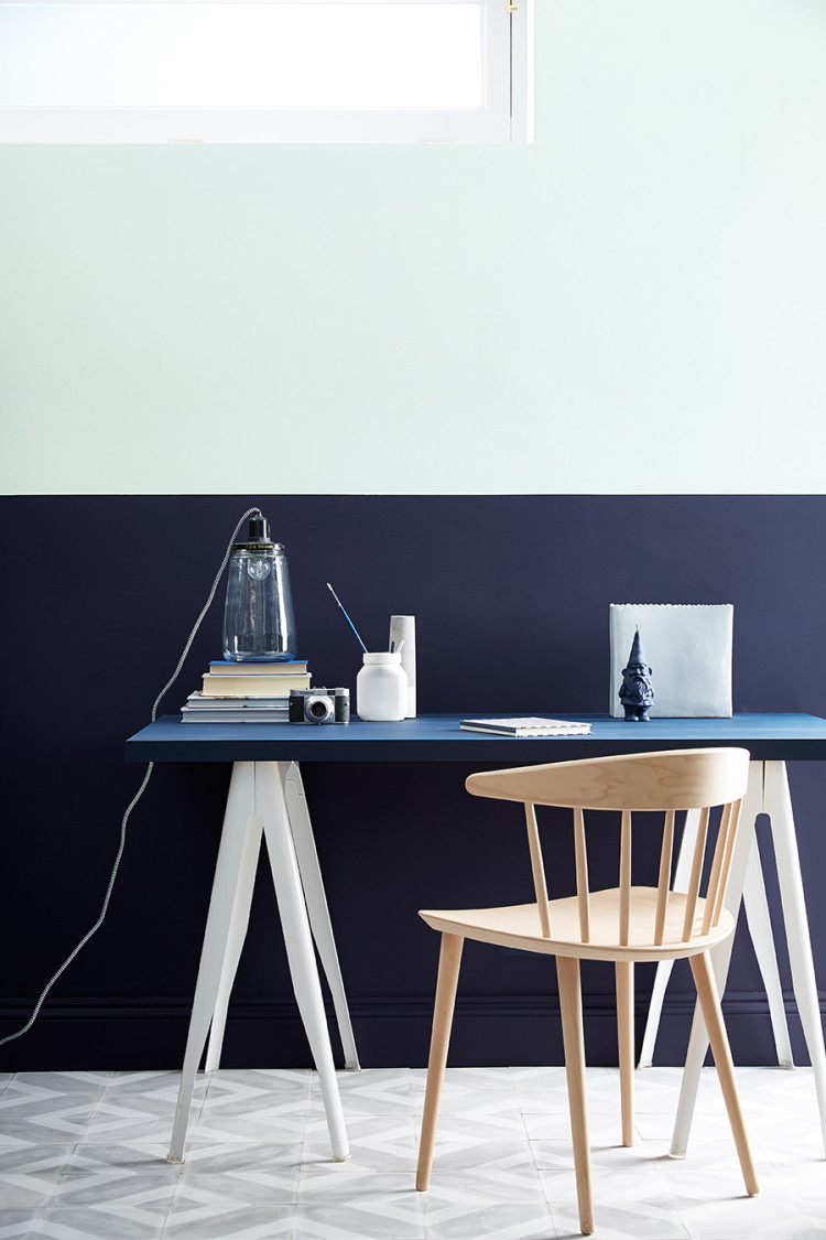
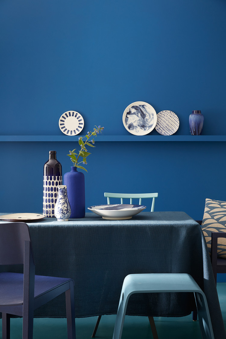
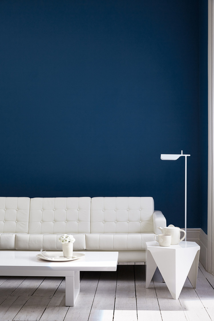
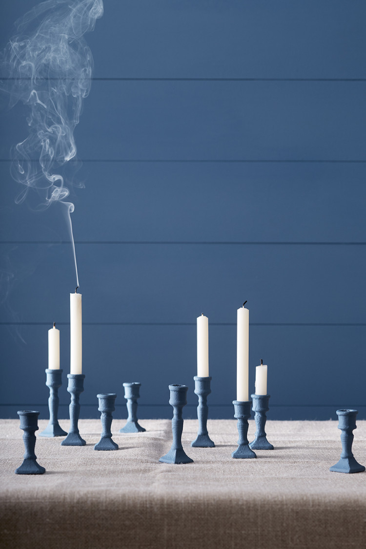
Navy has been floating around for a while and is gradually gaining ground as the new dark neutral (budge up Down Pipe) but this season, if you’re in the business of being fashionable about it all, it’s about layering shades of blue on blue.
David Mottershead, the MD of Little Greene, said: “Blue is the richest of colours, and historically the most expensive to produce. In art, blue paint was reserved for depicting royalty, dignitaries and religious figures and still, to this day, holds the same luxurious appeal and hypnotic allure.
“Many people fear to use blue because of its reputation as being cold and masculine – we can show a new way with this carefully edited collection and make blue more useable than ever.”
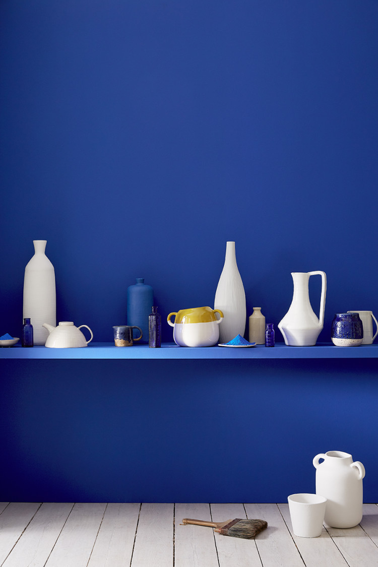
The card includes pale linen tones and indigo as well as a limited edition ultra blue (see below with the shelf of white crockery). This is a nod to the famous Yves Klein blue created by the eponymous artist in 1960 and originally named International Klein Blue.
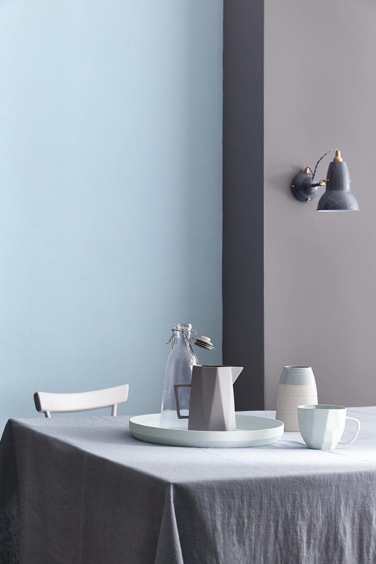
The great thing about blue is that it works really well in our northern hemisphere where the light is already quite blue and that enhances the colour. Yes, it can be cold so you do need to experiment and it can be cold if you mix it with white so be brave – slap it on all four walls.
The collection includes old favourites such as Hicks and Celestial as well as new ones with names such as Moon Shadow and Livid, Dock and Smalt. Or what about Route One, which takes its name from the meeting of sun and sky on California’s Pacific Route 1 highway.
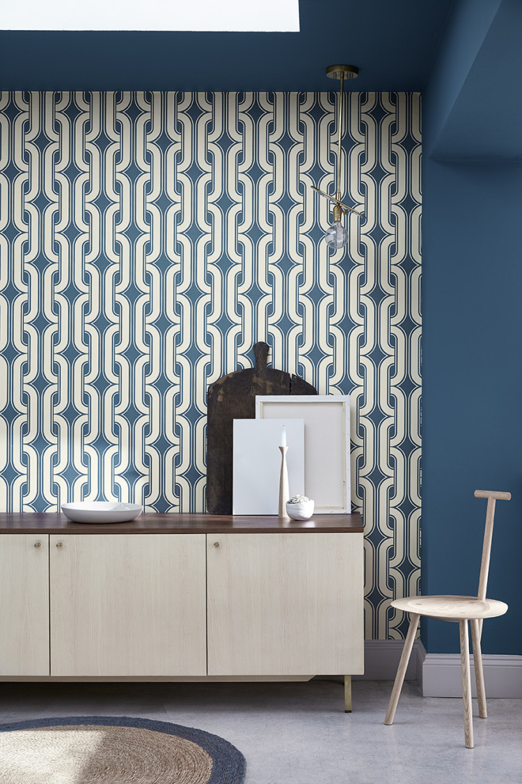
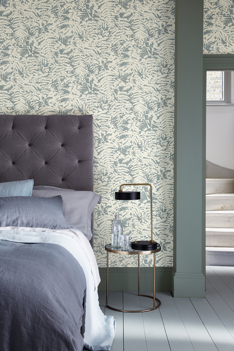
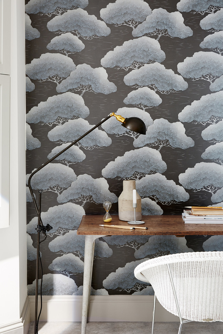
The collection also includes some gorgeous wallpapers of which the geometric and trees are my favourites. I have been thinking of replacing the wallpaper in the bedroom for a little while now. Perhaps one of these two will be the one.
What are you waiting for. Are we all going to be singing the blues soon? Which shades are your favourite?

I painted my wall with Hicks Blue. Where can I find the bowler carpet with the blue circle?
I imagine myself in a Greek island villa with the only colour splash being International Klein Blue… Ultra Blue is a very close second though! Beautiful colours… *spends an hour on Little Greene wesbite*
Sounds idyllic… I really might have to redecorate. Again.
Oh my, I really can’t wait for this new collection, Dock blue and Woad in particular look interesting… Thank you for the sneak preview, a nice trip away from grey for the day!
Hi! First time I’ve ever commented, though I’ve been reading your blog for a while now and LOVE it! Are we allowed to ask about the book?! Thanks 🙂
Very nice shades of blue 😉
Brilliant and lovely pictures I have just used Little Greene’s Basalt in my breakfast room, so I can officially say that I am ‘on trend’, as is the adage….
I love the Pale Wedgwood and Arquerite combo, so calming, and if I had a pad in the mediterranean I’d be hankering after that ultra blue for a room, how lovely is that?