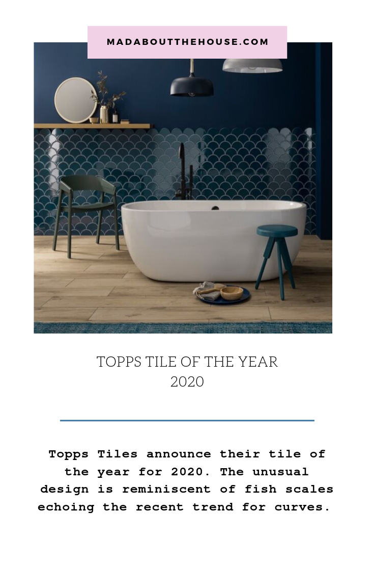
Well we’ve had the colour of the year and now it’s time for the tile of the year as revealed by moi at an event with Topps Tiles last week and for this week’s Wednesday AD Break I thought I would talk you through some of the trends around it and the different ways you can lay it.
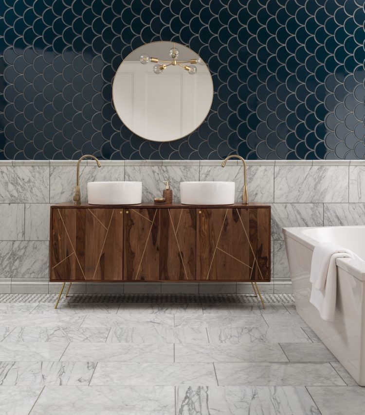
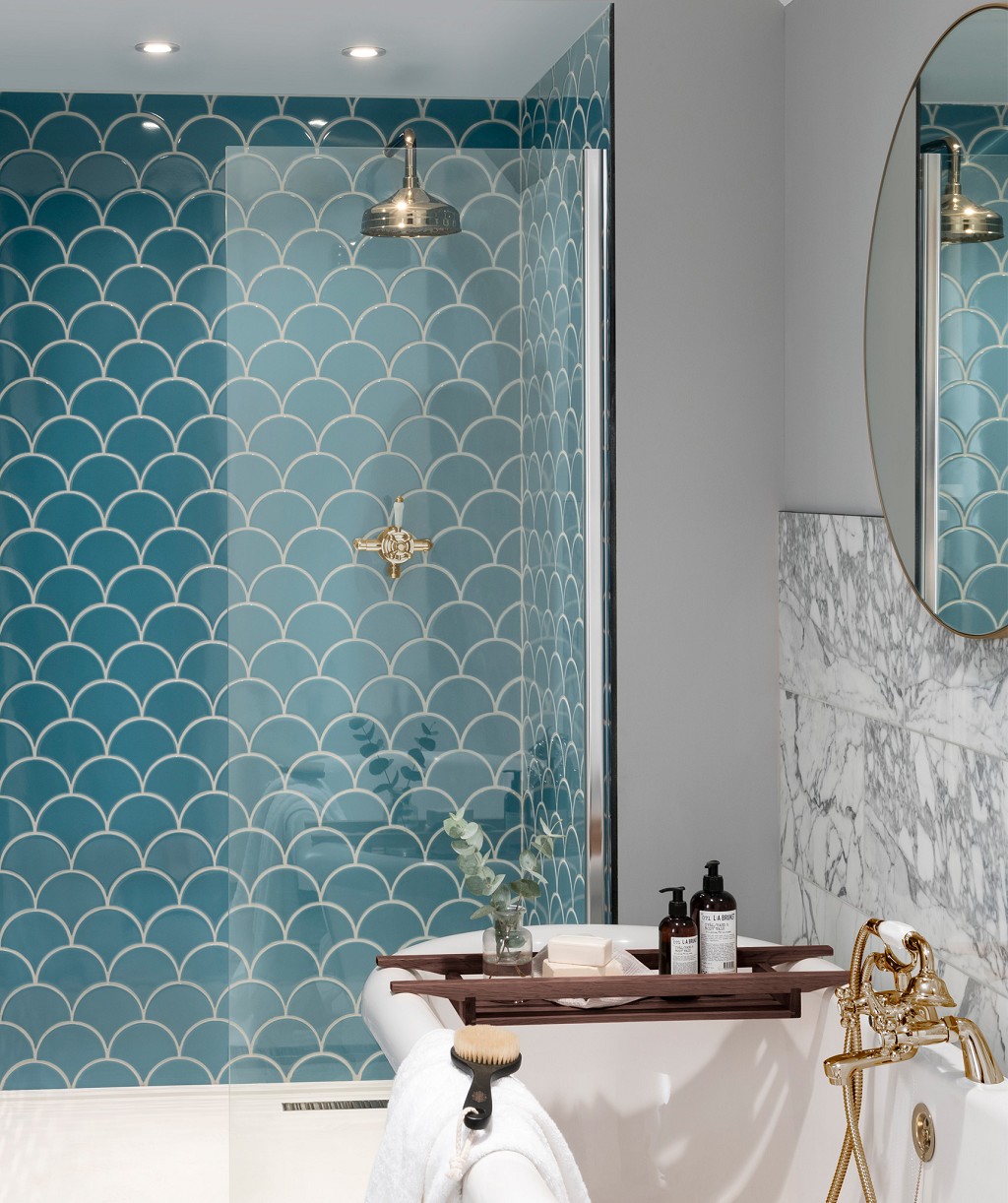
Because the first thing to note is that this tile, Syren in Midnight Blue, is a sort of fan, or fish scale shape which is so unusual. Regular readers will know that I have been banging on about curves being fashionable in interiors for several months now.
But it has been tricky for tiles to get in on the act as they are, or were, by their nature, a hard substance made with straight lines. So we’ve had the classic subway tile laid in a myriad of different patterns. We’re beginning to see the resurgence of the square tile and hexagons have also been growing in popularity. So far so many straight lines.
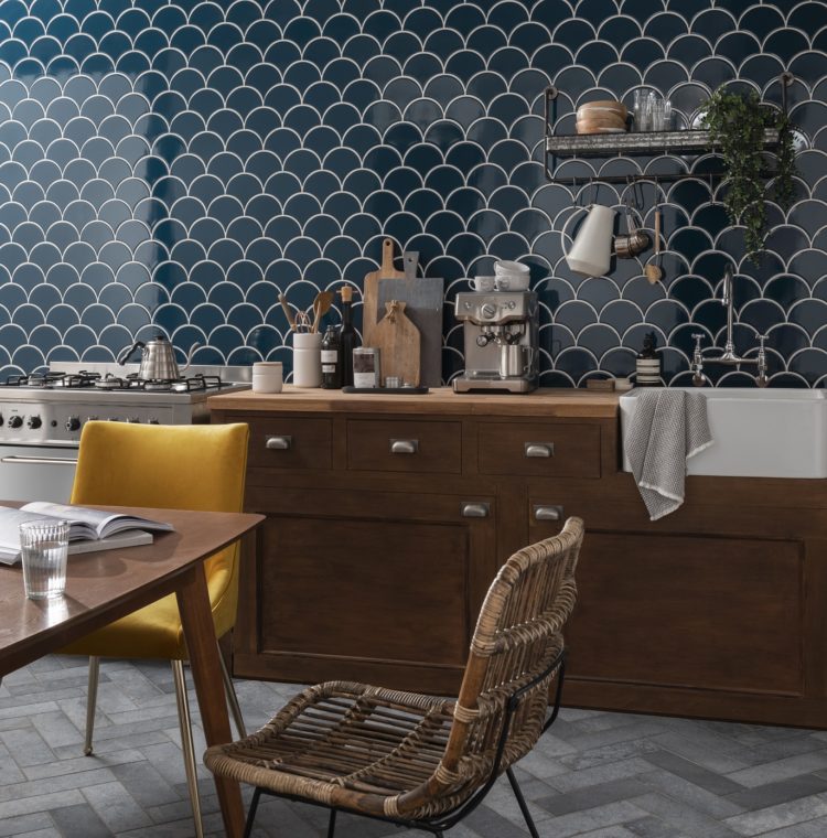
Now, finally, the curve has come. And this shape is more versatile than you might imagine as you will see from the images on this post. If you were doing half a wall I would definitely lay them with the curve at the top (as styled by Elle Decoration) as then you can have that lovely scallop shape across the top.
And at this point it’s worth noting that Dulux have created a palette of colours to go with the Syren tile (which also comes in different shades). Elle Decoration paired the the tile with the matching Indigo Shade paint but that doesn’t show the scalloped edge as much as I would like, so I would probably go with a contrast such as Pocket Stone, Timeless, Fossil Trace or Polished Pebble (I’m not going to link to all of them individually but you can search the Dulux site if any of them sound right).
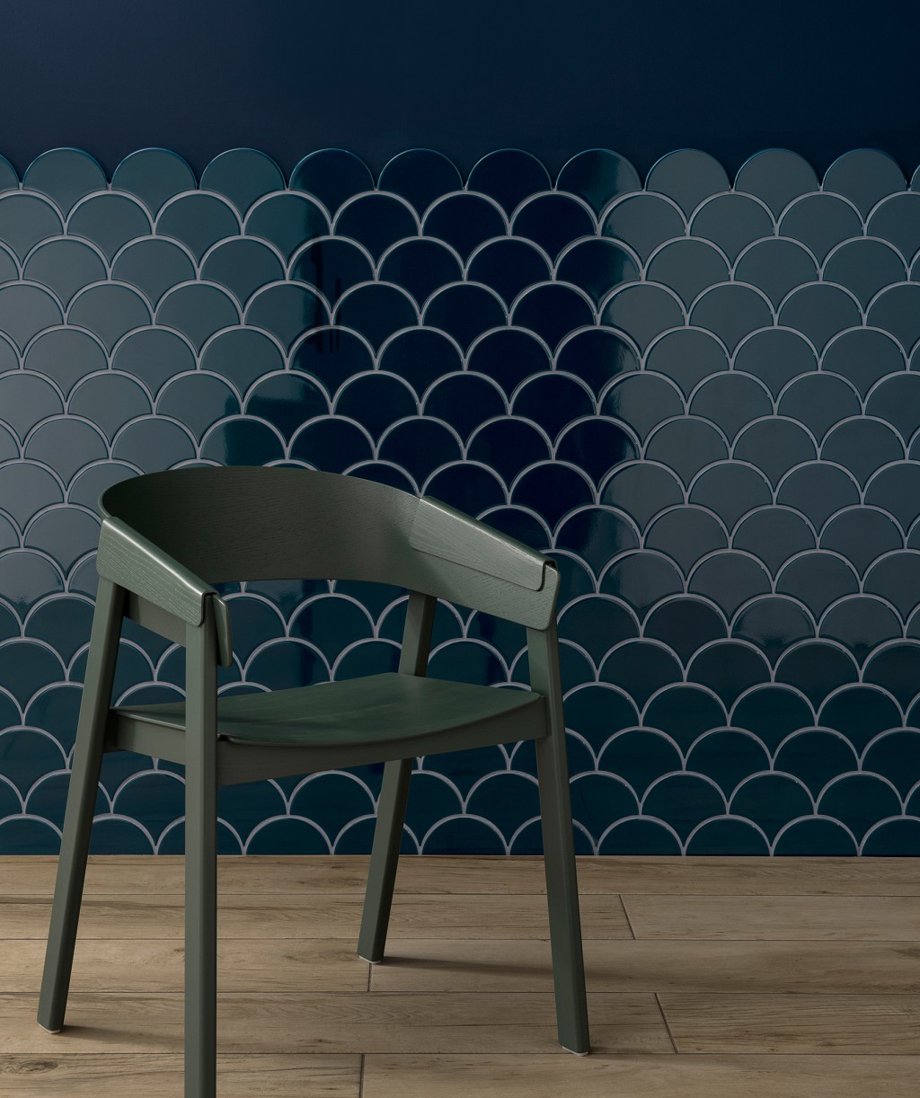
They also look great – and more fishlike – when laid on their side although I note the image doesn’t show what happens at the top. It maybe that you would need to cut them to make a straight line if the side edge doesn’t work as a pattern.
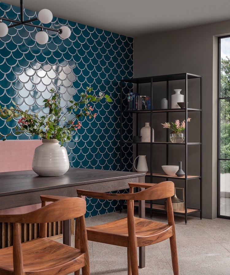
Of course, for every curve on top, there can be a curve side down which looks like the dining room picture. There was a lot of chat at the event about having a tiled dining room wall. My thoughts, for what it’s worth, is that it would work if the dining room was part of the kitchen and if the same tiles were used as the splash back in the other part of the room. It is just a decorative feature after all and probably just a question of getting used to something different.
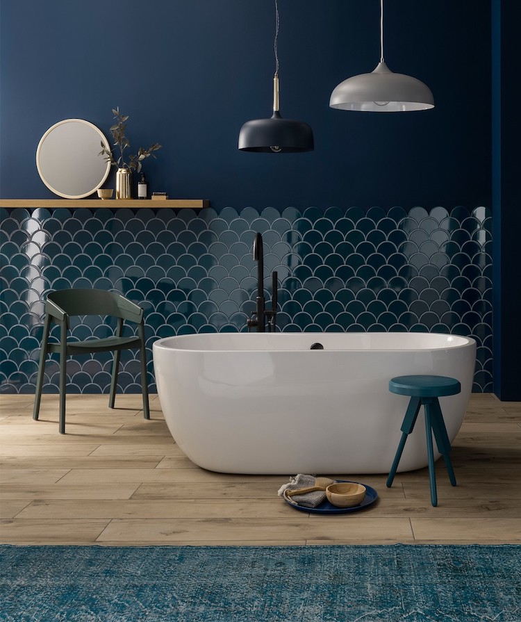
Alternatively I might have tiled only half way up to create a sort of panelled effect but with tiles. Remember these images are for inspiration which means they might equally inspire you to do something completely different.
The final way is this curvy pattern but I would suggest you make very good friends with your tiler before you suggest this one. Here the stylist has used pink grout to really make the unusual pattern stand out. You could, of course, use any colour you like. I’m going to say that a gold/brass colour would look amazing in both a kitchen and a bathroom with brass accessories.
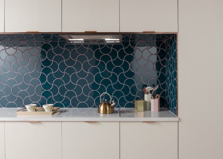
Gold grout would also work in a dining room scenario as it’s a bit more luxe. You could then have a sideboard on the wall in front with brass handles or even brass inlay to tie the two together.
I haven’t mentioned the colour yet either – this gorgeous navy blue (it also comes in Natural, Sage and Peacock see below). For years we have all tended towards the safe colours when it comes to the big ticket items in our homes – white kitchens, marble tiles, classic colours in traditional shapes. This is partly because it’s expensive to change and partly from a fear of going off any bolder choices.
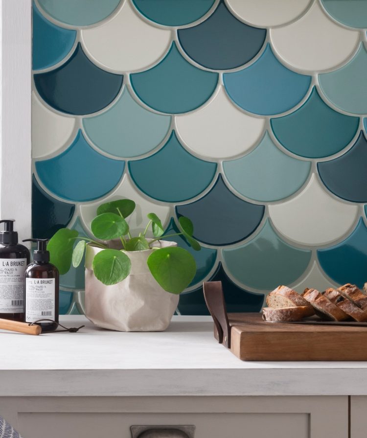
But times are changing and we are all starting to embrace colour now. It started with paint – and that’s still the best way to go as it’s the easiest and most affordable to change. Then we moved onto sofas (I wrote before about one of DFS’s best-selling sofas being yellow) as we grew in confidence and learnt to work out what colours made us truly happy and that we knew we would love for a long time.
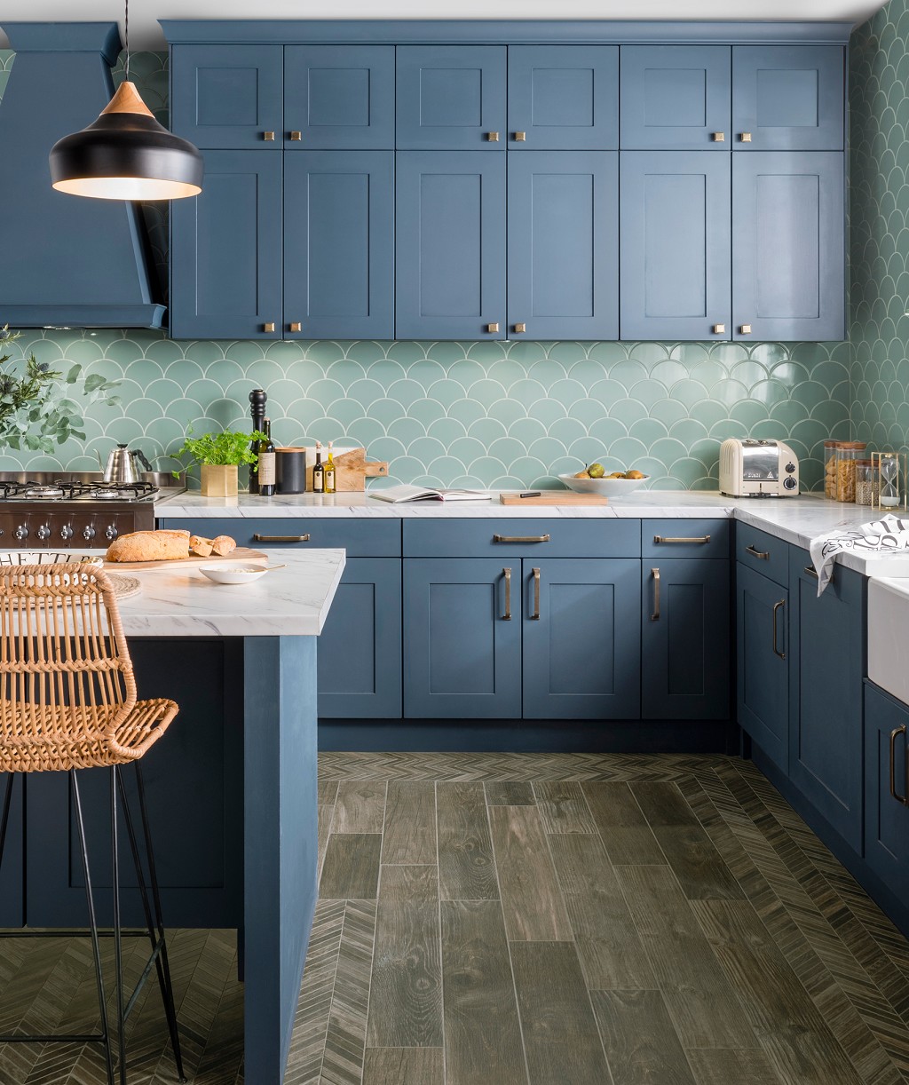
Tiles is perhaps next on the list. And this goes back to Monday’s post. If you pick a bold tile in a colour you love, you can always keep the walls more classic. Or not, as the mood may take you. You can also mix this tile with the other colours in the range; this blue is lovely with the creamy natural version.
And the final point? This tile costs 89p.
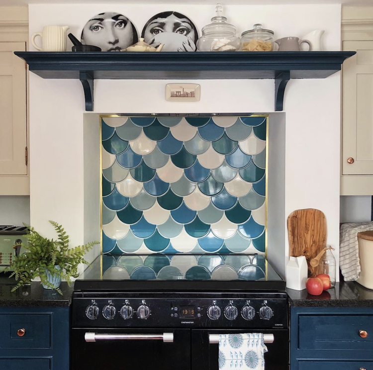
Here you can see it in the home of interior designer Melanie Lissack, who chose it for her kitchen last year. Well ahead of the curve as you might say…..
This post is part of my regular Wednesday Ad Break slot. I don’t post every Wednesday but if I do it’s part of a paid collaboration. The other four days of the week are unsponsored. Having said that you know by now that I only work with brands that I think can tell you/us something useful or beautiful or both.

I love the effect on its side, and that curvy pattern on the splashback is awesome! I’d never have thought of laying the tiles that way.
Guess it was only a matter of time before fishscale became mainstream. Froyle Tiles and Fired Earth having been making/sourcing them at least 20 years! But handmade is handmade and that comes at a price. As a designer/maker, I strive for individuality in the colour, texture and patterns of my tiles, looking to design/style conscious clients to make their own unique tile design statements, perhaps in the manner of Coletivo Muda, Gio Ponti, Roger Capron….. So many ideas!