Since we all universally loved this house I thought, for the final archive post of the month, it would be fun to come back and look around again. I hope you have enjoyed revisiting some of this content during the summer and I’ll see you back here on Monday with a brand new Beautiful Rooms post.
Good Morning and Happy Friday to you all. Just one house this week as it’s rather gorgeous and we’re going to have a good old nosey round. It used to belong to the furniture designer Faye Toogood and has been kept largely the same since she sold to the current vendors.
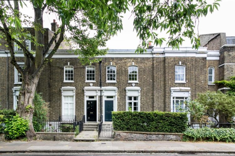
It’s a three bedroom Georgian house in North London and it’s on the market with The Modern House for £1,900,000. In addition to being in a great location, it also has a 60ft south-facing garden which is a always a bonus in London and practically a miracle in an area that is so central.
The house still has many original features which, bearing in mind it was built between 1714 and 1830, is amazing that not only the walls but the details have survived as well. And it’s not just about being well-built – remember the 60s and 70s when owners ripped out all those fireplaces and windows to replace them with low maintenance gas fires and aluminium window frames? It has largely survived that too. It also has wonderful wide wooden floorboards, which cost a fortune to replace; the Victorian ones, which are easier to find, are narrower and cheaper.
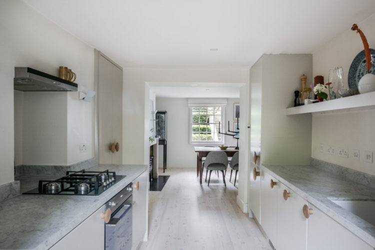
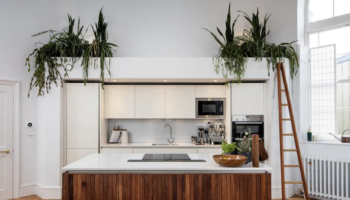
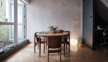
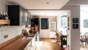
The kitchen is on the lower ground floor and opens directly onto the garden. The dining room, which you can just see above, is at the front and leads to a small utility room which opens to the front.
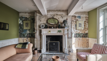
So you enter on the raised ground floor where there is this double reception room below and a small study at the back overlooking the garden. So that’s already a perfect layout.
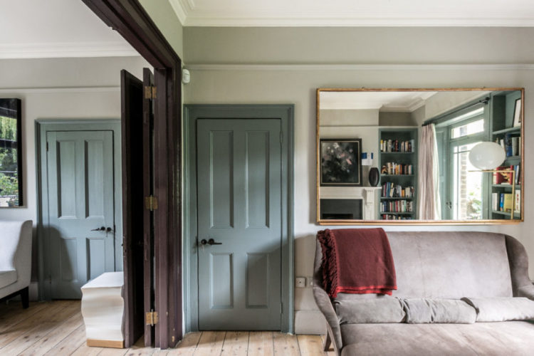
Remember what we have been saying this week about not leaving the woodwork white by default but making a decision about it? Well this house is a perfect example of that. And if I was a magazine editor with a team of people, this house would have been the culmination of a week of careful planning to perfectly illustrate what came earlier.
But I’m not and I haven’t so it isn’t. It’s just luck. But it does make the point brilliantly. The double doors are painted in deep chocolate brown, so they make a feature when either open or closed. The other doors are in a soft blue grey and the skirting boards are in chalky white to match the walls.
So the main point is that you don’t have to have all the woodwork the same, you don’t even have to have all the doors the same. But there is a logic to it – the doors into and out of the room are one colour as are the window frames at either end. The doors in the middle of the room are a contrasting colour. As long as it makes sense and isn’t just random then it will work.
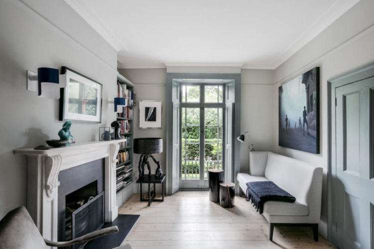
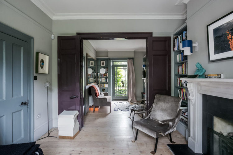
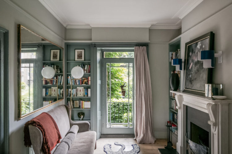
The other point to note is that it’s still a very restful space despite all the different colours. They all belong to the same greyed out palette so they all work together. Now it’s true that painting everything the same – woodwork, ceiings and walls will make a space feel bigger as you are removing things that distract the eye and draw attention to the edges. But, using different yet muted colours in this room you are drawing attention to the original features – in this case the wonderful Georgian windows and original wooden doors. So you have to decide what you want the colour to do.
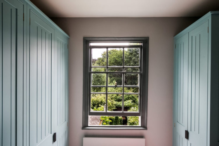
This room is lovely with its pink walls, dark window and blue cupboards lining the space. It’s quite brave to use three different colours in a small space but they all complement each other so it works. And it might be quite boring in white – unless that was a decision you made in keeping with the rest of the house that is.
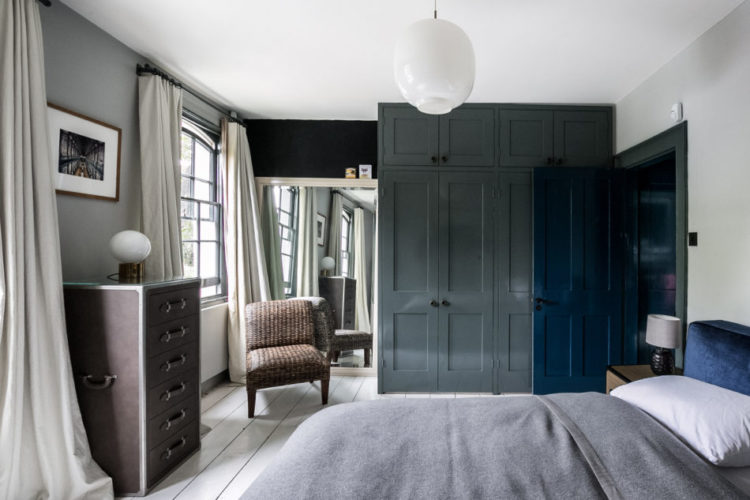
But it’s the master bedroom which is my favourite. The soft grey walls are warmed with the dark wooden furniture while the windows are painted in a darker shade of grey and the doors and wardrobes in navy blue gloss. Come in and look around.
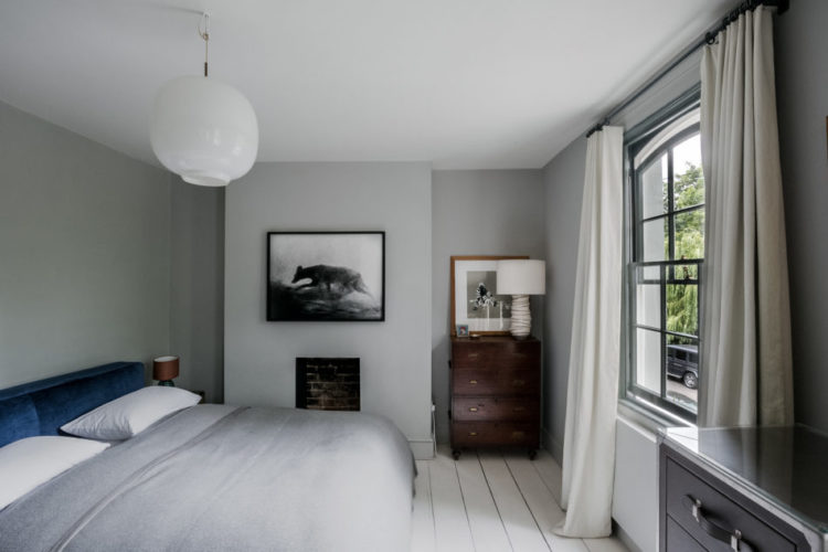
Note how the dark paint on the windows highlights their curved shape. It was common for Georgians to paint the outside of their windows in dark paint – often in dark green or brown. These days we all expect to see white windows and it’s regarded as a bit of a fashion statement to paint them dark. I have read various reasons for why windows were dark but one which seems fairly logical is that they weren’t very good at making white paint at the time.
It can also be difficult to paint your windows dark in a row of terraced houses as neighbours may complain, with some justification, that the look of the street has been spoilt. Perhaps that is why only the insides have been done here.
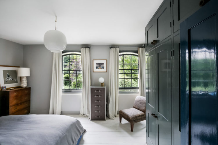
The fitted wardrobes have been built only halfway across the room which creates a little dressing room at the other end by the window. This is a good idea as it stops the room feeling boxed in and creates a private area. If you have the space, or rather don’t need all the wardrobe space, then it might be worth considering. Just make sure you “furnish” the corner with a large mirror and/or chair as has been done here. Otherwise it will just look like a dumping space rather than a design decision.
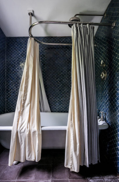
I have seen this bathroom many times over the years and I still love it. The navy blue fishscale tiles are gorgeous and they look fabulous over all the walls, which, I’m guessing, was an expensive decision. You can do the same with metro, or subway tiles, but it will always look a little more utilitarian. Unless you use a coloured, or gold grout.
Interior decorating – like housebuying – is for most of us a compromise and you have to decide what you can’t live without just as much as what you can live with. Unless you are the clients of an interior designer friend of mine who have just allocated a budget of £85,000 for one room…. yes you read that right.
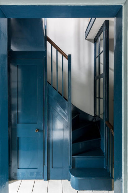
Finally, woodwork. Here in all its glorious deep dark blue. I’m not against white woodwork by any means but I am definitely looking at all the other colours before I decide if white is right. Remember, there are very few rules but the absolute key one is that it must look like you meant it and not like you didn’t make a decision.
And with that I’m hopping and skipping and jumping into the weekend. Actually, after a rather enthusiastic session at the gym yesterday I might be limping somewhat but however you get there, have a good one.
What a truly gorgeous house, those tiles in the bathroom were worth the money, they look stunning.
85k for one room – I would find that completely intimidating! surely you would be at risk of buying because it was expensive not because you loved it?
Lots of colour but perfectly restful. Great start to the weekend. Thanks.
Love the giant chocolate button knobs in the kitchen. The colour palette is beautiful throughout.
I love the pink on the walls in the smaller bedroom. Can you recommend a similar pink colour? Thanks
Try Temple by Paint and Paper Library. Or Setting Plaster by Farrow and Ball or Dorchester Pink or Pink Slip by Little Greene or Boro by Atelier Ellis
What a beautiful house. And I could look at that last picture all day, it really makes my heart sing … do you know which blue paint they used for the stairs, by any chance?
I don’t but you could try Farrow and Ball Hague Blue or Little Greene Deep Space or Mazarine or Hicks. Or Ink by Atelier Ellis. Or Blue Movie by Downsing and Reynolds.
Thank you Kate – to my mind that’s one of the most beautiful houses you’ve ever found for us. Now where’s that lottery ticket? It’s just perfect! And, having had a snoop around the rest of the pics on the estate agents website I can confirm that the garden is also a complete treasure. And I thought I was a sarf London girl …