Good morning to you from the dust hole. We are now, hopefully, in the final stages but, as The Mad Husband pointed out, it’s the bit where we have nothing and then suddenly we have everything. The base units are in but unpainted and with no handles. The appliances are in the right places but not plumbed in. The worktop is being templated and the electrics should be in place by the end of the week. Like I say, it looks like a room as it has plastered walls, floors and units, but it’s more theatre set than a kitchen as nothing really functions.
So I spent yesterday making a ferocious list for the builder of where we would like to be by the end of the week. I’ll let you know how that goes! In the meantime, some beautiful rooms to inspire and delight for the days ahead. And yes it has all taken on a slightly rose-tinted hue this week – no great Freudian leap needed to see why that might be at this stage.
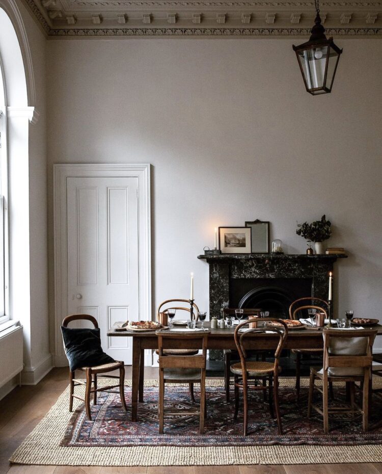
Now, dreaming of gorgeous finished rooms. The first of which, above, belongs to the wonderful Ellei Home, a site selling beautifully curated and considered homewares. Follow on instagram for a dose of calming beauty from their Edinburgh home and, as a design tip – if you have a rug that is too small for your space you can sit it on a larger jute or sisal rug like live they have done above and it looks great. Yes watch for tripping – I’m not suggesting it works for toddlers or grandparents, but aside from that it’s an elegant solution to a problem.
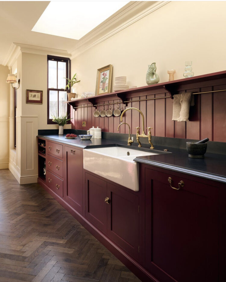
I featured part of this kitchen the other day – it’s the Hobbs house via location agency Shoot Factory and I’m showing this angle as one of the reasons we are behind with our own kitchen renovations is a small window like this at the end of the kitchen looking through to the pantry. Given that, in our case, there was a window there originally as it was the back of the house and it was then blocked up when the extension/pantry was added, it has been an extraordinary business to reinstate it. A surprising amount of steel, a large hole (32 bags of rubble) and a much delayed building control visit. I suspect if the structural engineer had agreed to visit the site before drawing up the spec and the building control had also come before the work started we may not have needed such extensive work but both specialists wanted to work from architect drawings and photos. I think perhaps both felt it was a small job and didn’t require a visit. Anyway, it’s done, it’s in and the back of the house could withstand a party of elephants so it’s all fine. Even though I think our window (or vision panel as I’m told architects refer to internal windows) is smaller than this one. Moral of the story – builds will be delayed by forces beyond your control.
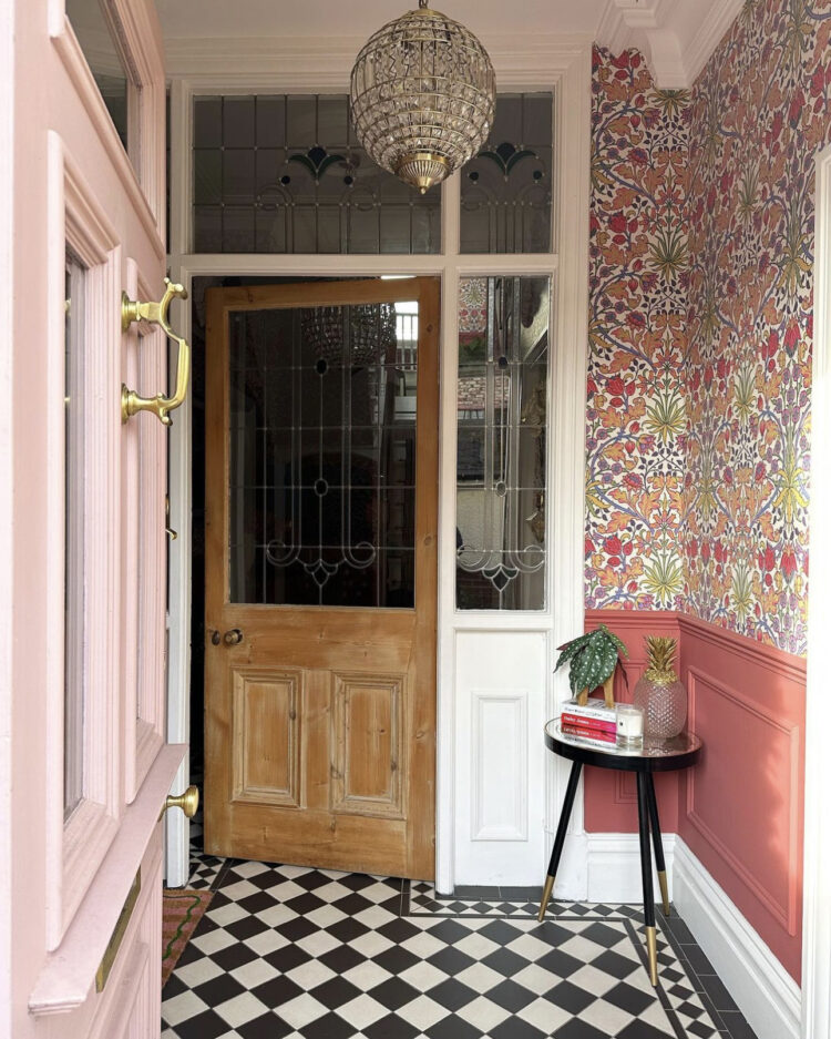
Moving on (with only slightly gritted teeth) I love this hallway by Lauren and Mark of Casa Old Corn. Black and white tiles are a classic (when laid well – those who remember early pictures of this house will recall I took ours out as they were not well laid) and it’s a really joyful way to enter a house when paired with this strong pink paint and floral wallpaper. The old wooden door stops it being sickly and it also has the look of an outer hall which means you don’t linger or spend much time this space so you can go bold. If you have a porch like this you can go as bold as you dare for an instant hit of your own personal dopamine as you walk through the door before moving to a calmer space (if that’s what you need) as you go further into the house. This pink colour is beginning to emerge by stealth on instagram too – try Rhubarb by Neptune or Paint & Paper Library.
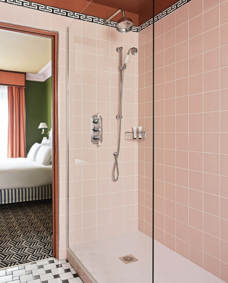
Now for a hotel bathroom and this at Parisian hotel Les Deux Gares is made so much more than the sum of its parts with the addition of the terracotta ceiling which stops the pink becoming too sickly and sugary. Another trick, if like me you despair of keeping white grout clean, is to choose a coloured grout. In this case I suspect daily hotel cleaning means the grout stays cleaner as soap stains don’t have time to settle. In a home where you might not clean the walls of the shower daily you might want to consider a darker colour. In this case – terracotta or even green to make a change from the classic dark grey although that would also work.
I looked at tiles like this for the shower room, which I wanted to pair with cream and terracotta in the same shape but I was vetoed on the pink so I have chosen different ones laid in a check. However, I suggest the Matrix Square tiles from Topps (14.8 x 14.4) are lovely (I ordered samples of several colours) and cost just over £35 a square metre. If you want pink look for the blossom but the orange and bone are also lovely. I need another bathroom now…
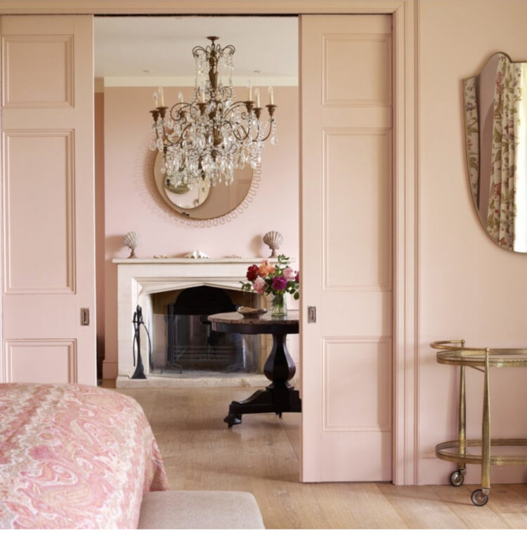
The bedrooms and bathrooms at Thyme England are all lovely and while this is very pink it’s the double sliding doors that attracted me to this space. This is Edward Bulmer’s famous Cuisse de Nymphe Emue pink and it likes a bit of dark wood, greens of any shade or even a spot of yellow/brass to tone it down a little. It will also change according to the light – in a south facing room with a golden glow expect a more intense peachy shade. In a blue tinged north-facing room it will be cooler and less intense. Check before you buy.
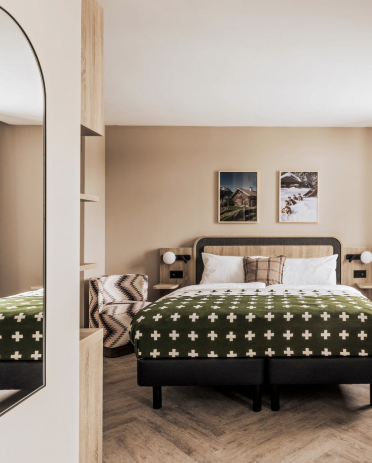
And talking of pink and green, the latest project from Run For The Hills is the Faern hotel in Arosa, Switzerland. Pink and green is a classic – it certainly has its Wes Anderson moment but I prefer a dirtier olive to a zingy emerald. You may want to go mint. That’s the joy of colours – there’s a shade combination for everyone and the light, the furniture, the accessories and the exact shade will make every single one look different.
Pink is here to stay – it’s what you put it with that is changing. Are you going terracotta or olive or even mustard or are you at the fresher end of the spectrum?


Oh love that hallway. Hear you on the internal windows. I’m having two put in today as part of a larger project (I can hear the builders knocking through the walls as I write) and have had to compromise on size (smaller, but no need for steel vs the bigger ones I wanted that needed massive steel and were way more expensive). Hopefully will still be worth it to get extra light into the dreaded Victorian ‘middle room’. Hope you get to enjoy it all soon! From a fellow dust-covered renovator.
Hello Kate! thanks for continuing to post through the madness of the renovation. Have to say that your stories of ballooning planning costs (before even getting to the actual labour and materials bit) put me firmly off attempting anything here that can’t be done through paint, furnishings, fabric, lighting…the more portable, the better at this stage.
Big fan of pink here too, although of a more taupe/beige fade to neutral than the rosier/fairy’s thighs hues here. It is a brute to get the right shade: F&B’s Pink Ground and Setting Plaster turn to orange/peach horrors in my house (my house hates Farrow and Ball generally, in fact – painting big bits of paper to test doesn’t work when the chemical reaction between paint and surface does things to the colour). Atelier Ellis’ Stony Plaster is good in one room, especially at night, but was chilly elsewhere. Little Greene’s China Clay is fantastic on ceilings, (except in one room, where it came out horribly sugary) , no grey or lilac at all, but China Clay mid comes out lilac – completely different shade, not just a tonal variant. Little Greene’s Castell Pink was too brown in one room, but came out the exact warm shade of very milky coffee with rosy undertone that I was looking for in another. Ferdinand was brown in one room, near white in another. Dulux Powder claimed to be pale pink, came out grey, wherever I tested it.
The waste involved in all these sample tins is a crying shame, but I have found it worth persisting.
I’ve had a similar problem with sample paint reacting and changing colour when applied to a previous painted surface. Little Greene on suspected Dulux. Is there a solution? Layers of undercoat?
Honestly, I don’t know what the solution is, beyond brute trial and error. Your house is your house, with its own peculiar chemistry. Some brands will say, use their undercoat, and all will be well. But I tried that with F&B on a ceiling, and when the F&B top coat was applied, it peeled the F&B undercoat off in strips.
Sisal rug under a smaller rug is a very clever suggestion. Thank you!
Looking at the Hotel Les Deux Gares, these rooms were designed by Luke Edward Hall, who is a very talented designer who is v creative with colour combinations. Love seeing his house in the Cotswold for inspiration.