Off to a grand Victorian house in south London this week which has taken full advantage of the large rooms and high ceilings to really make bold use of colour. But before you worry this isn’t for you, the colour drenching used throughout this property works brilliantly in smaller rooms with lower ceilings so this house, which is on the market with Inigo can still provide inspiration on a decorative level even if the budget is fantasy.
It’s on for £2,250,000 and has four bedrooms and a self-contained one bedroom apartment on the lower ground floor that could be incorporated back into the main house. It sits on a leafy road and has off-street parking and a garden studio in the 10oft long garden. All these features, together with the original features are now causing Londoners to nod in weary recognition of where the price comes from even if it’s unaffordable to all but the one per cent.
But, as I say (nearly every week/when I remember) this is Fantasy Friday and we’re not here for the finance we’re here for the fun . It’s about the possibilities of imagination rather than the practicalities of the mortgage broker. So, on that note, are you coming in?
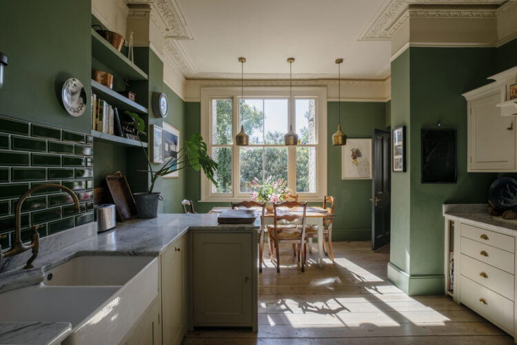
Now let me say first up that this is a lovely kitchen. And this is a great example of how you can completely change the look of a kitchen with a lick of paint. The floor and cupboards are neutral, the walls and tiles are green. That’s a fairly simple change to completely alter the look of the room – you could even leave the tiles if you wanted to paint the walls a complementary colour – pink for example – the new neutral.
So kitchen refresh aside, I am wondering about the pendant lights over the table. They’re in the middle of the ceiling but they’re not in the middle of the window so they don’t hang over the table, which is in the middle of the window. Now perhaps the table has changed since the lights were installed – think about that before you fix lights as something simple like a new table can throw everything off.
But it’s a common enough problem – do you line up lights with ceilings or windows or other features? This often comes up in relation to picture lights, or perhaps spot lights round the edge of a room. If you put a spot light between two windows you can never change the position of the artwork as it needs to line up. Better, instead to put a fixed light over a window as that won’t move. And here, it might have looked good on the ceiling to put the lights in the middle but it has thrown everything else out. So as a rule of thumb I would say use fixed architectural points for reference and then you can move furniture and artwork around.
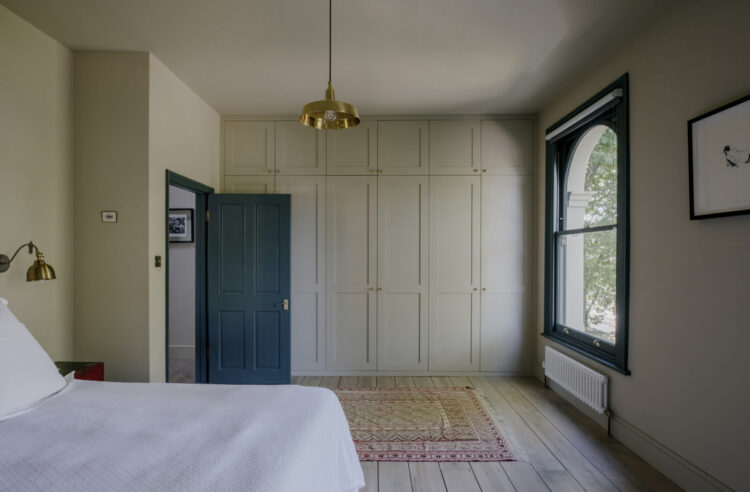
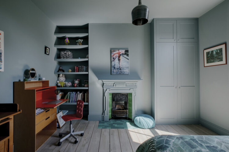
It’s a similar thing in bedrooms and has long been a personal bone of contention for me. Here the pendant light hangs down somewhere near the end of the bed where, yes, it gives a general light but it’s also highlighting a patch of bare floorboard. Now I get it – ceiling lights can be tricky to move and it involves an electrician but if you’ve got one coming anyway there are options.
Changing and lengthening the flex will allow you to move the light to a different part of the room and suspend it from a cuphook. In this case you could move it to that corner by the door and the bed and it could double up as a bedside light. Or you could move it directly across to hang between the two windows and perhaps put a dressing table or ottoman underneath so it had something to shine on and had a reason for being. That would also finish off that wall. If you felt there wasn’t room for a piece of furniture then a picture would work just as well and take up less space.

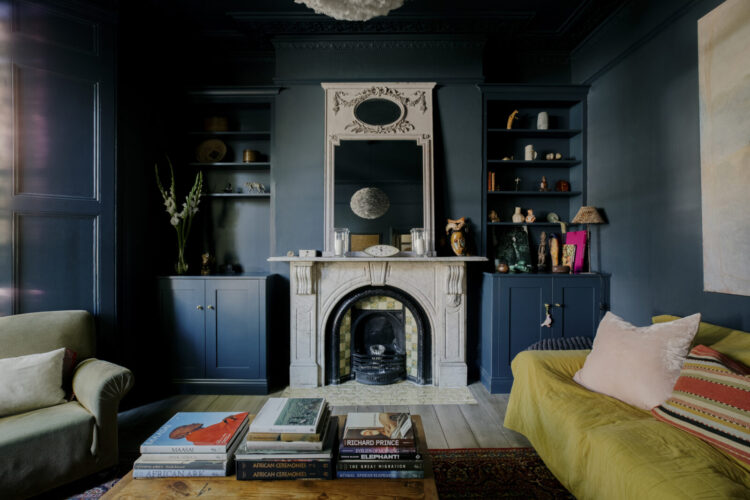
Right lighting homily over, let’s talk colour. As I said at the top colour drenching – or wrapping the same colour all over walls, woodwork and ceiling – is hugely effective and can be either dramatic, if you use a dark colour, or calming and restful if you stick to something paler.
As a guide if you the room is already small and dark or you use it mostly in the evening to relax and feel cosy and cocooned then dark colours work brilliantly. If it’s a space you want to be in during the day then you might prefer to use a paler colour. Some don’t call this drenching as they prefer to use that term for dark colours so if you’re interneting for the inspiration then you might need to add the word “pale” to your search.
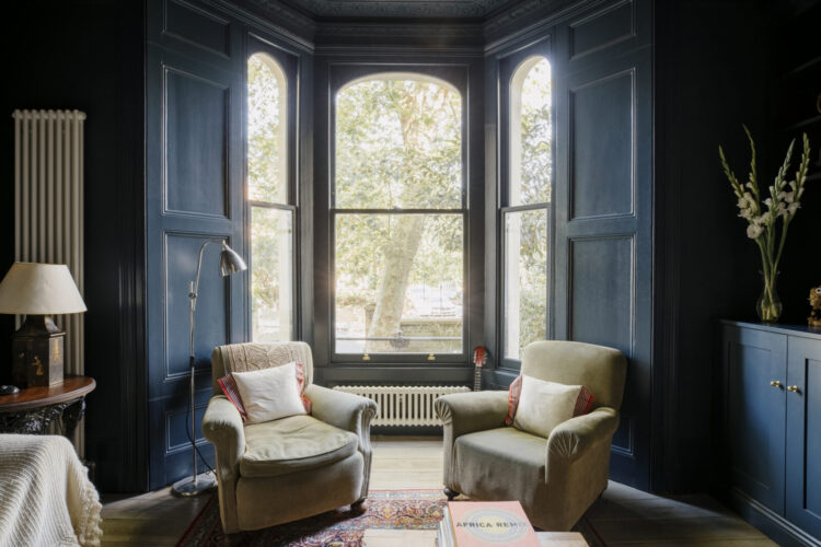
Below is another blue room where the ceiling wasn’t drenched but it would have worked well if it was, although the reflection of the chalky blue onto the ceiling gives a sort of tonal look. You can see that the fireplace, wardrobe and shelves have all been painted in the same colour.
This has the effect of calming the room and making it feel bigger as the eye isn’t constantly darting from corner to corner. Colour drenching used to be called the gallery effect (although now this just seems to throw up endless gallery wall images) and that’s because painting out the background like this allows your art and furniture to really stand out. So whether you’re coming at it from the perspective of an art collector or someone who needs to make something feel bigger than it actually is – also an art – then colour drenching is your solution.
Before we go a final word on windows. If you don’t want to colour drench -and you might not want to do it in every room after all, then you might want to concentrate the colour on the window frames.
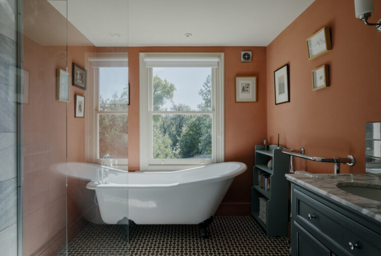
Below this is a lovely warm shade of terracotta that’s great for a bathroom where there is often a lot of shiny white. The ceiling talks to the black and white floor so no need to do that orange as well as that might feel somewhat claustrophobic. But the window really stands out. If it matched the wall it would immediately draw to the eye to the view beyond whereas, in white, you are immediately conscious that there is something between you and the view. In white the window acts as a barrier and breaks up the flow.
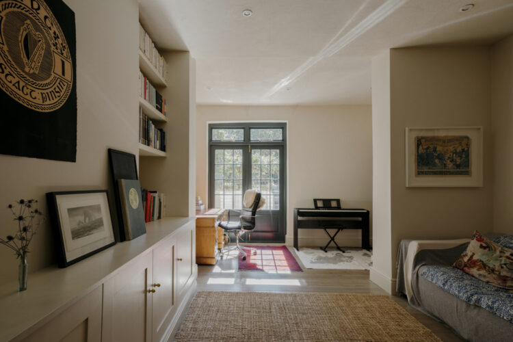
But that’s not to say you can’t use a different colour on your windows even if your walls are pale. The other way round – white/neutral walls and a coloured frame acts as just that – a frame for the view. As you can see below.
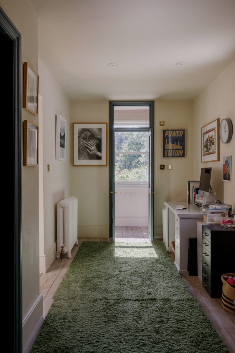
And in this corridor, painting the whole frame in a dark colour serves to draw the eye up and make you aware of how high the ceiling is before taking your eye to the greenery beyond. It works really well this way round but less well when you leave a white window on a strong wall.
On that note I will leave you to thoughts of paint and lighting for the weekend. The blog will be taking a small break next week as, some of you may know, Sophie and I are taking a group of 24 ladies to Italy – Milan and Venice – for a design trip and I will then be in Turin for two days to check on house progress and, hopefully, visit a vintage shop we have discovered to start picking up some furniture to fill the gaps. We’re still on a Christmas deadline for it all to be finished and have promised to cook the builders lunch on 22 December. They insist they are looking forward to this and will be ready.
So while I won’t be here I will be over on instagram so do check in there for updates and stories.


Interesting that most of the rooms don’t have any cornices or ceiling centres. I can see one where they have drenched the blue sitting room, including the decorative plasterwork. In the other room, they have brought the (pale) ceiling colour down to the picture rail.
I’m curious about any experiences/views on colour drenching the plasterwork in a modern (2.4m ceiling height) room. Do the same principles apply?
Have a wonderful time in Italy, I’ll look forward to the posts from there
I love to colour drench a room but I’d include the radiator. 2 rooms here have radiators that scream at me. When I do colour consultancy I always recommend toning the radiators back into the walls. Both these rooms have really attractive radiators so I understand why you might want to make a feature of them….just that I wouldn’t.
Hmmm, in the oldie days, colour drenching was painting everything white, or magnolia, or limewashing…..
Agree re the pros of colour drenching – not only can it up the visual impact of a room’s contents, but I find the contents talk to each other better. I’m less concerned with ceilings being white – sometimes one needs the visual air they provide; a ceiling gently reflecting the colour-drenched walls can be a bonus. Re lighting, hardwired can often be a pain, especially for those (me!) who like to play with layout. Fingers crossed well-designed wireless lighting surges so we can enjoy prettier options sans électriciens!
I also find this technique useful in old houses where nothing is ‘straight’, by painting the walls, ceiling and woodwork all the same colour the eye isn’t drawn to any imperfections (character :-))
I utterly agree