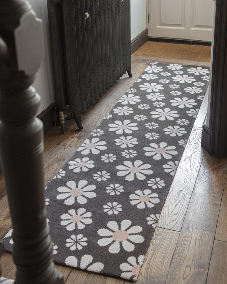
Goooooooooood Mooooooooorning everyone. I trust you are well-rested and fully caffeined and ready to start the week. I have some lovely room inspiration for you today but I’m going to start with a picture of my new Quirky Bloom carpet that I designed for Alternative Flooring as, if any of you are heading to Decorex I will be there this afternoon and it would be lovely to meet you and for you to see the carpet in real life. More on how you can see it in Wednesday’s post as it officially launches this week.
Now some rooms and let’s start with this gorgeous kitchen by Alice Grace Interiors, a design studio based near Bath. Now Alice is very clever at adding character to new build houses and she has also just launched a shop with some rather lovely pieces of furniture.
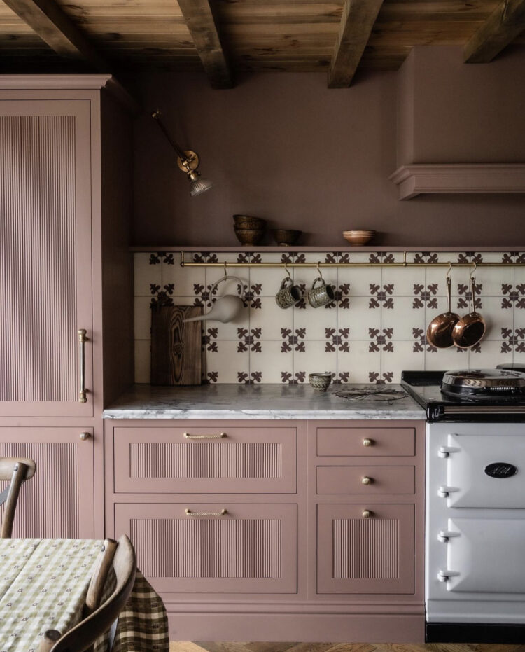
Pink is a colour that is showing no signs of disappearing and you can see here how Alice has wrapped it round the cabinets and walls for a really cocooning effect. The patterned tiles – in recent years a bit of a kitchen design crime but something I suspect is about to come roaring back into fashion – make a really great contrast to all the solid blocks of colour as well as lightening the room. The brown of the tiles also talks to the ceiling beams and the vintage wooden chairs.
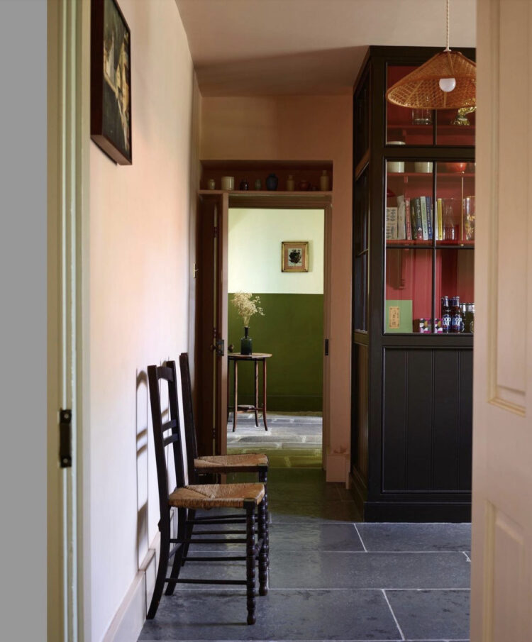
Staying in the kitchen and keeping the pink but this time there is a darker slate floor and you can see from this shot the importance of remembering to consider the view from one room to the next. In this case the green is perfectly framed and draws the eye. Now you can either centralise the artwork within the frame of the door to create a second, real life picture or, as has been done here, you can put it slightly to one side like the table so while you are still getting a frame image the eye is also drawn to the sides which tells the brain it wants to go and see what’s around the corner.
So, perhaps you might centralise a picture if it’s looking into a bedroom as you don’t necessarily want to encourage everyone to go tramping in there – a central image is a complete vignette in its own right – or if it’s a passage or room that you want people to visit you can cut part of it off – it’s like a beckoning finger… “come this way…”
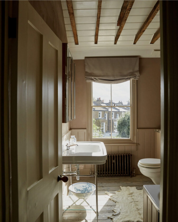
Moving rooms but keeping colours. Pink is a colour that is universally flattering to the skin – when it’s this soft plaster version – the hard blue magenta of Barbie less so – so it makes perfect sense to use it in a bathroom. The ceiling perfectly echoes the colours below and while beams can often bring a ceiling down and make it dark, here the contrasting colour of wood and paint adds interest and character. The basin looks very much like this one from Burlington which comes in 120cm wide so there’s lots of storage at the sides.
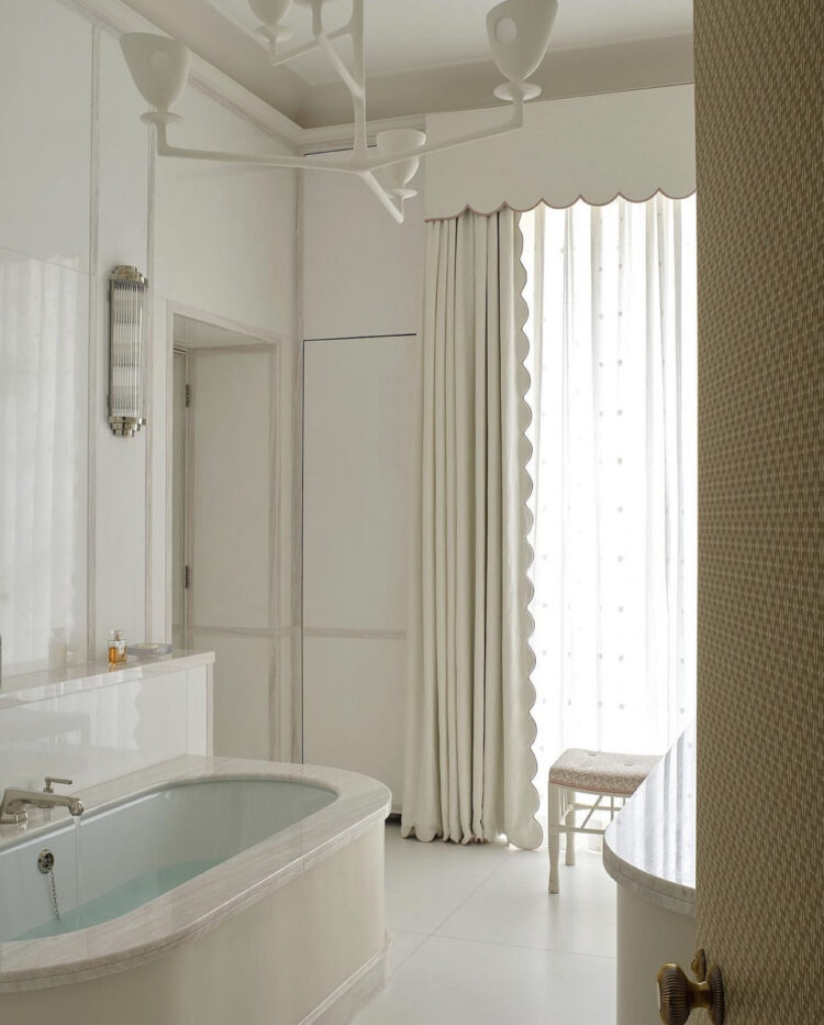
Now bathrooms are often white – it’s the default colour for many of them. Partly, perhaps, because white speaks of hygiene and often because it’s a small room and light colours are used to make it feel brighter and more spacious. But, as we also know, lots of white in a bathroom can feel cold and hard, particuarly, given the materials involved. So here is a simple trick – curtains – also in plain white – but with a pretty scalloped edge to soften it all.
I’ve said before on these pages the importance of texture to any interior scheme but that importance is tripled if you using a very simple colour palette. You can use as much white as you want but if that is your own colour and you don’t want it to look like a hospital you need to find a way to soften it. Fabric is ideal and, within that, shapes. Given that not everyone will want curtains in a bathroom (nor perhaps have space for them) consider a scalloped pelmet or a softer more relaxed blind. And the woman you need for this is Camilla Hampton who makes scalloped edging for shelves and pelmets and anywhere you might want to add a little curve.
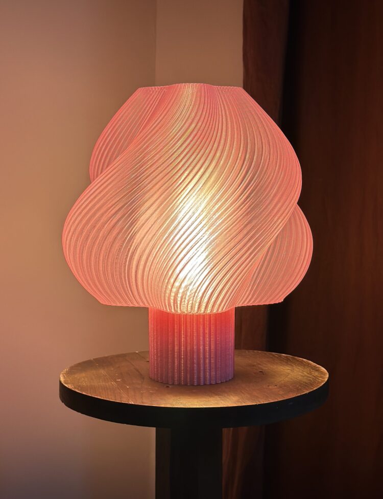
Finally, a little shopping for you. This lamp has been 3D-printed from recycled food packaging in Sweden and is available exclusively in the UK from Att Pynta. They very kindly sent me this one to see and I’m lucky to still have it as the 20yo immediately tried to steal it. It’s called Soft Serve as it clearly resembles a scoop of ice cream and comes in 12 colours. I plan to take it to the house in Italy where it will work brilliantly as a bedside table lamp.
Right I’m off to Decorex. I’ll share more on instagram stories so do follow along there and I’ll be back on Wednesday with more details of Bloom as it officially launches.


Hi Kate. Thanks so much for all the inspiration on colour. I’m just about to paint my (small) bathroom pink and the colour above is perfect. Do you know the name of the colour and company? I was thinking of F and B plaster colour but this looks a bit deeper.
I don’t but you could try sulking room pink by F&B or Ruse by Paint and Paint & Paper Library
Thanks for replying Kate. I have Sulking Room in my bedroom (thought it was apt!) so will look at the other one.
Sorry to have missed you…. we were at Decorex on Sunday, and we absolutely loved your carpet design!
Thank you so much, sorry to have missed you too.
That lamp!! I have been looking for something beautiful for my sitting room and it also comes as a pendant light. Two will be ordered when the decorating is underway.
Love the lamp. I’ve got the Le Klint model 172 and it always reminds me of softscoop icecream as well.