Welcome to a new week. At the time of writing the sun is out, the sky is blue and while the house is still full of dust we have reached the decorating stage of the kitchen renovation. So, after a super stressful day when the worktop was due (hence the lack of post last Friday) but did, in the end, arrive, there has been a weekend of laundry and sleep and we’re ready to roll again. And yes that counts for excitement around here these days.. don’t knock it.
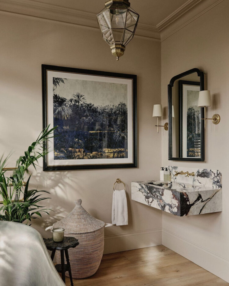
We’re going to start with this bathroom which stopped me in my scrolling tracks the other day. I’m a huge fan of everything Studio Duggan does and while you can see, if you visit the original post, the copper bath that is also in this room, this particular image was to show you the power of making sure you have one dramatic, or showstopping piece per room.
Long term readers will remember the 6ft tall palm tree lamp from the old house which drew the eye in the sitting room. Or the wall of open shelves in the kitchen. It doesn’t have to be expensive but it does have to be there. Now this basin won’t have been cheap but it’s really elevating this room.
I found a few alternatives if you are interested. This is £129 from Victorian Plumbing (marble effect) compared with this wall mounted version from Lusso Stone for nearly £900. As always it’s about working out what your budget will allow and how you want to allocate the various parts of it. I have mentioned before that I have made shower curtains rather than spend money on expensive glass shower screens. You might choose a regular loo and bath or shower, alongside an incredible basin that will give you pleasure not only every time you use it but every time you walk past it.
Next there is a slide into the classic colours of Spring and Easter sparked, in part, by a box of mini chocolate eggs I was given last week, and in part by the sudden appearance of daffodils at every supermarket check-out. Many of you will know that I find strong bright yellow best left to the garden but this slightly washed out and muddy version felt very calming this week as I was raging round the house wishing the work to an end.
If pastels are a little to clean for you (as they are for me) but you find yourself attracted to them then pick a slightly greyed out “muddy” version – think of those dusty colours in the south of France – lavender and mint with dark green shutters against pale yellow houses. Add dark wood and vintage rugs rather than the clean bright geometric shapes of modern ones and keep the number of colours down, opting for tonal versions of the same rather than introducing a rainbow of colours.
I am aware that some of you will want a rainbow of colours in which case this piece of advice is not for you. This is for those who want to be a little bolder in their choices but aren’t sure how to go about it. Another point to note is that if the pink of the top bathroom were green or yellow it would fit right into the room above as all are in the same palette of pale dirty pastels.
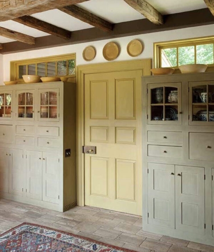
Here we’re taking the same yellow and green and setting them against a grey wall. You might not want a grey wall but the point is to show you how you can add other colours that are not pastels to the mix and stop it becoming too sickly sweet.
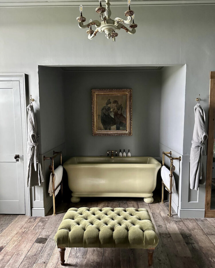
Note also the return of the avocado bath. I remember very clearly my mother being given permission to redecorate the downstairs loo of my Grandmother’s house where we lived for a number of years. She came in triumphantly saying she had found a new colour for the walls that was called avocado. “Yes dear,” said my Grandmother vaguely. “And what exactly is that?”
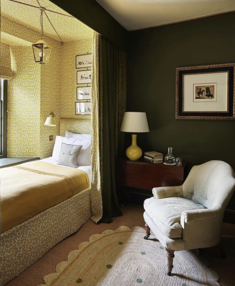
Moving on to the same yellow and green colour palette but this time intensified from pastel to olive green and a much stronger shade of yellow. This illustrates that old adage of there being no such thing as the wrong colour only the wrong shade. If your reaction to a colour is a hard no, trying mentally running it up and down a sliding scale of light and dark. Sometimes, for you, it will still be a no, but at other times you will find a version that you like. This is also good if you are decorating with someone and have to take their tastes into account. If you don’t like green (*waves to the green-hating reader) then you might want to swap this for a shade of blue. If the yellow doesn’t work for you then try replacing it with a variety of pink. And you only have to imagine this green set against everything from plaster to neon to see how much of a difference changing a shade can make.
Finally, we’re dumping the green and going all out yellow but again it’s a dirty yellow. It’s what plaster pink would be if it were yellow. It’s back to the south of France with its dusty yellow houses. This is a yellow I can do business with. Perhaps not on a wall – although perhaps I mean not on a wall in London – because we must also always take the setting into account when we pick colours. But in addition, this room needs that black and white striped lamp base and the black curtain poles that are creating the four poster effect.
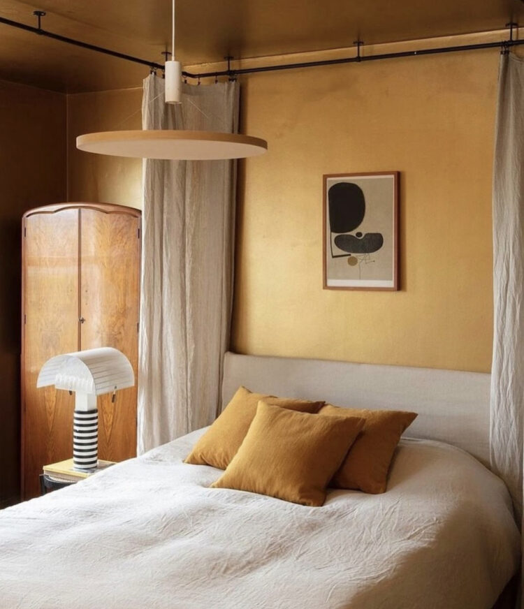
And on that note it puts me in mind of my mantra from the 2018 Mad About The House book, which, in turn, sprang from a post way back in 2016 as part of my top ten interior design hacks: Something new something old, something black and something gold. I stand by it.
So have you changed your mind on colours recently or realised that you like some shades and not others? I’ll go first – yes to navy no to sky, yes to olive no to sage.


“Something new, something old, something black, something gold” has become my mantra as well. And always, pops of colour and pattern against a neutral background. Cheers from Canada!