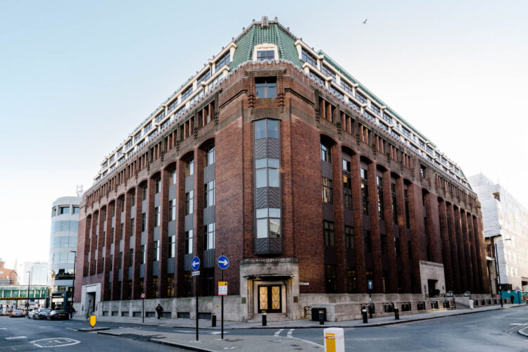
This two bedroom apartment in the heart of the City of London is, says Historic England, an “unusual example in Britain of the German Expressionist style” and was Grade II listed in 1990. It is also a blend of Art Deco architecture and Moroccan style interiors. But before you panic that there’s a lot going on remember that colour can be changed and it’s about how you choose to add character to your own places and spaces.
It’s on the market with Inigo for £610,000 and, in addition to its City location, has a two bathrooms and a large open plan living dining area. It’s on the fifth floor so the views are also amazing. If, like me, you are unfamiliar with German Expressionism in architecture you can read more about that here. Built in 1932 as the London Headquarters of the Co-operative Wholesale Society, it was designed by Leonard Grey Elkins, inspired by time he spent in Germany and Belgium.
Now you might feel that adding Moroccan influences to the interior design is a leap but the external architecture includes cement that has been carved out to look like stone with Egyptian motifs above the doorways – both styles use similar Moorish style elements and colours. So, with a rough context in place, who fancies a look?
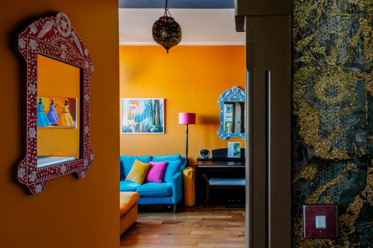
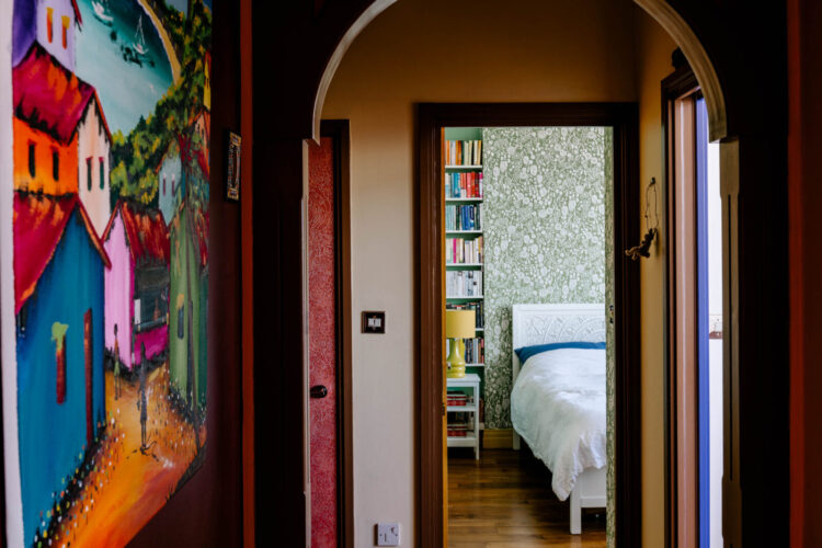
So starting in the sitting room and you can see how this space not only draws the eye to the view but the warm colours and jewel-like furnishings immediately bring more personality to a space that doesn’t really have any distinguishing characteristics. It now feels warm and cosy and, crucially, like it has something to say. Strip out the colours (and remember you can choose different ones) and it would revert to a white box.
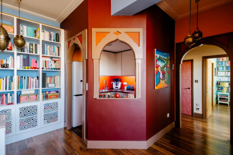
The kitchen is small but if your kitchen is also in a corner of a room you can hide the working parts by building a wall around it like this and creating an internal window in any style you like. I rather love how this echoes the arch of the door to the hallway although I would have painted the plug socket.
Below is where to start to get a sense of the layers building and of views beyond views.
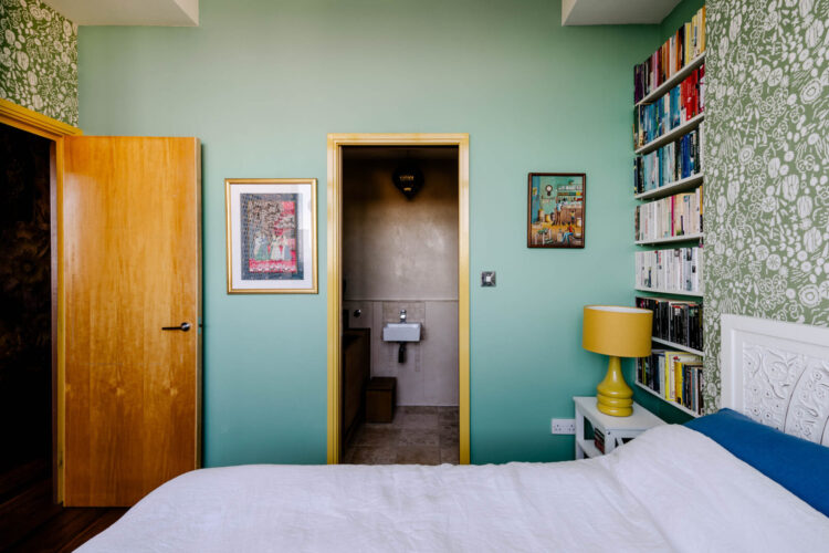
The colour scheme changes abruptly in this room from warm jewel tones to a more calming shade of soft blue green (try Little Greene aquamarine) with yellow accents – check out the door frame. And this brings us onto the key consideration when it comes to choosing your palette.
If we assume that picking colours you like is a given, the most important thing to think about is how your favourite colours make you feel. We know that in classic colour psychology green and blue are said to be calming and therefore good for bedrooms but the exact shades will be down to your personal preference and reactions. Sometimes a reaction is instinctive and there’s nothing you can do to fight it.
So you may feel that emerald green isn’t restful but, in your case, energising, in which case you don’t want it in a bedroom. I never have blue in my decor and, a professor of colour at Leeds pointed out to me a couple of years ago, I’m a rubbish swimmer and don’t really like the water so perhaps it’s not as random as I might have thought. However my engagement ring is an aquamarine which reminds me of the sea in Italy as seen from a beach! I love dark foresty greens and find them restful but am, for reasons I have never fathomed, not a lover of sage green.
If you aren’t sure about your colours and corresponding moods then take a bit of time on Pinterest, or looking at these rooms for example and try and tune out the furniture if it’s not your style, or the wallpaper and focus instead on the colours. Imagine sitting in that room and take note of how it might make you feel. Would you feel relaxed and calm, cocooned and cosy, ready for a party or a row? And finally remember – there’s no such thing as the wrong colour only the wrong shade. So if that orange makes you want to shout, imagine taking it back to a paler version and perhaps it might make you feel conversational.
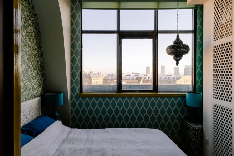
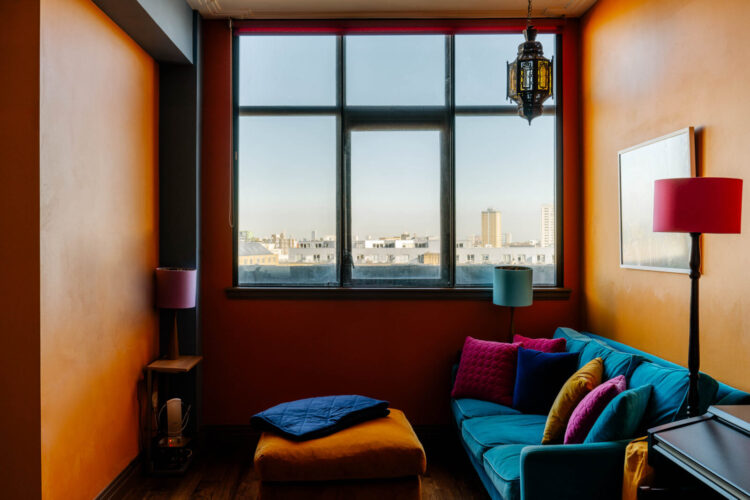
Above the bedroom is blue and green, which I seem to remember mentioning is a combination that is about to be super fashionable – in whatever shades you choose. But leaving the colours let’s discuss the ceiling light. Big lights, as they are often called, tend to hang in the middle of the room. In this case that would be right over the middle of the bed and if the ceiling isn’t very high it will be in the way. In larger rooms they are often pointing at the floor at the end of the bed – lighting basically nothing.
If space is tight then move it to a corner where it will still light the room but it won’t be in the way. And, in this case, the sculptural shape of the shade creates an interesting silhouette against the window and draws the eye to it and the view beyond. Its shape is also echoed in the wallpaper under the window.
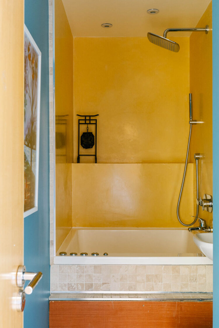
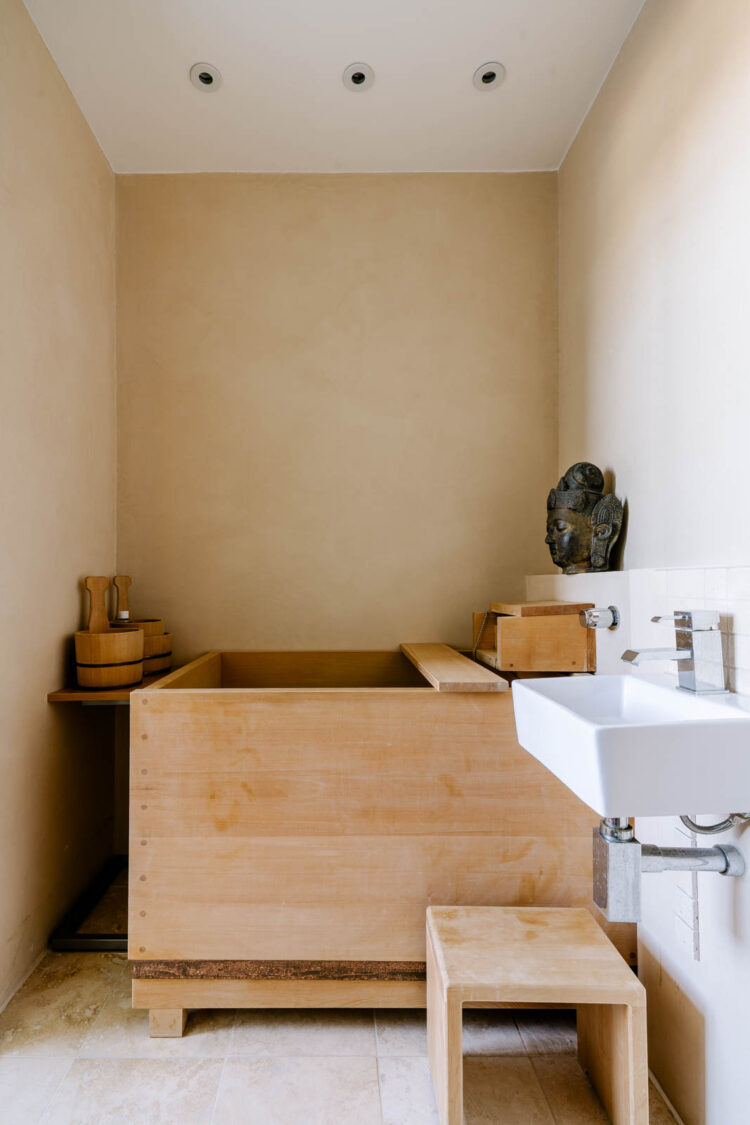
The bathroom above takes the blue and yellow from the bedroom and uses it in a different way so the colour schemes are linked but not copied. The bathroom below uses more wood and is – to me at least, a very calming space. The colours are neutral but natural wood has been proven to lower your heart rate and reduce stress which is why these deep Japanese baths are so popular.
In addition, the yellow bathroom has built in speakers and chromatherapy lighting so you can adjust the settings to create a more spa-like feel. And if you saw how many press releases I am currently getting about the wellness/spa at home trend, then this feels not only of the moment but practically essential!
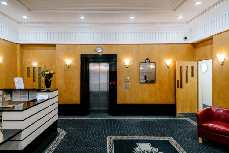
Just in case you are buying this one then there’s the lift. I once lived in a six floor apartment with no lift and a tiny square bath so this has a familiar feel to me. This is a lovely entrance to come in to although bear in mind this is leasehold and your service charge is £2,800 a year and part of the reason you can have a lovely entrance.
So colour lesson done. Let’s hear about how different colours make you feel in the comments below. I will tell you that once when we were recording the podcast in Sophie’s old rental flat (since sold) that she had just redecorated in vibrant shades of emerald and purple, floral and leopard I was in a fury the entire time. It wasn’t until we hit the grey rain-soaked streets of Brighton in search of coffee that I exhaled and understood for the first time that strong colours aren’t for me. It makes me tense. Give me tonal maximalism every time. Sophie, on the other hand, feels her life force ebbing away in shades of grey and brown and relishes the energy she receives from more vibrant colours. No-one and nothing is wrong just make sure you take the time to work out what is best for you.


I love the sense of vibrancy in this home. The owners have curated colours which contribute energy, warmth and a sense of the exotic. I love the Moroccan light fixtures. Before ordering a rice paper ceiling shade from an etsy seller, I wondered if I had made a wise decision, as the shape of my bedroom places the ceiling fixture about the middle of the bed. After reading your note on big lights, I did check, and yes, it’s placement works. The Japanese style bathroom is one I would love to own.
I have two chaise lounges upholstered in an oatmeal linen. I found two Indian cotton throws in a similar shade at the local Home Hardware store. The throws are finished in cotton tassels. This small but decorative feature elevates the look. A small but significant nod to the exotic.
I’ve always been skeptical of using colors that wouldn’t “normally” be used together, until using Harlequin Kienze bronze/graphite wallpaper on a long bedroom wall. The other walls are a very light gray, a large rug in a couch/desk area is white, cream, gray and a sort of muted light caramel. A second rug from Feizy was called “charcoal” online and arrived dark olive/brown with a slightly grayish raised design. I almost sent it back, thinking the charcoal floors and other gray elements would look awful with the rug, but rolled it out and lived with it for a bit and now love it. This is not a color scheme I would ever have contemplated, but the wallpaper pulls it together and people have commented several times about how beautiful and restful the room is, despite the size.
Such an interesting analysis today Kate thank you. I adore colour and like a lot of it around me, but need our bedroom to be calmer – I had an interesting reaction to the yellow in the bedroom for instance, made me shrink back, yet I love gold tones and yellow accessories in our dining space/hall (hard to know what to call it). I am definitely going to be having a wander about today and double checking my reaction to things we have going on here.
My sitting room is painted in Ben Moore Guilford green, a slightly sage green and I painted the kitchen open to it a lighter, slightly cleaner version. We now have 2 French doors out to the back deck which is my only rear gardening space and I wanted that end of our rowhouse to feel like a garden room. In our bedroom I did the walls in a mid tone coral with a soft light pink for the stenciling of a Morris marigold pattern- all the walls to within 7” of the ceiling. At first that strong coral had me freaked out, thought it was a terrible mistake but it’s a dim, north room so I pushed on and got floral fabric for drapes that was midway between the two wall colors. That really helped. A friend thought I should introduce some green for the top border where I decided not to stencil. My kitchen color works great there on a sample board. This collection of colors is really different from my much safer ventures! But in the glow of the lamps in the evening is very cozy for me.
I liked the Japanese bath …
Thanks for this Kate. I started reading this wishing you would feature more non London houses (I am in Scotland so love it when you travel around the UK a bit more!)
But then I realised that the total joy of your Househunter posts is the fantastic analysis which is always so perceptive. I feel like a pretty observant person who is obsessed with interiors. But your posts always pick up on things that I might have completely missed, or ‘felt’ but wasn’t able to understand/analyse myself. So thank you for your wisdom!
Finally whilevreading your commentary on this home I had a total brainwave about a colour we had been mulling over in our own house. So double thank you!!
This is in my apartment block and my husband and I were so surprised when we saw what could be done in one of these flats. We are currently in the middle of renovating ourselves so it is fun to see how creative these owners have been. The building was converted from offices in the late 80s/early 90s and the default tiling in the kitchen and bathroom was rather dated by the time we moved in, and I’m still trying to temper down the orange pine everywhere and replace all the shiny chrome!
We may not get the views but we do overlook the courtyard which makes it relatively quiet for central London, and unlike this flat we are fortunate to have floor-to-ceiling windows in the living and bedroom which makes it gloriously light. The ceilings also seem much lower – ours are about 3 metres high with some originally features – so I’m also feeling grateful for that.
I know the service charge seems high – especially for those outside of London – but the concierge team are all amazing, and the quality of the interiors and service we get feels worth it!
That’s amazing! Thanks for sharing this. So interesting to hear about your space and experience of living in this block!
Perhaps with the exception of the darker bedroom, I’d never do this and couldn’t live with it for more than a weekend. But I still love it. It works on it’s own terms and has a real personality. It must have taken confidence, I’d love to know more about whoever did it.
I adore the bedroom, although I’d want to get rid of one of the two bathrooms and make it bigger. But it’s so interesting how something with so many colours and patterns in such a small space can feel calming.
All those colours make me confused and uneasy. And the first thing I would do is rip out that ridiculous kitchen wall. Still, fab views and lots of space for the price. Cheers from Canada!