And there we are right back in it with a virtual visit to our first house for sale of 2019. And it’s a beaut. A converted jam factory in London, it’s a four bedroom maisonette (which means duplex for US readers) and is on the market with The Modern House for £1,795,000.
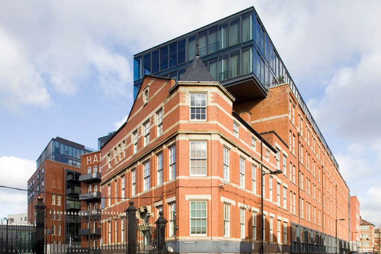
I’m aware that some of you will find this extension controversial but I think it’s rather brilliant. Sometimes you can add on in keeping with the original, but often you create a pastiche of a style or it doesn’t quite match or fit proportionally. Adding a red brick layer on top would have spoilt the shape of the original building, so the architects, Simpson Haugh, have quite simply added a completely contrasting modern glass storey and although it does look as if it’s perched on top it is, I think, the best solution. And I would also venture that since so few of us actually look up when we are walking around cities you probably wouldn’t notice it as much as you think from this picture.
The former Hartley’s Jam factory is in Bermondsey and you can read about its history here and see how the extra layer has been added onto the original building.
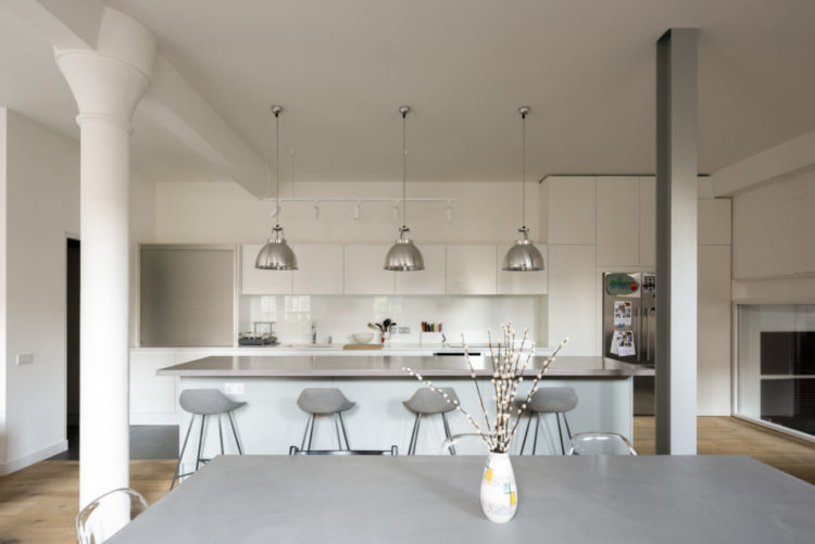
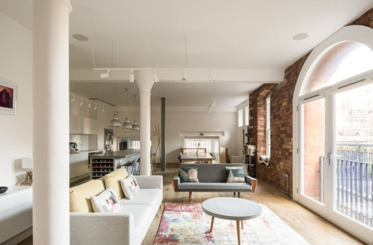
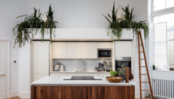
The whole building has been converted into flats and this apartment is set on the lower and raised ground floors in a corner so it has more privacy than the others. At over 2,000 sq ft, it’s also one of the largest in the block.
As you can see the living space is open plan and there are various tricks you can employ to zone the space even if yours isn’t as large as this one. Use different lighting in different areas, as you can see has been done here, with pendants over the island and task lights pointing towards the worktop.
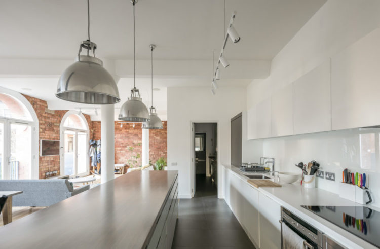
You can also mix up the flooring although sometimes, unless the space is very large, that can result in a slightly “bitty” feel. Instead, keep the flooring uniform and break it up with rugs. Or you can use tiles in the kitchen area and wood in the living areas.
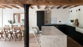
Here the space has been zoned by the exposed brick wall which forms a corner around the sitting area while linking to the dining space. This building also benefits from the pillars which create natural stops between areas.
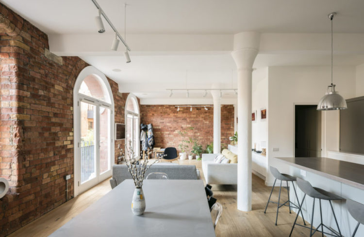
I love light and airy feel to this apartment but, if you lived in something similar, or open plan, you could also paint the beams in a dark, or feature, colour to break up the space a little more.
And you know what I’m going to say about that rug don’t you….
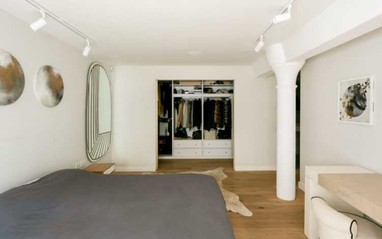
Now look at this. At first glance it looks like a free-standing wardrobe with a jazzy pattern painted on the door. We can all do that you think as you contemplate your own, inherited, slightly unattractive, fitted wardrobes. But take a look below.
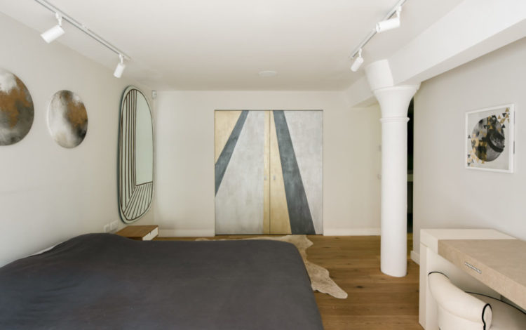
It’s actually a sliding door to the wardrobe and this is something I have often suggested to clients. Firstly – always consider a sliding, or pocket door in a tight space where the door is taking up too much room. It’s not the cheapest solution, but the gain in space may well make it worth it. Secondly, if you are fitting one then consider painting it in a contrasting colour or colours to make a feature of it when closed as has been done here.
So that’s this week’s property. Whaddyafink? Anyone moving in? I would for sure. I should add, for anyone who’s thinking about it – and received 1.75m for Christmas – that there are three bedrooms on the floor above including this master suite with its own bathroom, and two more with a bathroom to share. The fourth bedroom is by the living room and is at the opposite end from the utility room and loo, so whoever sleeps there needs to be last to bed, unless they want to walk through the sitting room for their midnight wee. Alternatively it would make a great office if you needed only three bedrooms and an occasional spare. And were a disciplined enough homeworker to be able to walk past the fridge without diving for snacks every time you got up from your desk.
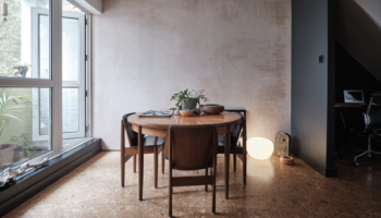
Mostly though, take note of the pale walls. Going to be a lot more of that in 2019.
I love the space, I would add a few more pops of colour here and there.
Nope!! Won’t be spending my millions on this one Kate!! I really feel it looks like someone plonked a plastic Ikea storage container on top of the building. I’m quite sure the architect could have been a tad more creative – sorry 😏
Interior on its own is nice if a little bland and smacks a little of “been there-done that” …. we need Sophie in there for colour!
Golly gosh, clicked through the vendor links and it’s all a bit dreary other than the pillared lounge diner kitchen area, which is lovely, if a bit ooh zoned. Bathrooms remind me of hideous school showers. Your house far more beautiful, don’t waste your unicorn millions on this. Happy New Year from a welsh based lurker.
Hmmmm. It’s as if your dear Auntie Flo decided to don a modernist fascinator. Is she now edgy and cool, or does she just look a bit barmy?
I think the addition is architecturally gross, although I can see your point that it would be much more unnoticeable from almost any other angle. The photographer obviously loves it as this is probably the most intrusive view. The windows are very nice and I do love a nice window. I wonder if the addition on top has roof terraces? But then I would be torn between the appeal of a roof terrace and the dissatisfaction of living in an apartment that has none of the charm of the building it was sitting on… What a dilemma, eh? So I’ll save my shekels this week.