We have all become much more adventurous with colour when it comes to our walls (and furniture come to that) but sometimes it pays to be a little more adventurous when it comes to ways of using that colour. Regular readers among you will know that I am always banging on about painting the skirting boards to match the walls to make them look taller, and therefore the ceiling look higher. But there are other things you can do to create impact and interest and so today I thought I would round up a few clever ways with paint.
Often the problem is simply that it’s hard to visualise what a room will look like with certain paint effects so I hope this post will act as a sort of virtual cut out and keep guide to anyone who is thinking of picking up a brush any time soon.
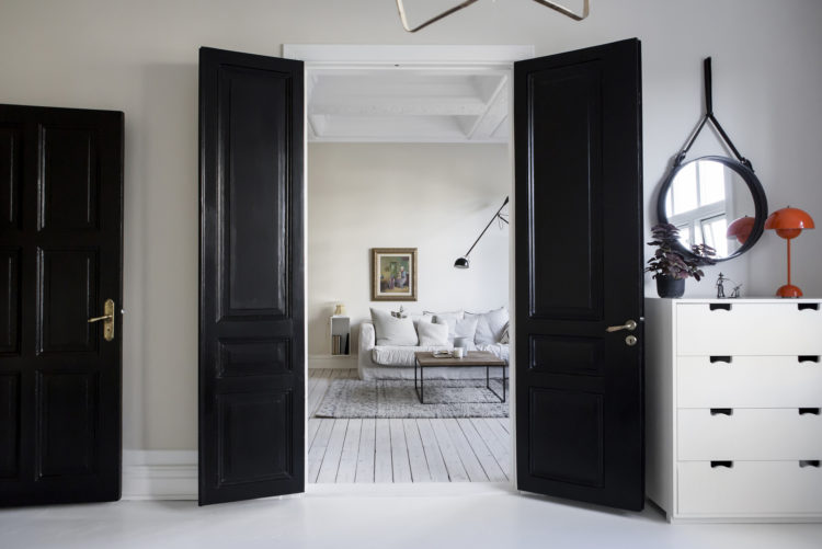
So the first one is paint the doors. And you can do this either to match – see below – or to contrast – see above. This packs a real visual punch and, going back to a post I wrote a couple of weeks ago, uses the colour in unexpected ways. We assume the walls will have the colour and the woodwork will be white. So do it the other way round. My spare room has a black wall and a pink fireplace rather than the other way round. There are no actual rules – whatever the decorator might say.
Another way to make the space look bigger is to paint any cupboard doors to match the walls. This will not only haide them but it will make the room feel larger and calmer as there isn’t so much distraction for the eye. You can also do this with the top level kitchen cabinets. Not everyone wants open shelves and most of us need more storage than bottom ones supply, but to stop the space feeling crowded keep the colours dark below and light, or matching the walls, on top and you will create a sense of space and calm.

And no-one said it had to be done in pale colours. Below you see a Devol kitchen where the cupboards, the walls and the ceiling have all been painted to match. It’s definitely dramatic and it’s not for everyone but at least now you have an image to refer back to if you are toying with the idea.

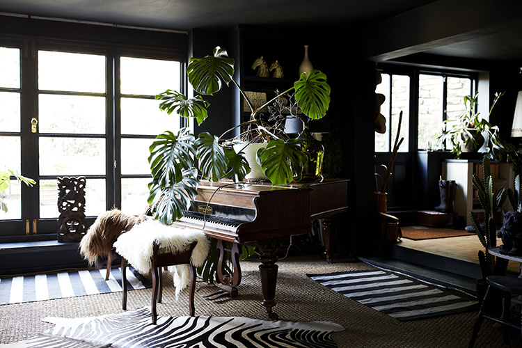
Talking of ceilings. So you can do as Cowboy Kate has done here which works to blur the edges of the room and therefore means that a low ceiling tends to disappear. It will, in a dark colour, actually seem to recede into the distance. Again, it’s not for everyone but if you live in a cottage with low ceilings and want to use a pale shade then pick one that you can do the whole room in – from skirting to ceiling and you will create the same effect.
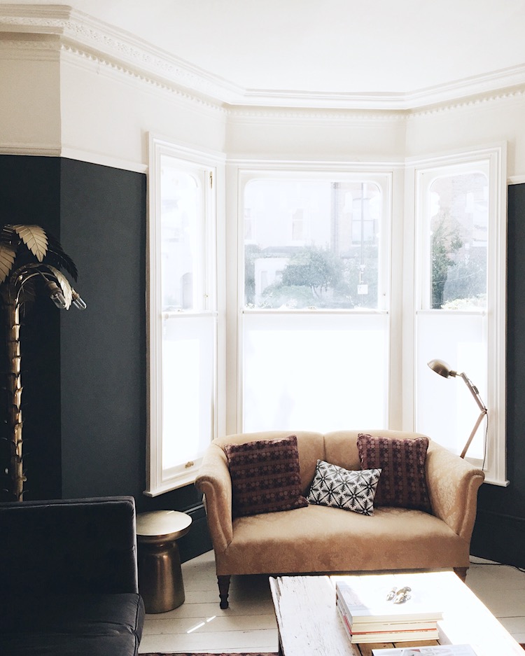
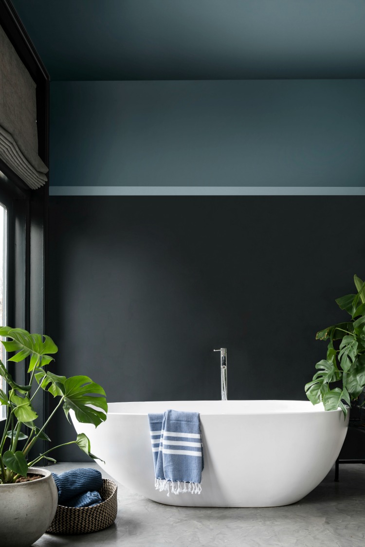
Or you can take my route. I painted up to (and since this picture was taken) including the picture rail in one colour and then went lighter over the top part of the wall and the ceiling. This also has the effect of raising it. If you paint the traditional way with walls up to the ceiling in one colour and skirting board and picture rail another you are simply drawing attention to the edges of the room and creating a series of stripes on the walls. It’s busier to look at – so the room is less calming and you will immediately see where the ceiling starts and the walls ends both at the top and the bottom. The room will feel smaller.
OR paint the ceiling and above the picture rail in a strong colour as Dulux have done below. You don’t have to have a white ceiling after all – rules were made to be broken and, as we have already established, this is more of a tradition than a rule. And if you don’t have a picture rail then just paint a stripe at the point you would like to have one.
Half-painted walls are not only interesting but also practical – especially if you have a dark colour at the bottom where kids and dogs tend to leave a muddy trail and bikes can also scratch the paint. If you have a dado rail then painting the bottom half one colour and the top another is the usual thing to do – looks traditional – to overuse a word – but if you don’t have a dado rail and simply use masking tape to create a straight line it looks modern and fresh.
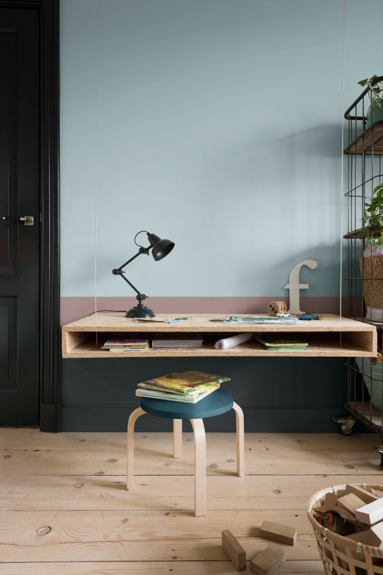
This also works well in an open plan space to zone an area. Or in a bedroom, for example, where perhaps as they have done below, you want to differentiate a working area from a play area.
You don’t have to restrict yourself to painting sections on flat walls either. Now, I grant you this is a brave look and was done for a marketing campaign but the point is that, again, it creates a seating zone and even if you wouldn’t do this it does give you food for thought.
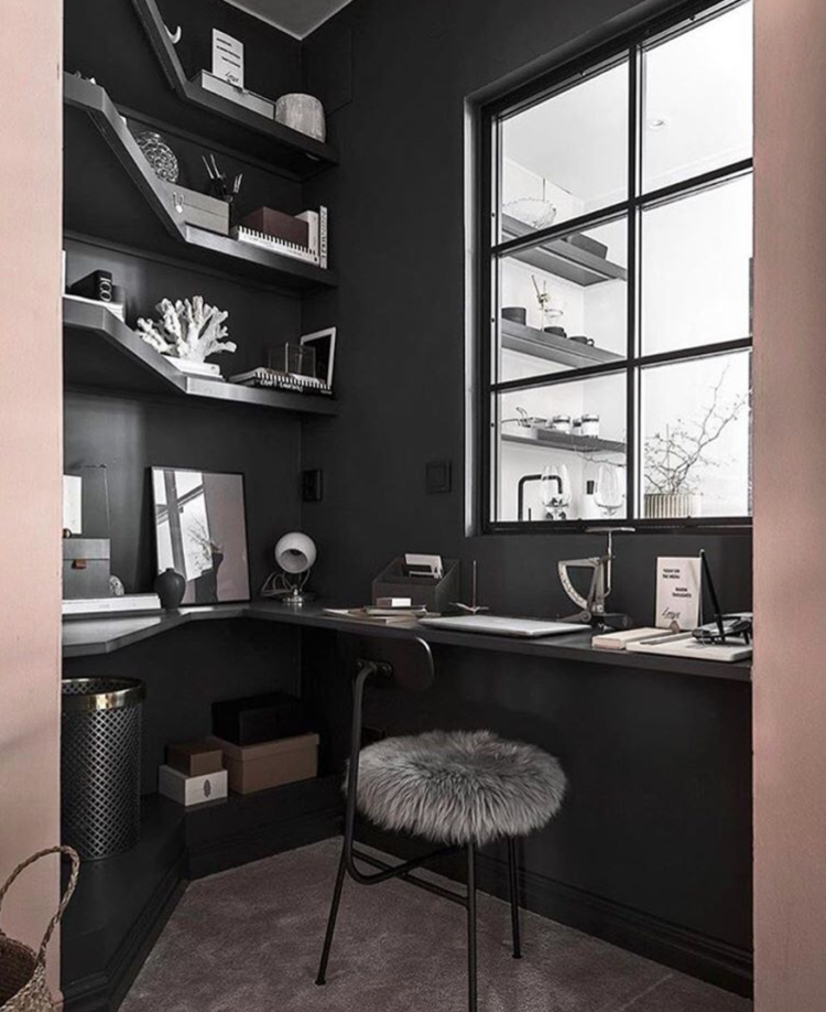
When it comes to windows dark will always frame the view better and, in this case, fits with the charcoal of the wall. This work area has been created in a corner and the blush pink has been used in the rest of the room while the dark grey has been used to zone the space.
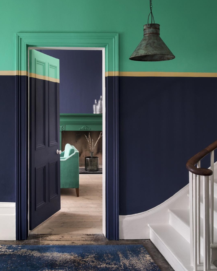
Or you can do a mash up of all these things – but treat the door as part of the wall otherwise it will be too much. So in this case there is a sober navy blue on the bulk of the wall with a yellow stripe instead of a picture rail and a green ceiling and top part of the wall. Again you don’t have to be as bold as this but you can see how it works.
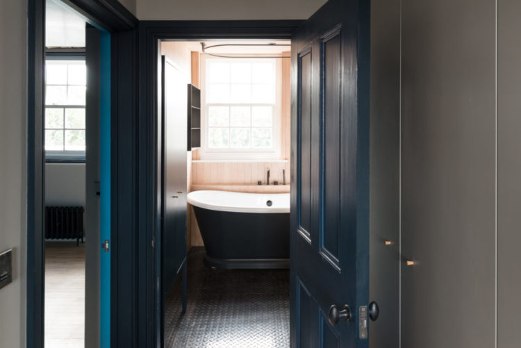
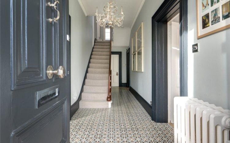
Another way to define the space and create definition is to paint the skirting boards and doors in a different colour from the walls but instead of white go dark as you can see below. Again this frames the view into the next room as well as bringing interest to what can often be a small dark space that is too narrow for furniture. And you don’t have to stick to black or grey although that is often a safe way to start.
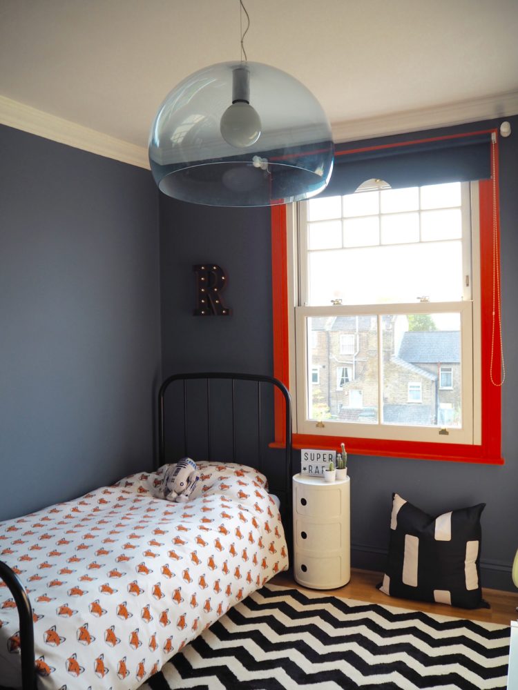
If you like the idea of highlighting the woodwork then who says it has to be white. This is the bedroom of Jess Hurrell’s son. The walls are Juniper Ash by Little Greene and the window frame is Charlotte’s Locks by Farrow and Ball. Painting the actual window is a bore as it’s tricky to get into all the nooks and crannies but you can just do the frame like this to add a punch of colour.
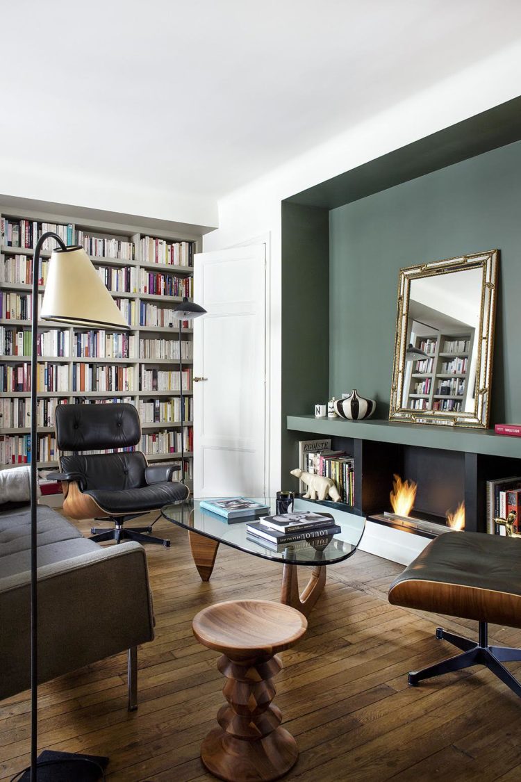
Finally, think about using paint, not as a feature wall, but to highlight a feature that is already there. In this case the alcove has been painted out in green which highlights an existing feature rather than just painting a single wall because you were a little nervous about using that particular colour round the whole room.
This is, of course, by no means a definitive list but it hopefully gives you some ideas and thoughts for your own spaces and perhaps will help you visualise what certain techniques will look like. Do let us know how you have used paint in the comments below.


Goodness, you’re brilliant! And I’m stuck in a beige tiled floor rental *sad face*
Love this post, big fan of the blog. After a cock up in the living room paint wise lost my mojo a bit, but am moving on to an all grey hallway but picking the stairs and banisters out in white. But after this thinking about a fake picture rail in paint too or even an extra stripe on the stairs?
do it! not a fake picture rail – just a half-painted wall.
Totes going for it. Two different greys and white details sound about right? It’s such a weird space a hallway. Am half way through a house renovation and your blog has become our bible “Yeah but Kate says…” etc. Thank you. It’s ace.
Excellent post Kate with lots of great decorating ideas. I’m just about to tackle decorating a few rooms and this post has given me food for thought.
Karen
The F&B Oval Room Blue has just arrived and I’m about to repaint my study. Just in the nick of time you have reminded me NOT to paint the skirting Cornforth White, but to stick with the OBB (and it also means less masking tape). Hurray for Kate!
I love all of these colour schemes. Just wish I was brave enough to be a little more daring with my own decorating ideas. Thank you for a really great blog Kate.
Loving this post! I like to decorate with colour and you really help to clarify how particular effects work.
Great post and so timely as I am currently painting our kitchen- crown ‘rebel’ (Matt), the darkest of grey/ almost black on cabinets, some walls and skirting boards and Crown’s (Matt) Granite Dust on the other walls, but, and this is why I am posting, all the wooden cabinets will be varnished with Polyvine’s decorator’s varnish in dead flat finish. It gives hardly any sheen and certainly less than using a satin paint finish, and does a wonderful job in protecting surfaces, plus it is easy to paint over. It even protects the pumpkins on my front step!
now THAT is a very good thing to point out. Thank you.
Oops, I think you are referring to my ‘grey’ comment the other week. Sorry, no disrespect intended. Totally love your blog, its the best thing on the internet.
I don’t think I am am I? No disrespect intended from me either! And thank you for your kind words. x
A really informative post Kate, thank you, isn’t paint just the most wonderful and transformative substance. Another tip I remember from my old KLC course is in regard to painted floors. If you paint the floor and the skirting in the same colour (in contrast to the walls) it will visually increase the sense of floor space. This is a particularly good device if you have a very narrow hall or passageway.
Great ideas. I’ve been meaning to ask you this for ages – if you are painting the woodwork the same colour as the walls can you use the same paint or do you get the colour made up in paint suitable for wood? Also, on walls do you tend to use Matt or silk?
You will need to get different paint for woodwork. So I use matt on the walls and eggshell on the woodwork. They are the least shiny options.