Time for our weekly stroll through 10 Beautiful Rooms. This is where we come for inspiration and ideas so that when we play fantasy househunting on a Friday we are ready to move in and make these places our own. First up this week we are having a look at the work of the brilliantly named Mad Cow Interiors aka Sue Miller whose style is a carefully balanced layering of vintage pieces with splashes of colour and lots of textures.
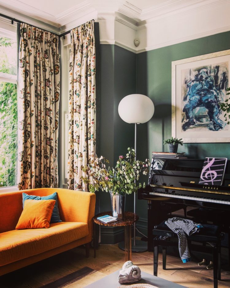
It’s a technique that’s tricky to pull off but looks amazing when you’ve done it. It’s also hard to recreate as a lot it is down to Sue’s eye. She knows and she probably can’t teach you. But take a wander round these rooms and see if there are elements that you could use in your own homes.
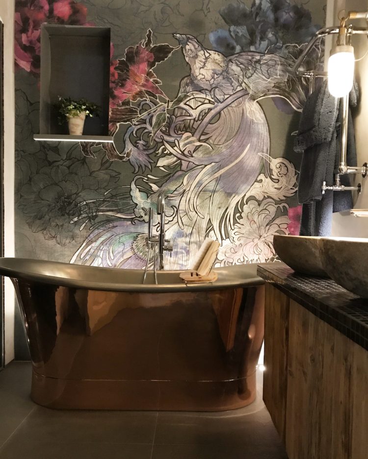
And if you can’t then hire her. But look at this bathroom above for example. It’s a perfect mix of the luxury copper bath which is prevented from being too bling (for want of a better word) by the rustic wooden cabinet while the wallpaper brings a touch of glamour. Now, a word about this wallpaper – it’s from Wall and Deco and is a waterproof membrane with a decorative pattern that is perfect for bathrooms and damp areas.
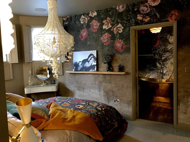
And look how it connects to the bedroom next door. I love the flowers floating down the walls and although both this and the bathroom have two very dramatic patterns the colours tone and they don’t fight.
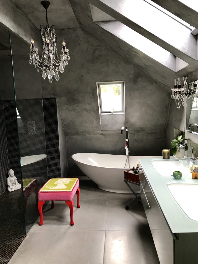
In this bathroom the contrast between the chandelier and the concrete walls is gorgeous – and a little less dramatic than the room above while and the bright pink stool adds the requisite dash of colour to the monochrome background.
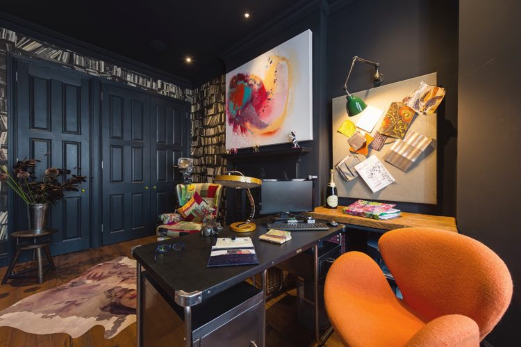
This is a study and with its dark walls and ceiling feels like a cosy place to shut yourself away from the outside world and concentrate undisturbed. And I say this as one who is typing at the kitchen table while the 14yo does his homework and intermittently asks me to “google the causes of World War One” or “define Art Deco” as his computer crashed for the final, terminal, time this weekend and he has, of course, got 17 pieces of homework to do by the time you are reading this on Monday morning. Anyway…. breathing deeply… No I don’t know the mass of an atom as it happens.
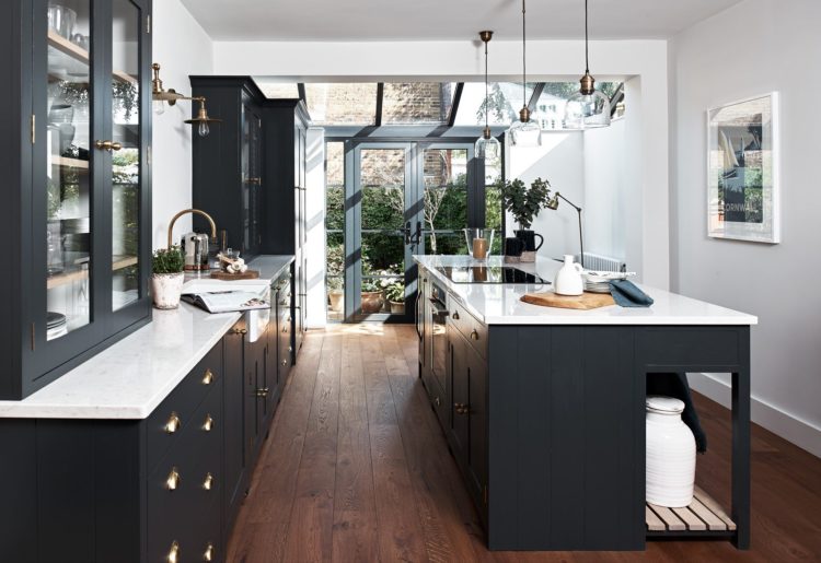
If you like a little lightness with your dark then this Neptune kitchen might be the one for you. Note how the dark window frames highlight the view and bring the whole room together with the dark cupboards. A wooden floor brings a modern rustic touch and stops it all being too perfect, while the pale walls and marble worktop keep it light and airy despite the dark cupboards.
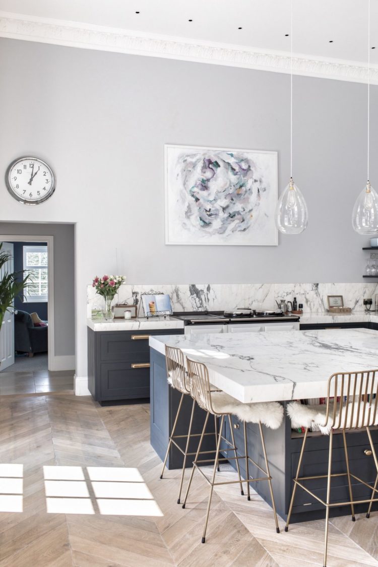
This location house for The Shoot Factory has used a similar technique and, if you have the room, look how they have created a square out of their island so you can sit four people in a conversational manner rather than lined up as if they were waiting for a bus. That is definitely an idea to bear in mind if you’re a) doing a kitchen soon and b) probably don’t live in a narrow Victorian terrace. Who me?
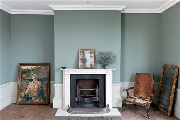
I wanted to show you this for the fabulous colour palette in the room below. This pale greeny blue grey is wonderful with the distressed tobacco of the chair and the old pictures. If you incline towards a leather sofa and there are some great ones about these days (try the Axel from Westelm) then a soft romantic wall colour like this is a great contrast.
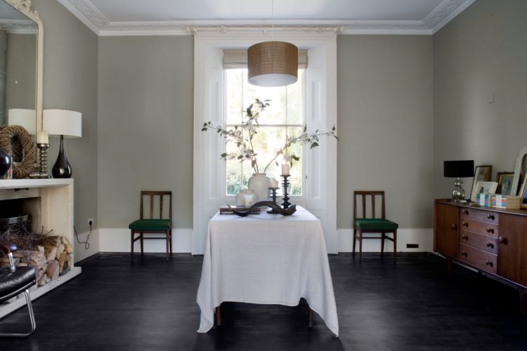
Sticking with the soft palette, this dining room is a perfect example of the summer colour palette that we were talking about last week. The pale muted colour scheme is very restful while the chairs place symmetrically either side of the window make it a calm space to look at as the eye isn’t rushing about trying to take everything all in. If you find this space dreary and dull then you are perhaps more of a Spring person who likes vibrant colours and more pattern.
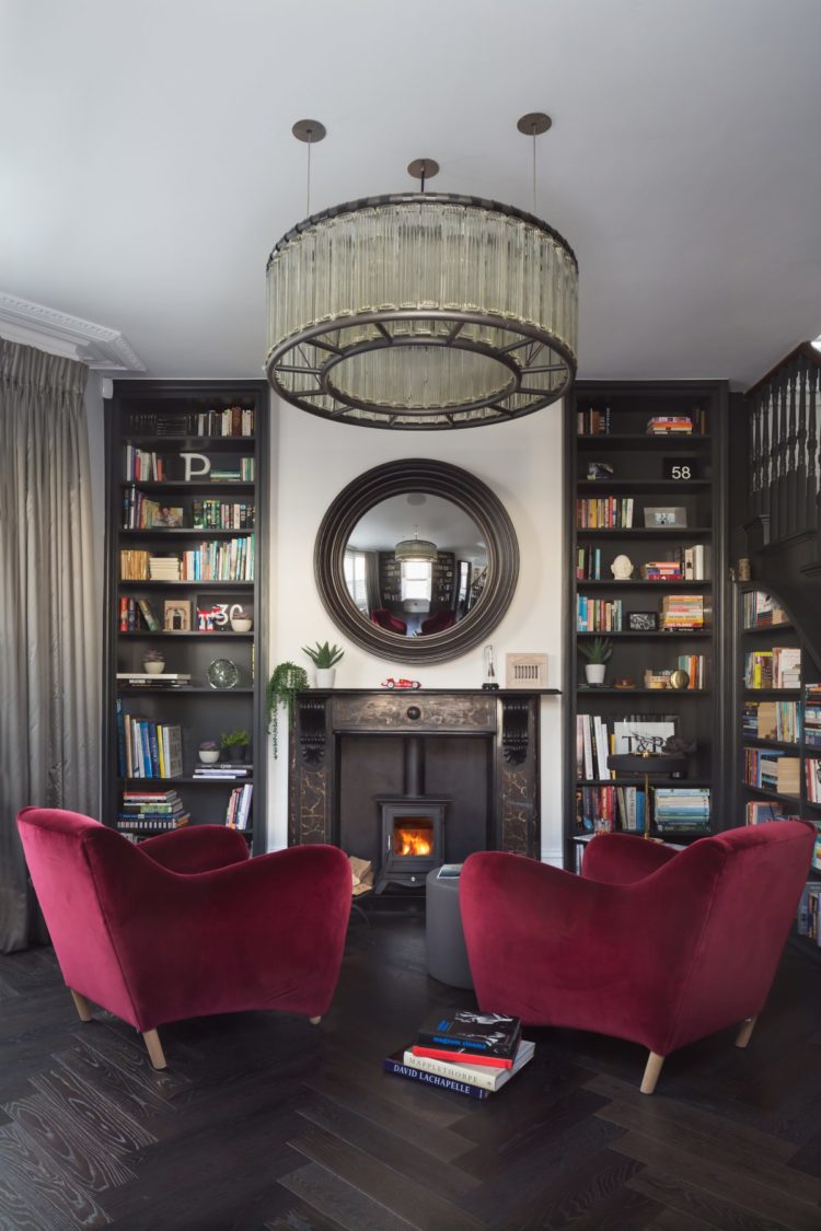
Finally, this is the home of interiors photographer Paul Craig, who has been on these pages before telling us how to take pictures of our own homes. I love this space and the way the vibrant chairs look against the dark shelves and dramatic lighting. Definitely a place to look forward to at the weekend.
I hope you liked these spaces. Drop into tomorrow for the definitive guide to buying carpet – and before you all shout think about the stairs. Or the bedroom. I shall also be investigating what to do when you spill something on it. And you can step away from the salt right now.


Perfect fit for someone like me who’s fascination is reading blogs. I can mostly relate. Keep sending them please!
Hi kate – further to Sandra’s comment, I too am no longer hearing the plop on the mat of your daily missives since your holiday…..
I can only suggest the same as I did to Sandra – can you unsubscribe and resubscribe and check your spam. Let me know if that makes a difference. I hope so x
Love the square kitchen island – as Kate mentions it looks great for conversation.
Kate I thought I would mention I am having real problems receiving your daily blog. It used to arrive around 7 am each morning M-F. It then stopped before the summer holidays. I have enrolled again but still not receiving it. Any ideas?
Thks
Sandra
Hmm – have you tried unsubscribing and resubscribing – that worked for someone else last week. And also check your spam folder? Let me know x
O please o please what is the fabulous colour This pale greeny blue grey is wonderful
I want to paint my living room this colour.
Mplto grazie
You could try Teresa’s Green by Farrow and Ball. Borrowed light is also beautiful in a south facing room – can be cold in a north facing one. There might be something in either the glass or ice range from the Paint and Paper library or try aquamarine from the Little Greene Paint Company. These are all guesses as every computer renders colours differently. But, having said that, these are all gorgeous colours!
If Paul Craig would like to invite me round for a drink I would be reluctant to leave his comfy room!
Nice piece about you in Remodelista Kate!
As always, a great selection of rooms. I love seeing rooms that are FUN, which Mad Cow Interiors is definitely delivering! Very much looking forward to your post on carpets tomorrow… I need so much of it. I’m sure I can rely on you to give us a bit of a treat and not just the usual grey/beige/greige selection!