A light and summery mix of rooms for you this week seeing as we have, so far – at least where I am – had three sunny days in a row. That may be it for the British summer so enjoy it while it’s here.
Now, what do you think of this?
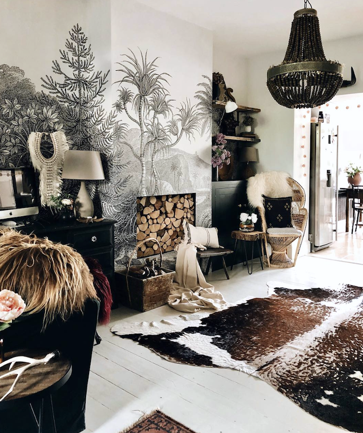
It belongs to Kyla Magrath and I love it, although I suspect it’s one of those rare things that would invoke the marital veto from the Mad Husband. I am often asked to mediate between couples when it comes to interior design ( I rarely agree to get in the middle and tend to fudge my way out of it – so don’t ask me) but the next question is usually how do we negotiate the marital minefield that is having different taste?
The answer is the Marital Veto. It doesn’t happen very often, but once invoked means the subject cannot be revisited or rediscussed. The last time was when I suggested gold grout in the bathroom. It was instantly vetoed and that was the end of that.
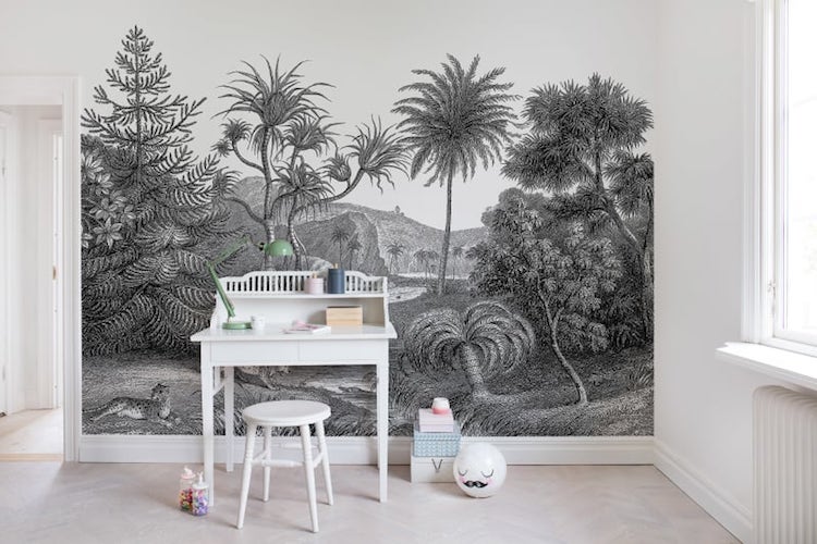
I have long hankered after a black and white jungly mural (this one is by rebel walls) but have never raised it because I suspect I know what the answer would be. And I’m not going to be vetoed twice in a row so I shall have to enjoy this one vicariously through Kyla.
It’s similar to the bellewood paper used by Emily Henderson in her daughter’s nursery and I love that too. But it’s not going to happen so I have taken a different approach to introducing green into the bedroom which I will show you later in the week.
Because there’s always the real plant way as seen this room in this flat for sale via Innerstadsspecialisten shows.
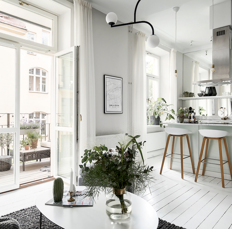
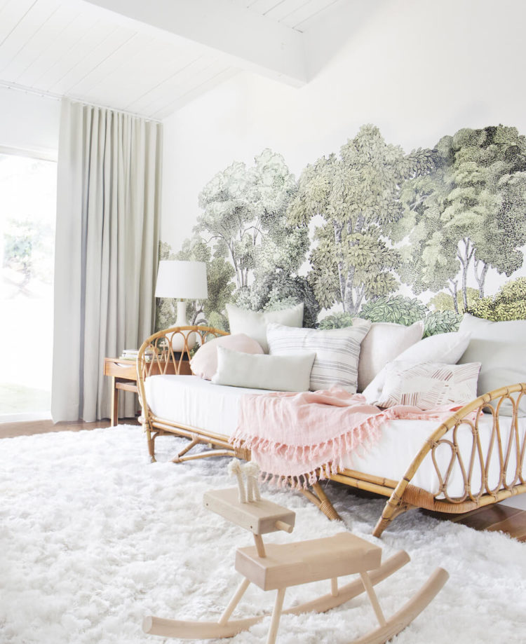
My bedroom is shortly going to be a mix of grey, white and green which is a combination I find so restful and peaceful. This Swedish room has brought in green only the plants but it’s the perfect space for the time of year.
It wasn’t till these two images ended up next to each other that I realised that floor of one is the same as the ceiling of the other. Shiplap, as it is now called to be modern and fresh, as opposed to tongue and groove – which is basically the same thing but sounds less cool and fashionable, is being nailed up all over the place. It’s basically panelling in the sitting room and kitchen and shiplap cladding in the kitchen.
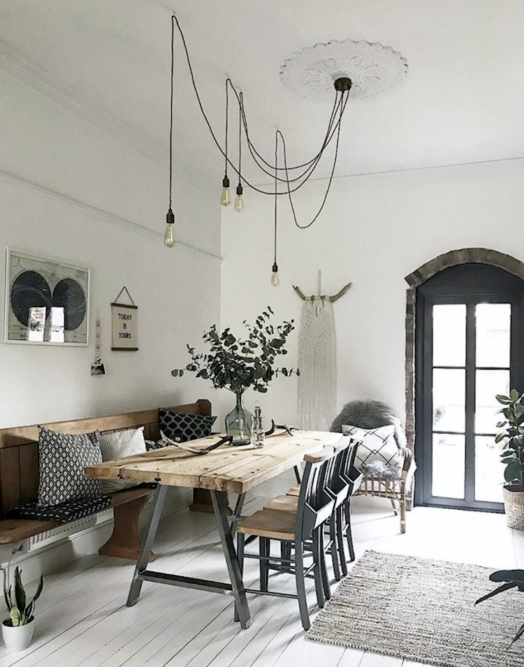
Turning back to the soft green and this is the dining room belonging to Philippa of Pip’s Home which I have decided to show you from both sides. Once again white painted floorboards, white walls with black accents and this wall of green which works so brilliantly as a backdrop to the black-framed picture on the wall.
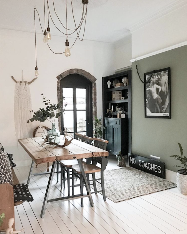
Also – for anyone who has a ceiling rose in the middle of the ceiling but doesn’t want to put the table underneath it, this is what you can do. Buy lots of long flex from somewhere like Dowsing & Reynolds, which I wrote about last week, a multi-outlet rose and some cuphooks. Then you can simply move your lights to where you want them without having to lose an original feature.
I have written about this before and it’s particularly noticeable in bedrooms where the pendant light hangs somewhat pointlessly over the end of the bed. Why not drape it over to a corner where it can hang down and be a feature in its own right – gives you an excuse to buy an amazing light fitting too. That means it still does its job of lighting the room but it’s not in the way and you can hang it much lower – and make more of a feature – that you could if it was hanging over the bed.
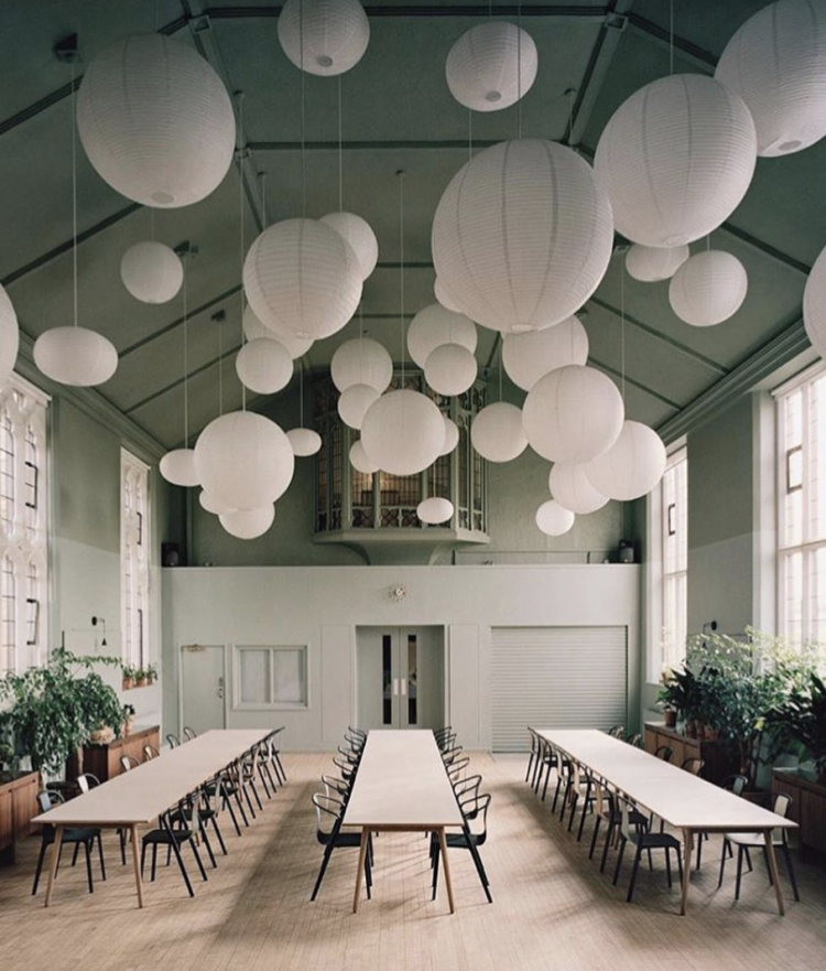
Now that’s how you make pendant lights a feature. This is the Refettorio Felix (photograhed by Rory Gardiner, who took an amazing set of pictures of The Mad House for Remodelista) and designed by Ilse Crawford, who’s also partial to a splash of green used not only here but in her work for the Aesop stores as well.
The refettorio has been redesigned from the St Cuthberts community centre for this new kitchen, dining hall and drop in centre that aims to reduce food wastage by using the knowledge of top chefs to create healthy meals for those living in socially vulnerable conditions using supermarket surplus ingredients. You can volunteer to help or hire the space for events which is what I shall do if I ever do. As it were.
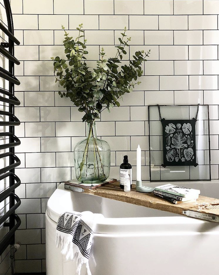
Sticking, sort of, with the white grey and green theme is this bathroom by Lucinda Mitra, of Nest Twenty Eight, who has used black grout with her subway tiles. It was a fashion but now it’s a classic and it’s so practical as anyone who has ever tried to remove that brown soap scudge from white grout will attest. I think it looks fresh and clean and, with the addition of lots of greenery, modern as well.
The key to this look – get to the shops now and buy lots of those green vases. H&M had some, Arket have lots although I find their website too annoying.
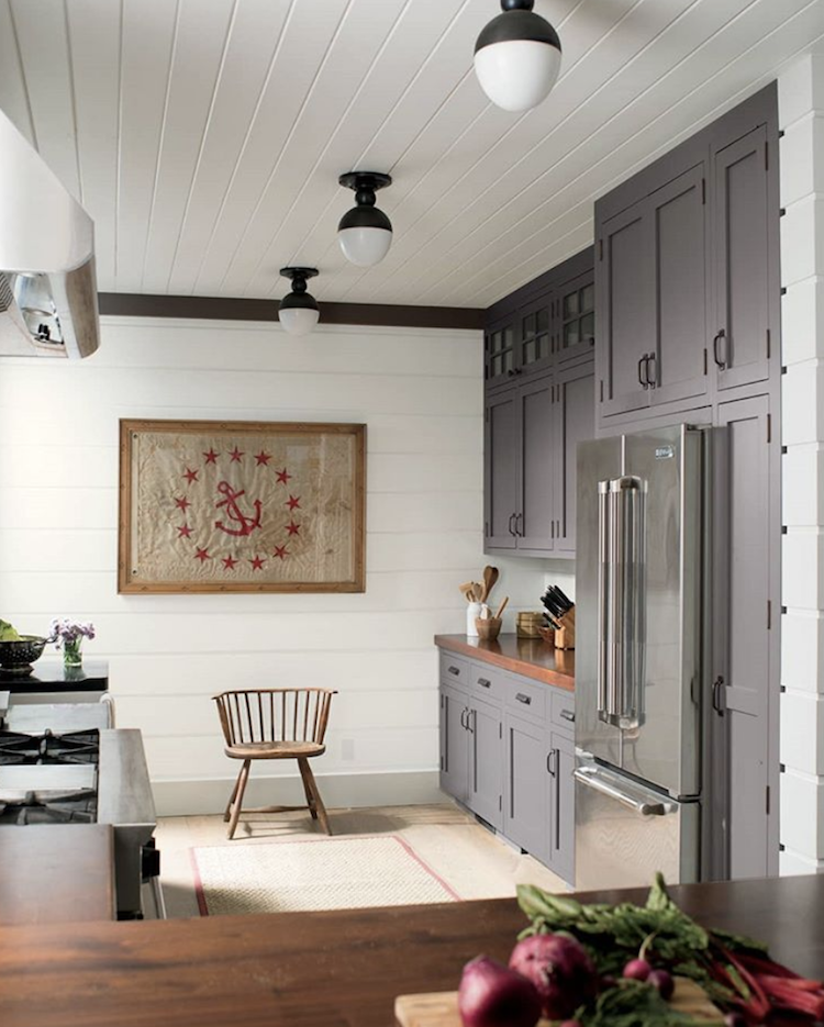
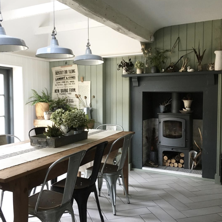
And finally to bring it all together – wall cladding and green and grey in this gorgeous kitchen belonging to Marie Nichols.
That’s all folks. I hope you have enjoyed today’s stroll through 10 beautiful rooms. I’ll give you a little look at my slightly green and soon to be greener bedroom tomorrow….


Hay sells a lovely green vase: https://www.trouva.com/products/hay-medium-green-colour-vase-2
the s, m, and l sizes have a slightly different pattern.
Hay sells a fabulous green vase right now: https://www.trouva.com/products/hay-medium-green-colour-vase-2
The small, medium and large have a slightly different pattern.
I dare say that we may actually be experiencing a “summer” in the UK? Instead of the single week of sun we’re used to!
Personally I’m a fan of the jungle mural, especially the bellewood paper. I love the green tones against the white/cream of the rest of the room. It really brings the outside in, and makes the space feel even more airy.
Growing up surrounded by trees isn’t something to shake a stick it!
Thanks for such a beautiful post. I’m excited to have several more Instagram accounts to follow.
Sorry about the vetoes at your house!
Lovely calm rooms, super colours. I particularly like the colours in the first Kyla Magrath room and the wallpaper is great – except there are too many things clamouring for attention. I don’t think it needs the mural and the rug and the light fitting all shouting; two out of the three would be great. And although the other rooms do look inviting… are you sitting comfortably? I don’t think so. Mean little cushions or none at all. Makes a nice photo though.