Good morning everyone and I hope you all had lovely weekends. I can’t believe Monday has come around again so fast bookmarked as it is by our weekly strolls through beautiful rooms. I often start out trying to find you a trend or a theme but then I get distracted by the rooms themselves and so they tend to be a more random collection of what has caught my eye the previous week.
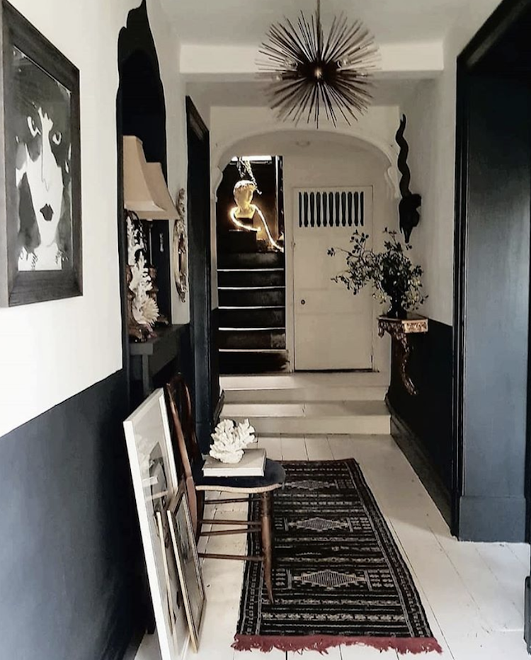
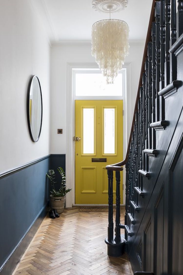
Given that last week was the London Design Festival, I could talk to you about upcoming trends and colours but we’ve had quite enough of that recently so let’s just walk and talk shall we? First up is this gorgeous black and white hall by Jane Learmouth, formerly known as Cowboy Kate and now as The.Kate.Edit so if you followed her and had lost her then make sure you find her again as she documents the transformation of her house.
Her Georgian house has featured on these pages before and she is in the long process of gradually turning it from black to white – for those who want trends then paler is definitely one of them. However, I still love the compromise of a half-painted wall and this is a beauty. Not to mention helpful for those of us who can’t decide if we want to go light or dark.
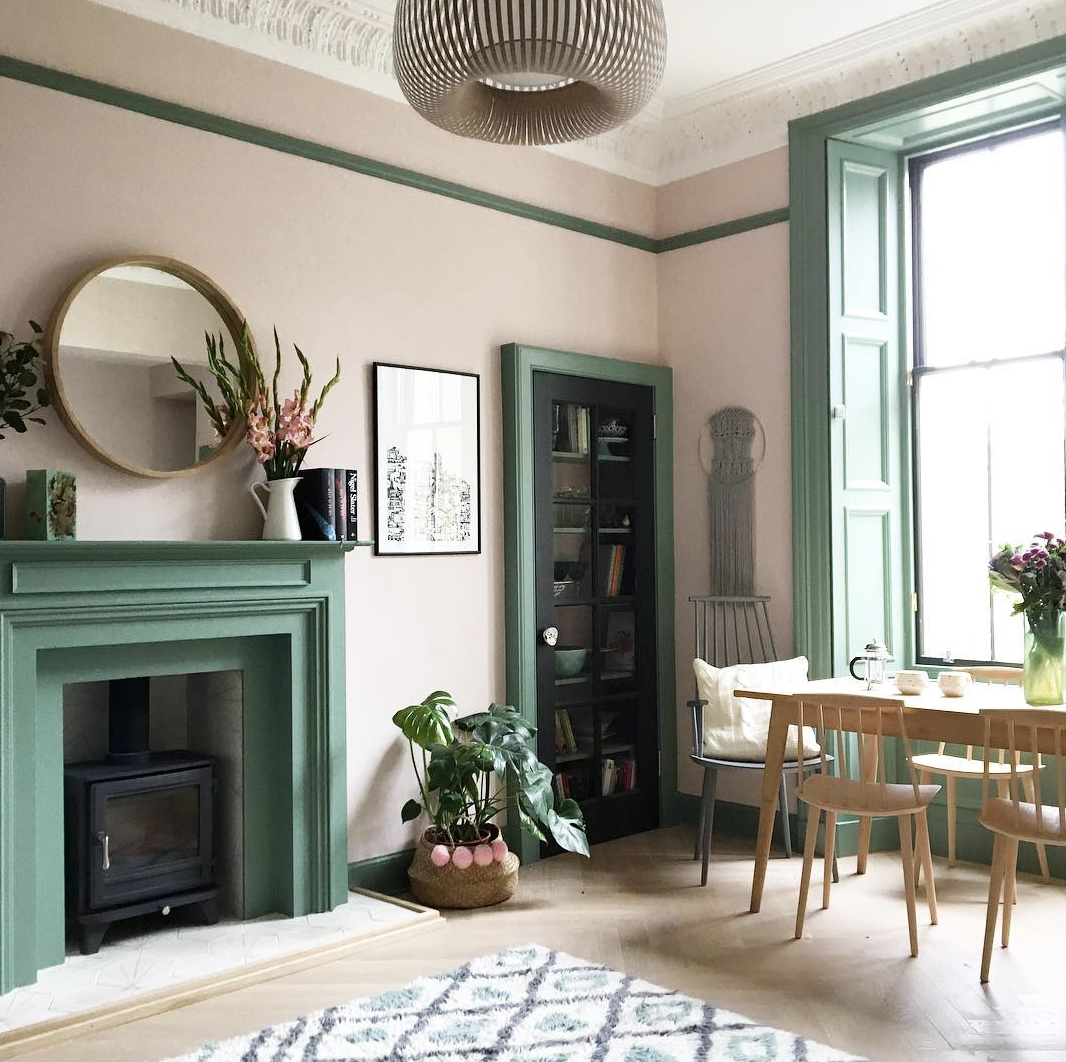
Now this is a room I adore. I have spoken recently about not leaving your skirting boards and woodwork white. It may be traditional but these days it more often looks like you didn’t bother to make a decision. And given that you clearly went out to buy (and presumably test) the colour on the walls why not do the same thing for the woodwork?
Not only is this pink and green a gorgeous combination, but it looks like the owner really thought about what she was doing in this room. If I had another sitting room – in my dream expandable house – I would definitely think about shamelessly copying Ella.
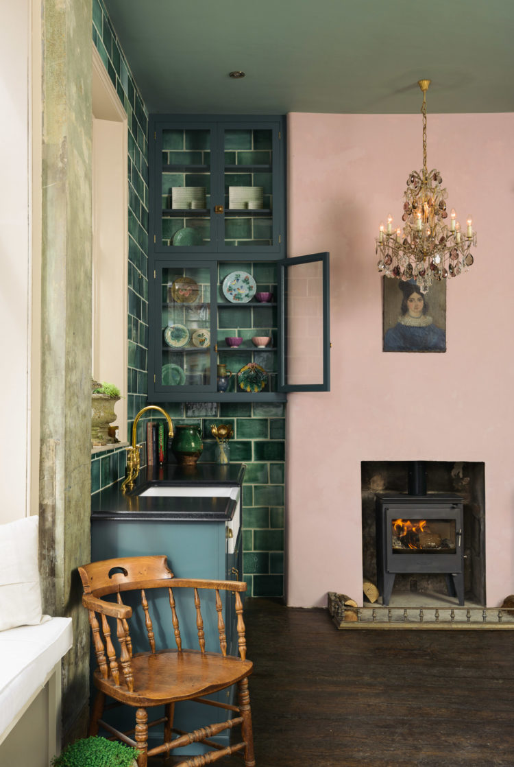
And as a reminder of how well pink and green go together, here’s the Devol Showroom in Clerkenwell, London with its green ceiling.
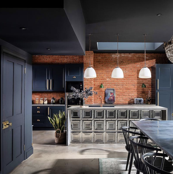
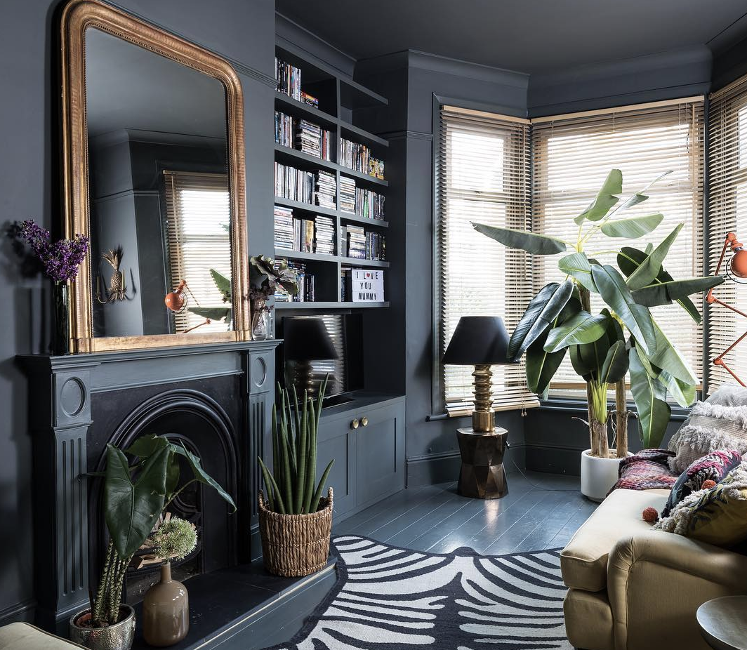
Another instagram favourite is Suszi Saunders, whose home was recently featured in Living Etc and whose dark navy blue kitchen is gorgeous with the soft red of that brick wall. It’s opposite a glass wall which prevents it from being too dark while the metallic island throws the light out even more.
Here’s another image of her sitting room with its matching dark walls and woodwork and even up over the ceiling. It’s a brave decision but if it works for you and the way you live in your house as well as the times of day you use the room then go for it. Again there is a large window and the lack of curtains means that no precious daylight is lost through the sides of the bay window.
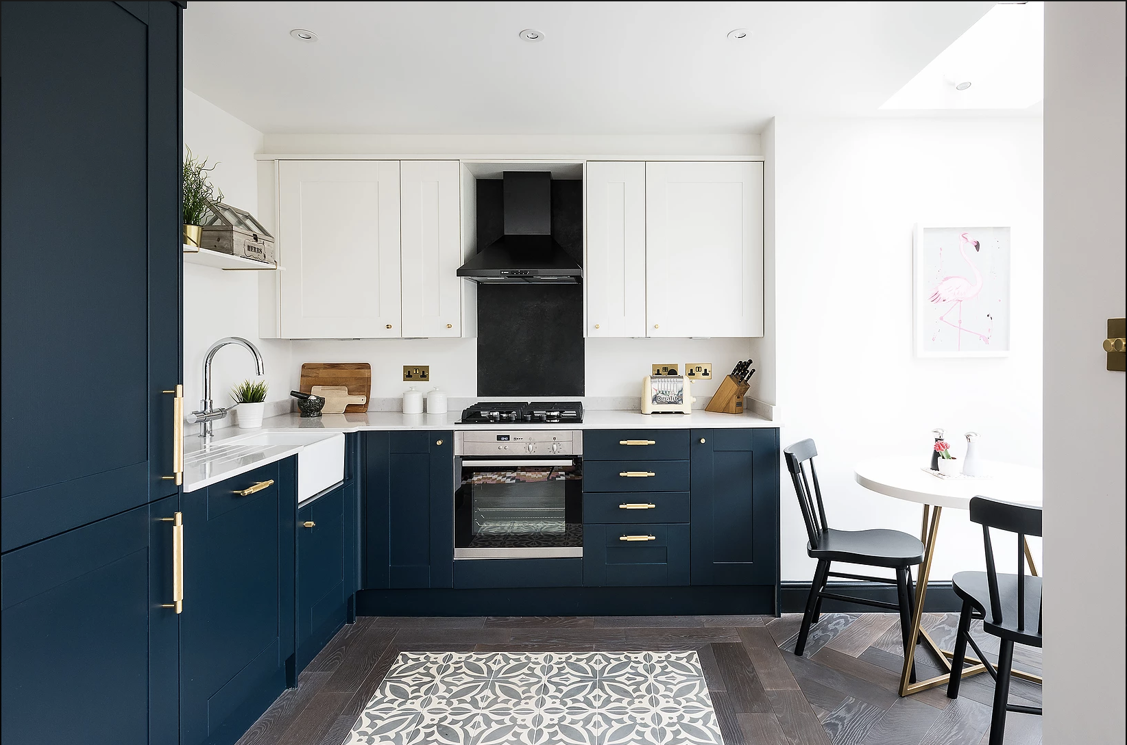
Sticking with navy blue, but returning to the half and half principle of Kate’s hall above is this kitchen by Owl Designs. You don’t have to match the cupboards at the top and bottom and sticking to a lighter colour will make the room feel more open and airy. It also means you might feel emboldened to use a stronger colour on the bottom as it won’t be so overwhelming.
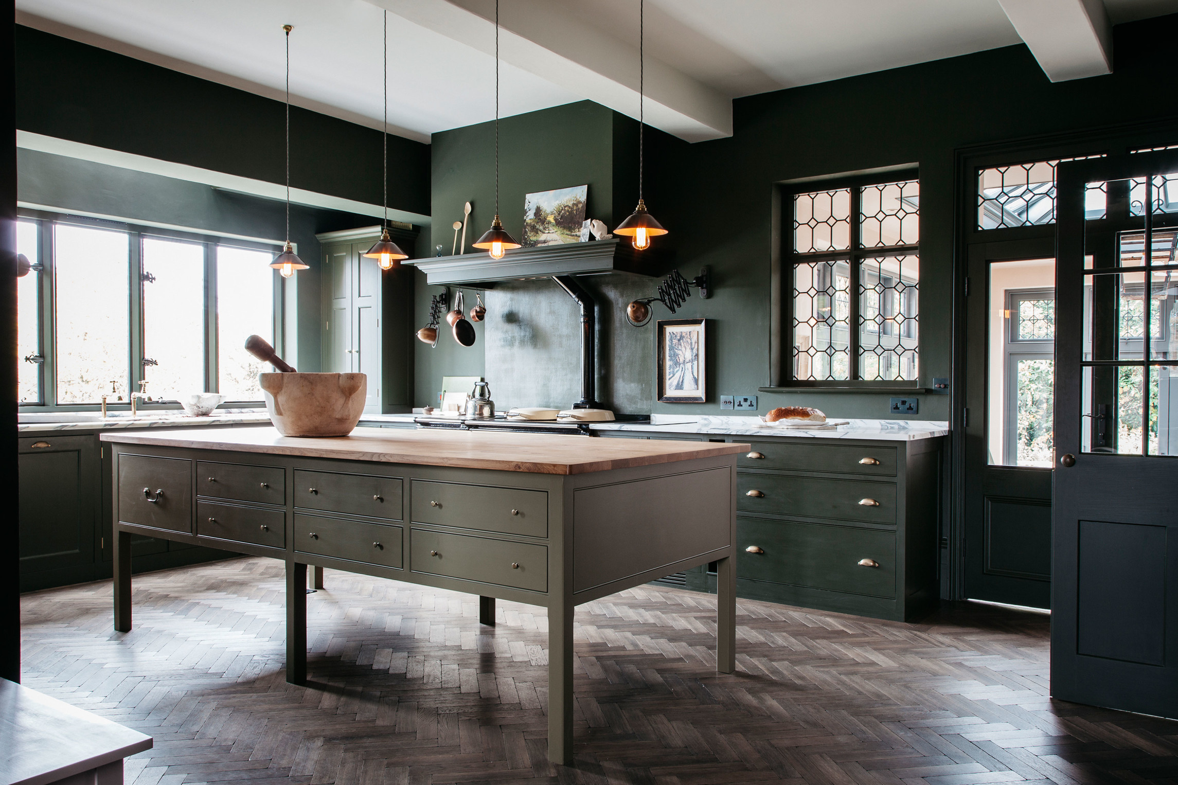
But then again you can look at this wonderful green kitchen by Plain English and come over all green – with envy as well as paint. I love this but I would counsel you to think about it if you don’t have windows on at least two sides. You don’t? Funny that – nor me. The white ceiling works to lighten it and you could have a pale floor to bounce light around. And, if you can find the storage elsewhere that table island also allows light to pass through and under so that helps too. There are tricks you can use but you need to know what they are.
So perhaps you might want to go back to the other end of the spectrum (as Kate has) and paint everything light and bright. I can’t decide, at this time of year, whether I want the dark cosies or the light and brights. My house is a pretty good mixture of both.
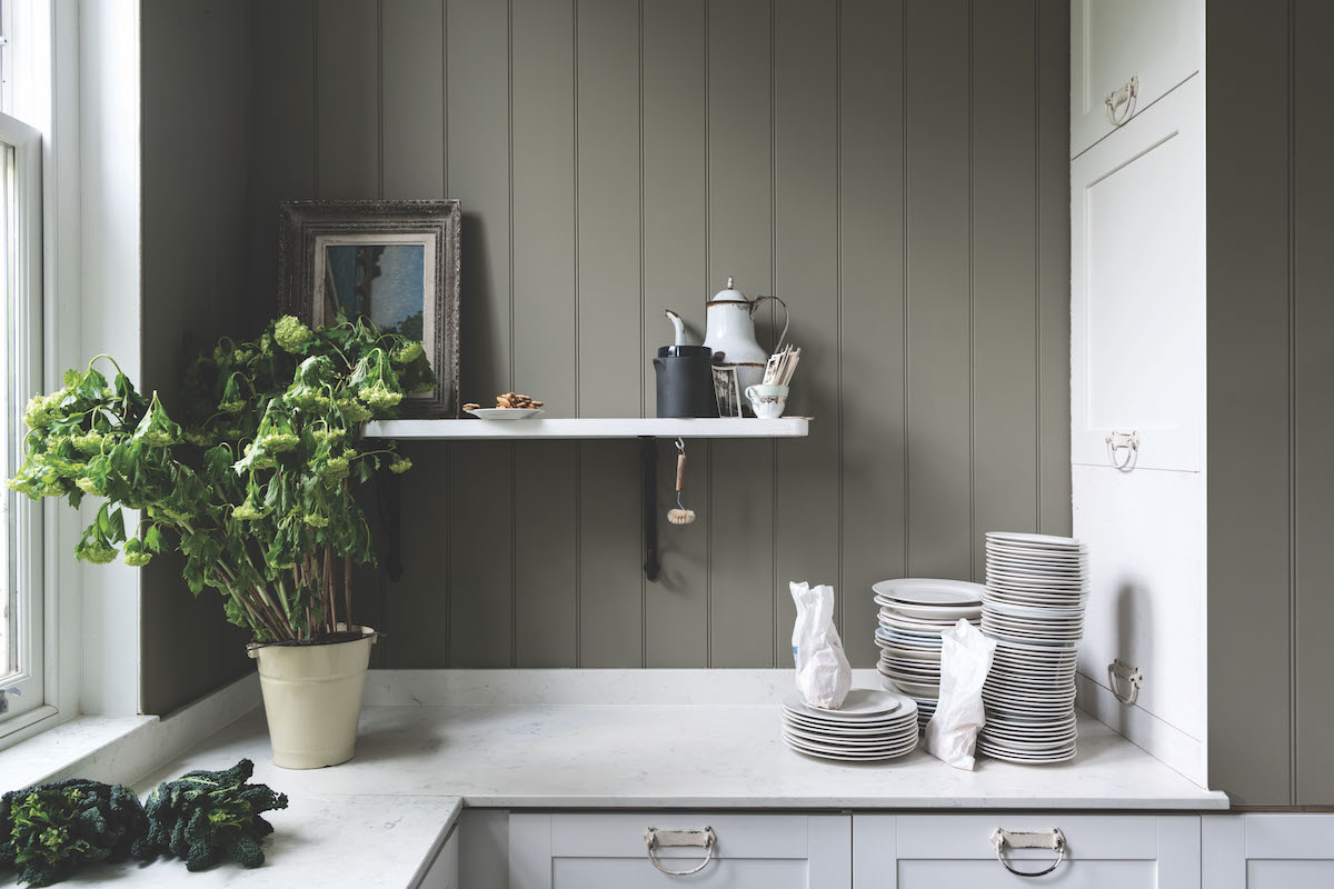
Staying in the kitchen, I wanted to show you the last of the new Farrow & Ball colours which I didn’t receive last week. This is called Treron and is greeny grey colour which is said to be a little darker than Pigeon. Now I love Pigeon but it’s already quite dark so get a tester. Both are gorgeous with white but think about pink too – you could choose a really pale one like the new Jitney for a stunning combination.
And so we shall by the front door. Back to a half-painted wall which is always a good idea for this part of the house as the walls inevitably are scuffed from bikes, bags, dirty hands and even pets. This is practical as well as pretty. And who wouldn’t love the back of the front door painting in a cheering, and contrasting colour. Mine is burgundy to match the stairs – and no you won’t find it too much as it’s quite hard to see both at the same time unless you’re an owl.


Nice Rooms…. Great Work.
It’s odd how these things creep into your consciousness without you realising. I have spent the last year decorating a new place and I felt a strong desire for pale walls with brown furniture.
The trend for dark blue kitchens didn’t last long, did it? Right back to white in the last pic, which suddenly looks all fresh and new compared to the blue one. I think the dark blue kitchen is suddenly going to look very dated in a couple of years. It hasn’t had long either. I had a (white!) kitchen put in in 2014 and blue kitchens were nowhere. The Plain English catalogue (inspiration not purchase I hasten to add) was all pale greys and whites. I still think it is a mistake to be very “on trend” with something you won’t want to replace in a few years.
Thanks so much for featuring my clients bold yellow front door Kate! You are right that it makes sense to use a darker tone below the dado in hallways as they always get bashed around, and them at least you can just touch this area up rather than the entire wall. As the hallway was so huge and we wanted to create a sense of drama, we also painted the entire staircase in the Hague Blue- side of the staircase, spindles, treads & risers, the lot! You obviously can’t see it in this shot, but we added a gorgeous egg yolk yellow patterned stair runner to go on top which tied in with the front door. More images here if anyone wants to see- http://www.imperfectinteriors.co.uk/projects/victorian-villa
The pink and green room is incredible, absolutely love it. Apologies for the gender stereotyping but I never thought I’d end up trying to persuade my wife that we need to paint our living room pink!
Hi Kate!
I absolutely love that soft pink and green combination. It’s really lovely. Would I be brave enough to have it for my garden room given that there’s already lots of green s from the plants?