This is one of my favourite houses so far this year. It’s sold now (no surprise there) but we can still go in and remind ourselves how it looked.
I LOVE this house. With only one small exception. Actually two, but apart from that I think it’s amazing and can’t understand why the owners are selling it. Although it belongs to one of the founders of Darkroom, one of London’s most fabulous design shops, so it’s possible that the next house will be even more exciting…
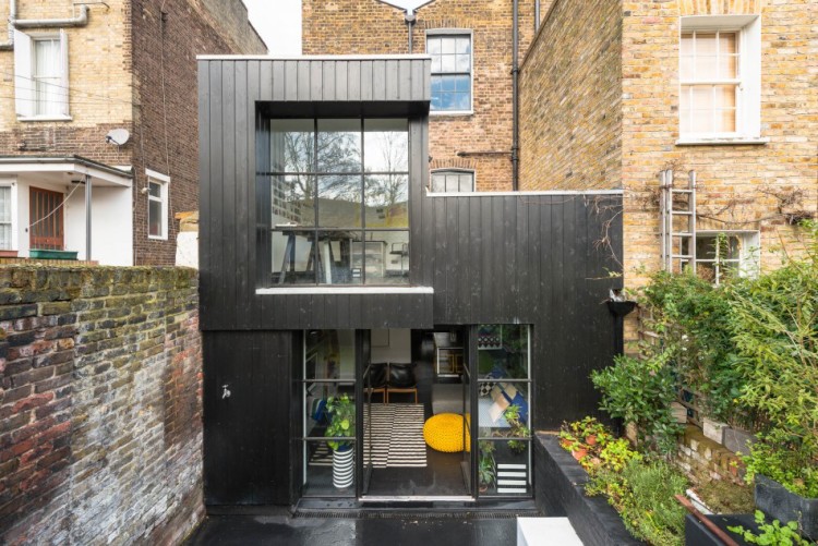
Anyway, on with the tour. It’s on the market with The Modern House for £1,650,000 and is a three bedroom Victorian terrace with that fabulous black extension by Paul Archer. Ready for a stroll round? I’ve included lots of pictures this week because there was so much to see.
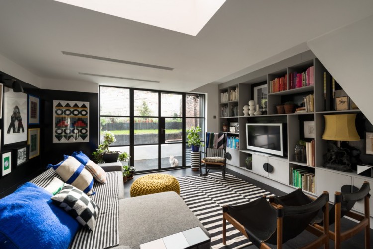
First up a couple of shots of the sitting room which include the two tiny details I would change – one; the blue cushions. Can’t do cobalt but it’s a personal thing. I would change to olive green. Second, colour-coded books. Shoot me but I hate that. I really do. Please don’t. If you have and you invite me round there is a real possibility that I will rearrange them while you have nipped off to the loo.

And actually, from this angle I can see that the blue does look amazing. Yes you have to be brave to do the floor and the walls but hopefully these images will inspire you. After all, you could just take elements of it – have a different coloured sofa for example. The walls full of artwork also lighten it as does the glass wall at the back, so you needn’t fear that painting your house black is going to turn it into the Batcave.
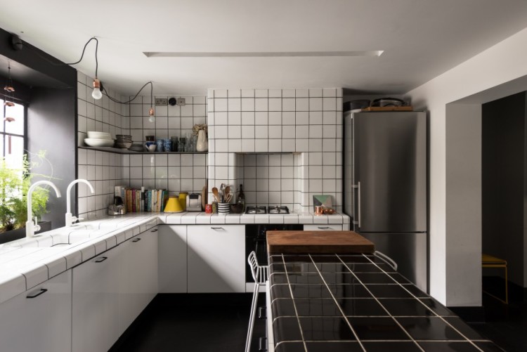
Worrabout this kitchen? I love the white tiles with black grout and the black tiles with white. Such a simple idea and so effective. It looks like a kitchen made from graph paper and is completely perfect for the strong graphic designs so beloved of the company.
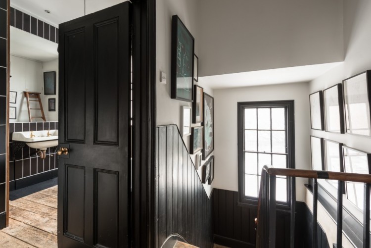
The owners have used the same trick in the bathroom, although just pause for a moment to check out the stairs. See how instead of painting dark walls with classic white window frames, they have inverted that look to keep the walls light and the doors and windows dark. Nice innit?
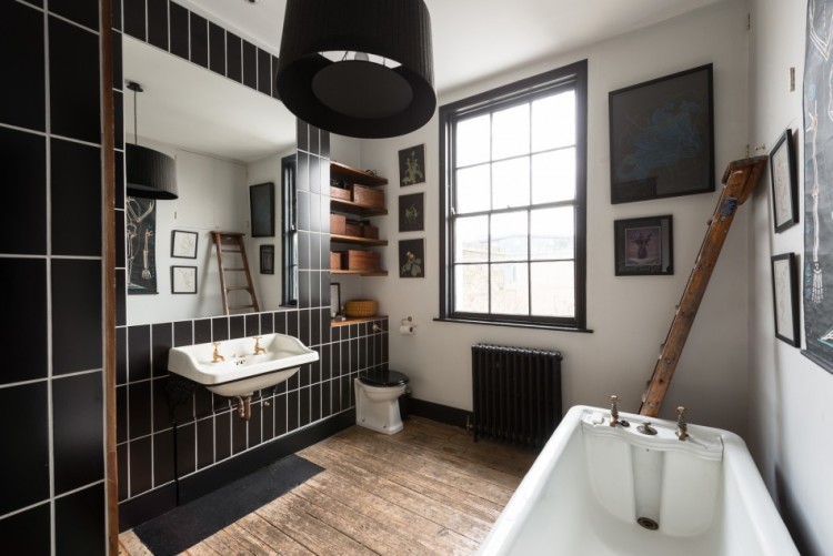
The other key to this room is the wood. The reclaimed (probably original) unpainted floorboards soften the black and white and mean that this colour scheme fits perfectly into an old house. A black, or white, tiled floor would have felt too modern for this space.
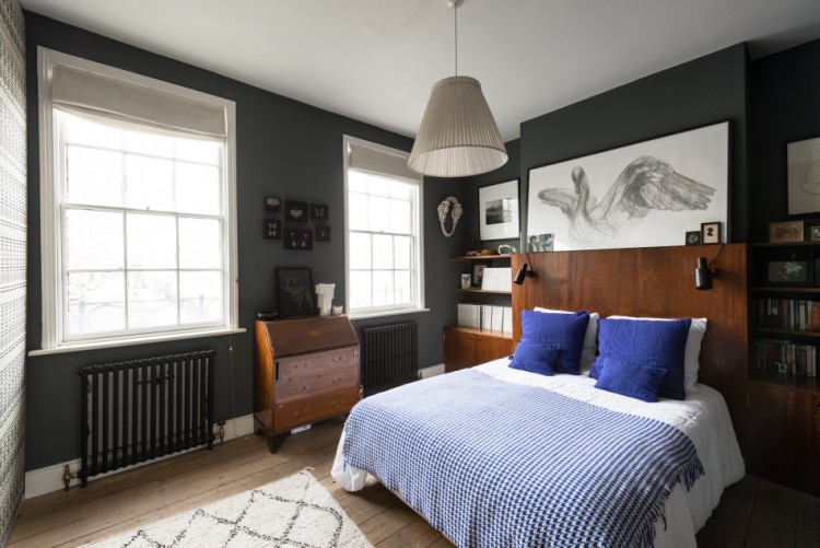
Finally the bedroom and again they’ve changed – this time we have dark walls and white windows. Proof that you don’t have to do everything matching for it to work. Check also the important touches of wood to keep it from looking stark. Great house. I want it.


I really like the dark window frames against white.
The addition is nice, with all that light. Especially since the living room has such dark colors.
Not a fan of tile countertops (pain to clean) but as a look, I agree they are very graphic and that contrast of tile and grout is clever.