This week on the podcast we discussed whether the rules of fashion apply to interiors. Regular readers will know that I have often said that where the catwalk leads the cushions will follow and there was a very clear example of that when it came to the biscuit and cream shades which were all over the high street earlier this year.
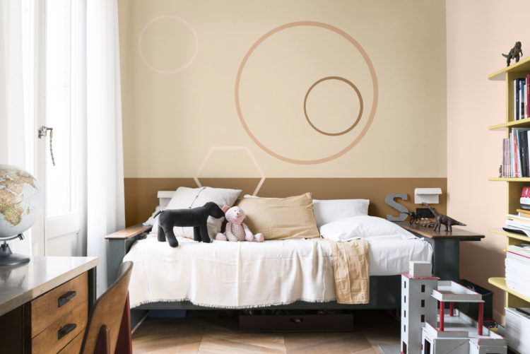
In 2018 Dulux announced that their colour of the year would be Spiced Honey which met with the usual outcry, but then when it started appearing on clothes from high end to high street it was only a matter of time before it started finding its way onto our walls as well. The same thing applies to neo mint which I wrote about the other day. And Instagram is full of the hashtag #dresslikeyoudecorate.
The idea was sparked when I received a press release from our podcast sponsors John Lewis titled: “Does this come in black” and extolling the virtue of the little black chair. And so, all together now: Sex and The City voice: I got to thinking… do the rules of fashion apply to our homes or is it one rule for one and one for another?
Let’s take one of the most well known aphorisms by Coco Chanel: “Before you leave the house, look in the mirror and take one thing off.”
Now I often do this when it comes to clothes. I might have added a scarf or a belt and often find that I remove it just before I leave the house. And I might also do then when it comes to my interiors, preferring to scale it back rather than pile it all on.
Even Sophie, who is known for her maximalist approach, admits that she might start off by putting everything in and will often then start taking things away before she is satisfied.
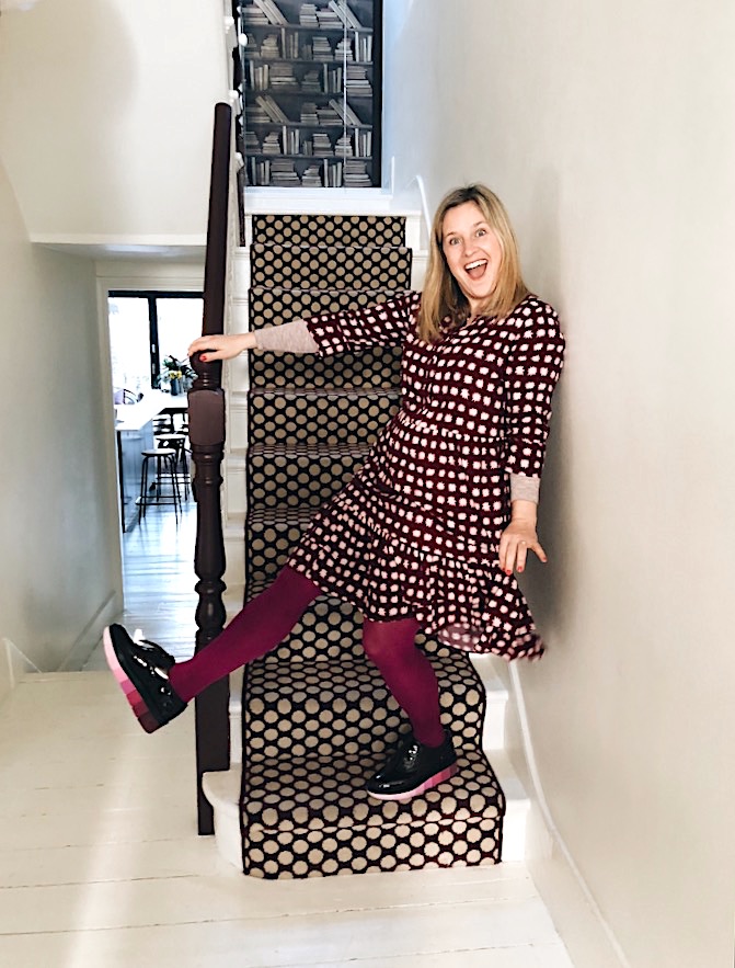
So that’s round one to fashion and here she is dressing like my house rather than her own!
Next one: Leopard is a Neutral. Sophie totally agrees with this one and both she and her home have accents of leopard in them. I disagree with the leopard but have both a zebra print pair of shoes and a rug so perhaps it’s true if you expand it to mean any animal print. That said I think it only applies when it’s in its natural colours. Once you have crossed over to neon or cobalt blue leopard prints they are no longer neutral. But as earrings and shoes, cushions and throws, a dash of animal print does indeed fit with very colour scheme and motif.
What about: Always invest in a good pair of shoes? I think this works too when applied to interiors. Basically, think about the core function of the room and buy the best you can afford; be that the sofa, the mattress or perhaps the oven (if you like to cook).
And here I am dressing like my own house. As I am unlikely to be spotted dressing like Sophie’s!

Lastly, and this was where we came unstuck. There was an old rule that said you should always match bag, shoes and belt. Now we decided that this rule was dated and no longer applied. But then these things are cyclical aren’t they so perhaps that will make a return to our wardrobes? In which case will the long held rule that nothing should be too matching in interiors also be overturned? Do you think the three piece suite will come back into fashion? That’s one to ponder isn’t it? I have always rejected a three piece suite precisely because I have always felt it looks like you didn’t put any effort into your room. That you just added to cart because it was the easiest thing to do. But perhaps our opinions will change and a three piece suite will start to look careful and thought-out? What do you think?
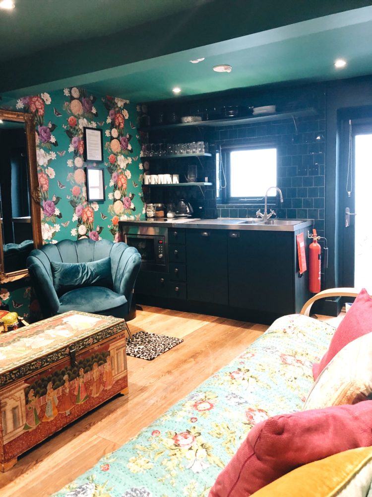
Also on this week’s episode we returned to Sophie’s holiday let which she has recently decorated removing the heavy black wallpaper in favour of something lighter and more colourful. In doing so we worked out five guidelines for decorating very small spaces.
1 You can go all out in a small space but you must pursue it to the end. Wallpaper all the walls, paint the ceiling to match and add contrasting patterns on the soft furnishings. You can’t go halfway – ie bold paper with a white ceiling as this won’t have conviction and the contrast between the white and the pattern will be too much. If you’re going to go for it then really do it .
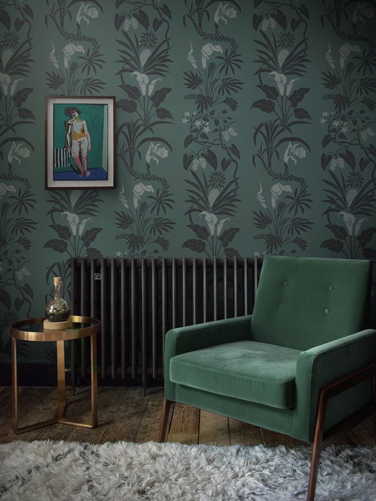
2 When mixing patterns you need to keep the colours tonal but big blousy flowers love a bit of contrasting geometric. This is the way to un-Granny your florals and add a bit of edge to a scheme.
3 Black and white is another good contrast to colourful patterns and this can be stripes, geometric or even more flowers.
4 Rather than painting a window white to match the walls, try painting it in a strong colour – this works particularly well if a) you are drawing attention to the view beyond and b) if it’s a pretty window with an original shutter or a good shape.

5 If you have an open plan kitchen or a kitchen in the living space then (and this works for all sizes) it can be a good idea to keep this area really quiet in terms of the décor. It’s probably mostly functional so paint and tile it to match the overall colour scheme of the room its in rather than drawing attention to it with bright colours.
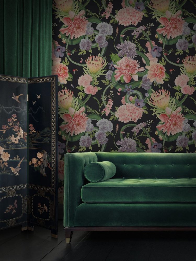
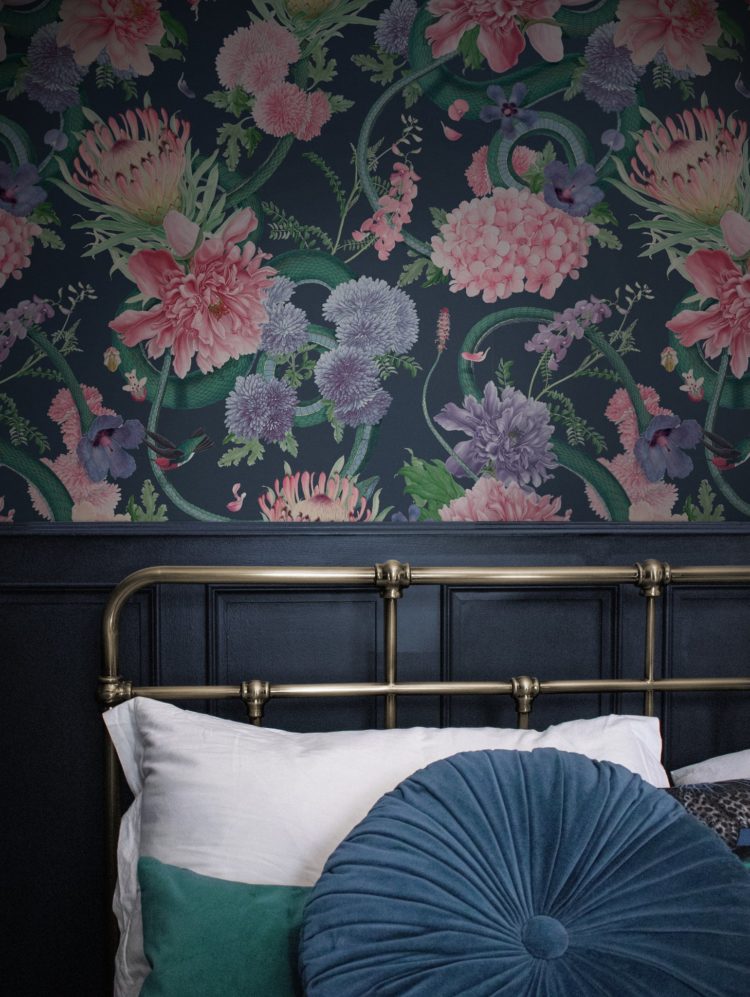
Sophie has, of course gone all out in her flat and in addition to the Graham and Brown Bloomsbury wallpaper of the year in the living space, she has also used a dramatic pattern by Divine Savages upstairs in the main bedroom. Listeners to the podcast will hear me suggesting she paint the ceiling in pale pink rather than the white she has used although she did match it to the background colour of the wallpaper.
One other key tip for wallpapering is if you have chosen a strong colour and if you live in an old building where the walls aren’t always straight then paint the room first in a colour that matches the main colour of the wallpaper. This means that should anything move (and old buildings do) or if the wall isn’t straight, you won’t notice any flashes of white between the joins. In fact, you will hardly notice the joins at all. Some people work out where the edges of the paper will be and just paint strips of colour on the walls first, but Sophie did the walls and the ceiling in their entirely as you can see from the pictures.
Then we spoke about dining table styling or as it used to be called laying the table and now seems to be called tablescaping. This part of the show is probably best listened to as we chatted about childhood rituals and Christmas decorating rather than suggesting guidelines and rules but, given that it’s the time of year, all I’m going to say is; if you are hosting then you must reject that pressure for it all to be perfect. Pour another glass of wine, find a job for the nitpickers who complain that it’s not done the way they would do it and relax.
I hope you enjoy the podcast – those of you that listen. We have secured sponsorship until the end of June 2020 so we will be continuing to discuss all things interiors for a while yet. Do listen if you haven’t already – it’s about 40 minutes long and if you have and you like it then do please rate and review us as it helps spread the word. This post intended as show notes and illustrations as we are aware that interiors is such a visual medium that it can be useful to see some pictures too. That said I always try and make it so it can work as a standalone post for those of you who aren’t into podcasts.
With grateful thanks, as ever, to our sponsors John Lewis & Partners without whom this show would not be possible.


I love the podcast – you two are a delight.
Don’t have anything in particular to say about the content of this post but just wanted to say I loved the photos of you and Sophie! You always look so confident yet comfortable with a kind of signature style. And Sophie’s face made me smile, she really reminds me of my sister 🙂
That’s very kind of you thank you xx
Three piece suites…if you remember any of my other comments you may remember I am very traditional, or I was and still am a bit.
I always had a 3pce suite until I got remarried and moved house. There wasn’t enough room in the sitting room so we got a settee, one chair and a matching storage footstool. Then we added a conservatory onto that room and bought a 3PS from the same manufacturer in a toning material as the 2 rooms opened up into each other.
In 2015 I consulted a local interior designer, Ashley Sutcliffe from LiveLikeThe Boy In Colne. He helped me move away from tradition and be more daring. We redorated with lovely paper from Mini Moderns and with style advice from you and your book Shades of Grey. We also invested in new seating arrangement, two large very modern plain fabric sofas from Rom and one large arm chair. Keeping just one of the original settees also. So a thing can really work if you plan it properly.
As you often say we, as the homeowners have to like it, maybe embrace new ideas if we feel it works for us and the house.
Always keep an open mind,
I am a huge fan of your blog and podcast. Great guidelines here. Thank you!