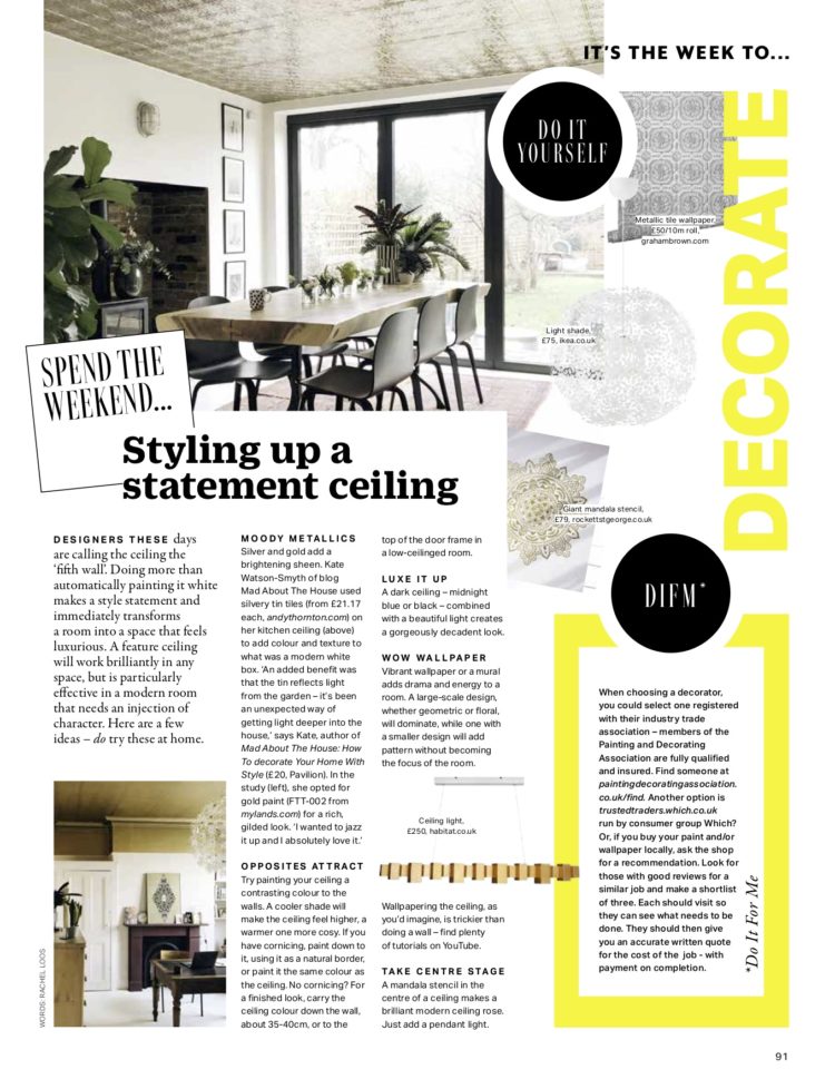
Throwing it back to some statement ceilings in honour of a spread in Grazia earlier this summer which included two of mine. And, coincidentally, today’s issue of the magazine includes their first ever interiors special for which I wrote a four page special on the seasonal updates you can make now.
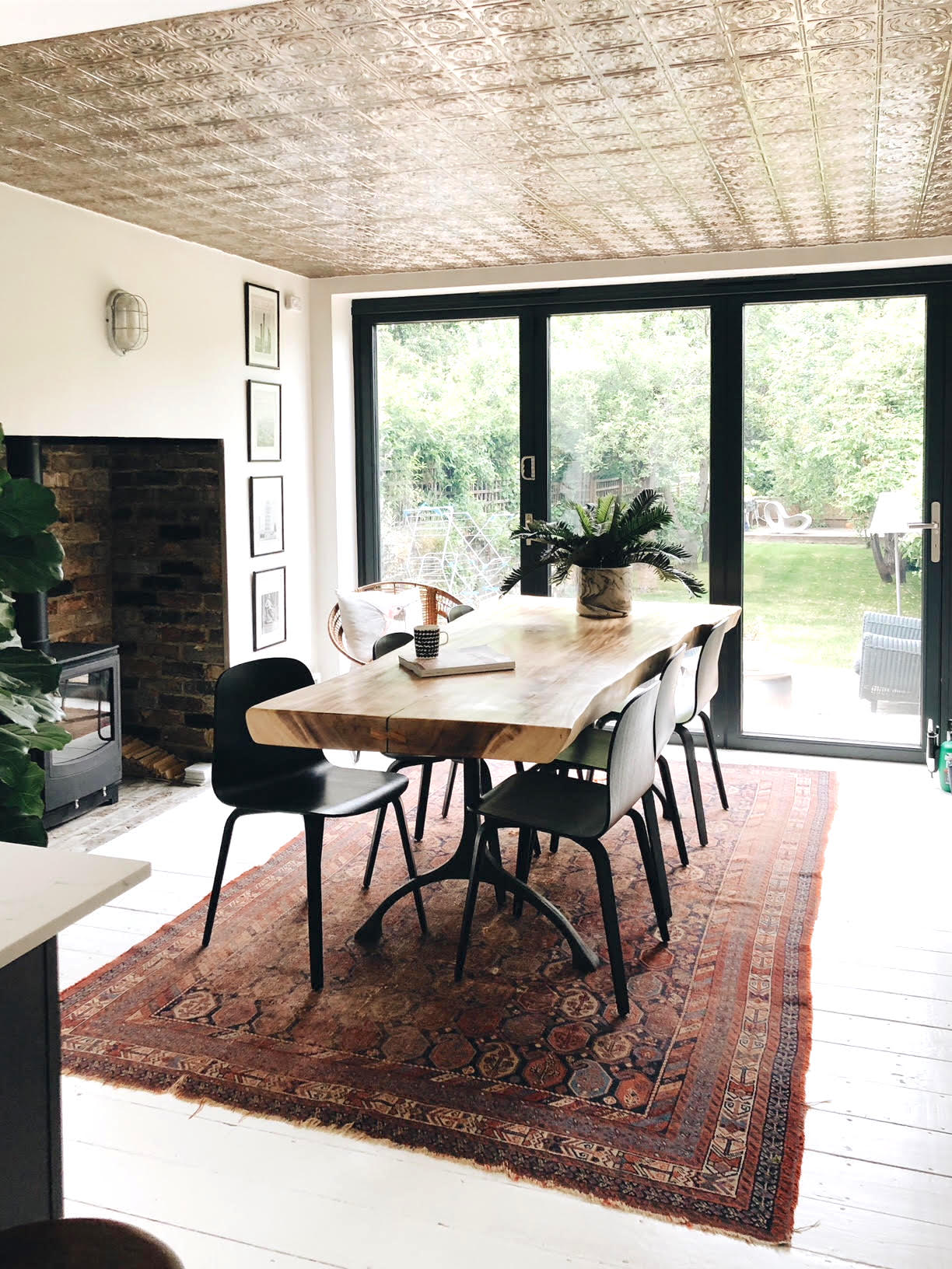
It’s not that walls can be in fashion as such but there is definitely a move around not forgetting the fifth wall – or the ceiling as it is more correctly known. Mind you, last week someone told me the fifth wall was the floor but I think that’s definitely the sixth. Anyway whatever you want to call it, today I’m shamelessly taking advantage of the fact that Grazia magazine has written about this very subject this week and has included both my gold and my silver ceilings for illustration.
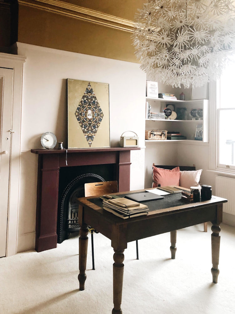
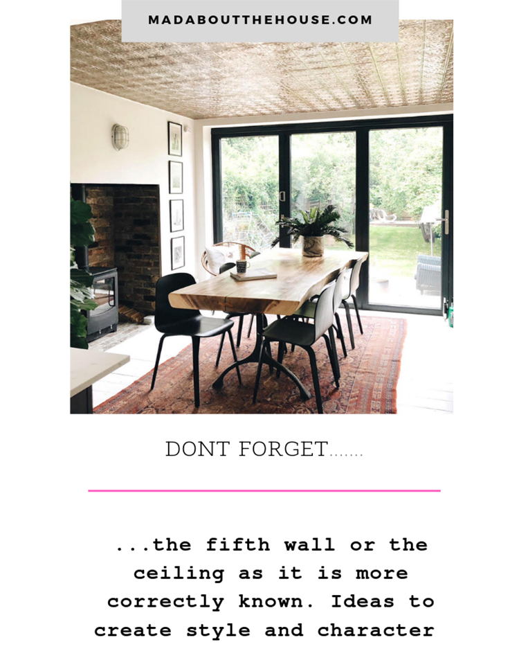
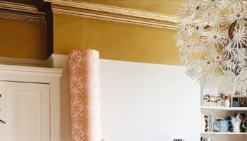
And it wasn’t until I wrote the sentence; my gold ceiling and my silver ceiling that I even realised I had them both. The tin tiles have been there since 2010 and while I love them just as much as I did when we bought them I sometimes forget to see them, as it were.
We installed them because this is an extension and the ceiling is too low for the classic pendant over the table that most people do, so we did this to add a feature and to bounce the light back into the room from outside. It’s something you could do with any low ceiling to add character. We chose to leave them silver but they were intended to be painted and you could do that to add interest to a new build for example – even if you painted them white to match the walls.
Although, let’s talk about that. White isn’t always the best choice just because it’s the traditional one. You don’t wear a white top with every outfit so why pick a white ceiling no matter what the wall colour? That’s why it helps to think of it as the fifth wall -because you will actively choose a colour for the other four so why not this one?
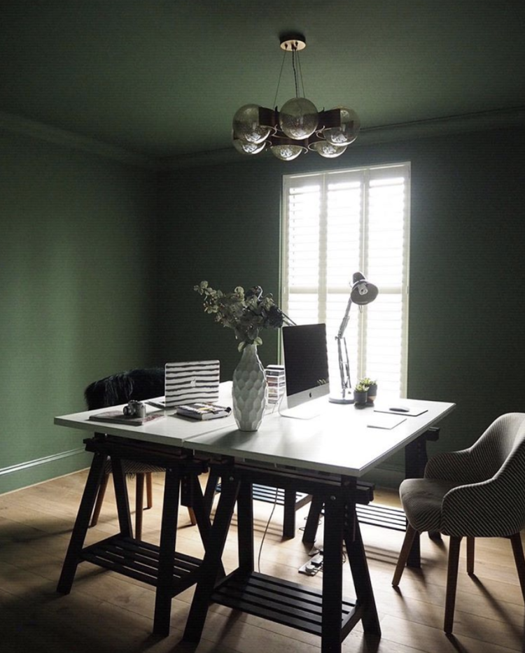
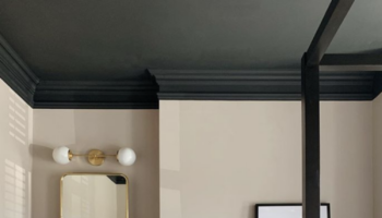
Sometimes it looks great to match the ceiling to the walls as Erica Davies has done here. It’s a dark colour; Hobby Wood by Earthborn, and it looks wonderful in her study. Yes, it probably has made the room darker but only she can know if that’s a problem and I’m guessing it’s not or she wouldn’t have done it.
It’s also a calming and creative colour and perfect for a study. There is a pale floor, white desk and a large window all of which will be bouncing the light around.
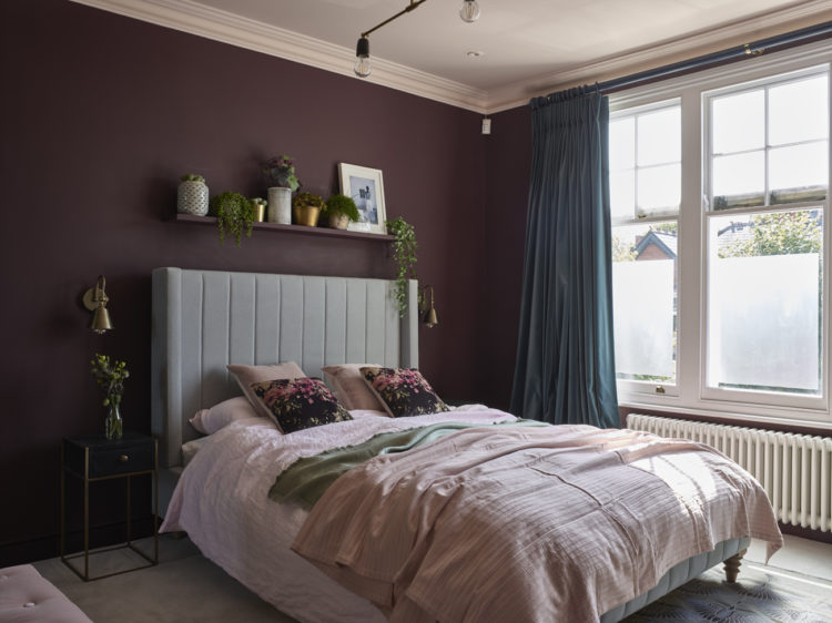
Now what about this? The pale pink is so much better than that default white in this room by Em Gurner. But it’s also another colour idea. The walls are, effectively, deep pink or burgundy, with the ceiling a paler version. If you are worried about making the room dark by doing everything the same, as Erica has done, then do what Em did.

Or you can do it the other way round as in Hannah’s room above. Pale walls and the ceiling in a darker version of the same. I have said before that painting a room all the same colour blurs the edges and makes a room feel bigger as the eye isn’t drawn to the corners and confines of the space.
This is why it can be a good idea to take the ceiling colour down to a picture rail if you have one as it will make it appear larger and it will make the ceiling recede. And if you look at this picture above the fireplace you can see how the camera angle has effectively blurred the wall and the ceiling together so you can’t tell where one ends and the other begins.

Or there is the complete contrast option as shown by the ever-talented Em Gurner again. In this case the combination of pale pink and olive green is stunning and not too heavy. I am often asked what mistakes I have made in my own interior decor and the most recent was when I painted the bedroom ceiling dark grey. The Mad Husband hated it as he felt the ceiling was coming down on him. In hindsight I can see this was because the walls were a pale chalky white – the balance was off and there was too much of a contrast between the two colours. But above, with the pink a strong shade in its own right and the olive, a strong but crucially soft, colour it works perfectly.
Now I’m not saying there’s anything wrong with a white ceiling. I have several but I’m suggesting that before you reach for the white think if another colour might have more impact.
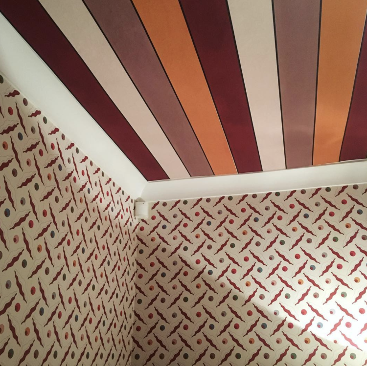
And this is what I want for another ceiling somewhere. I have gold. I have silver. I want stripes…
I’ll update with an image of Grazia when it’s out. And here it is:

Quick comment about painting the ceiling the same colour as the walls.
The light affects the paint job and the ceiling, in my experience, looks a paler colour but it’s the same paint as the walls.
The painter used a light colour for the walls and ceiling and at times the ceiling looks MUCH paler.
Something to consider.
I love your blog, but this did get me thinking. I might have a project for those gold or silver tiles! Where did you get them? I’m also curious why anyone would buy silver tiles and then paint them? Many thanks, Karen
True Kate. This is what I love about some of those temples and cathedrals which have such intricate piece of work in the ceilings. We tend to ignore it but I’d like some colour on it than empty white ceilings.
A small room, for example an ensuite shower room should in my opinion be painted walls and ceiling, the same colour. We mostly, all have tiles whether we want them or not. That’s the case for me so I chose a paint which was the nearest colour to the tiles. There’s no window. White ceramics and cupboards, lots of mirror glass and steam proof Nutmeg White all over. I am hoping to loose the effect of too many tiles and make the room more inviting.
Love all the ceilings but the striped one – it would give me a headache!