After the last few weeks of finding a theme to this regular Beautiful Rooms post I decided to just pick some great spaces this week. There is a loose connection, if you want to look for such a thing, in that all of them have one or two great stand out features that make them great and that, if you want to adhere to a design philosophy, is something that I believe you should try and do in every room that you decorate.
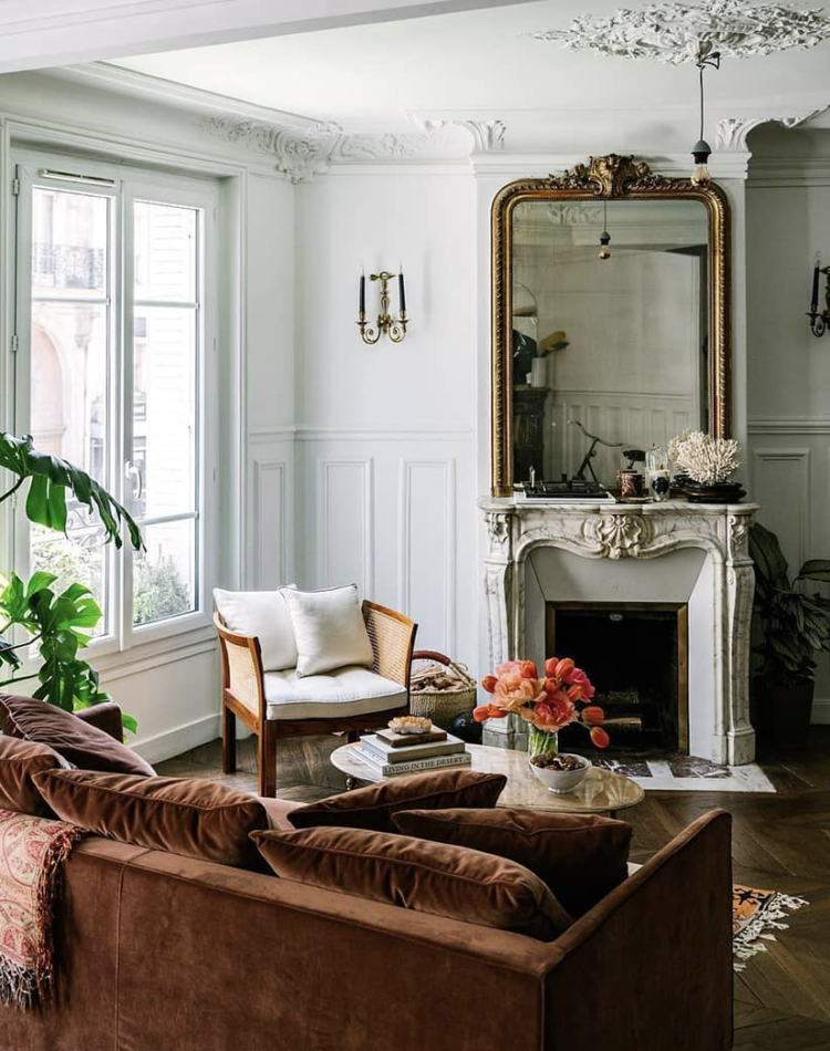
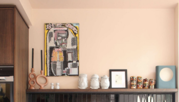
In short every room needs a wow factor. Or, if not a wow factor, something that provides a talking point or tells a story. The room above is elegant and understated and has wonderful original features so yes it’s easy to make this look good but that giant mirror is the added element that draws the eye and from there leads you around the room.
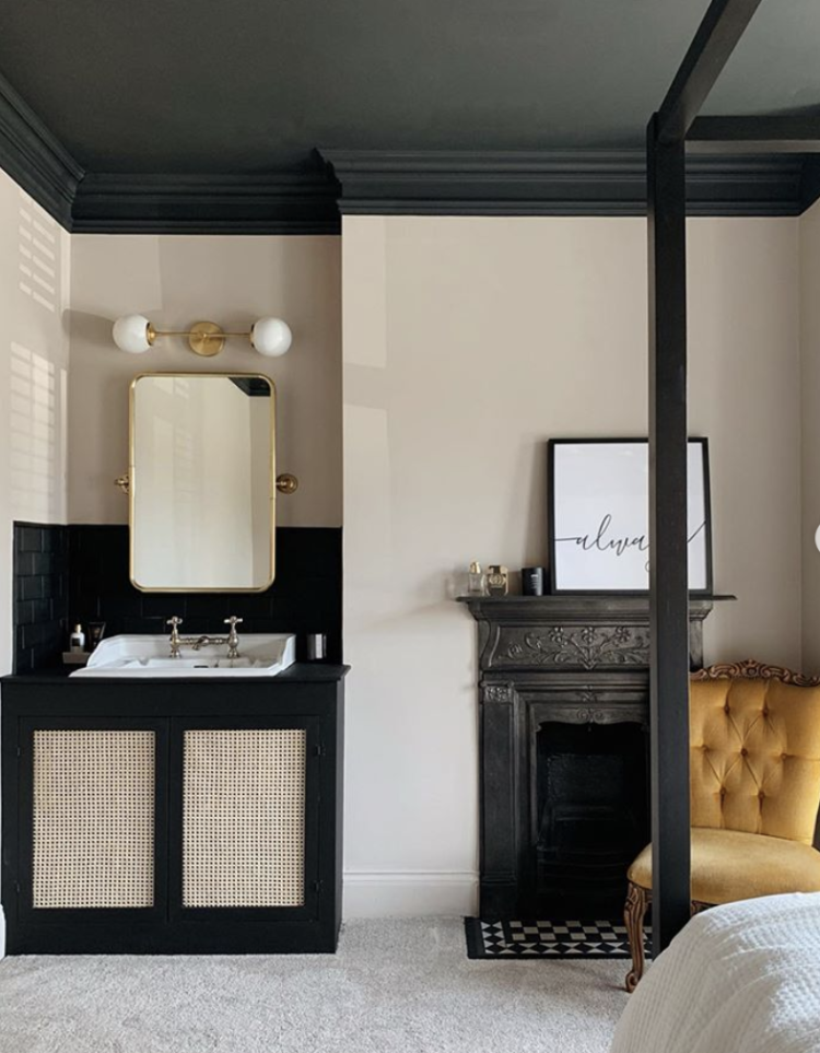
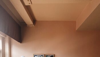
In the pictures above and below it’s about the ceiling of course. Chelsea, of The House that Black Built, has painted a dark ceiling but, in a clever touch, she added coving all the way round. This has the effect of softening the hard line you get when the wall hits the ceiling at right angles and also bends the ceiling slightly down over the walls making it look higher and the the footprint of the room larger. The black is then echoed in the basin vanity unit (which she also made and which we shall return to in a future post as well as the four poster bed.
If you want to paint the ceiling dark against a paler wall then do consider adding a cornice if you don’t already have one. Or bringing the colour down to the picture rail if you have one of those instead. It will look so much better than a just stopping at the end of the wall. If you follow Chelsea on Instagram she has created a series of story highlights called How To: Coving which explains how she installed this polystyrene coving (that costs about £5 per 2m length) and since no-one is going to get up there and touch it it doesn’t matter what it’s made from. This is also very light and easy to stick.
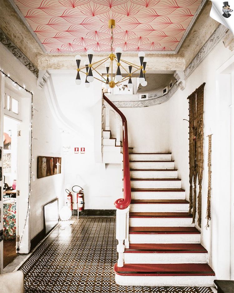
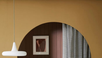
Or there is the wallpaper the ceiling trick which Fine and Dandy Co have done to such great effect above. Much harder than painting but it is, I think, a look which is going to increase in popularity as we realise that the so-called fifth wall has so much potential for adding colour or pattern. And, of course, in any room other than the bedroom, it’s a way of adding a wow factor that you don’t have to look at all the time so it needn’t become overwhelming.
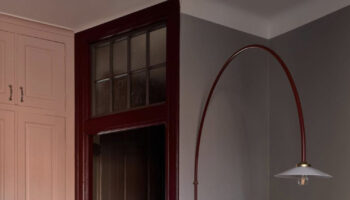
If that feels too much note how the bannister handrail has been painted red to match. I have painted ours burgundy to match the spotty stair runner although I have to say that from a distance it tends to look like mahogany rather than paint. Alex Stedman of The Frugality, has painted hers in pale pink which is quite subtle but is a very quiet wow. It’s also a colour that repeats throughout her house so it makes complete sense.
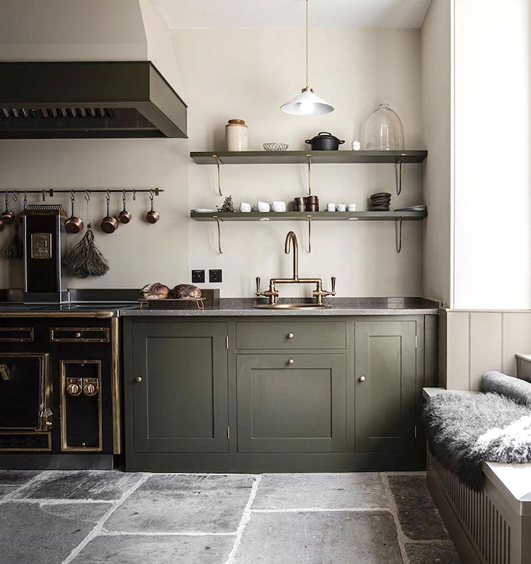
This kitchen by Plain English, like the room above may be a collection of great decorative choices rather than a single wow but you could go for the colour in the first instance. A green kitchen might feel like a bold choice but by keeping it to the lower cabinets it’s less overwhelming while painting the shelves to match just ties the two spaces together in a clever, yet understated way. The brass details – handles, pans, tap and shelf brackets mean that the number of colours is kept to a minimum so the overall effect is one of calm and elegance that has a timelessness to it even though it’s a bold colour choice. The wall colour – a sort of off white bone is also key. White would be too much of a contrast and while many people tell me they hate cream, there are so many different options you need to look for the one you can live with. What is chalk for one will be cheese for another so keep testing till you find what works for you.
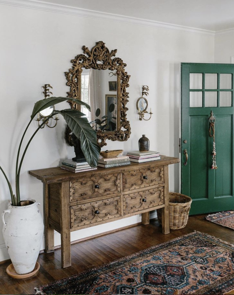
Or you can just go for a seemingly random idea that looks totally right for no apparent reason like this green door. Why paint a door a boring shade of white when it can earn its place in the decorative scheme of things. It could also have been navy or pink to go with the rug but the green goes with all those colours and just turns this corner into something special.
Your homework for this week – come on it’s been nearly eight years and I’ve never given any homework ever – is to look at your own rooms and see if there’s one place you could add a bit of wow with wallpaper or paint. Or if simply painting a door might create something really interesting. You can report back in the comments below.
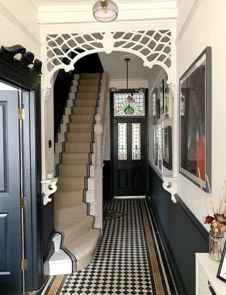
I read this like a test: first tried to notice what attracts my eye in the picture, then read the description. And failed every time, I have to say 😀 In the first pic it was the luscious velvet sofa, the second -th the “always” print and the black tile (to be honest, did not even notice the black ceiling, had to go back and check the colour after reading the text), the third – the chandelier, although yes, at least noticed the wallpapered ceiling this time, since it matches the chandelier so well; the fourth – the beautiful latticework arch (also made a second guess that it might be the floor or the stained glass window, but well, no); the fifth – the brass details (I guess the cupboard colour is more or less neutral among current trends and doesn’t attract attention as such); the sixth – the mirror (no luscious velvet sofa in sight might have been the case). I do agree that each of these rooms have at least one thought-out gorgeous detail, even though they’re not what the post says.
I think it’s all about identifying your own wow factor or detail and we’re bound to pick up on different things. I love that yours were all completely different to mine.
I tried to guess what your ‘WOW’ would be in each room before I read yours. Always a different ‘WOW! Just goes to show what is wow for one is mmmm for another. Loved the idea of walking thorough my house trying to create a WOW in each room, it might be as easy as a jug of flowers or a magnificent pile of books but it will be my WOW for now. Thanks for the inspiration and motivation to do something simple but never the less impactful
Oh Lordy…. love those Hallways….and the Green door is beautiful. You’ve set me thinking 🤔
The wallpaper on that ceiling is amazing! Any idea who it’s by?
Tiny bit of wow in my living room – painted the leading edge of the door rusty red to match a mirror .
Good Wow though!
Hi Kate
Loved this post – as for homework dare I say plenty of WOW factors in my own home , unfortunately I suspect more along the lines of silent “WOWs” as in “what possessed her to do that!” I blame you.
Dear Kate
I absolutely loved today’s post. Every picture a great example of unusual and yet harmonious design.
Best regards
Sigrid