A random selection for you this week on the basis that while you can’t please all of the people all of the time then different readers might find different things to take away or bookmark to come back to later. Also we’re going bumper today as I found lots of things that might be useful which makes it appropriate to welcome you all in with a hall with a view as it were.
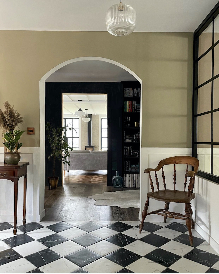
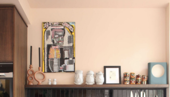
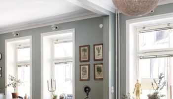
And what a hall to come into – I would urge you to go and see the rest of the house on Sharon’s instagram as she has done so much to this house and it’s all clever. Firstly the middle part is now lined with bookshelves which has given what might otherwise be a dark passageway a purpose. You do have to work with what you have, and rather than leaving it as simply a link between sitting room and entrance, try and make it look like you designed it that way.
But leaving the floorplan aside it’s the details that really make this work. The squares of the black and white checkerboard floor are picked up by the windows in the sitting room at the far end, and again on the internal half wall on the right of the image above which leads to the the kitchen. This wall creates a break between the entrance hall and said kitchen but also allows maximum light into both spaces.
Last week I did a zoom consultation with the owner of a house whose front door came directly into the sitting room. The result was that she had furnished it with a sofa and chairs but the family never use it because it feels like a hall with seating in. The key is to make it feel like a sitting room which has the bonus of a door directly to the outside and a view of the trees and garden. This, we decided, would be best done by a half wall not unlike the one above – glazing optional. That way people can walk in and out without feeling like they are tramping through the sitting room. A sofa in front of said wall so you are not forced to watch the entrances and exits will also make it feel more like a room than a road.
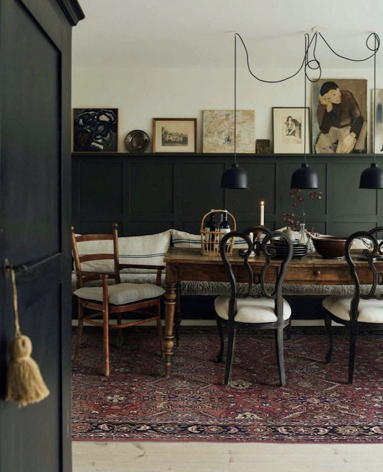
We’ll come back to floorplans at the end, but above is a rather lovely kitchen space that looks completely organic rather than put together and that, surely, is the holy grail. The panelling may well not be original but it works to zone the space and act as a sort of “back” to the built-in banquette with its collection of cushions that make it look more inviting (and feel more comfortable). The pendant lights are draped low over the table – this is key to creating an intimate space and also to zoning a dining area within a larger room. Pendant lights are often too high and unless you really are moving the table for dancing (and in many cases I would say where to?) on a weekly basis you really can hang the lights low – just make sure they are over the head of whoever is likely to be the tallest person sitting down and if someone really tall does turn up then he or she can sit at the end.
Finally, if you add a narrow shelf to the top of your panelling (5-7cm should do it) you can add to and rotate different pictures along the top allowing you to feel like the space is being constantly refreshed.
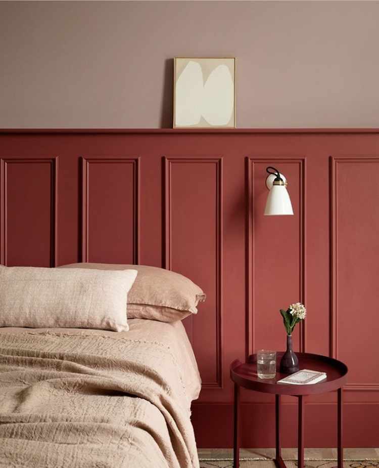
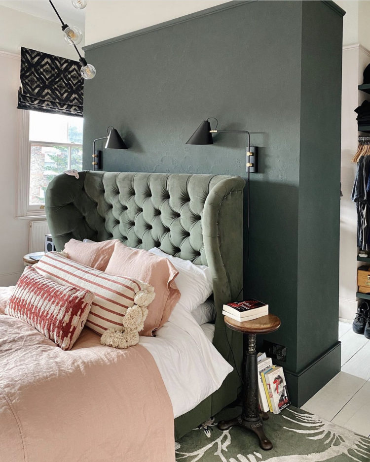
Staying with panelling and I keep coming back to this colour – Beetlenut by Paint & Paper Library – and this has so much impact despite the fact that there are basically only two colours (three if you count the ivory of the lamp and the artwork). But there is a varieyt of texture from the wooden panelling, the linen bedding, the painted bedside table and the flower. You could add more textiles to the bed and there may well be a rug out of shot.
But the key point is that if you have a divan bed (perhaps with useful storage underneath) you don’t have to sacrifice character or spend a lot of money on a headboard. You could panel along the wall like this – and if you do it wider than the bed then you are wrapping the bedside tables into it which joins it all together – or you can just paint it with no carpentry required.
The lamp sits neatly in one of the panelling boxes and the narrow shelf gives space for pictures to hang. That said I might recommend a command strip as you don’t want it falling down on your head in the night. If space is too tight for bedside tables you could make a proper shelf above the bed and put books, flowers and even a clamp light onto it. Just make sure, once again, that the tallest person can sit up in bed without banging their head.
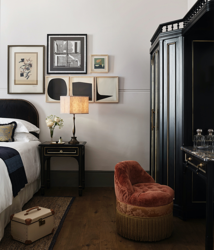
Talking of arranging pictures and this, from the Nomad Hotel, caught my eye this week. We have all seen gallery walls spread over vast spaces beside stairs and filling large spaces, but I thought this was a great example of a small gallery wall. The pictures are not over the centre of the bed, as would be traditional, but grouped by the bedside table and my guess is that you would take far more notice of them there because that’s not the classic place you would expect to see them. The shapes and colours tie in brilliantly with the rest of the room and perhaps even draw your eye to the curve of the headboard and the flowers on the table. Take nothing more from this than the notion that it’s not about rules it’s about having the confidence to do what you want and making it look like you meant it. Of course you could have had a single picture either side of the bed, but a small group makes more of a statement.

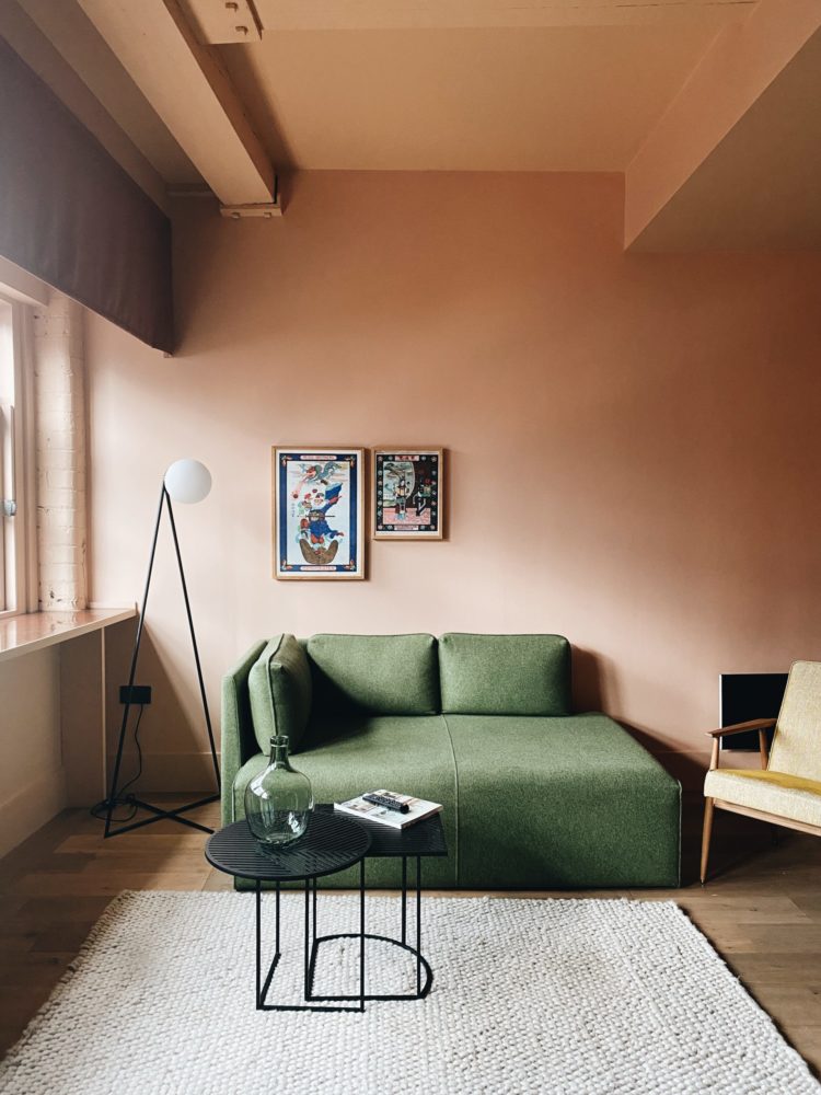
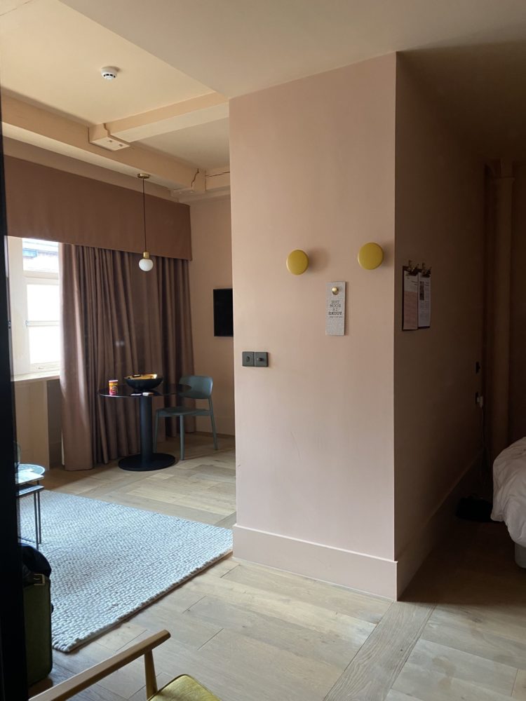
Now a lightning trip to Manchester this week and a stay in the Whitworth Locke hotel which I found so interesting from a design perspective that I wanted to share a few pictures with you. Regular readers will know I am fascinated by hotel design for the need to cram so much into a small space while retaining a feeling of luxury. I know that many of us won’t be living in warehouse apartments, but plenty are in small spaces and while the temptation is to push everything back against the walls to have as much open space in the centre as possible, this hotel shows how you might do it another way and, brilliantly, you can see all the floorplans (go to view gallery and click floorplans on the top right) for all the different rooms/studios/apartments so you can easily see how you might adapt anything to your own space or on a smaller footprint. Above is the one bedroom open plan suite which is 30sq m or 323 sq ft. Below is the Suite where I stayed (34sqm and 366sq ft but remember you can adapt this idea to a smaller space).
Above this wall divides bedroom from sitting area and remember a bed is around 2m long and you need, at a pinch, 80cm to walk around the end, but you don’t have to box in the whole bedroom, it’s about making a screen between the two areas. If you have a long sitting room and need a WFH space you might be able to do similar at one end and if you’re worried about losing light then do as Sharon did above and make it half or a third glazed.
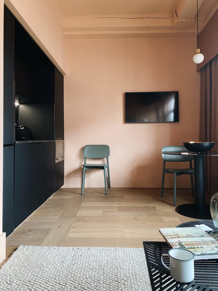
These two images are facing each other and you can see how the sitting area faces into the kitchen and uses the far wall for the TV. What intrigued me most about this kitchen was that the units have been placed in such a way that it creates a dividing wall on the other side of which is the bedroom. So this is, in effect, a wall that is 60cm deep (a standard unit) and in this run of cupboards there is a fridge (over the oven) a slimline dishwasher, a full size washing machine, two full width (60cm) units – one under the sink and one for storage, while the remaining 20cm (a slimline dishwasher is 40cm) houses a floor to ceiling unit with cutlery drawers, bin, and more storage so the whole lot is in a run of 4 x 60cm standard widths and it’s fully equipped. There are more cupboards, which are about 30cm tall, along the top but this picture is too dark to see them.
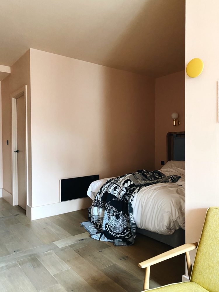
The wall is probably about two thirds of the full width of the room and you walk around the end of the wall to the bedroom which has been created between the wide kitchen wall and a narrow wall behind which is the bathroom (and don’t forget you can create a shower room in a space 1m wide by less than 3m long. You can see below how the bed is effectively screened from the living space but because it’s open you don’t feel like you are sleeping in a box. And I slept there and and no I didn’t make the bed before grabbing this image because I wasn’t, at the time, thinking I would be sharing it!
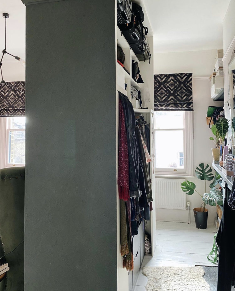
I took this picture below in the mirror but it allows you to see the thick wall that houses the kitchen. I have done a similar thing in my bedroom with the wardrobe (see below) so you can adapt these plans to your own needs. And, if you’re creating a small kitchen, you can see from the pictures above that this is relatively spacious in front of the units and that table would easily seat four – you could have a table for two or a narrower rectangle table with a banquette at one side, which brings us back to the second image.
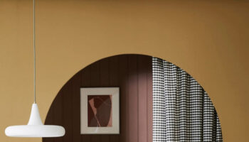
And let’s not overlook this fabulous pink colour scheme with its green sofa, yellow chair and black accents taken from kitchen. Its a bit Wes and I’m here for that.
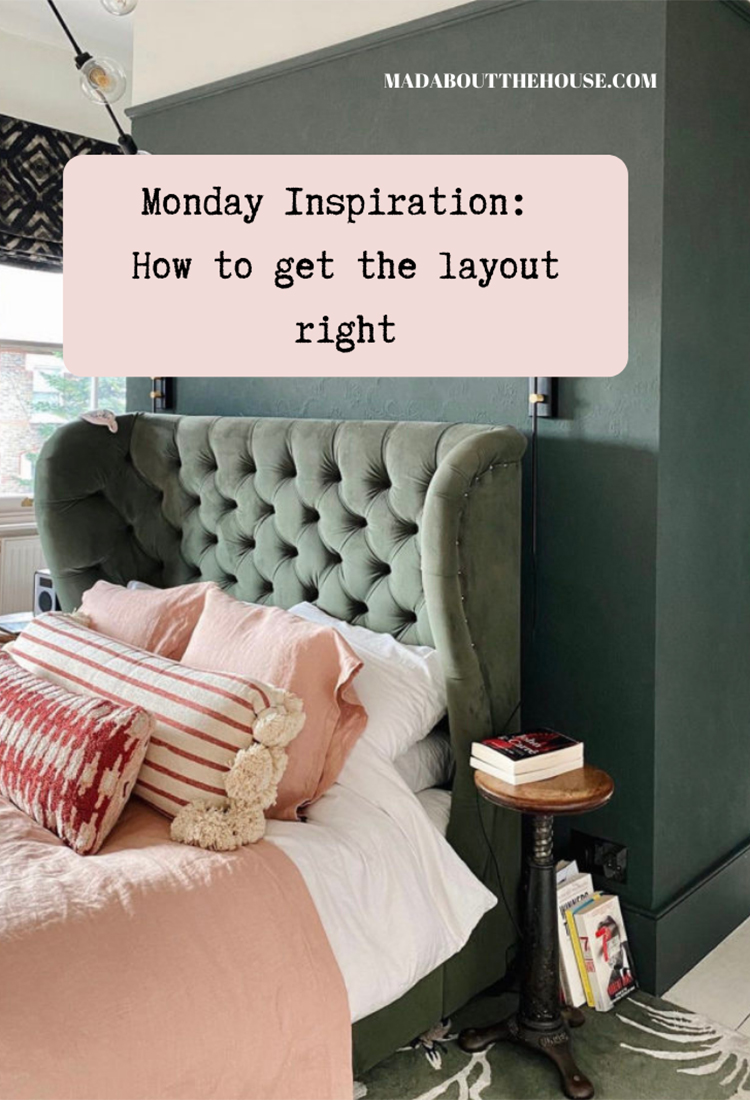
So with the circle fully formed I leave you with an image of my bedroom and walk through wardrobe that was used in The Times this week on a feature on bedrooms. I have included the link although it is, of course, behind a paywall.
We put a wardrobe behind this false wall but you could, if you had more space, put a bath or a shower or in a different room swap the bed for a sofa and put a kitchen behind it. The point being that open plan is all well and good but sometimes walls are a lot cleverer than they are given credit for.
And with that I will leave you. I will be back on Wednesday with an interview with product supremo Philippe Starck. As part of my partnership with Duravit, Starck, who has designed a new range for them, has agreed to just three interviews with British Press. I landed one and am thrilled to welcome him to these pages.
I love the images from the hotel, and your comments on them are really helpful. I’m thinking of how to section off our loft bedroom into separate bed and work from home space and this has given me some great ideas. Love the idea of the wall that doesn’t extend fully across the room and the cupboards as a wall – may well do that with wardrobes in our space. Thanks!
I like the off centred gallery wall in the Nomad Hotel photo. While something mounted over the bed looks attractive, I am not comfortable with the thought it could drop down. This arrangement adds interest and inspires a more comfortable night’s sleep. A lovely room!
Love the cushions on your bed Kate ,could you please let me know where they’re from . thanks jo
The front two are from Anthropologie a few years ago and the back ones are linen pillowcases from Himla which come in square as well as rectangle – it’s lovely soft linen.
Great ideas in the hotel room….although the tv hovering on an empty wall is bothering me…it’s rather lonely and needs to be integrated…some carefully placed art or a slim console table?
Beetlenut…….a colour I’m SO glad to see! In former decorating days, the now-proven highly toxic real red oxide paint was a colour I loved and used a great deal. I found out, to my horror, about its toxicity the hard way. Bless Paint & Paper Library for coming up with this wonderful and still special favourite of colours. It’s bookmarked!