Well pull up a chair (or a curved sofa) who’s been watching Halston? It’s a five part drama on Netflix about the fashion designer who started out as a milliner (finding fame after Jackie Kennedy wore one of his pillbox hats for the presidential inauguration) and went on to dominate the fashion of the 70s and 80s. It’s a great show (there’s a two hour documentary on Amazon prime too) but the interiors have got everyone talking as much as the clothes.
And I wonder if it’s a timing thing? After all the 70s have been creeping back onto our radar and while curves and rich colours have been in the interiors news for a while, I was particularly drawn to these images this week – helped, no doubt, by my own potentially Halstonesque project in the loft.
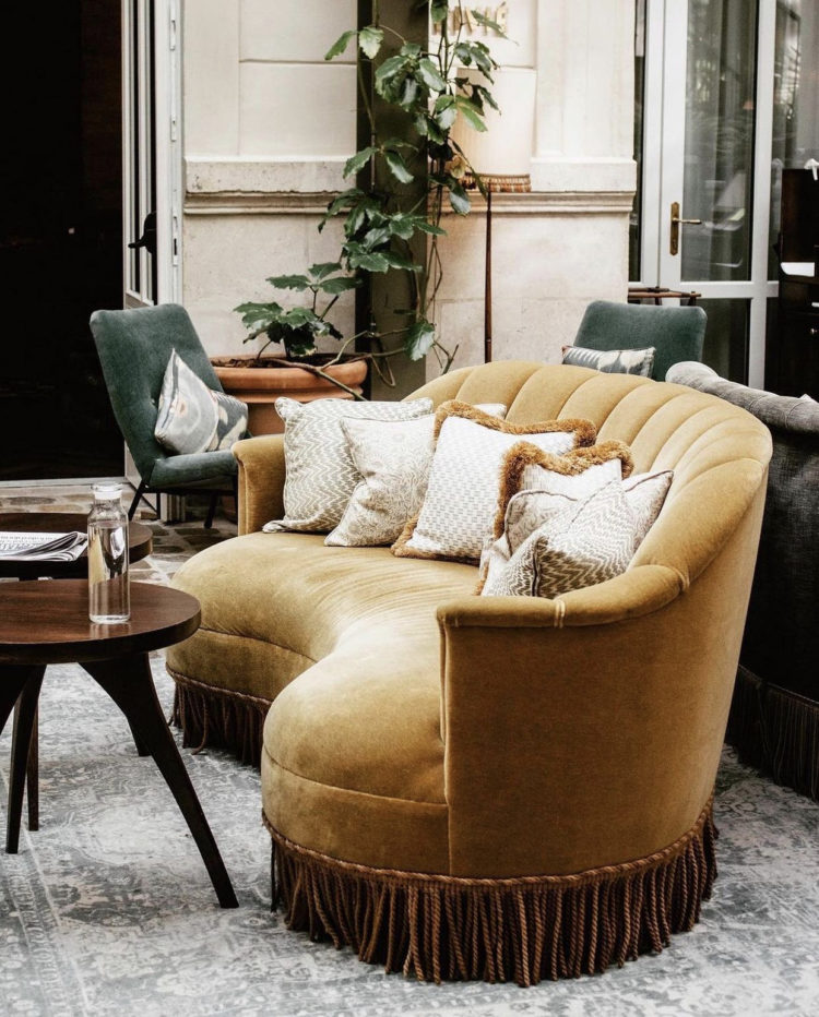
Above and below are two images from the Hoxton Hotel group. Their hotels are always a joy and I love this curved and fringed sofa. I also, now I look again, note that it’s a deep dark yellow and after my desire for this colour during the first lockdown which faded as soon as the restrictions eased, I wonder if I’m drawn back to it in the current uncertainty over rules and regulations. Or maybe I just like it and I should get on board with that.
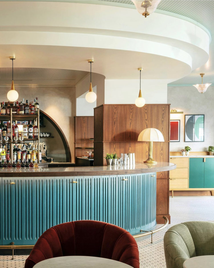
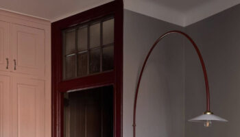
Fluting is another trend that’s going nowhere – it’s perhaps the new panelling and while I imagine few of us will be installing a curved bar in our homes – although much more of this seesawing between open and closed and we might….
However, it was also the colours that drew me into this. I have no blue in my house and no plans to add any but I love this picture. And this, my friends, is why I always say that Pinterest is your frenemy as it will lure in you in with pictures of places that you adore but can’t hope to replicate. And that’s fine, take inspiration from the colour combinations or, possibly the shapes, but don’t tie yourself in knots trying to recreate something that won’t work in your home. This image is a mini masterclass in linking shapes – from the curved red chair in the foreground to the artwork at the back with the lamp on the bar between. Same goes for the blue and this shows how you need to layer your schemes so you can link near and far and create a cohesive look.
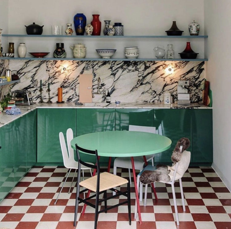
Similar colours but fewer curves in this kitchen. I’m not sure I’d ever actually have the courage to paint my kitchen this green (although again, I love looking at it) but I love the checkerboard tiles and the high gloss effect on the doors. I’d probably choose a terracotta cupboard and keep it all a little more tonal with matching chairs. But looking at a picture that draws you in and working out how to adapt it to your own space and budget is all part of the process.
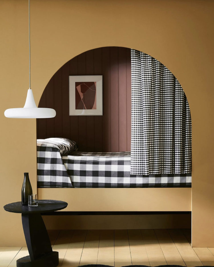
Keeping the checks and coming back to the curves and muted yellow for this fabulous image from Little Greene. Black and white is a joy with any colour and using the checks in two different sizes is a brilliant idea that would work with florals as well.
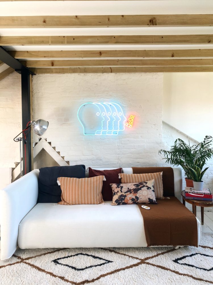
Finally, my own loft, shown here with a neon sign that is part of a limited edition collaboration between Jonathan Adler and Yellowpop. There are several designs including a couple of faces and an eye. This has started me off down my own 70s rabbit hole and after testing a bright orange for the brick wall we are now set on a soft red colour (very Halston Olympic Tower office) which might just look amazing with the neon sign.
It also raises the question of when is a feature wall not a feature wall? And I think the answer is simply – when it’s a proper feature and not just a random wall. This is the chimney breast which fans out into a triangle (hidden by the plant on the right) and mirrored on the other side of the dark beam on the left. It’s also a different material from the rest of the wall. And, might as well be honest, it’s The Mad Husband’s office not mine and he’s up for it and it means I get to experiment. It’s like a having a real life Pinterest board.
where is that beautiful floral cushion from that sits on your sofabed? I absolutely love it and would love great with the palette of colours in my house
It’s an old Madam Stolz Tokyo reversible cushion – here’s the link
Great vintage ambiance. Nothing like that kind of elegant bar to raise my spirits ahah.
That loft space is amazing! Love the neon light.
The Velvet Home | UK Interior Blog</a
I am amused by that kitchen with the mismatched chairs. It reminds me of my childhood on the farm in the ’50s, when that was all we could afford. Who knew?
The bed alcove though, I could just stay there all day with a book.
You have defined the space in Mad Husband’s office perfectly, red wall or no. Does he get any work done? Cheers from Canada!