Right so I’m going to try very hard to write about the picture next to the picture to avoid the scrolling up and down but this will mean we’re going straight in. None of that spraff about how are you, what’s the news, have you remembered to water the pots (er no not as often as I should).
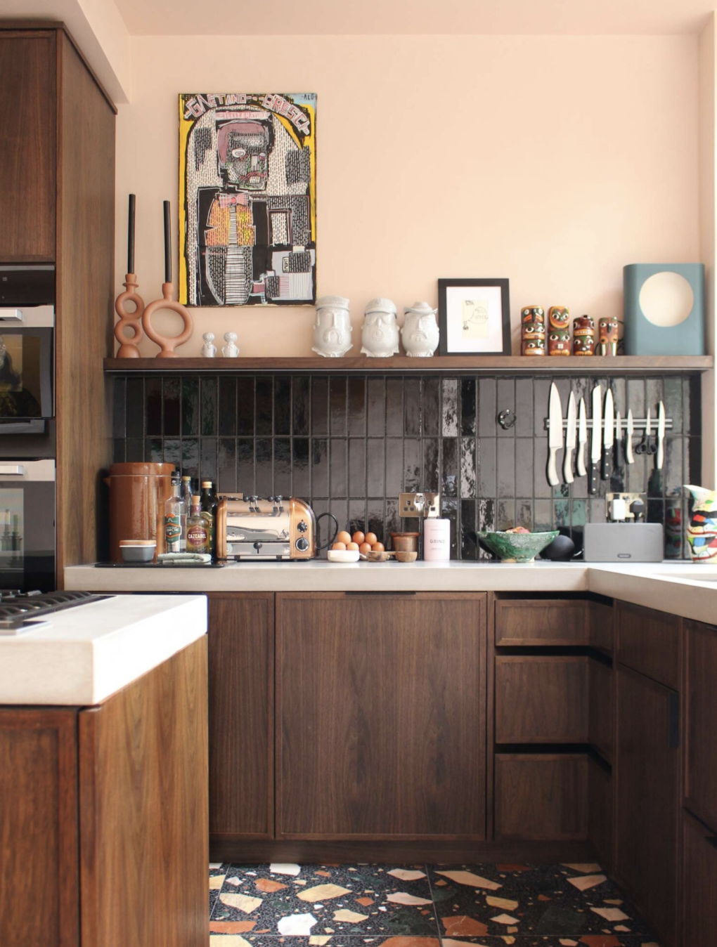
But that’s fine because I think my brain has worn smooth and I’m all out of chit chat as it goes. So let’s have a look at this gorgeous kitchen which belongs to Zoe Anderson, owner of the wonderful shop WA Green, who worked with Guy Derwent Architects to reimagine her space.
I was drawn to this mostly by the unusual colour scheme – that said I’m going to declare that I painted my kitchen units in a dark chocolate brown three years ago and we had various bits of pink wall until a few months ago when, having failed to convince The Mad Husband that every wall should be plaster pink, I conceded and we painted them all in a rich cream instead. Just, as the 20yo would say, putting that out there.
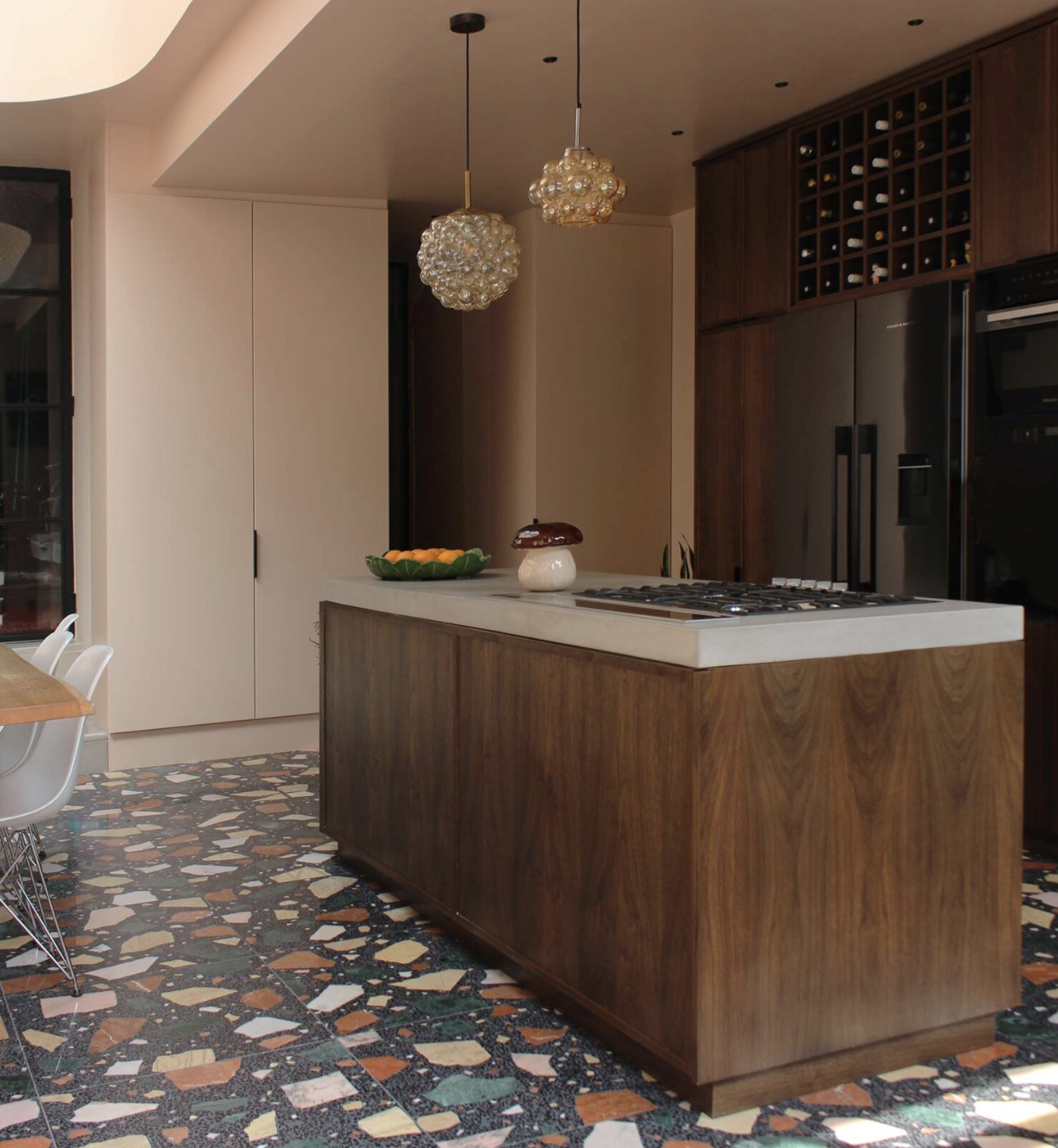
BUT, this warm and rich combination is gathering pace now and I particularly love the way Zoe has added these vertical black metro tiles and then brought all the colours together in this giant terrazzo floor. I have a love/hate relationship with terrazzo, feeling that we have seen too much of it on lamps and cushions when I feel strongly it’s for floors only but here, on a floor and with a large pattern that allows the colours to stand out, it really works. Kitchens are often full of solid blocks of colour and if you can find a way to bring in some pattern you should and the floor may be just the place to do that – the irregular design of terrazzo can be a little less formal than traditional checks. That said I am currently hankering after a brick red and cream lino checkerboard floor in my kitchen which, I’m thinking, won’t change the levels too much or be too disruptive to install. I have NOT run this past TMH yet though so I’m not holding my breath…
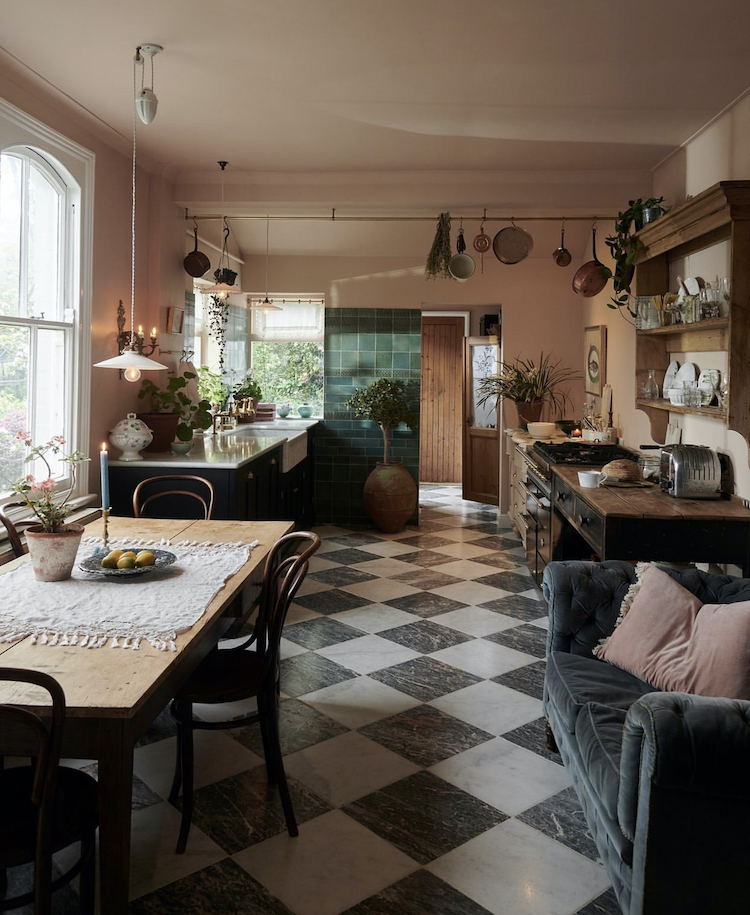
This Devol kitchen below (belonging to Helen Parker, the company’s creative director) has similar plaster pink walls, a wooden worktop with black cupboards – so same sort of colours as Zoe’s – and a black and white check floor. The lack of wall cabinets also gives it the unfitted kitchen look and turns it from a kitchen into a room in which you cook and eat and hang out. The hanging pan rack is also a doing the work of probably two cupboards there. The ceiling can be great for storage if you can pull off the trick of having one that is high enough so that you don’t get clocked by a dangling pan every time you walk past and low enough for you to be able unhook (and crucially re-hang) what you need.
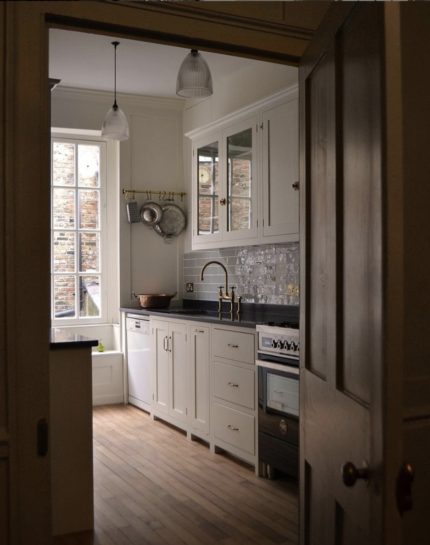
This small kitchen below (also Devol) was more about the door frame for me than the actual kitchen but there are a couple of points to note; the metro tiles – here in traditional brick formation but always a classic. The other point is the units on legs. Most of us have a traditional solid plinth, or kickboard, but that does make the units more solid and “heavy” in the space. A short leg makes it more “furniture” less “cabinet” and while you can’t actually see more floor (the old adage that the more floor you see the larger the room looks) it generally gives a feeling of lightness and therefore spaciousness. If you already have the kickboards (as I do) and you can’t just remove them – not least because your flooring doesn’t go all the way under (as mine doesn’t) then you can replace them with mirrored board – this will reflect the floor and make it seem bigger and also give a sense that the cupboards are floating.
Another wooden kitchen (by Nordiskakok) but this time there are wall cabinets although they are so minimal and, crucially, match the colour of the wall so they don’t crowd the room. There has long been a perception that all your units must be the same colour but I would say choose whatever colour you like for the base and instead match the wall units to the wall (which can also be whatever colour you like obviously). This is particularly important in small kitchens, which, by the time you have added all the necessary stuff needed to make them function, can quickly appear cluttered.
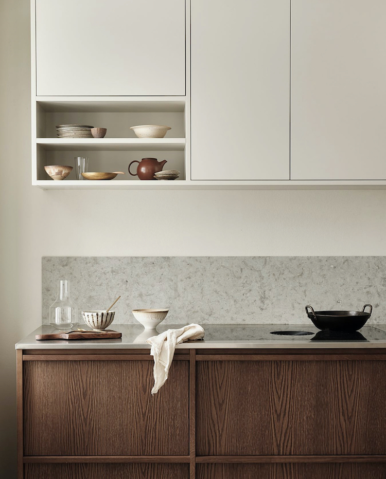
Here the pale cream cupboards and wall blend together (we can’t see the ceiling but I would have used the same shade on that as well) while the lack of handles also create a more minimal appearance. Look down and you see the worktop and backsplash also match and both are cut from single solid slabs so you don’t even have grout lines to break up the look. That will be more expensive but it’s always about balance and you can look for the savings elsewhere.
Moving out of the kitchen to a vintage wooden desk against a wall that has been fully clad in tongue and groove – another look that I love for kitchens if you aren’t having wall cabinets. This is loosely linked by the desk which just brings a cosy vibe to the space and looks like it has always been there.
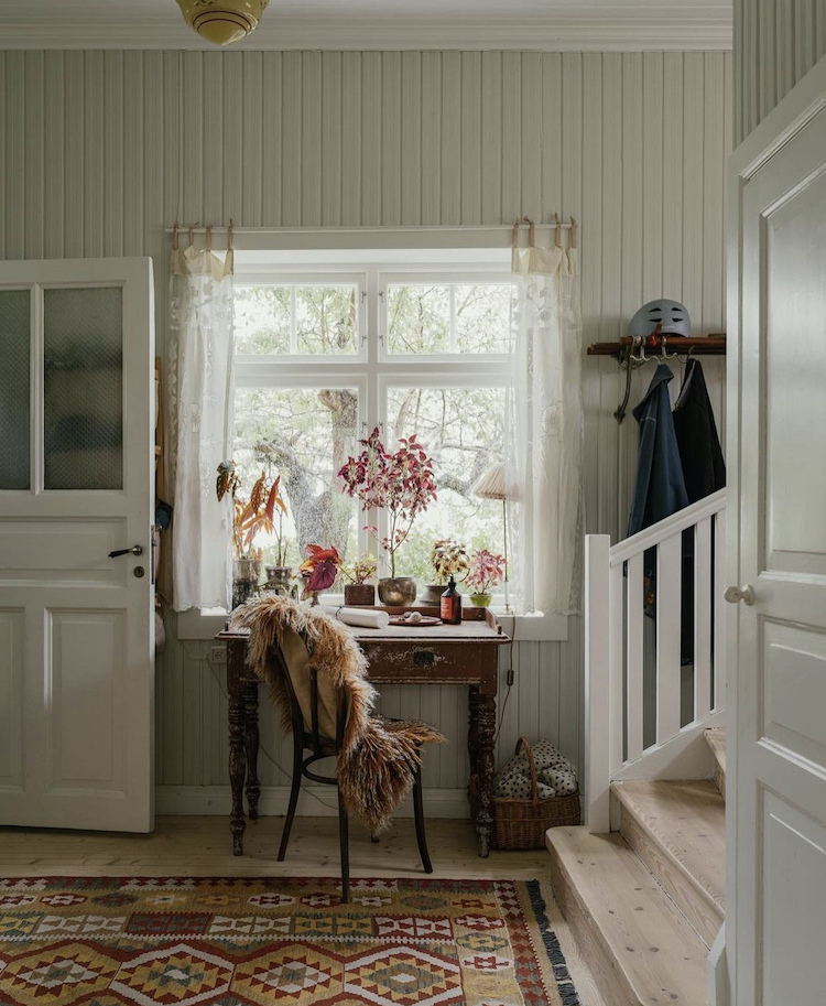
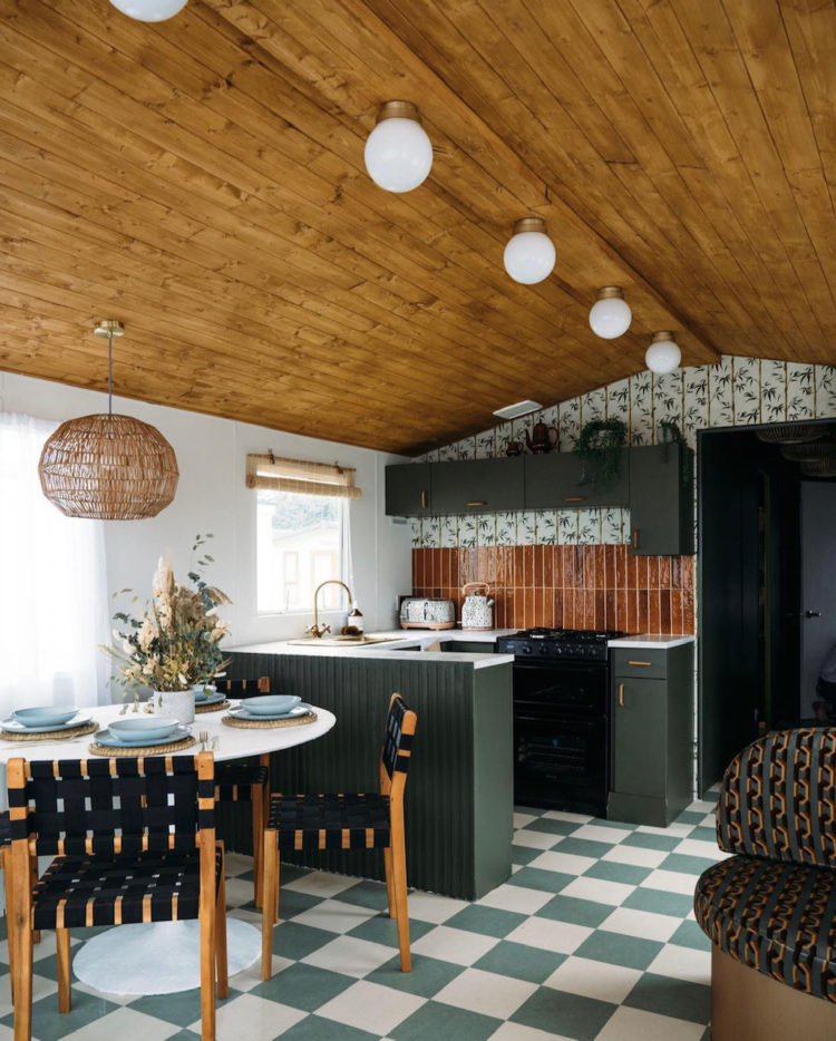
But it was more the rug I was drawn to as it has clearly provided the colour palette for the whole space and that led me, in colour terms to the Club Jupiter caravan which I have featured before. Here the cladding is on the ceiling but look how it links to those fabulous ochre metro tiles (again vertical) which are like Zoe’s black ones at the top (you’re gonna have to scroll at this point if you can’t remember them!).
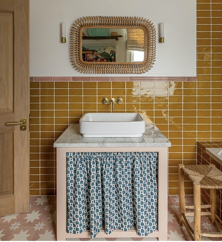
This tobacco/ochre, call it what you will, is a strong colour and one you might be nervous of, but you can see it with the colours of the rug above – brick, cream and blue – and with the forest green of the kitchen below so it’s more versatile than you might have initially thought, while still making a statement.
Because we end up here – same colour tiles but laid in columns, and here paired with pink – a star pattern on the floor and a pretty edging tile across the top before the floral blue and white curtain (a proper disrupter move if ever I saw one) is added. Now this curtain could have been green flowers, which would have felt like more of a classic colour combination but you really notice the blue and the statement it’s making. I’ll be honest – this is a bit of a love it couldn’t wear it moment for me as I would probably have defaulted to green or to a chintz pattern that used all the colours like this GP + J Baker classic Magnolia pattern.
But the point of these posts is, as ever, to show you things that you might not have seen and to help you consider things that you might not have thought of and if it has done that it has succeeded. Now I’m off to research lino flooring…

Found in a Lino search gorgeous https://www.forbo.com/flooring/en-ie/products/marmoleum/designing-with-marmoleum/marmoleum-meets-mendini/bunfq2#18012
I love this post! Please share the outcomes of your Lino search – I’m also looking for unusual checkerboard combos and discovering they’re hard to find! I really enjoy the way you’re talking about colour – I’m contemplating plaster pink and dark red or wood so this has been really helpful!
Hmm – this is proving tricky as every time you put lino into the search you get vinyl. I think looking for Marmoleum and Forbo are good search terms but I haven’t yet found my brick and cream check. That said I whispered it in passing to The Mad Husband who said no but that’s just an initial response…
Lovely: am currently thinking on exactly the same lines re real warm-wood fronts and a run of lighter wall cupboards up to ceiling height. As I have a thin, dull galley kitchen, I’m wondering whether to increase the feeling of width even more by fronting the wall cupoards in mirror. Perhaps with a wood trim at the bottom where sticky fingers would go. Thoughts? Genius? Weird?
I think mirror will show the sticky finger prints up but I was once told that if your chrome fridge was covered in sticky marks then a light coating of baby oil would prevent this so that might work? Alternatively you could paint the wood trim in gloss which is easy to wipe down and bounces the light around in a similar fashion. I worry that all mirror fronts might look a bit “bathroom”? I think maybe glass fronts (reeded so you don’t have to see any mess that’s in them) and a mirrored splashback – usually too far back for sticky fingers to reach. Also look for antique for foxed mirror for splashbacks as the natural markings will a) hide marks and b) stop it looking too “gym”.
I like the mustard/ochre and pink combination in the last picture, as it confirms me in a combination I am contemplating. If I could just book my electrician in so that I can crack on with the rest of it and actually get to the fun stuff!
If you are off to research lino floors, could you kindly share your findings here? I’m having very similar checkerboard lino thoughts lately but it’s all a bit mysterious and also hard to wade through the vinyl, which I do not want.
Hi. I would really appreciate that post too! Thank you. X
yes it’s tricky isn’t it – every time you put in lino you get vinyl… will hunt about
Can’t wait for this ! I painted my wooden hall floor checkerboard , I love it , but its looking worn and chipped now. Would definitely consider Lino 😊
Hi everyone,
actual real Lino is very popular in Sweden so for inspiration I recommend you go through a few homes at Historiska Hem. If you’re looking for material: we’re just putting real lino down in our kitchen and are using Forbo Marmoleum Click, which is the real deal with lino on top and cork on the bottom.
Thank you for this recommendation, Karin! We are embarking on a kitchen remodel and I was not aware that a lino/cork combination existed. It is exactly what the Tentative Husband and I might be able to agree on. Samples ordered : )
I’m especially loving the giant terrazzo floor Kate in picture 1…….. any idea where to buy etc?
God those plaster pink / dark wood kitchens are to die for. Saving this for my kitchen renovations in a few years.
I don’t know if I’m brave enough for the terrazzo though – I worry it’s been so popular that it’s going to be considered dated in a few years. Agree with you on the terrazzo cushions but at least they’re easy to change!