Normally at this time of year I would be heading off to Paris to visit the Maison e Objet trade show to see what looks the designers are predicting for the months and year ahead.
Obviously in the current circumstances I’m barely allowed to the end of the road, never mind abroad so I have been reading what everyone else is predicting and combing through my inbox to see what look like the most prevalent ideas that will emerge.
Now remember trends are optional. You don’t have to follow them but, as has been pointed out before, they can be hard to avoid as all the shops seem to end up stocking similiar things. That said, interiors move much more slowly than fashions so there doesn’t tend to be that one season wonder that disappears faster than you can incorporate it into the overall scheme. Finally, as a guideline, I would say that if you see a new trend and feel instantly that it’s your friend then it’s one for you to explore. Sometimes there might be an instant personality clash (that’s me and copper) in which case you can just sit that one out. It will, like your baby’s sleep patterns or your teenager’s temper tantrums, pass and be forgotten about as everyone moves on.
In addition, these trends I have highlighted are not so much about buying a cushion with a pineapple motif or a faux Berber rug but more about changes in lifestyle that many of us will be making and which, therefore, can be defined as trends because lots of us are doing but it is about more than just shopping.
COLOURS
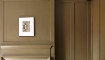
So what do we have? Well firstly I’m going to stick my neck out and say that while there are lots of predictions for the return of grey and yellow (following Pantone’s colours of the year) I think it will be only the yellow that sticks. We’ve done grey and you’ve either got it and love it or had it and redone it. I just don’t see that being adopted by a new audience. But do remember that Madame Arcati is not my middle name. Let’s not forget that – talking of colours – when Dulux told me in 2009 that grey was going to be the new colour I laughed. Yes I did.
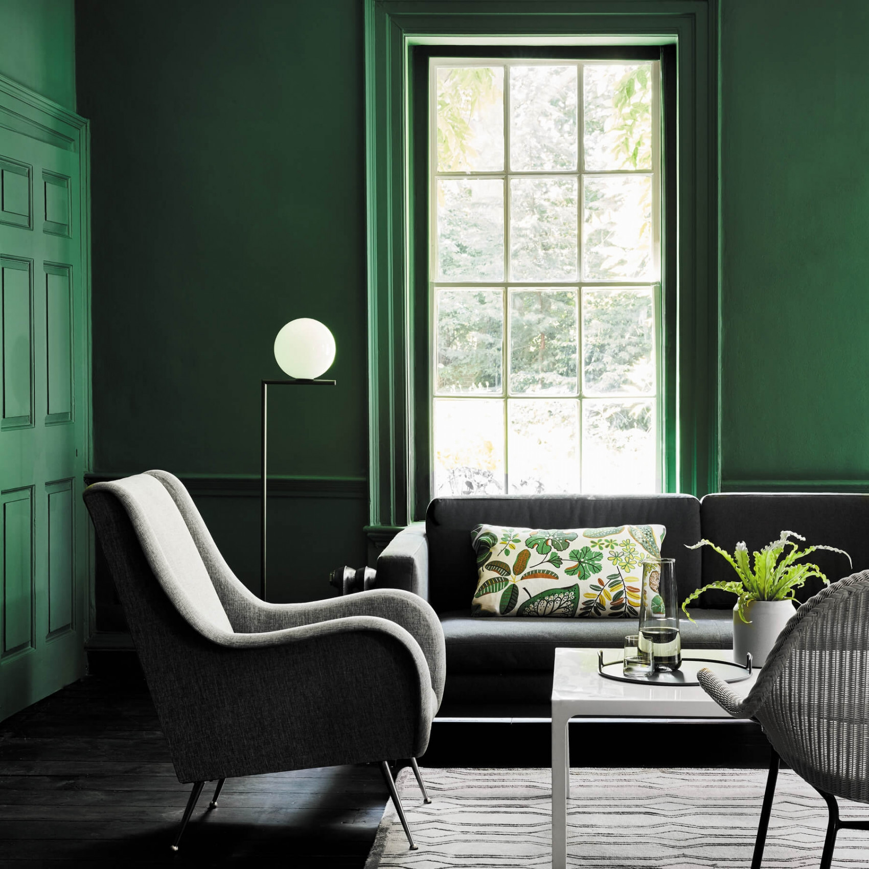
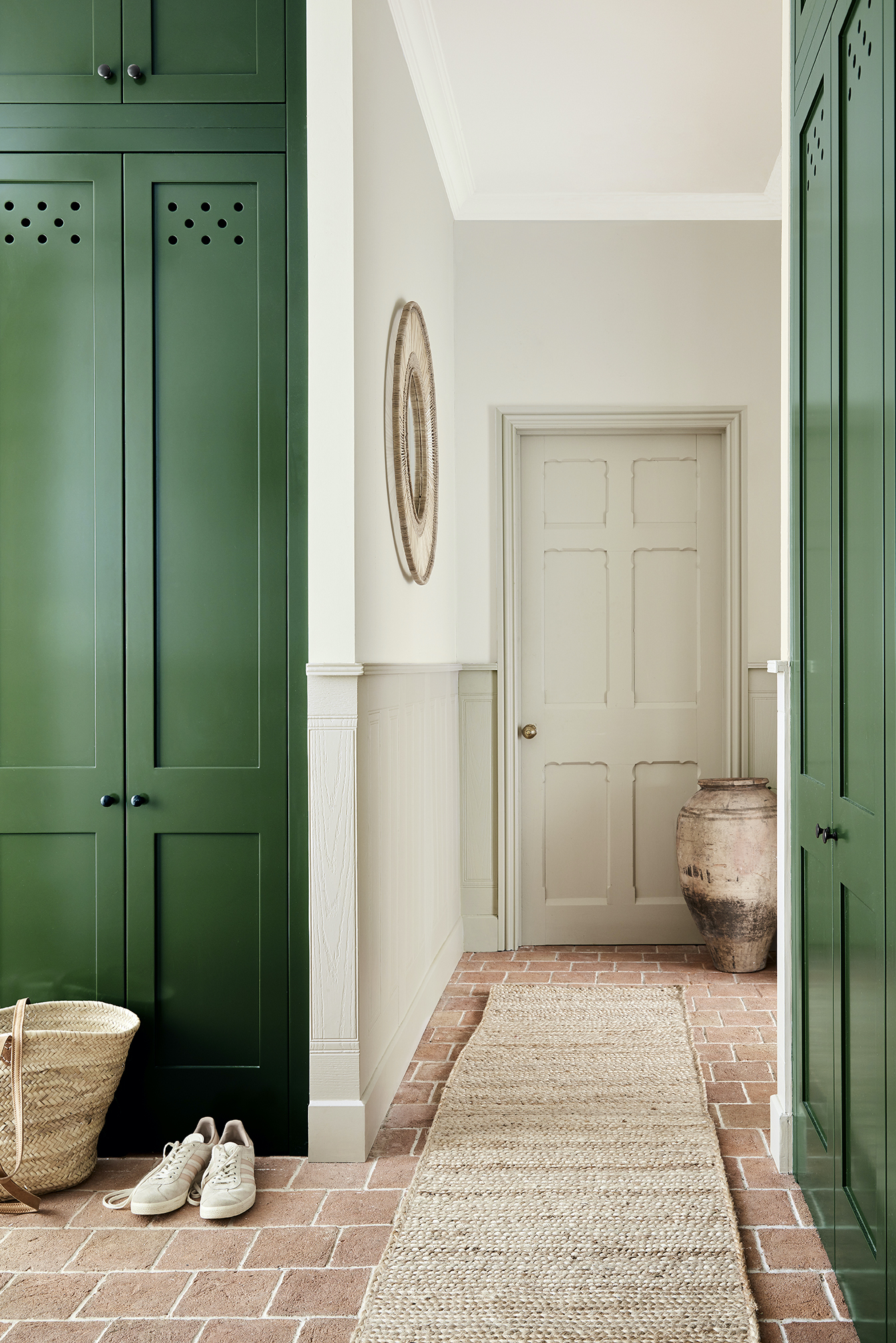
But I know I flirted with the idea of yellow during the first lockdown and I won’t have been the only one. Ruth Mottershead, the creative director of Little Greene, has said that sales of green are increasing and while green is a colour that has been floating around for a while, I’m certain the pandemic and the indoor lives it has forced us to leave, have hastened its take-up.
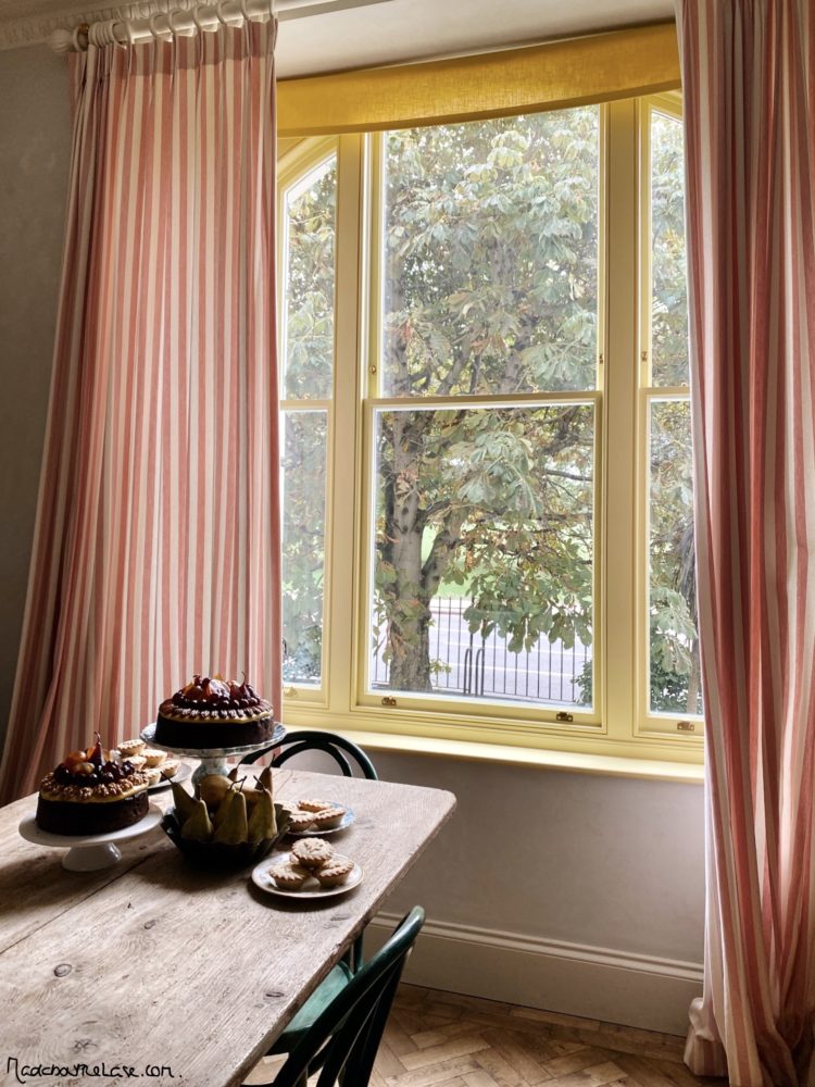
If you are nervous of painting whole rooms in yellow, then use it as an accent on a lamp or a decorative object or even, as Skye McAlpine has done to such brilliant effect, a window frame and it will always look like the sun is shining in.
One the subject of colours, I dealt with this on Monday but I think warm pale neutrals are about to have their moment too. As was pointed out in the comments, mixing them with bolder accent shades of blue, burgundy and chocolate stops them being bland and creates a more contemporary look.
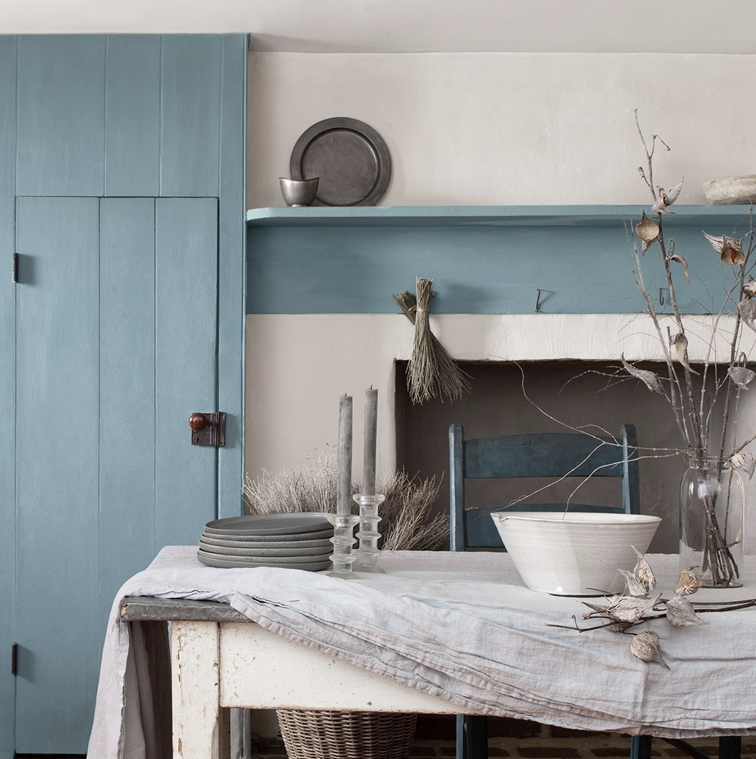
And don’t forget the power of blue – always top of any survey trying to find the world’s favourite colour Benjamin Moore chose Aegean Teal as its colour of the year with its soft blue reminiscent of the ocean, another colour, like green and yellow, that we may find ourselves yearning for in an era where travel is so curtailed.
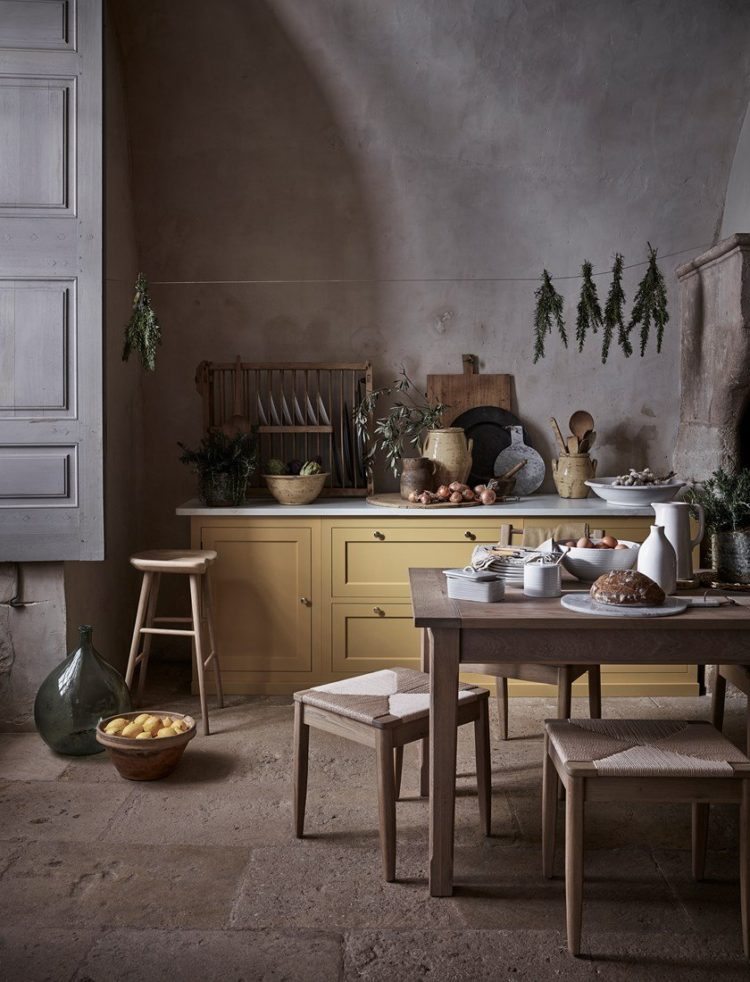
COTTAGE CORE
Again this rustic maximalist look isn’t for everyone although it has been slightly adapted from its original incarnation which was a nod to English country with a dose of a simple, more rural lifestyle thrown in. So even if you don’t have the look you might have the values – a desire for a more sustainable way of life and a love for homemade things whether it’s sourdough starters or starting to recycle more. It doesn’t have to be about wearing a vintage Laura Ashley dress and as many hair slides as you can fit onto the side of your head.
But it IS about being cosy at home – however that translates into a look for you. It is about warm natural colours with vintage items to bring character. You can read more about it here and, if you’re still not sure know that Homes and Gardens have renamed it Rustic Vogue and made it a bit less Little Women and a bit more as Reddit put it: “your grandma, but like hip”.
So, dress how you wish, decorate how you like, but know that if you are finding comfort in a homemade bread or an upcycled cupboard that you can be part of this movement if you wish. You can also call it Grandmillennial Chic which is another version of the same idea – that one might require a bit more fringing on your sofa though.
VINTAGE
This is going nowhere. I wrote about vintage as a trend a year ago and I see no reason to change my mind. If anything the cottagecore aesthetic has strengthened it and now that many shops are shut and our desire to be sustainable is growing stronger, this continues strong.
CREATURE COMFORTS
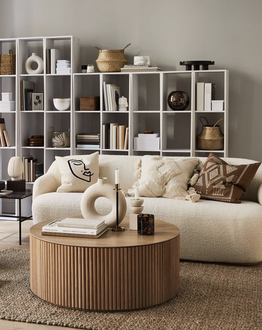
As we spend more time at home we are going to spend more time interacting with our spaces and the textiles will have a greater role to play. The trend for curves, which began a couple of years ago, will gather pace as we look for sofas that hug and cushions that feel as inviting as they look. Think of deep pile rugs that work wonderfully under bare feet (who’s even wearing shoes any more?) and even texture on so called hard surfaces like vases and candlesticks is becoming more pronounced.
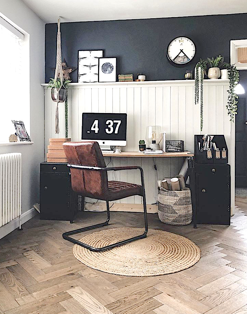
MULTI-FUNCTIONAL SPACES
Seems like a no brainer I know but I think it will play into a wider aesthetic where open plan living will fall out of favour as we crave walls to give us spaces to be separate from each other. Many of us will continue to work from home, so the temporary sofa coffee table spot will have to evolve into something more permanent and productive. Rooms will no longer have just one job, or even do two or three jobs badly, but will be reimagined to include a proper desk space or a sofa bed or an office in a built-in wardrobe or kitchen corner.
So that’s my take on the new trends for 2021 but, as I say, I think they are more general lifestyle trends that will be reflected in our interiors. What do you think? Seen anything new that you fancy?


I painted a double window frame in yellow in 1982 – clearly I was ahead of my time!
Everyone apart from us hated it and when we sold the house it was the first thing the new owners changed along with the grey painted wardrobes
I’m predicting a slow but sure rise in take-up of naturalistic, eco paints like lime and linseed. Bauwerk’s colour palettes are fab. On the other end of the spectrum, Memphis-school inspired pastel brights. Also… is raw ply still/going to be a thing ?
Morning Kate,
Warm neutrals from Farrow & Ball – Wimborne White on walls, Shaded White on vintage mirrored cabinet with Breakfast Room Green on open wood shelving in dining alcove and Dix Blue on accent chair and wooden serving tray are working well in my south facing loft. Complimented by texture in wool rugs; Fair trade baskets; linen upholstery; 100% cotton made in India throws and natural wood; the feeling is home at last! The many tips and images you have provided over the past several months have definitely been instrumental in fixing this scheme. Thank you!
A little cottage core evident in vintage china sitting very pretty on open shelving.
On yellow Ive read its difficult colour to wear ( bought a bright yellow summer dress last year but on reflection not sure it did me any favours even with a tan ) so wondering if would be same with interiors. I really love the shades of yellow here and I know you say its only paint so if a mistake is made can be changed but dont have energy ,time or money to repaint immediately so this prevents me from trying it out. Imagine again it depends on the shade and the light in the room etc. ?
Thank you Kate I”m an avid colour aficionado. Love your blog with Sophie. Have just had the Decorators in. We have a large Victorian semi detached Villa. Great proportions ceilings a room sizes. Sitting room has double doors into our kitchen..therefore I felt the two colours must be complimentary. Sitting room. In Farrow & Ball “Vardo” Kitchen in “Trumpet” by Little Greene. Which is a gorgeous zingy yellow. Bringing the yellow into the sitting room with lampshades from Graham & Greene. & Vardo a vibrant Teal. Into the kitchen with accessories. Having now used both paint companies products, pleased to report “Little Greene” is the best paint for coverage and finish.
So enjoyed reading this – beautiful photos and love those greens – thank you – much better read than -Washington
Blue, for me, is always a winner. I’m struggling at the moment with decorating as my natural colours are quite bright but we’re putting our house on the market next year and I know I must decorate with that in mind…
Morning! Lovely images. I do like the new little greene stone colours. Make me think I can do more with what I have here! I bought a vintage curved sofa last summer…so I’d like to think I’m trailblazing….but to read that both those trends have been circling for a couple of years it seems I may be more laggard 😂