Just when you think you’ve checked all the shades of grey paint, along comes a whole new collection. With pictures that are so stunning you feel inspired all over again.

We have already looked in detail at how to choose the right grey paint. We have pored over beautiful images to inspire and we’ve definitely considered more than 50 shades.
But then along comes Little Greene with their new collection called (no surprises there) Grey and we can gaze at another 28 shades who have just joined the party.
There are four variations each in seven degrees of intensity, and, as the press release says: “the collection channels the decade’s hottest (or perhaps that should be coolest) look”.
It started, according to the company’s PR manager, Angela Fawcett, with the hunt for the one. The one perfect shade of grey that would eclipse all the others. It ended with a whole group. Colours for every room no matter which direction it faces. Colours for dramatic intensity and calming relaxation.

Everything is manufactured in the UK with, Little Greene claims, up to 40 per cent more pigment than ordinary paints, resulting in a deeper intensity of colour.
While paint companies are notoriously reluctant to confirm sales figures and numbers, they are in agreement that there has been a definite shift away from yellow-based neutrals to a more Scandinavian palette of greys.
Ashley Spooner, of Paint and Paper , who supply all the major names, says: We’ve definitely seen “grey” paint colours becoming more and more popular. One thing to look out for is that grey (from all manufacturers) is very much influenced by light and time of day. It is definitely worth using a sample pot and painting a bit of each wall in the room and taking a look at the colour at different times of the day.”
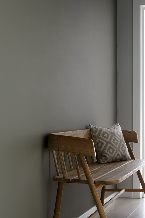
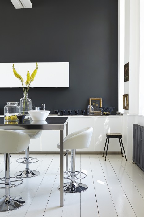
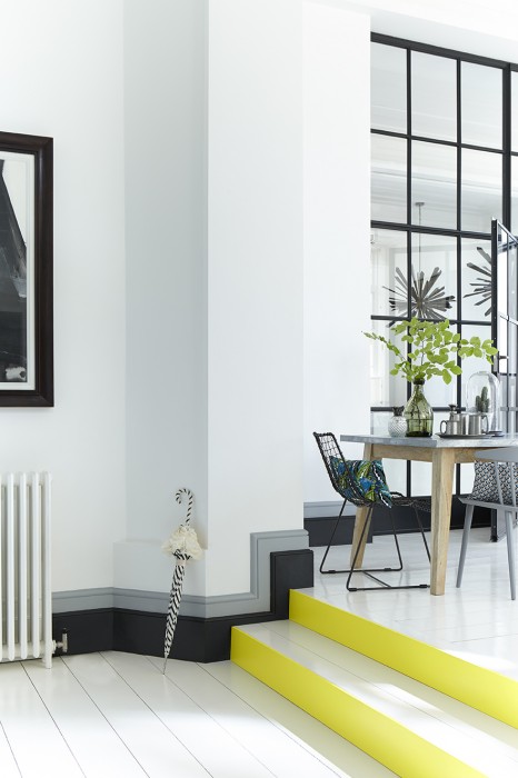
The only problem now is which one to choose? You can afford to be really imaginative as this image below shows and if you’re not sure about painting the walls then do something dramatic with the skirting boards.
Ashley says Little Greene’s French Grey is a popular shade and adds: “Their Absolute Matt range is perfect for greys because it is virtually sheenless. Little Greene is popular with professionals because of its quality.”


Hi – inspiration please for a scandi themed hallway and landing with limited natural daylight.. have 2 pairs of little hands that cannot see the bannister(!!!), and will therefore use the walls to balance!
Would love a mid grey, and have also fallen in love with Fern Living Family Tree wallpaper which would look fab on the wall behind the staircase.
Thank you!
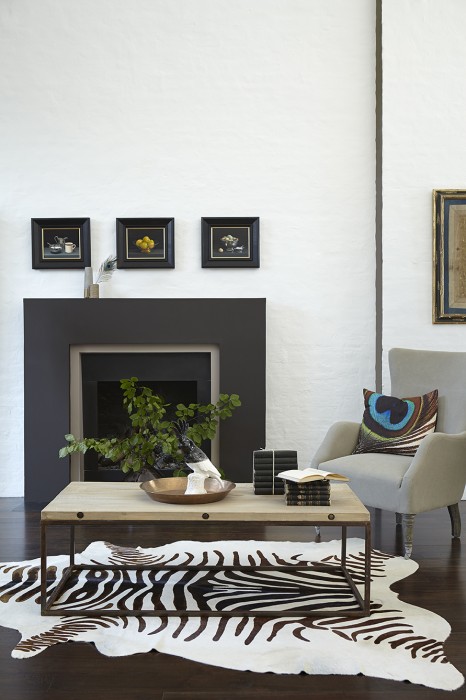
Thanks for this post I absolutely love the first photo, all the greys with the mustard throw and that board and batten in the background, I LOVE IT ALLLLL
🙂
Hi there, I’ve found your website so useful thank you! I just wondered whether I could ask your opinion – we are building a new extension which is directly east-facing and which will hold our new kitchen/dining room open plan. I was thinking of painting the kitchen cupboards Little Greene Mid-Lead and using LG Mid-Gauze on the walls, then having a blue pendant over the island (the worktops will be Silestone Lagoon which is white with v faint grey swirls). The floorboards will be washed light grey oak. Do you think this will be too cold??? Your thoughts much appreciated!
Hi, I’m so sorry for the delayed reply, I have been away. I’m slightly afraid to answer in case it’s all too late. East light can be cold and I feel that that might be quite a lot of grey. I have sometimes found that two shades of grey tends to leach each other and lose the effect so I might be tempted to lose one of them which will make the other stronger. I love the mid-lead, which is a good strong colour so would be tempted to suggest walls in a chalky white colour. This will warm up the darker grey, make the pendant stand out and, if you don’t like it, is easy enough to change. I might also wash the floorboards in a chalky white too if it’s not too late. Or perhaps add a splash of colour with a rug or runner depending on the size of the room. I have downpipe (farrow and ball) on my kitchen shelves and when I painted the walls in Cornforth white (also F*B) last year the whole effect was rather bleh (technical term) so we went back to wimborne white walls and the whole thing is much more dramatic and stronger now, which is why I suggest this to you. Let me know what you decide, regards, Kate