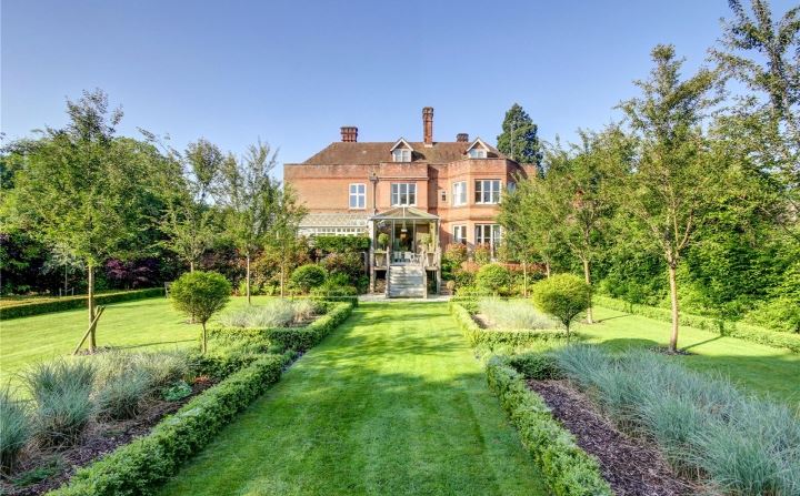
It’s a post of two halves this week. First up the traditional house in the country followed by the ultra modern new build, which, unusually for this slot, isn’t furnished but I wanted to talk about a couple of the design elements so I thought it was worth looking at. So, first up is this four bedroom Victorian house near Newbury which is on the market for £975,00 via Savills.
But before you get excited thinking about this enormous house and garden for under a million quid not that far from London…. you get the north wing. It’s a huge mansion that has been divided into four large houses – this one is nearly 3,000, which is massive but if you were moving to the countryside to get rid of the neighbours then think again as they will still be there.
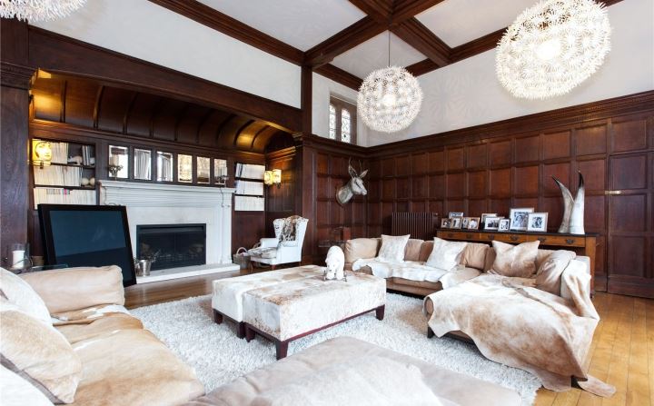
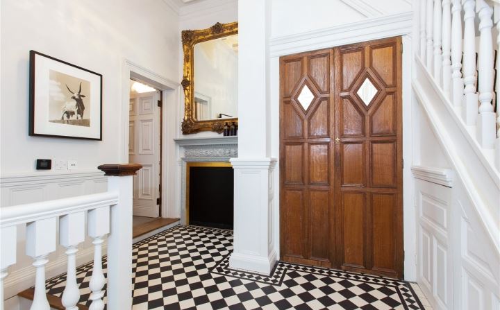
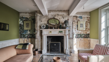
Inside though it’s a gorgeous mix of original features set off by neutral furniture but look at all the textures which lift it. Those two pendant lights are from Ikea by the way. I have one of the giant ones.
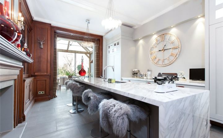
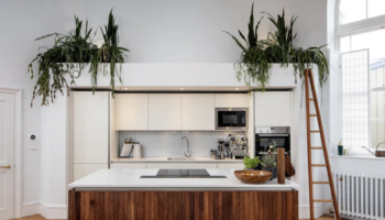
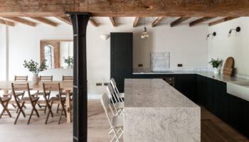
It’s the same in the kitchen; the marble island is contrasted and warmed up by the sheepskin throws on the stools.
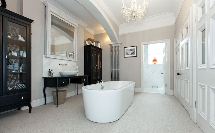
And how’s this for a bathroom? Although I’m baffled by the fact that there aren’t two basins when it seems as if there would be enough room for it. Love the matching black cabinets though.
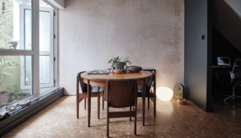
Now for the empty one which is another four bedroom house this time in Sandwich, Kent, which is on for £1,350,000 via The Modern House. It was built on the site of a former architectural practice and is reminiscent of a church with its arched windows and high ceilings.
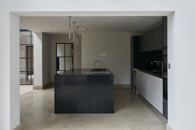
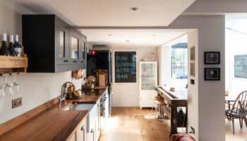
You have to just look at the spaces and imagine your own furniture (or someone else’s, it’s fantasy Friday after all) in these big rooms. I love this black kitchen which, with the dark wall behind, creates a zoned area within this open plan space. But look how the dark frames on the internal doors and windows punctuate the space and frame the views. Imagine a couple of vintage bar stools at the island – to counteract the shiny newness – and some plants so soften it.
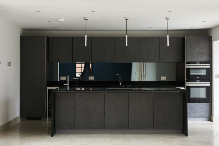
Here is is from the other side and you can see how the wall at the other end of the room has also been painted dark to mirror the dark kitchen. In a long rectangle space, painting both ends dark and matching will shorten the room and make it appear more square and less tunnel like. Painting the long side walls would immediately turn it into the latter.
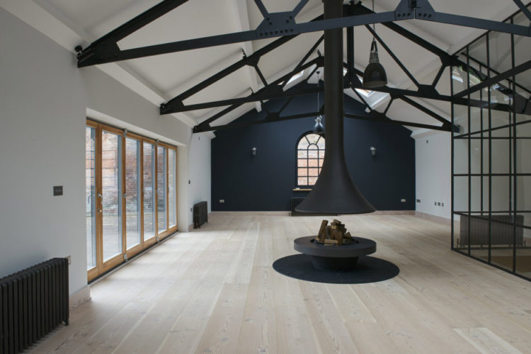
This shot shows you the church- style windows although I’m guessing it might be harder to furnish round that central fireplace than you might at first think. I could have a good try though. Also I wonder why they chose not to paint the doors to the garden in black to match the rest. When you can see how well it frames the greenery of the garden, it seems like they would do it on all of them.
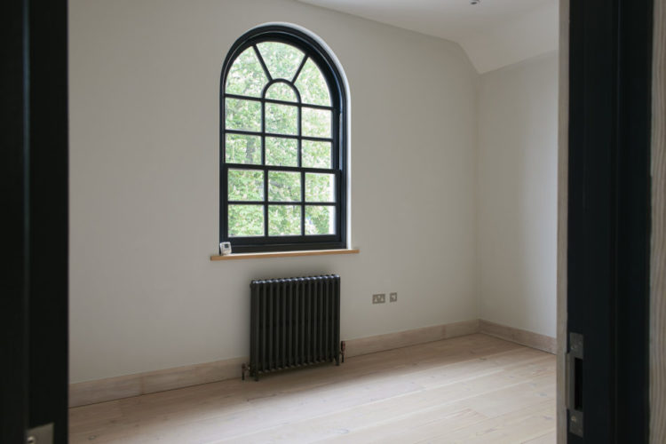
Finally, for anyone who has been toying with the idea of dark doors and frames but feels nervous that it might look odd, look at this picture. At the moment it’s an empty room but imagine catching a glimpse of furniture of a painting on the wall through here. It gives it all a little more momentum don’t you think?
So do you prefer an empty space to imagine yourself in or a furnished one where you can see how the space works and then decide if you like it or not? I could have either of these this week. What about you?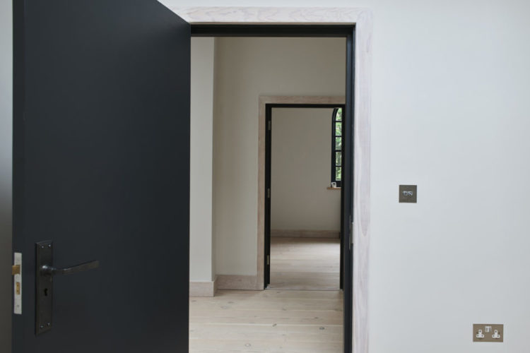
Great article! – in case anyone is still wondering, the second sink is in the shower room, through the door behind the bath.
One of your best articles ever! Not too much drivel. I love all the animal skins in the first house. I would catch a plane there today and move in. Arriving Monday probably from New Zealand!
Um, not too sure how to respond to that. Thank you. I think.
I’ve said it before but I really can’t stand the dead animals draped all over house no.1. There are couple of cows on the sofas, the horns of some unfortunate beast on the sideboard and then the sheepskins in the kitchen. Just horrible. At least the stag looks synthetic.
So I’m going with house no.2. The kitchen has sold it to me – along with the crittal room dividers and the black paintwork. i think I could be very happy there.
yes; my thoughts exactly re. the dead animals. it’s so inappropriate for the 21st century.
The black cabinets in the bathroom are Ikea too!
I think I’ll take number two please this week. I’ve always fancied a home near the sea and I’m definitely up for the challenge of fitting furniture around that amazing fireplace! I would be changing those patio doors and the bathroom floor though (with my fantasy budget).
I LOVE London, but that house in Newbury might just make me change my mind!