This week on the podcast Sophie and I discuss how to buy furniture online and get it right. You can listen here and I will return to this as a full post next week as it’s an increasingly permanent part of our lives. We also discuss hall flooring and sound proofing in our regular Style Surgery slot and we were also delighted to bag an interview with Ruth Mottershead, the creative director of Little Greene, whose wonderful paints I have just used in my office do-over, and who took time out from her maternity leave and her three-month old baby, to chat to us about finding the perfect neutral.
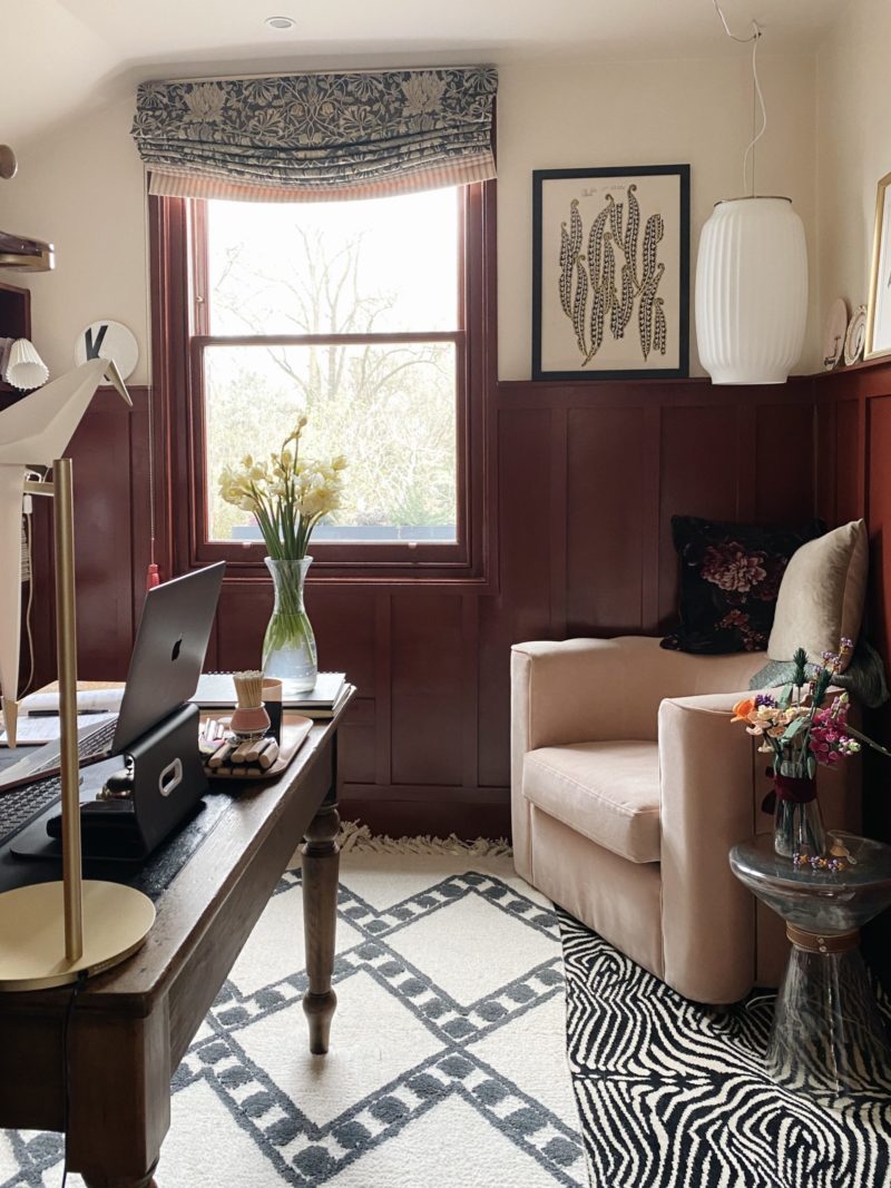
Little Greene in its present form was founded by Ruth’s father David but its roots go back to the 1700s when it was a dye works providing paint and dye for the cotton industry on the outskirts of Manchester.
The company prides itself on its eco credentials and was one of the first UK paint manufacturers to achieve the European Environmental Standard (BS EN ISO 14001) in 2004. Their tins are recyclable, their oil-based paints are made with sustainable vegetable oil and the VOCs are virtually zero. You can read more here.
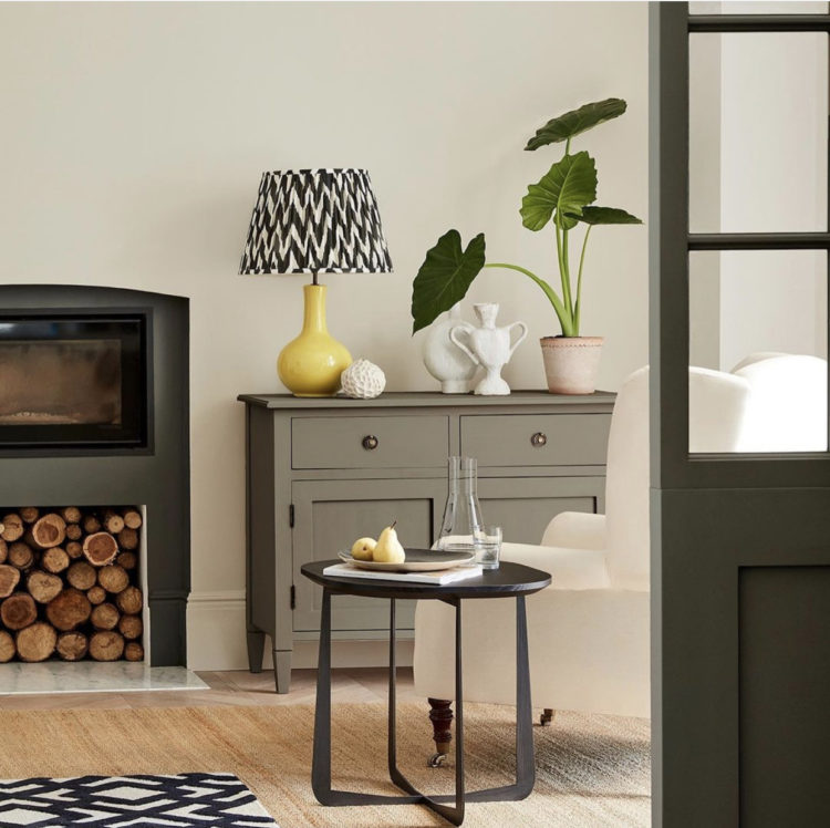
“My father always felt there was a space in the market for something that was environmentally friendly and really good quality,” says Ruth.
“We have really focused on that. It was hard to find a replacement for oil-based paints but we have managed it – using a mix of naturally occurring vegetable oils.”
Little Greene has remained true to its family roots. As a child Ruth remembers sitting at the kitchen table painting colours onto card to send out to customers. And now, married to someone in the wallpaper business, her home is a colourful mix of paper and pattern.
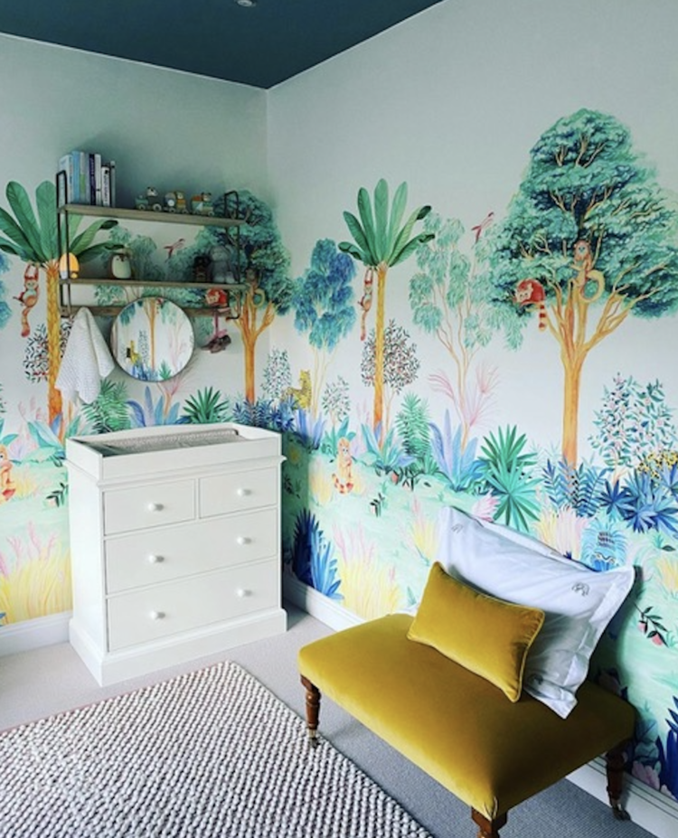
“Every time we make a new colour it’s too exciting and there was a point where my husband would come home from work and I would be painting the kitchen wall a different colour. There are lots of colours in our house and not so much neutral.Currently the Mottershead sitting room is Livid with a China Clay ceiling. The baby’s nursery has jungle wallpaper by Sian Zeng, pea green walls with a dark green ceiling (Pleat) – reminiscent of a rainforest canopy.

There is a total of 238 colours to choose from, which might seem overwhelming, but Little Greene have been clever at dividing the range into colour collections. The first of which was grey, which also was printed to show you cool greys moving to warmer from left to right making it easier to decide what you needed. Then followed the blue, pink and green collections. And, the newest – Stone.
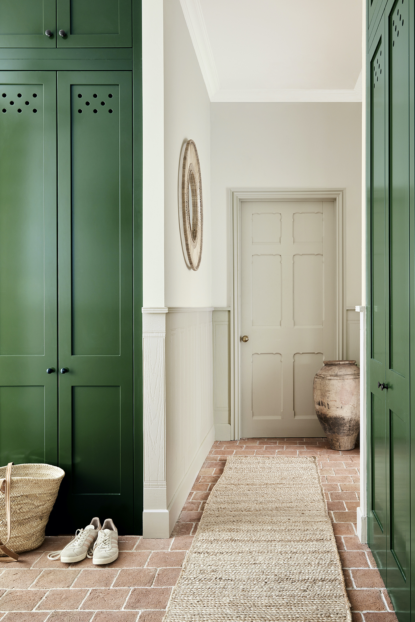
And just like that we’re back to magnolia and cream. Or are we? Sophie, as you can imagine, whose hashtag is #banthebeige isn’t initially a huge fan. Which is why we decided she should be the one to interview Ruth (lockdown rules means it’s easier for a remote interview to happen one on one).
“It’s true that beige has a bad reputation,” says Ruth. “But in its most basic form it’s just a mix of yellow, brown and white but we have made it much more complex than that.
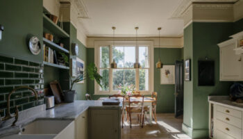
“We define a neutral as anything you can make with a naturally occurring pigment so you can include rich, dark green and deep earthy reds.”
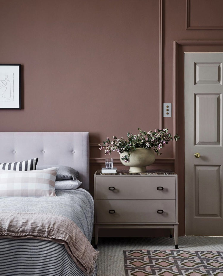
And this is why if you colour match paint for a cheaper version you won’t get the same depth of colour that you will from a more expensive brand. Put simply, Ruth says, a cheaper paint might achieve the same colour with only two pigments, Little Greene will use several to give you that depth of colour and shade. I will add that there’s no judgement on this blog as to what you use – we all have our own parameters of what is affordable after wall and I have colour matched paint myself but, if you have done that and wondered why it wasn’t the same that’s your answer.
The Stone colour card is formatted into six columns of six colours from dark to light and if you pick from the same column, you can be assured they have the same base colour so they will all go together allowing you to pick and mix from that column. Of course you can go outside those lines but that is up to you and your eye.
The six columns include the six base shades: red ochre, burnt sienna, yellow ochre, burnt umber, lamp black and green earth.
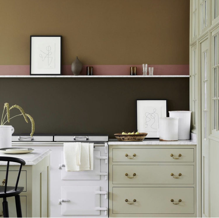
These then, are the new neutrals. Warmer, deeper and, finally, a move away from grey which has dominated sitting rooms and bedrooms for the last 10 years. That’s not to say that grey is over. Just that, says Ruth, we are, as a nation, pivoting to warmer shades of grey than in previous years.
When it comes to neutral paints picking the right shade of white can be one of the hardest descisions to make. When I wrote Shades of Grey back in 2014, I interviewed Ruth’s father David who told me they had a shade of grey called Gauze which was just made from black and white. There was no other warming pigment within it. It was a cool colour and, he said, it was not a big seller.
It’s the same with brilliant white. Yes it can work in large rooms, filled with natural light but it can also be harsh. Most of us (dealing with lower ceilings, awkward corners, less space than we might like) prefer something a little softer.
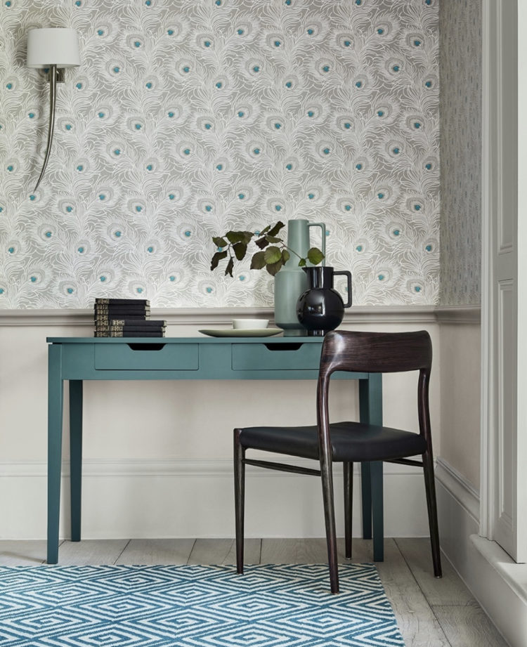
Ruth offers the following advice. Firstly if white, or a version thereof, is your choice stick to one shade of it in a room so use the same one for walls, woodwork and ceiling.
Now, regular readers and listeners will remember Sophie and I discussed how to pick the right shade for the natural light that comes into your room recently) and Ruth has some suggestions for a white that works in either north or south-facing rooms.
Slaked Lime, Portland Stone and French Grey pale have both cool and warm shades in their base which means they will sit happily in any room. If you don’t know which way your room faces, or you don’t care enough but just want to paint it and go to the pub then this is what you need.
If you want a little more involvement/choice, then every shop stocking Little Greene has a Little Book of Colour which lists the ingredients of each shade and allows you to check the base colours.
When it comes to the best selling neutrals Ruth points to Loft White and Shirting with Portand Stone and French Grey coming up fast behind and says that while navy has been popular for a while, this has gradually shifted to a more teal based blue and now is moving over to various shades of green. No surprises there as we have all been starved of nature for a year.
The Great Indoors podcast will be back on 15 April with a round up of the latest interiors book releases.


Can you please provide a link to your advice on soundproofing, as mentioned in the first part of your post? Thank you
It’s in the podcast as linked. In the style surgery section at the end. It’s about flooring though not walls.
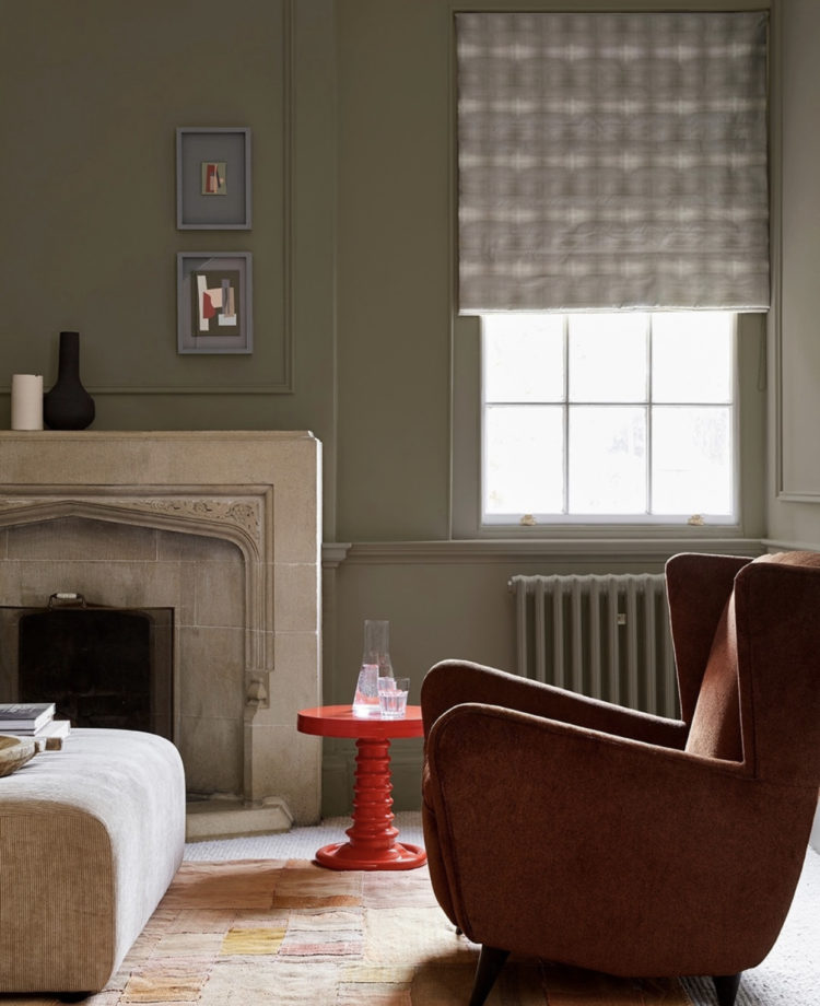
ooooh that wall in the last picture looks nice, forgive my eyesight but is that the sage green (80) from the linked little green page? Anyway the grey frames combined with that wall is such a premium look. My imagination is dead without influencers like these online, keep them coming I need more clients rooms to plaster so I can bring some of these ideas to life in someone else’s home 🙂
Love these colors …Great work!!
Love these colors – every single one. They aren’t the “star” of the show but seem very easy on the eye.