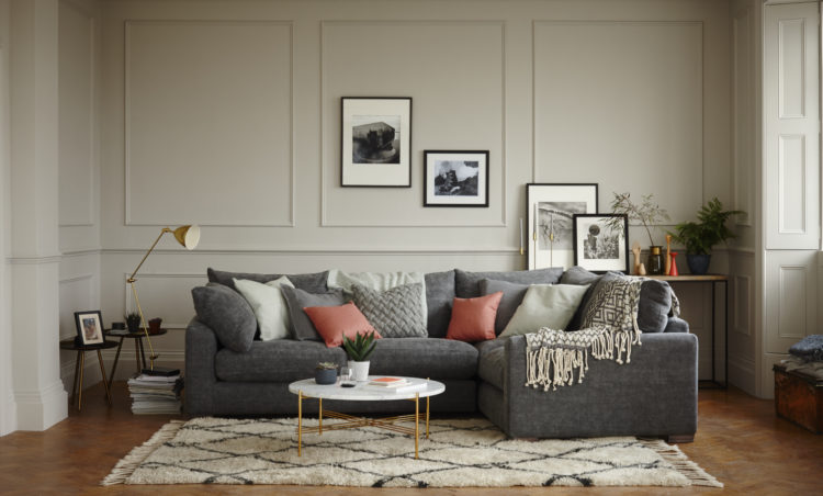
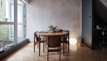
We’re doing something a little different this week. This, contrary to what you have been asking for, is the very antithesis of a real room. But there is a reason for my going off piste – this is apparently the perfect living room. Shall I just pause while you scroll up and down and tut a bit… Done? Right, it’s a pretty big claim isn’t it?. What do you think? I have to say I quite like it – those muted colours, touches of black and splashes of colour. And, ooh yes, panelling – current No 1 obsession as you know.
So why is it supposed to be perfect? Well DFS questioned 2000 people (which is a lot in terms of these surveys) and asked them about their ideal design choices ranging from style considerations like wall colour, flooring and fabric and then about the practical requirements such as layout and types of furniture.
The results were then analysed and put together in this room by interior designer and stylist Pippa Jameson, who is brilliant and who I happen to know, but we’ll come to that in a minute.
The survey also found that we feel happiest and safest in our living rooms, and that there was a clear preference for wood flooring and muted creams or beige colours on the walls. Comfort was also key and there was a desire for multi-tasking surfaces – a table that doubles up as a tv stand or computer rest and wide sofa arms to prop the laptop on so we can do social media while watching telly. This is the DFS Keswick by the way.
Apparently we spend around 21 hours a week in our living rooms in the summer and that goes up to 35 in winter so it would seem that the kitchen has been replaced as the heart of the home. Is that true for you? While we’re on the stats I’ll just give you these ones to mull on too: women feel least happy in the kitchen and men feel least happy in the bathroom – you can make of that what you will. And 41 per cent of men most enjoy being in the living room with their partner compared with only 30 per cent of females so there’s something to argue about this evening.
Facts over, let’s take a closer look at this “perfect” room for it does illustrate the importance of the black art of interior styling. I’m pretty certain that most people in this survey – when they suggested wooden floors and cream walls – weren’t thinking of, or living in, anything like as pretty as this.
So yes that proves what you have all been saying – the value of the real room analysis over the confected and stylised ones that appear in magazines and adverts. But, now that we have this room let’s take a closer look and see why it works.
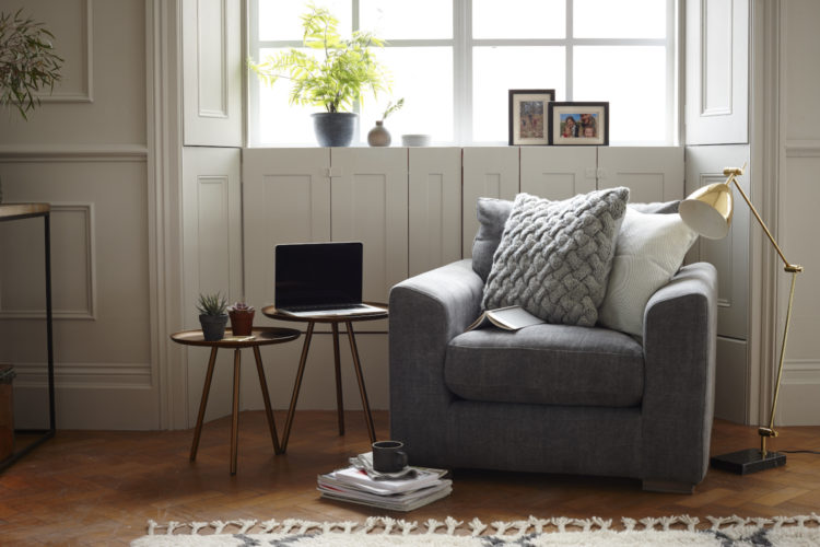
Yes it’s clearly a great room with high ceilings and panelling Tricky to make this look rubbish. It’s the old Kate Moss in a bin bag scenario – works for a supermodel not so much for the rest of us. Still, while you can’t do anything about your ceilings (bone structure) you can do a lot with good lighting (in rooms as on humans). Use wall lamps, floor lamps and table lights so the lack of a pendant light – particularly in a sitting room, which is mostly for cosy evenings – isn’t an issue. Consider a tall floor lamp that can arch over a sofa or coffee table and bring some light from above.
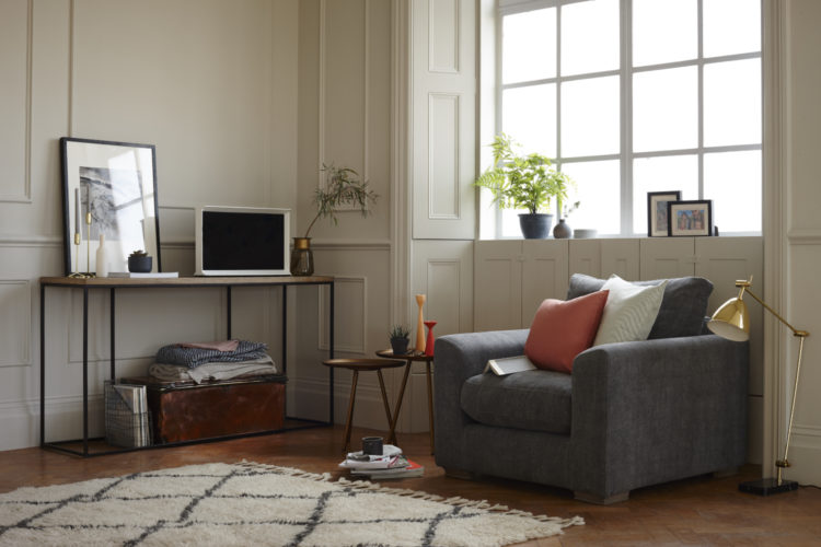
Panelling? Well you can buy that these days and stick it on. Perfect for old houses and you know what, I don’t think it would be a disaster in a modern house. I mean I wouldn’t do it in a modernist one, but I think a few simple panel boxes like this would work perfectly well in a sitting room of almost any period.
Note also – there are no curtains. Now that is because in this particular room there are beautiful wooden shutters (and I don’t mean those plantation ones which are popping up everywhere – do you live on a plantation? Exactly). Now, I get that curtains used to be necessary to keep out draughts, but in these days of double glazing and insulation they are less important. If you like them that is fine, but you don’t have to have them. After all, they do cut out a certain amount of precious light and, if you have bay windows, the bendy tracks cost a fortune and then either take up valuable space at the sides where you could be putting a lamp or a side table, or block the light from the side windows making the bay completely pointless as a feature.
I like a simple blind which doesn’t detract from the windows – especially if you have lovely sashes – and which don’t steal your light. We have fixed ours halfway up the window so the top is bare but the bottom is shielded from the street. You can also get blinds that pull up from the bottom as well as more traditional ones.
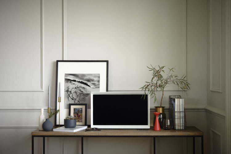
Now that we’ve looked at the bones of the room, take a look at the touches of black which define the space and anchor it – the iron legs on the table, the black pattern on the rug and the black photograph frames. Then there are the metallics which will catch the light – the floor lamps and the brass candlesticks.
Finally the sofa and chairs (which do match here but which is not essential – or even necessary in my view but let’s not forget this was done for DFS). These are charcoal which is a perfect foil for any colour you care to add. Pippa has added soft coral and sage green which is gorgeous, but you can do neon or layer in monochrome with patterns. Also – throw-draping lessons. Mine never looks as stylish and at the same time as casual as this one does here. That was probably 20 minutes of tweaking to get the shot. And if you did that at home and somebody sat down you’d be livid.
The final touch, which we would never have thought about two or three years ago, but which now seems essential to finishing off a room – plants – real or fake it doesn’t matter. I haven’t mentioned the rug because you know that now don’t you – the biggest one you can afford/fit and anchored under at least the front legs of the sofa so you are not creating a rug island. No-one wants to sit on rug island.
So there we have it. All the top tips for creating the perfect living room included in this space. The question is do you like it? Comments in the boxes below…
The way it has been put together is great, but there is a feeling of blandness.
Hi Kate – any idea where the marble round table is from? am on the hunt for round , large marble coffee tables and this ticked the boxes…thanks!
finally getting round to catching up on your blog at the end of a busy week and i’m very pleased to see this image.
I’ve just finalised the concept for a bathroom (as opposed to living room but hey) with wood effect porcelain flooring with muted toned paneling for walls – end effect should be quite similar to the above so i’m hoping that my client will react in the positive way as those from the survey (as opposed to some of the readers comments eek)
must dash as i’ve realised that i need to take an A level in Maths to work out the positioning of the paneling …….!!!
I actually quite like it, do you know where the rug is from?
It’s probably from Le Redoute
After a looooong look at the pix, it finally hit me: the room looks empty! Not in a cool , minimalist fashion, but in a “We’ve been robbed! And they’ve stolen half our furnishings!” vibe.??
I DO like the cream color. ☺
Cheers!
Ugh, it’s incredibly dull.
Kate, I do agree with other commenters, this looks like a showroom. It’s quite nice, but it’s a showroom. I also agree that the DFS team has taken the input and unfortunately distilled it down to a rather mundane conclusion, i.e. lack of real personality.
Plus, the arrangements remind me of my two biggest gripes when it comes to furniture arrangement, especially in good sized rooms. Grouping items closely together or all around and up against the walls, either choice makes me cringe. The former feels claustrophobic and the latter feels impersonal, alienating. Somewhere in between and best-suited to how the room is used makes the most sense to me.
All that said, kudos to you for generating such a lively discussion. It reflects wonderfully on you and your readers. My thanks to you all. Cheers, Ardith
Kate, thanks for asking for an opinion. Its empowering. Soooo, here it goes. I’m not feeling this room. It is bottom heavy. As much as I like the cascading effect of the art work, the scale is too small in relation to the spaciousness of the room and the size of the couch. I wanted to see a massive single subject, or more of the smaller frames arranged in such a way as to create one, to pull my eye upwards. The great Diana Vreeland was right — the eye has to travel.
“It’s”
It’s wonderful that you’ve all left such insightful and thoughtful comments. Thank you all
Speaking of paneling… what’s your view on shiplap these days? New house in the country. Should I do paneling instead?
Surely the perfect living room has to have a fireplace/woodburner? And I agree about the rug – sick of the sight of them!
I am a style over content kind of person (and we have the bruises to prove it) therefore I am in awe of Helen’s detailed analysis of why this room isn’t a success. My first reaction was much the same as yours I suspect – you would need to work hard to make this room look bad. I have made variations on your ‘Kate Moss in a bin bag’ comment on so many occasions when looking at ‘house porn’ as we generally call it, that I think my partner might have groaned slightly when I pointed it out to him.
I once spent a week binge watching Homes under the Hammer when suffering from an excruciating neck strain that precluded any kind of activity involving movement. Many of the ‘developers’ were targeting much the same market as DFS and ruthlessly stripped the houses of any vestiges of character along with the rotten woodwork and mildewed bathrooms. The interior design combination of choice was usually magnolia walls, cheap laminate floors or sh*t brown carpets (my description not theirs), beech effect kitchens and beige bathrooms. They were mind numbingly bland and, to my mind, very unappealing and I spent a lot of the time swearing at the telly as yet another fireplace or dado rail bit the dust. However, whether renting or selling, this apparently is the winning formula for anything other than the most expensive properties.
Those of us who are a bit obsessed – ok a lot obsessed – with all things interior tend to forget that there are millions of people who hardly give it a thought. I do understand that for many of them it is preferable to move into a home with a fully functioning bathroom, even if it is boring, than a leaky tribute to Victorian plumbing, particularly if they have neither the inclination, money or expertise to remodel it. I am also aware that some people lack the confidence to take risks with their design choices and as you have pointed out on more than one occasion, when it comes to big purchases, you need to be careful not to make expensive mistakes. I’m sure your friend and the head honchos at DFS knew exactly what they were aiming for with this room, not too challenging or cutting edge but with enough accessible style and deft design to appeal to, and inspire, their average customer. Mission accomplished I think.
I really like that you explain what works and what does not, in a showroom and in the real life. In addition to be a great blog it is highly addictive now.
As for the perfect living room, I like it a lot but not sure I would like it in someone’s home as it is probably ‘too perfect’, too ‘made by an interior designer’ for my taste if you know what I mean.
So much to like about this room – the space, light and that gorgeous panelling. I’m also coveting that beautiful marble coffee table. But I also feel there’s so much that’s totally impractical. Seems a shame, given that it’s based on such extensive research and should therefore, presumably, show a room that you could walk into and spend a comfortable “real life” evening in.
Sadly, I think much of it is styling over practicality. To spend time in there comfortably you’d need to do a fair bit of rearranging. As someone already said – so many cushions. They’d have to go on the floor. Side tables full of plants and candlesticks whilst magazines and coffee mugs are on the floor. In a room that size, there’s room to put rectangular side tables alongside both arms of the sofa AND have the central coffee table. I would love to have space to do that! That would give loads of space for proper side lamps (great for reading etc), plus everything else. Or why not show a proper tall reading lamp? Instead of that (ok, very lovely) lamp that wouldn’t do a great job when placed on the floor.
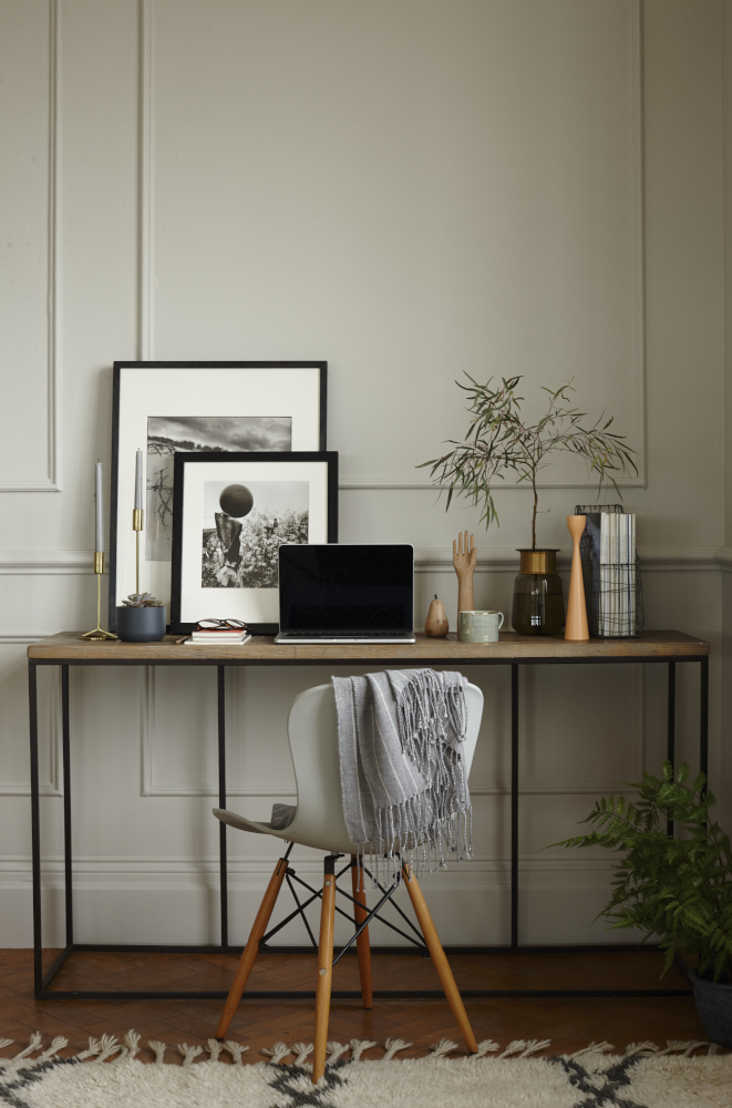
The console table – absolutely right, they’re brilliantly versatile pieces of furniture. If you want one to double up as a desk though, don’t choose the one they’ve got here with a bottom frame that will annoyingly get in in the way of your chair legs every time you try to sit down to work. Also this one is too high for a computer desk – there are lots that aren’t.
I know, I know – it’s not a real room in a real house, and it IS beautifully styled. But that’s the problem, it seems to be totally missing the point of the exerecise. And when creating a living space that really works, the devil is always, always in the details.
Why ask people what works for them and then create images of a space that doesn’t bear much resemblance to most people’s living spaces and arrange the furniture in a way that isn’t at all practical? Style, comfort and functionality absolutely can go together beautifully. But not here, sadly.
And we do own a plain oblong oak coffee table that lifts up. It is very useful as a supper/laptop table with storage underneath to hide some of life’s detritus. ?
The art on the walls cascading to the art on the table is brilliant.
I cannot bear to see another one of those rugs. Following the herd.
I like the look of bare windows, but I found in our place that the very high ceilings (14 feet) made the space resonate too much. Some simple drapes–left open, just columns on the sides of the windows because we also have interior solid wood shutters–improved the acoustics immensely.
I do like this because it is soft and neutral and calming to relax in. The look I am aiming to achieve . The pops of colour are great too, adding interest.
We have a new suite on order, made by ROM (Belgium). It is in the colour Leno Mouse which is a grey/ brown fabric with texture. It has metal legs, in various colours and the head resting areas are on a ratchet, so they can sit flat backwards or tilted up as a headrest. It will look great ( I hope) on our grey mixture carpet. Only snag is…..now delayed delivery for another month. I have some cushions from Lush Designs in Wild Boar and Cottages & Castles just waiting to be put in place.
Well I think we can safely say, judging by the comments so far that this is NOT, in fact, the perfect sitting room. I thought it had points to commend it but there you go. At least we know what we don’t like, which can be half the battle. We will return to poking our way around real homes next week.
It looks like what it is a DFS showroom. I spent a tortured weekend in their Tottenham Court Road Showroom with a friend looking for a decent sofa. Much of their range is sole less – maybe with the exception of the French Connection range. Maybe if I had a dedicated TV room or den it might work but not for the sitting room – it’s dull and not like a real sitting room.
Utterly uninspiring & bland.
A comfy lounge / sofa is a must but I have given up on those touches of colour in cushions and throws in the Living room. They spend more time on the floor.
Well yes that’s true!
Husband says they are called “scatter” cushions and “throws” for reasons.
Anodyne. Looks like a showroom. I for one want a room that shows my personality – where’s the personal touch, the quirky, or something that brings a bit of drama to the room.
Yes!
I just wouldn’t feel cosy in this living room.
It’s too designed and impersonal. Cream and beige
walls do not make for a welcoming room in my
view.
Not very inviting. The sofa seems lost in the space and its color doesn’t go well with the beige wall.
I loved it, it had just the right feel but do you know what colour the paint is?
I don’t but I think it might be one of those warm pale greys that looks beige in a south facing room or when the sun hits it. Or it might be beige!
Farrow and Ball – Cornforth White!
It’s a perfectly nice vignette but a little dull?? I agree that there needs to be a level of comfort and I’m all for a squishy sofa. I have the wide arms on a sofa so I agree that’s helpful to stand the iPad on. This image is a good representation but twice the size of a normal living room in this country. Well mine at least!
It feels comfy like an old pair of shoes. I can appreciate the look but not the vibe.