Happy Monday or whatever day you are reading this to you all. I’m excited to share today’s finds with you as there are a couple that really set my heart racing and after nearly 10 years of this blog and 20 writing about interiors I’m taking that as a good sign.
While you read this I will be heading off to Decorex to see my sofa again in the flesh (this time in Caper, a lovely olivey green) and I will also be chairing a discussion on sustainability in interiors with Jules Haines, Ray Clarke and Simone Suss. That’s a 1pm for anyone who is reading this live and is planning to head down there today.
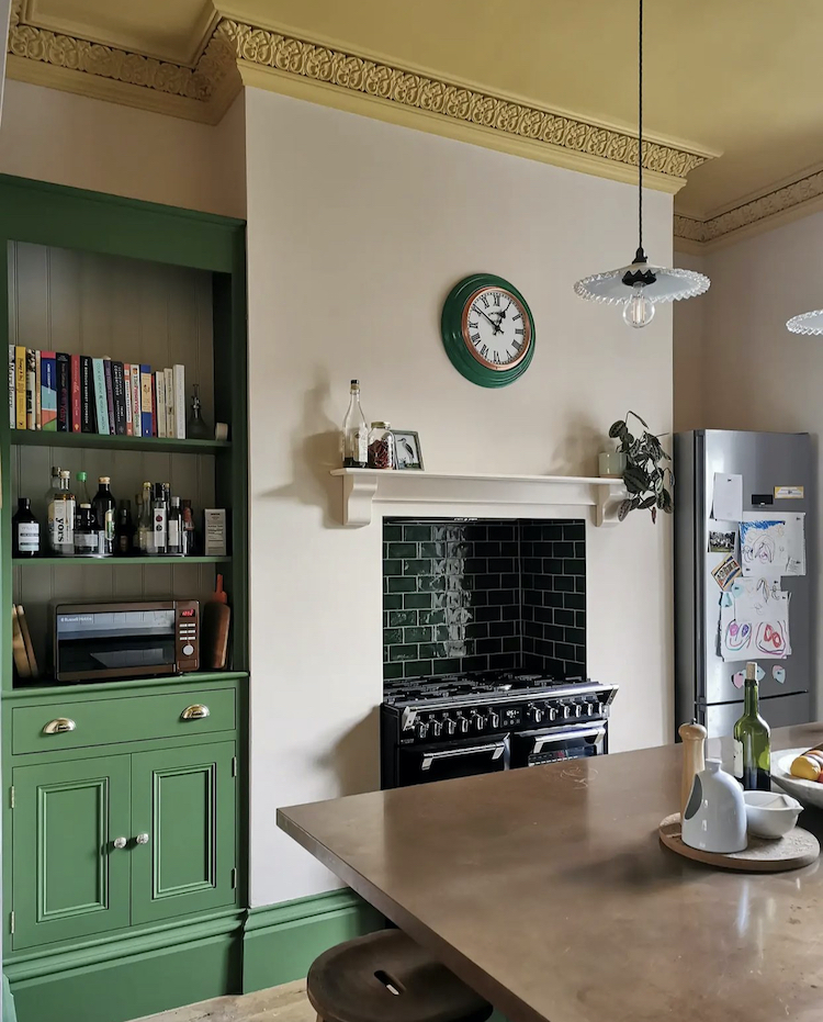
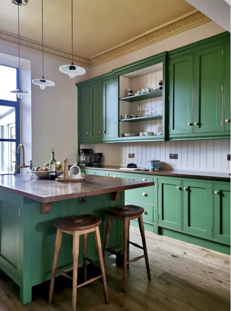
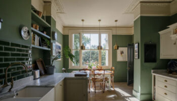
But for everyone else – worrabout this kitchen then? I can’t even, as I believe the expression goes. Never, ever would I have thought of putting pink, green and yellow together IN THE SAME ROOM. In pairs yes. And pink and yellow with plants I have done (well it was gold but you get the idea). But this, by Karen Knox of Making Spaces is bold and restful at the same time. The green is Hopper by Little Greene and for the rest of the details you can head on over to her blog where she has written about it in detail. And if you like it leave her a lovely comment. Anyone who lived through the “outage” last week (tongue firmly in cheek here) will know that blogs and websites are very important to small businesses who are finding instagram increasingly tricky (tongue not in cheek here as is serious point).
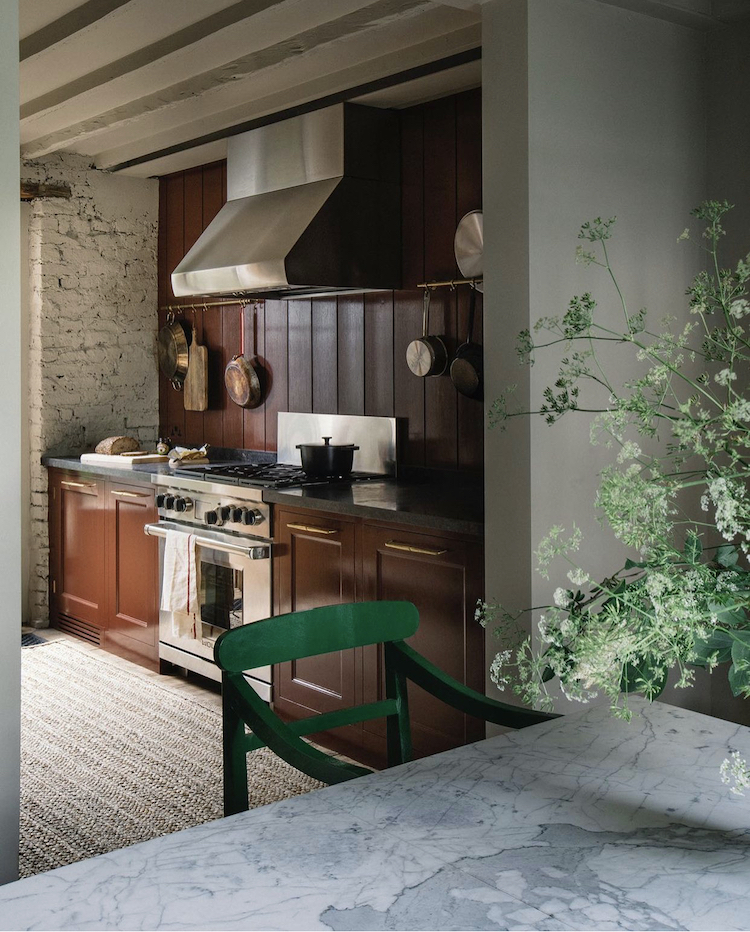
Staying with green and this kitchen by Plain English is as fabulous as their kitchens always are but that green chair is bringing it. It’s back to that disrupter colour which I have spoken about so much, the idea of adding an expected or extra to a very co-ordinated scheme. This room would be lovely with a vintage wooden chair but the emerald green just bangs into the middle and wakes everything up. Doesn’t have to be green, could have been, in this room, cobalt blue. It’s about choosing something from the opposite side of the colour wheel so it’s a real contrast and there’s not too much of it.
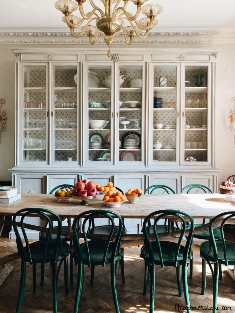
Shall we just remind ourselves of how good a green chair can be? Here it’s the fruit that’s doing the disrupting and don’t forget that works just as well. Plus you can change it as you eat it! Skye McAlpine, who is a genius at table styling, is a big fan of a single item in abundance so here it’s oranges and pomegranates (ok this is two but one would have worked) red onions or lemons while the decor is essentially just natural wood, a warm cream and those green chairs.
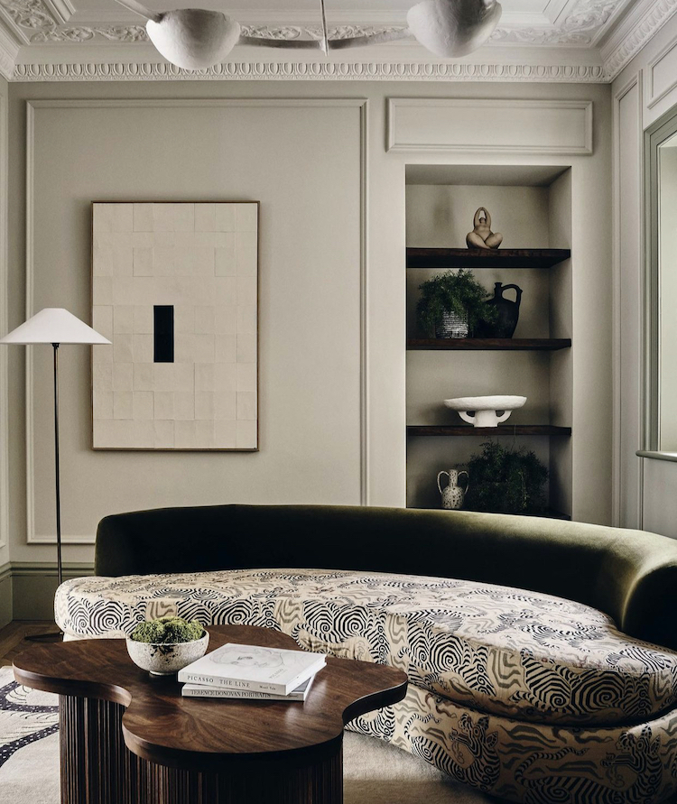
Staying with the same colours as above – warm cream and green but this time it’s more olive. Now I agree (before you say it) that this is very much a second sofa. It’s a sofa you have in a dressing room or an office – a sofa where you can perch and chat. This is not a Monday night Bake Off on the telly sort of sofa but if you had the space for a second one – or perhaps instead of a chaise longue – let’s be honest mine is mostly decorative and for the cat – then this is the sort of thing that would look amazing.
And if not then take note of the two tone decor. I think that’s a thing. It works really well and is more elegant and sleek than 400 scatter cushions.
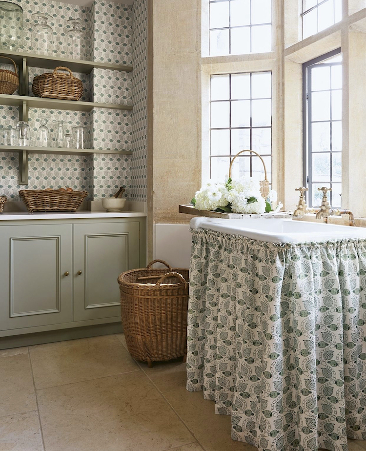
Next on things that caught my eye this week was this and I know that sink skirts will be forever controversial – believe me I know this. The Mad Husband is enraged by the very idea but I thought this was a clever way to tie the design of this room together. The wallpaper behind the shelves matches the sink skirt and the windows have been left bare. Adding curtains may have been the more traditional route – and this is clearly a period property – but you know I always like an unexpected tweak and this is quite fun.
A reminder here of the only skirt sink The Mad Husband ever liked and the one that changed my own opinion on them. Basically, as they are essentially a frilly furbelow I prefer to keep the fabric minimal and would only use with a check or a ticking stripe. This is my long term secret plan but I have other things to persuade him of first so there will be no breath-holding on that front.
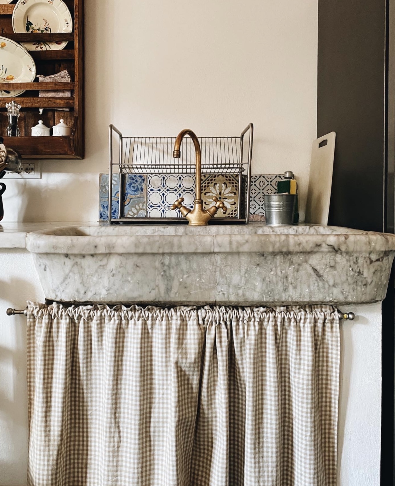
And once more for the gorgeousness:


I have a skirt that hides a washing machine front door.Its on an expandable cafe curtain rod , an inexpensive way to bring something different when the rest of kitchen units are plain and boring. You can rummage in the basket of cut offs in some fabric shops and find a piece of funky fabric (eg. I have a piece of probably expensive curtain fabric with images of women in 1950’s dresses). So while you might not be able to afford full length curtains in designer fabric you might be able to get enough to make a sink curtain. Good to have ideas for people who live in rented flats who are restricted in what they can do but want to add their own personality.
I think the key to a workable (and husband persuadable) kitchen or laundry room skirt is that it be hung on rings and so slides to one side or the other and out of the way easily. They can be terrible if you have to keep shoving at it or lifting it up and draping it over yourself when scrabbling around underneath it to find something. I love the look but truly sympathize on the practicality issue. Right now I’ve got a heavy fabric nailed into a shelf to hide the laundry baskets and cat litter underneath. My husband (and I) hate it because its in the way and its shoddily shoved up on one side for the cats. But it will be elegant and usable once I locate some long but thin rods to install with rings to clip or hook onto the fabric. Something to consider.
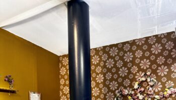
I saw the yellow ceiling and the Plain English kitchens last week on Instagram and both stopped me in my scrolling tracks after many, many months of deep diving for kitchen inspo. So refreshing to see colour used so cleverly. Both kitchens have that uncontrived vibe of ‘Oh this old thing? I just threw it on… ‘ but Karen Knox’s blog is wonderfully honest about how much time it took to pull those colours together. Love them both and the sink skirts (who knew?!) AND the green mix/match sofa. Also, nicely done with your Love Your Home collab. Vita is very beautiful indeed.
Inspiration in abundance! I love the scale of each room; the way each designer has positioned lighter elements (ceiling pendants, chandeliers) against tall, solid walls; and the how textiles and wall coverings, mouldings, and wall panelling add elements of interior interest. The pretty vintage tiles sitting behind the marble sink are exactly what I am searching for to have in my bathroom. I made a two panel sink skirt for the bathroom vanity. It has ties instead of gathers, which permits the panels to slide along the rail more smoothly. The ties also add a dressed up look to an otherwise country cottage appearance which is what I wanted. I am also a fan of greens in most shades, so just love your selections.
Hello – I’ve been wondering about the exact shade of your gold ceiling. Do you happen to remember whether it was FTT-001 or FTT-002? Mylands has been out of stock of the colour cards for months, making choosing between them tricky!
It was 002 – hope that helps x