Morning, morning and the end of January is rolling round already. Buckle up, the year will move into warp speed from now on. Today, I wanted to address this white paint issue. Those of you who read the podcast notes post or even, hell, actually listened to it will have cottoned onto the headline about banning white paint.
This appears to have caused some consternation. So, first of all let me say this – that was a headline. Designed to grab your attention and make you listen. Now, having got that what I wanted to say was this; I’m not against white paint by any means. I have lots of it – in an off white, soft chalky kind of way – but I wanted to make the point that white should be a choice, not a default. If you choose to paint your ceilings, walls and woodwork white that is absolutely fine but the key word here is not “white” it’s “choice”.
My mission on this blog is to help you to choose things that are right for you and your home, and the way you live, by showing you things and getting you to think about them first. So don’t paint the skirting boards white because that is the way it has always been. Likewise the ceilings. Paint them white because that is the best colour to go with the walls – which, I’m pretty sure, are painted in a colour that you thought about and tested and made a decision on. And if white is the answer to the question then that’s perfect. But sometimes it isn’t.
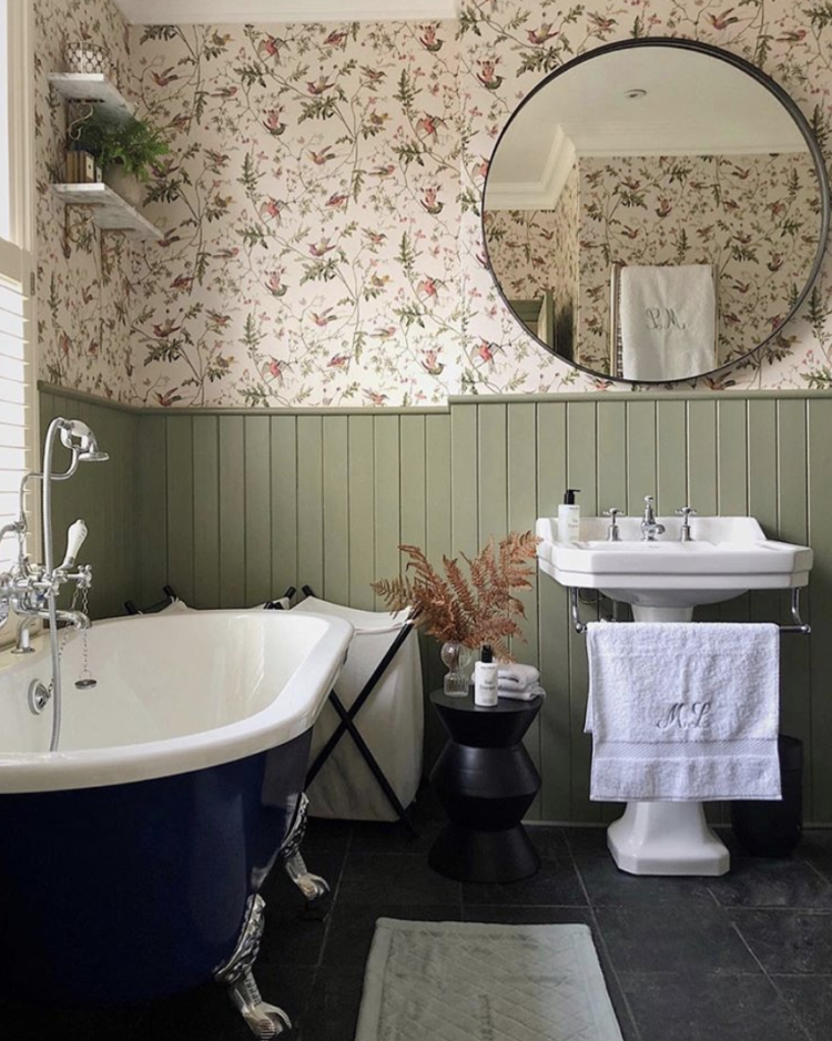
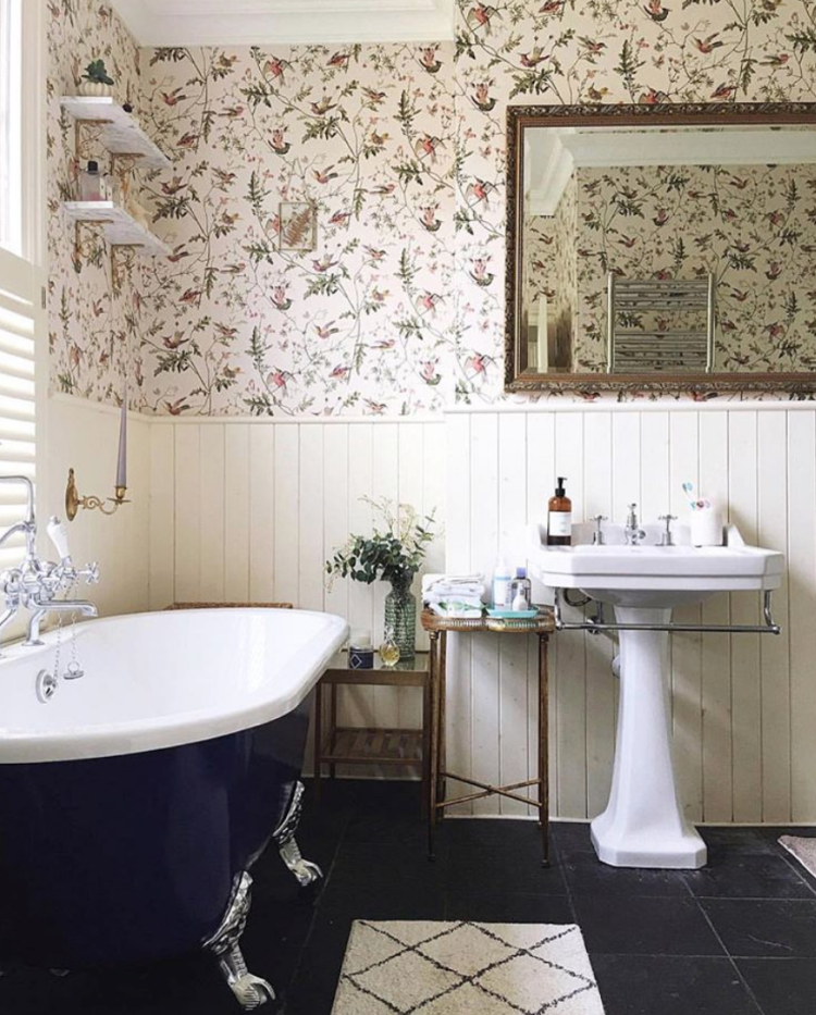
So today I have gathered a few images where it could have been white and wasn’t and, I think, looks better for it. At the top we have Melanie Lissack’s gorgeous bathroom, which is very Soho House. The tongue and groove was cream before Christmas – the background colour of the wallpaper and a perfectly reasonable choice that looked great. But now she has painted it green (Treron by Farrow & Ball) which highlights the green stems of the flowers in the paper and it looks amazing. Suddenly the wallpaper pops and the room has just somehow va va voomed (for those who remember that old Renault advertisement). To be clear, I love both and you might prefer the white version, but it’s a good example of how choosing a colour can make a huge difference and that is why I wanted to show you. Well that and I’d quite like my bathroom to look like this.

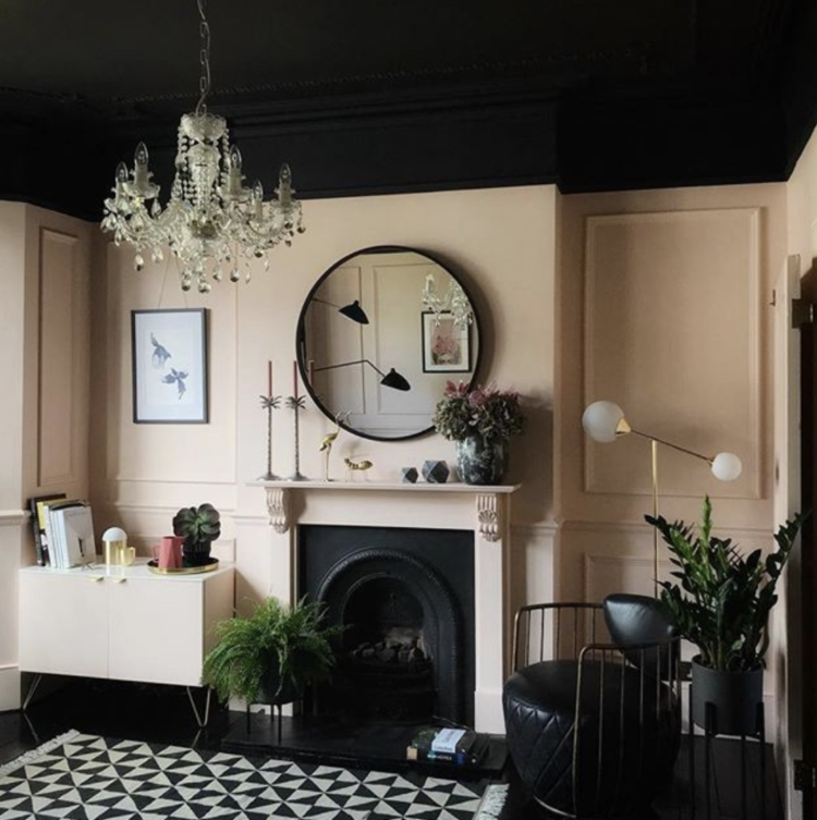
Below that is a room with pale pink walls and a dark ceiling that matches the floor and really makes a feature of the pink in the way that a white ceiling wouldn’t. The dark paint works with the dark fireplace and the black leather chai and brings it all together. The whole room has been considered and no detail – including the ceiling – has been left out. One point to note – the dark has been brought down over the top of the walls which makes the ceiling look bigger as it doesn’t outline the footprint of the room, and therefore tricks you that the room is larger than it is. Taking a dark paint up to the walls to meet the ceiling (or vice versa) can simply show you the confines of the space. This trick is also meant to make the ceiling recede although it’s already high so that probably wasn’t an issue in here.
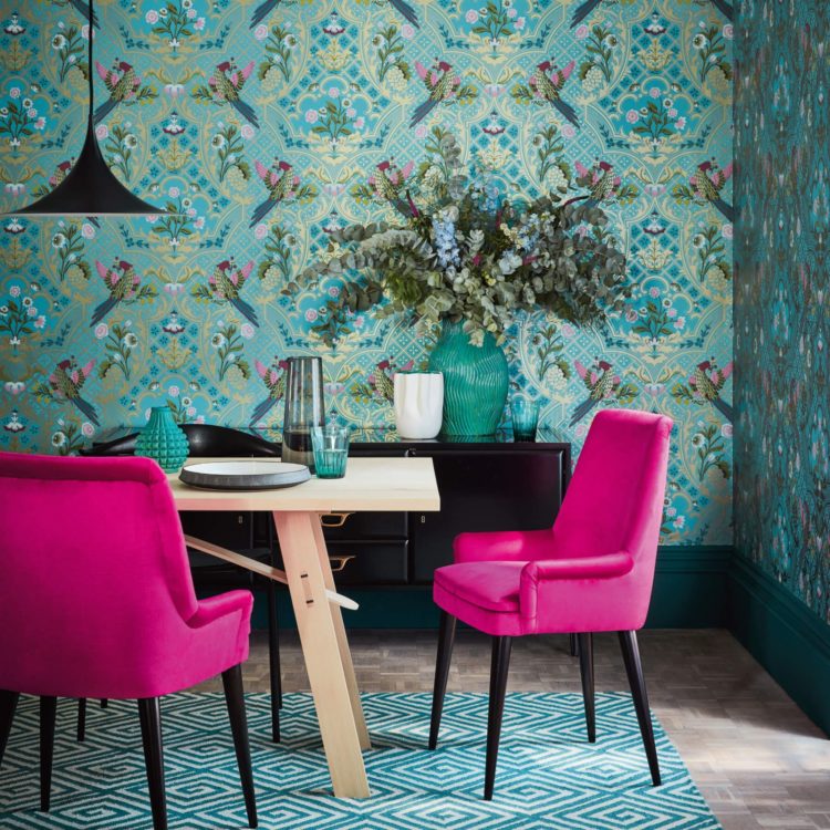
Another brilliant example is the staircase by the interior designer Sarah Brown. Blue woodwork is an unusual choice, but it works brilliantly with the wallpaper and the neutral stair runner, which, in turn, balances the strong paintwork. The neutral carpet is also one of the wallpaper colours, but instead of neutral paint and a bright runner, Sarah has flipped this on its head. And there’s no white in sight.
These two wallpaper images were brilliantly styled by Sally Denning and you can see the woodwork trick in the picture below where a strong teal has been used. Compare with the one above where it has remained white. However, the dark wooden cabinet is beautiful with the wallpaper and either that, or terracotta, could have been used on the woodwork. Although, I should point out that this is for a Little Greene wallpaper campaign and the skirting board was not the point of the picture.
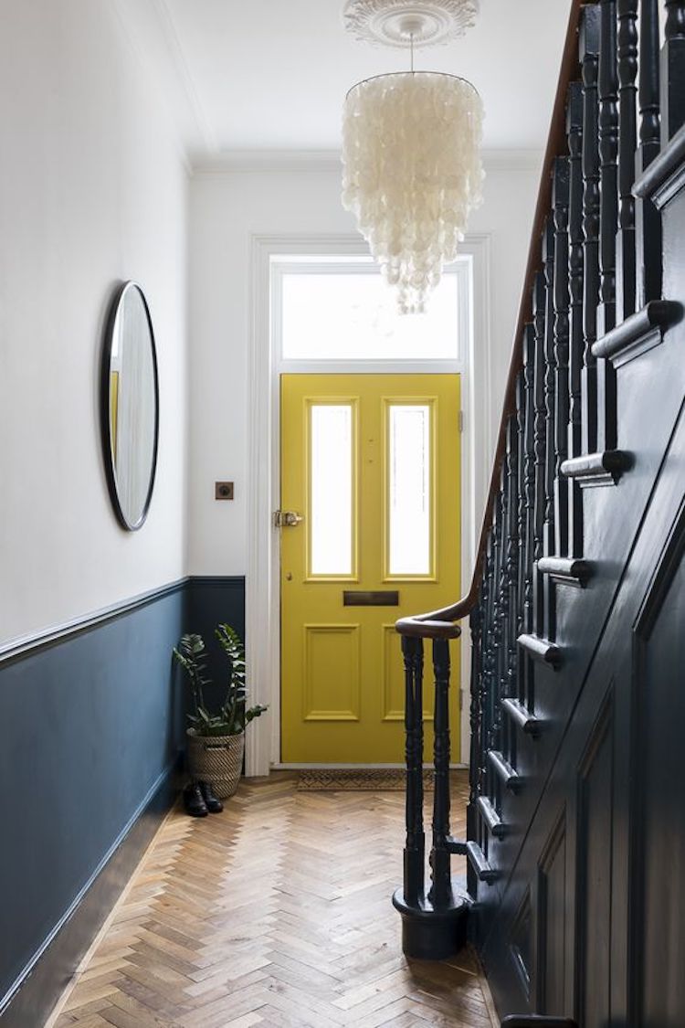
Here’s another example of using a colour other than white by Beth Dadswell, of Imperfect Interiors. The hall is black and white but a splash of colour has been added to the back of the door for contrast. I was a latecomer to this – my hall is also mostly white with the spotty burgundy carpet – and last year I painted the back of the door to match. It’s lovely to see when you come down the stairs. And, since it’s such a small area, you could change this as often as you wanted, whereas painting halls and stairs are a nightmare as the walls are so tall.
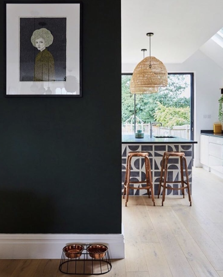
Moving away from paint and I just wanted to show you Em Gurner’s kitchen island where she has used tiles in an unexpected way – on the end where most people might just paint it to match the cupboards. It’s a small area so you can perhaps afford to choose a really spectacular tile (these are from the Dark Room Bert & May collaboration) and it just brings something else to the room.
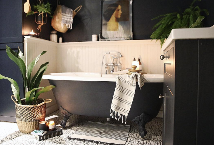
Finally, no pattern, no unexpected paint, but a clever way to incorporate a bath into an open plan space and we were also talking about zoning open plan spaces in the podcast too. So we end where we came in – talking interiors.
And on that note I’m off, as we’re recording a live episode in Dublin this week as well as an interview with Trinny Woodall for a new segment on the show (not sure when that part will be broadcasting yet). I hope this has helped with the white paint dilemma – it’s not banned it’s just to be thought about.
Coming up on the blog this week – eight of the best round coffee tables, an interview with Jonathan Adler and – for Wednesdays Ad break – expert design advice from West One on how to save space and money when designing a bathroom. I hope you will visit and read.


Should radiators be painted the same colour as walls? We have some older ones in a bedroom we are redecorating (painting the walls an airforce blue) and I don’t know that keeping them white blends in very well…
Exactly – paint them to match the walls and they will disappear and it will all look much better.
I love these examples of choosing the ‘other’ colour instead. I’m always for going against the norm! (Also, I do like those rather stylish looking pet food dishes in the kitchen pic)
I’m pretty sure they’re from made.com