Well what a week last week was. I travelled to North Wales to visit The Little Greene Paint Factory and see a preview of the new colours coming in September. Then, as anyone who dropped in on Friday, will remember there was the zip wire. Reader I did it. I really thought I might not and I don’t know if it was a combination of peer pressure (everyone else did it so I followed on) or actually knowing that it is important every now and then to push oneself out of ones comfort zone. And I don’t know if it was that or the result of a few months of mulling things over but I have come back rejuvenated and excited to plan the next chapter of The Mad House. So there we have it. And here’s a picture of my hanging head first over the disused slate quarry waiting to speed down a wire at 100 miles an hour for 58 seconds.

It is, apparently the fastest zip wire in the world and while I have no intention of ever doing it again I can recommend and occasional pushing out of one’s comfort zone to reignite the synapses and feel rejuvenated. Would you? In the meantime shall we take a much calmer stroll through this week’s rooms?
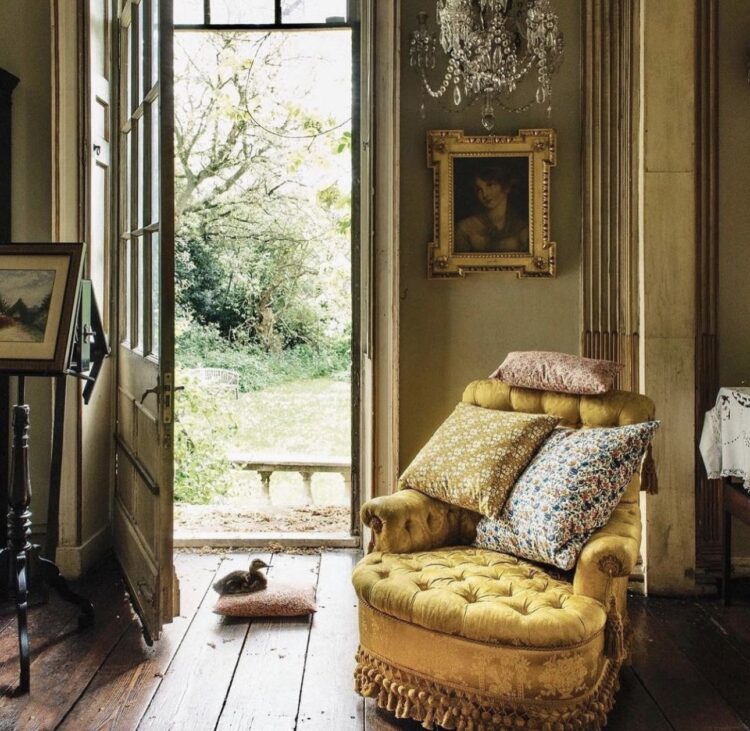
This room immediately caught my eye after so many of you loved the yellow doors from Friday’s post. Installing a yellow chair next to a garden door might be an easier option if you are nervous about getting the paint brush out. Both will bring the same sunshine effect (duck not necessary).
Now, a word about accent chairs as they are often described. Yes, if you want to be precise they are adding an accent to a room but more than that they tend to be small. An accent armchair is not a great big slouching armchair that you are going to curl up in with a book and a glass of wine. They may not even be for a long bout of television watching. They are more, if you like, chatting chairs. Which means you are sitting upright not lounging. And, because they are small, they work really well in bold or patterned fabric and just tucked into a corner or by a view. If you have noticed that there’s a certain patch of floor that is hit by the sun every day at the same sort of time then, if there’s space, that can be a great place for an accent chair.
A final word – look on vintage sites for accent chairs as they are often smaller. After all, if you move house and go somewhere bigger, a small chair from a sitting room can always move to a bedroom as a chairdrobe (no I know YOU hang your clothes up in the wardrobe every single day I was talking to the others). The interior designer Susie Atkinson also once told me that she loves vintage chairs as the rake (angle of the back) is often more comfortable their modern counterparts.

To the bathroom next and I wanted to show you this for the tiles. In the same way that a chesterfield sofa was, for a while, the epitome of middle-class chic, an aspiration which was later replaced by the kitchen island, so the free-standing bath has become the ultimate desire for many a renovator. Now I’ll admit, I’ll fell into this in the last house where we converted a bedroom into a bathroom and it feel obligatory to put a free-standing bath in front of the fireplace. It looked fabulous but neither bath nor fireplace were ever used.
The truth of the matter is also that most of us don’t have room for a tub this size. And, if you are not by nature a bath person putting one in is not going to change that. So I wanted to show you that a fitted bath can look just as good if you are prepared to work a bit harder on the decor.

The simple pale blue and white check tiles have been used to great effect all over the floor, up the side of the bath and up the wall on the far side. It’s super effect and has the effect of making the floor look like it is bending up the side of the bath. The colour of the tiles is classic which is another way of saying timeless and means you won’t feel the need to rip them out in two years and start again and you can easily change the colour on the walls if you need. Here is a pink plaster tadelakt which is, admittedly, harder to change but that’s an expensive finish. Assuming you have painted walls like the rest of us then it’s a paint job. In the shower, you could opt for plain tiles in a colour you love or a toning rather than a contrasting colour. The main point being that you shouldn’t despair if you have a small bathroom with a shower over as most people in the UK do ( I would have if I hadn’t ripped the bath out completely dividing opinion on whether that’s wise or not) because you can really “werk” with your tile choices and it need never, ever look like a compromise. And here endeth that interior design lesson.
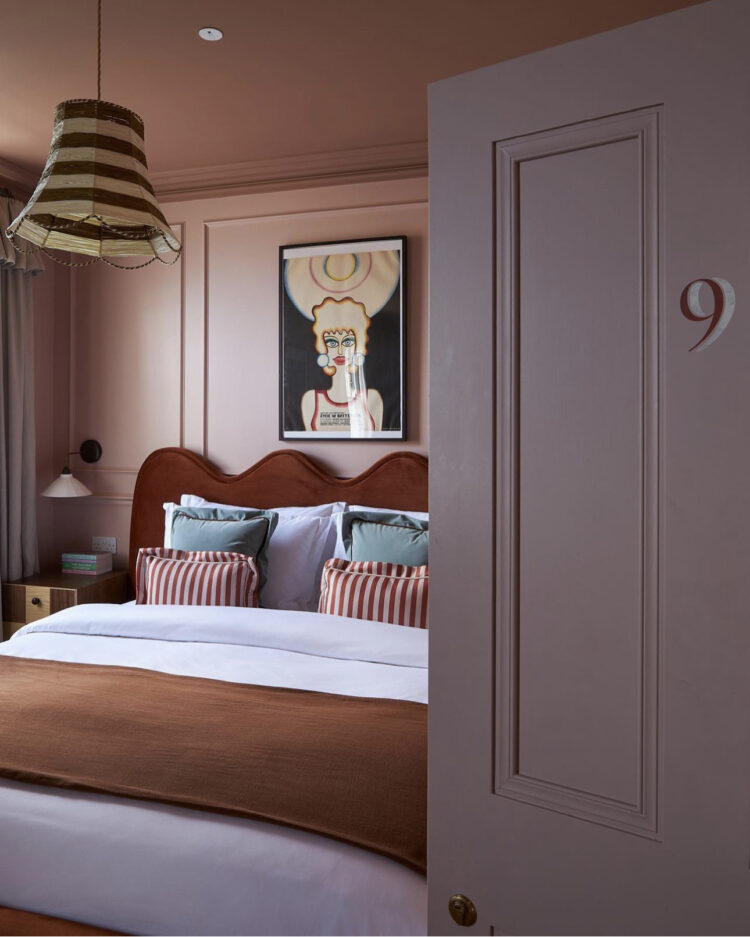
Staying with a similar colour palette and moving into a bedroom at the new Margate House Hotel. It’s hard to tell the exact colours from this shot but here it looks like lavender and, since I was invited to share my opinion on that very colour recently I wanted to include this. It’s still quite a controversial colour choice and, for my part, I like it with cream and olive green (think south of France and the dusty colours of Provence) but here it’s working well with some pale pink and rust and a spot of caramel to ground it. My instinct is it’s probably the light playing tricks on us but one of the few things I remember from art classes at school (apart from the teacher who refused to teach me calligraphy when she was teaching the rest of the form because “you’re left-handed so what is the point) is that you should always paint what you see. And therefore even if your brain says the door is white you shouldn’t paint it white. And that way, who knows you may come up with your own great colour combinations.
Don’t worry about her by the way – I was so determined I taught myself and, for a while, I was quite good at it. I’ve probably only remembered it at all because of the zip wire.

Staying with bedrooms but this is also a bit like the bathroom example above. Sometimes the bedroom just isn’t big enough to have the bed in the middle of the space. Sometimes it’s a child’s room and you only want a single bed. Here the owners chose to push a small double against the wall to free up more space in the middle of the room. Both my sons have currently got the same arrangement in their rooms. One by choice (more space in the middle) one as there is no choice.
But, in the same way the tiles have been used to maximum effect with the built in bath, so the headboard going around the end and side of the bed is a brilliant idea. This makes it easier to use the bed as a day bed or sofa space during the day – perfect for small children and teenagers. It also has the effect of making it look like you meant it which, I have come to think, is perhaps my defining mantra for interior design. This doesn’t look like the room wasn’t big enough for the bed you wanted but rather that you wanted to create a multi-tasking space that worked for both sleeping and relaxing. And also (and I’m looking at the 20yo here) means if you spend all day in your bedroom you can perhaps alter your position from lying down with your head on the pillows to sitting up and using your back muscles.
Now DIY is not my thing and I’m not going to pretend otherwise but fixing some batons to the wall covering them with foam and staple-gunning some fabric over the top can’t be that hard? Can it? In the 22yo’s room where the bed has to be against the wall we opted for textured wallpaper on the lower half of the wall which creates a similar look but it’s not as comfortable. I may revisit this in the fullness of time.
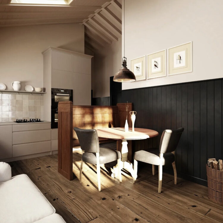
Finally to the kitchen. And this gorgeous picture of the sun hitting the table. But that’s not why we’re here. What caught my eye here was the vintage screen around the table. It looks like the kind of thing that might have come out of a church and is definitely something you might see in a salvage yard and wander what you might usefully do with it.
It works perfectly to zone the space between the kitchen and the rest of the room. Any higher and it would be less stable and also block the light. This way it doesn’t block light or conversation but just brings some separation to the two areas. It’s a clever idea and something that would work for anyone in a multi-tasking space. So if your desk is in your sitting room and you don’t want to see it at night but feel that there isn’t enough space for a wall or a screen then perhaps this half height version could be the answer. I’m definitely going to look out for one as soon as I can work out what to call it. Which is often half the battle with searching I think.
I hope that was useful for anyone working on their own places and space and here, until next time, for anyone who’s interested here’s a little video of us setting off on the zip wire…
https://youtube.com/shorts/elXUMZlcfUk?feature=share
With thanks, I think, to UPPR for organising the trip. I’ll tell you more about it soon.


I’m a hater of all things purple – can’t tell you why. But I love terracotta – it’s the cosiest colour for me. Would never have thought to pair it with lavender. It looks beautiful for a hotel but couldn’t live in it.
I love a yellow antique chair, I recently inherited one from my Gran and can’t wait to bring it home and revive it (keeping the yellow of course).
Well done Kate! I’d love to do that – much less effort than zip lining which is a must for those looking to view the world from a different perspective.
Love the Monday inspirations Kate. Thank you.
That crushed raspberry Tadelakt TDF …why would you change that EVER??
I am totally with you on the “either you are a bathtub person, or you’re not” concept. I can’t live without a bathtub. Showers leave me cold, literally as you step outside and you’re cold, but also the experience for me is not fun. I’d lose a bedroom every time to accommodate a bath.
Freestanding baths are generally not that comfortable and I’ve heard many short people like myself say the same. A shorter fitted bath often works best because you sit comfortably within it. A massive freestanding bath you can’t sit in and let’s say read a book, or browse your phone. Please don’t criticise me for browsing my phone in the bath…. ’tis my daily treat.
Lavender is one small, dangerous step away from LILAC. That and terracotta are two of my least favourite colours and yet the Margate hotel looks beautiful!
On a side note – there is an open plan shower above the seat to the right of the bath. Presume the drain has been air brushed out of the picture but still wonder how much of you would fit under the shower with the seat in place. Maybe it folds?
Speaking of yellow, I am planning on painting my bedroom ceiling yellow. Wish me luck. I rather like the idea of waking up to a yellow sunshine-y colour when the outside is grey!
I have always hated zip wires although not as much as lilac but see it in different light now you have alerted
me to colours it can work with . Clever too to post posture advice to your bedroom dweller alongside a an unmissable video of his death defying mum . I have a wall of fitted wardrobes with an accent chair beside – piles of clothes on chair as it blocks easy opening of wardrobe doors at least that’s my excuse ! Love the bath idea – it almost disappears when tiled as wall
That style of bench seating is sometimes called a monks bench. They often have a useful storage chest beneath the seat.
The headboard idea is great. (Hobby upholsterer here). It’s not a very complicated thing to make. Thinking too about the accent chairs, mid century chairs like Parker Knolls tend to be a good bit smaller than modern chairs, but pretty comfortable for all that, so are a great choice for an accent chair. And you can buy a non-reupholstered one for a song, just get it recovered. (Or have a go at an upholstery class yourself – that’s how I started).
yep. rather fed up with free standing baths. They are becoming a bit of a design cliche. much prefer a built in bath as one has somewhere to put the soap. Living with a school of porpoises as I do/have done, I find them a bit of a no go. They’re ok if one wants to lie back & be beautiful eating a chocolate flake with a glass of white wine but in reality my experience is give them a miss for a family or those with grandchildren. x
I think the screen around the kitchen table in the last pic is a pew. It’s a good idea but possibly not that comfortable, the seat tends to not be that deep. I love the headboard idea. That’s one to steal!
Well done on braving the zip wire, I’m not surprised you felt great after. You survived!