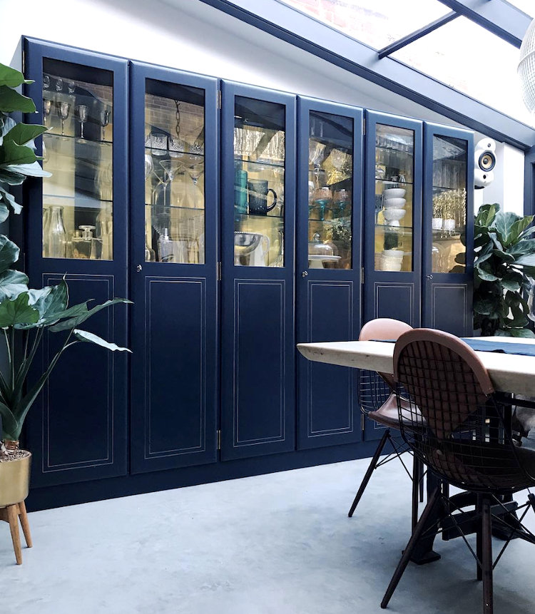
Good Morning and welcome to Monday. We start this week’s room inspiration with a visit to the house of Philippa McFarlane, who has featured on these pages before. I love her house and these brass-lined blue kitchen cabinets are definitely on my “to steal” list if I ever redo my kitchen.
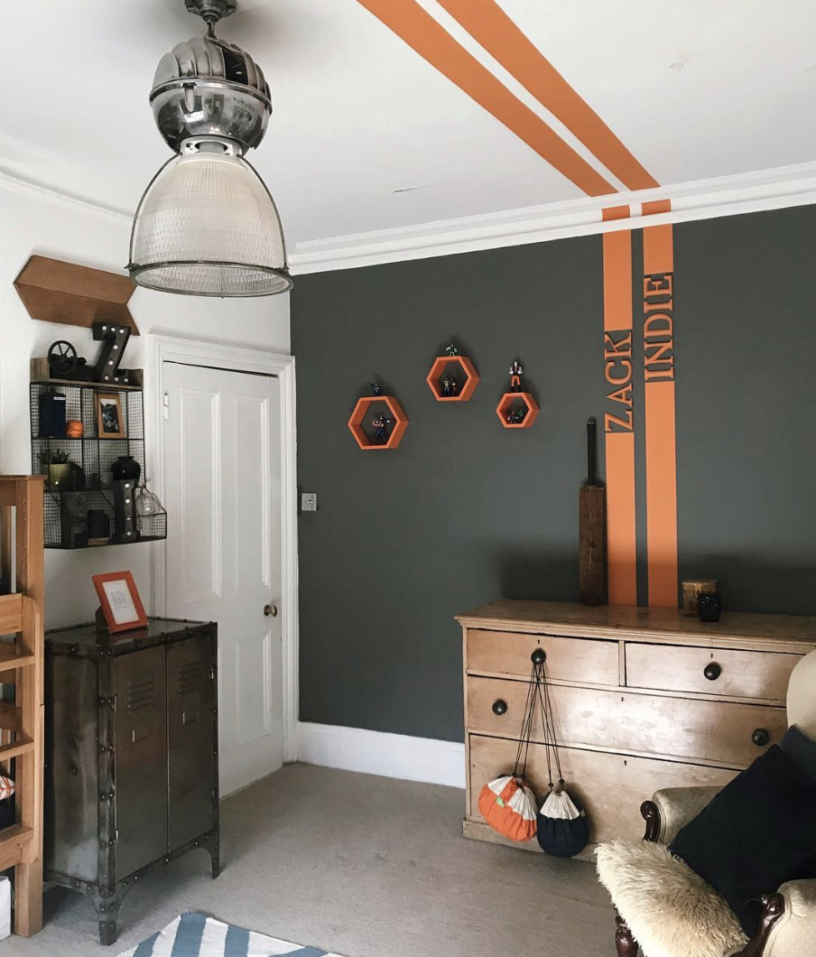
Philippa (and I urge you to follow if you are on instagram as her house is full of inspirational ideas and dramatic colours) has also created this fabulous bedroom for her sons. It’s a brilliant way to future proof as surely no-one will ever go off a stripe and yet it brings and element of fun to the space. I also love the idea of taking a paint effect not only up the wall but over the ceiling as well. I’m now looking at my freshly painted office with the gold ceiling and wondering about a small gold stripe down one wall….
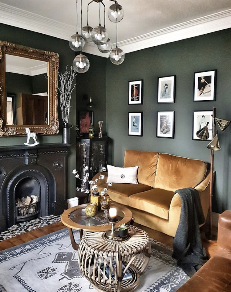
Next up green in the home of Natalia of Marks and Rowe Interiors. Finding the perfect green is hard – well finding the perfect shade of any paint is hard I know – but green is a tricky one as it can be too yellow. This is a sort of dark olive by Mylands which works beautifully with the gilt, orange and ochre but would also love any shade of pink – imagine a neon – as well as a pale silvery grey. Get the right shade of green and it will be far more versatile that you might imagine.
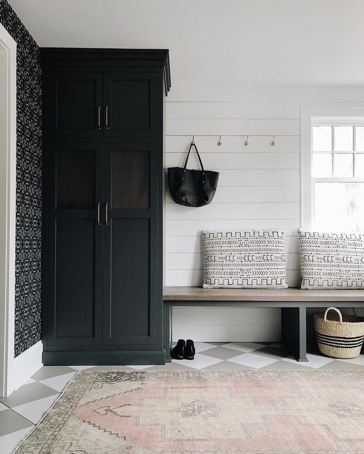
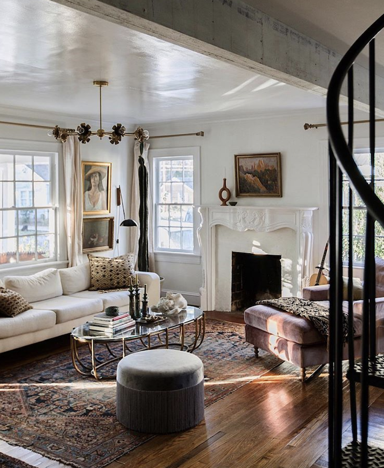
Taking it back to the classic black and white in this scheme by Kate Marker Interiors but look at the patterned wallpaper that softens what might otherwise be a little stark, the cushions and, of course, the faded rug with its soft pinks and worn design.
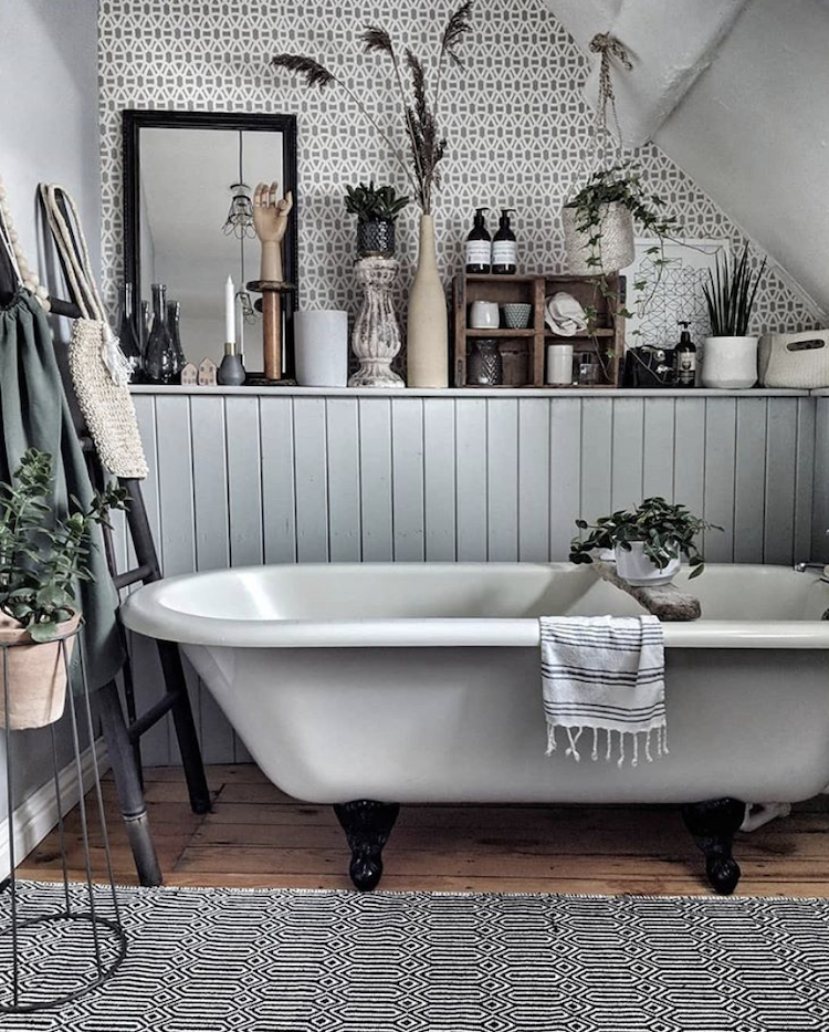
This is another fabulous monochrome room which may be grey (not dead but having a lie down to make way for other colours) but has been warmed up by the collection of objets along the shelf. These include vintage wood and lots of different textures – ceramics , concrete, grass and plant which bring character to the space. I could never be a minimalist but have, in the past, described myself as a monochrome maximalist – this picture explains that perfectly.
And for the transformative power of paint look no further than this gloss ceiling by Carley Page Summers. I spoke last week about what paint to use on which surface and this is a perfect example of why gloss is great for ceilings. You can see how it’s reflecting the light back and bouncing it round the room. If you have painted a room dark and want to do the ceiling as well then do it in the same colour but gloss to increase the light.
One point to note – it will highlight every lump and bump though so if you have woodchip paper then you might want to steer clear, or cover it up heavy grade lining paper. We did this in the office which I am going to show you tomorrow so drop back in then to find out more.
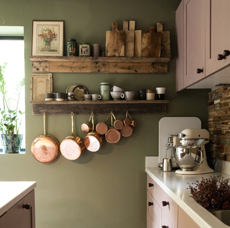
Finally, a couple of images from a new discovery – the homeware and events store – Wattle and Daub – drop by for lots of pretty ceramics and throws. Here is her kitchen – another shade of olive green and this time teamed with pink cupboards. And I may have raged about the dominance of copper but if it’s a traditional pan in a kitchen (and you’ve got strong arms) then I love it.
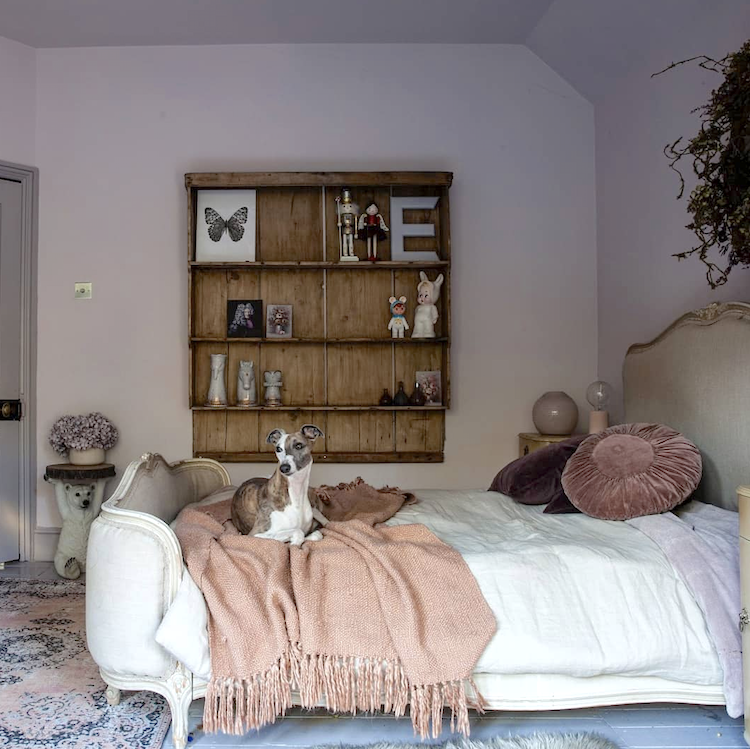
More shades of pink, teamed with the restorative powers of warming vintage wood and a very handsome whippet to finish off this week’s selection of rooms. I hope you have found them inspiring either as new accounts to follow or with ideas for your own places and spaces.


The grey-orange accent palette for a boys room is killer! Nicely executed.
Some years ago I read an article with beautiful photographs of Nina Campbell’s small London home, completely restructured by her. The sitting room was stunning. Mirror glass was used to good effect and the ceiling of the lowish room, was painted with a gloss paint. The play of daylight enhanced the beautiful room.
That green kitchen wall colour is amazing! I’ve been considering something like it for our tricky semi open plan kitchen-living room-hallway, but I’m hesitating regarding the wall colour – floor combo. At the moment our floor is a whitewashed effect laminate, and I’m worried the darker walls will create a weird contrast with the white floor. But on the other hand I worry that a darker floor will make the whole room/area too dark. I was set on a darker wooden laminate floor, but then I spoke to my mother about it and now I’m worried it will be too dark 😛 I should have just listened to you and Sophie in an old podcast episode where you specifically said not to talk to friends and family about these things! 😛
What a nice treat first thing in the morning, thanks. I noticed a couple of the pics have touches of “boho” such as the rugs and some cushions. Any tips on how I could introduce the tribal/global/boho look without it looking too themed? Thanks