Colour forecasting is big business and it’s an inexact science. While paint companies and trend spotters will try and predict the next big colour they don’t always get it right as it’s impossible to know how consumers will react. They can try and predict a mood – green being the prevailing one at the moment – but they often won’t know which particular shade of the basic colour will tap into the zeitgeist.
However, if you pay attention to shop designs and, in London particularly, the background colour for advertising billboards you may have noticed that millennial pink is no longer the colour of choice. Yes it’s still on our clothes and our cushions but have a look around you. The new background colour is called neo-mint and it’s everywhere.
This was highlighted by WGSN, a trend forecasting company used by designers across several industries, when they announced back in March that neo-mint would be the colour of 2020. I first saw it at Maison et Object in Paris last January and, I don’t mind admitting, didn’t like it much.
But that’s the thing with these colours. They tend to creep up on you so before you know where you are you start to accept them because you see them so often. As I say, firstly on instagram pictures of trade shows, then in shop decor and as background colours. All this time you aren’t really noticing it as it’s a background thing. But by the time the manufacturers are creating sofas and cushions and clothes, you’re already unconsciously familiar with it and ready to accept it.
As well as being gender neutral as a colour, it’s also a shade that is regarded as a fusion between science and nature which is also reckoned to be an important relationship as we start the new decade. The other thing to always bear in mind is that these colours can take up to three years to filter down to the high street so if you are only just starting to spot it now it will be a while before you see it everywhere. Which also gives you plenty of time to get used to it.
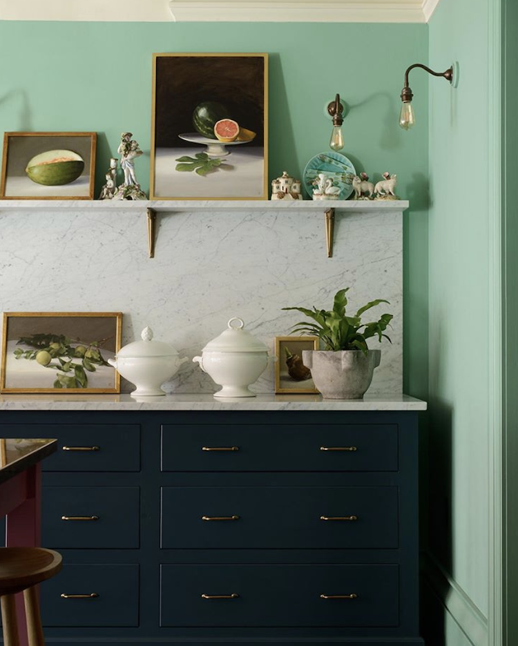
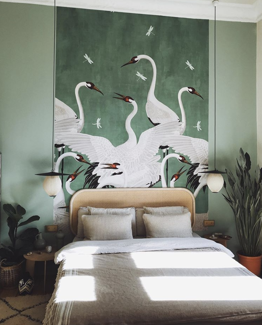
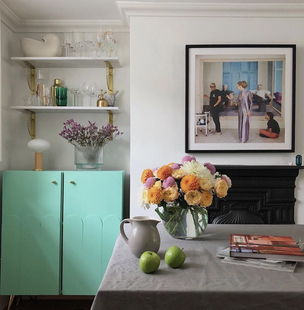
I have gathered together a few examples of it here so you can see how you might want to use it, or what other colours it goes with so that if you like it you can think about how you might incorporate it into your own home. As you can see from Melanie Lissack’s ikea hack below, it loves a bit of pink and orange. But it’s also interesting to note that when Devol Kitchens opened their New York showroom earlier this year they also chose to incorporate a splash of neo-mint into their traditional navy blue kitchen set up. It also loves brass and chocolate too so although it might seem quite a difficult colour to start with, when you start to think about it it’s surprisingly easy to incorporate.
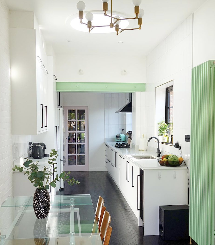
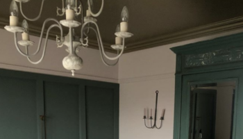
And I love this subtle use in the kitchen of Emma Worthington of, @moveovermagnolia who has used it to paint the RSJ holding up part of the kitchen and tied it in with the radiator as well. In a previous collaboration with Bisque radiators I said that if you have a radiator that is a feature why not paint it to stand out rather than blending in?
One other point to note is that everyone said that blush pink would morph into terracotta and while there is lots of terracotta around it hasn’t become the background shade in the way that neo mint has whereas this unusual shade of green appears to have arrived out of nowhere and taken over.
Have you noticed the gradual emergence of neo-mint? I bet you do if you start looking for it now. And, given that you’ve got a couple of years until it saturates the high street what do you think?

So interesting to hear about colors that are trending. I love the new neo-mint color. Makes everything pop.
I bought a sweater in sea foam and thought it was 👌 ok until my daughter pointed out I looked sea sick 🤢.
I do however have 2 Citrine feature walls (I go for makes me happy!) one with an orange and cream Chinese lamp and orange tat to set it off. The other with turquoise jugs and bits to liven it. Green rocks here – but not sea foam!
I was sure a year ago that the next “it” colour would be some kind of pale green and just look at this. No, wait, I bought a set of sage bedding already last summer. Love this!
Oooph. Hated it back when it was called “seafoam” & still hate it: it reminds me of hospitals, morgues, basement chemistry labs at uni & truck-stop washrooms. (I detest subway tile for all the same reasons, btw.) Whoever thought this was a good idea has never studied medicine or science or done a lot of long-distance driving. Just no.
Never liked it.. ESP as a wall colour. But I like Melanie Lissack’s treatment also those Cute Cava curtains n move over magnolia… less is more works best for me with this colour. I find it too cold on walls…. esp in Ireland where it never stops raining n the skies are permanently Grey 😩
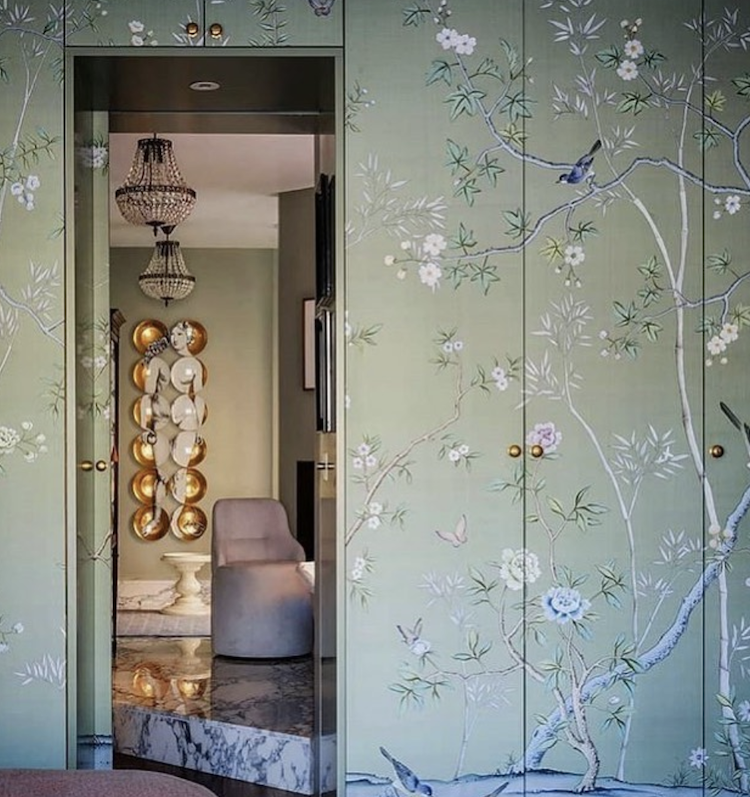
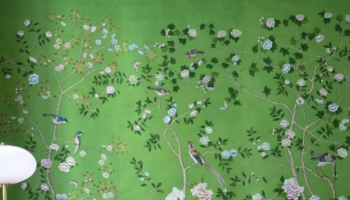
I like the wallpaper, it appears more subtle. When I look at the photo of the radiator, it reminded me of vintage jadeite tableware which I am fond of and which might be an option for incorporating the color without a large commitment.
I’ve never been particularly keen but I do like it in the devol room. I enjoy the way it looks against the dark blue but don’t think I’d want it in my own home. It makes me feel a bit cold.
I think it’s easiest to use in a retro context – with 50s pastels or 30s black and chrome – or when slightly faded and blackened. I’m not surprised it has overtaken the over-hyped terracotta – THAT is a hard colour to make work in this climate, and even harder for those of us who remember the 1980s!
I really don’t like it as a wall paint colour, I find it cold and it reminds me too much of hospitals! I do however quite like it as a foil for other colours if used in small areas i.e. cushions, accessories or a cupboard against a dark background. I wonder if I’ll change my mindwhen every shop and magazine are saturated with it!
Nice, but not for me , I’m still in Pink mode it’s my happy colour 🙂
Well, I decorated my bathroom in neo-mint metro tiles back in 2015, though back then (and now) I called it sea green. Goes very well with millennial pink and also with that pop of black you suggest in any interior. Nice to be ahead of the curve for once…! Though it does serve as a reminder that one’s personal taste can go from “ew” to “wow” in the blink of an eye. All that matters to me is that I like it and it makes me cheerful whenever I go in there.