Feeling all the greens at the moment and there is so much of it about – in shades not just the trend-led mint – that I thought we would have a little wander through five beautiful rooms that have made it a highlight. Green is also great for a Monday. It’s calming and inspires creativity. A perfect way to start the week. Coming?

This is the bedhead of dreams. Or is it the bedwall? It looks like upholstered velvet and it’s such a brilliant idea if you have a divan bed, or even if you don’t. The vertical lines will also lengthen the walls and make them look taller and note how, in the background, it echoes the vertical lines of the radiator and even the legs of the bedside table follow the same form. This is a perfect example of the Red Thread.
You might not even notice unless it was pointed out but there is an understated cohesiveness to the space that isn’t just about colour although the linen bedding and bedside rug also link to the terrazzo bathroom floor.
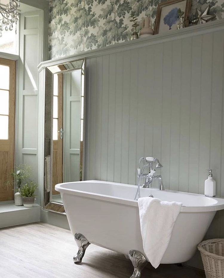
Staying with the vertical lines and this bathroom above has foresworn tiles in favour of tongue and groove panelling. This is fine if you not that splashy in the bath or don’t have a shower over. Taking the panelling high also creates an impression of height and allows for a strong wallpaper at the top that doesn’t dominate the otherwise restful scheme. This is a perfect example of when you can take a wallpaper over the ceiling as well for added impact. Just make sure you choose a pattern that isn’t growing in a fixed direction or it won’t work.
Below the mural on the far wall makes the room look larger as the perspective of the drawing fades back into the distance while the vertical lines of the internal window create a broken plan effect. This is a lovely restful shade of green that works well with the black as well as the soft pink and cream but you could add drama with stronger shades such as burgundy and orange or go tonal with lots of very dark green.

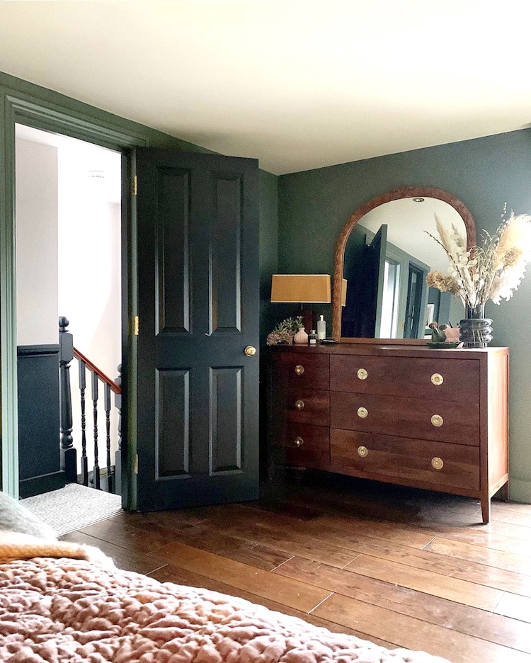
This green room is also a lovely restful colour albeit much darker. Bedrooms are tricky in that you have to decide if you want a dark colour for night time cocooning or a light shade to get you out of bed in the morning. I love dark walls but I have discovered I need a pale bedroom or I won’t get up. Note here how the green loves a bit of dark wood and how the skirting boards and woodwork have been painted to match the wall.
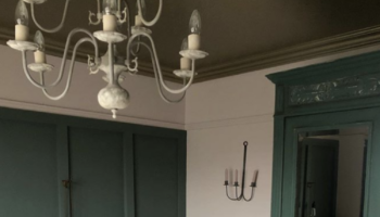
The door is the same colour as the half painted wall outside. You don’t need to paint a door the same on both sides. The key is the edge. As a rule of thumb is the hinge side will be the same as the room outside and the handle edge should match the room the door opens into .
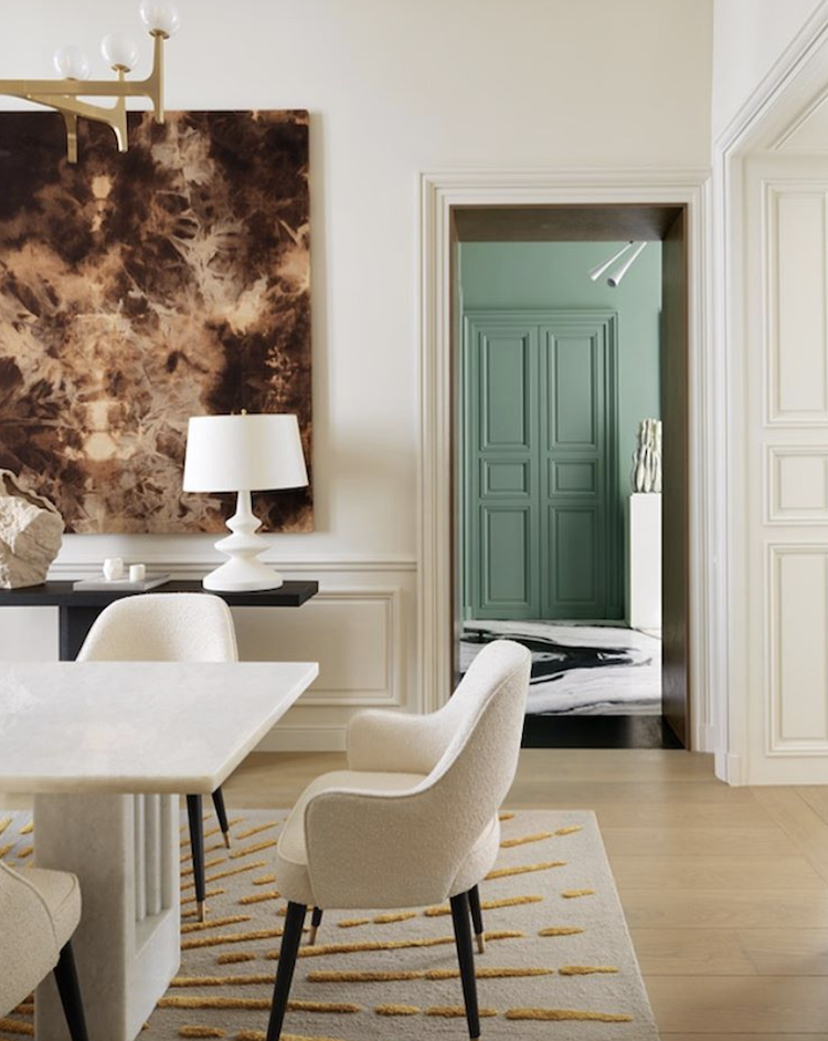
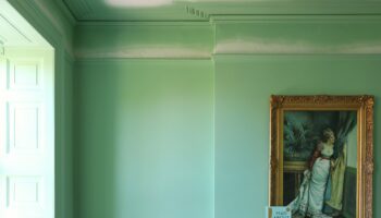
This next room shows you the importance of decorating your home as a whole. It’s never just one room in isolation. Each room leads to another and there is always a view that you can make the most of. In this case the green is a totally new colour as, in this shot at least, we can see no green in the foreground, but the colour goes perfectly with the pale shades in this room and makes for an interesting glimpse of what lies beyond.
If you want another example of Red Thread check out the pendant lamp and the rug underneath the table. There’s the panelling too but that’s kind of obvious.
Right then -all ready to go forth and calmly create for the week ahead? I’ll be back tomorrow with a Trend Focus piece looking at all things reeded and fluted – glass, wood and walls.

Thank you for sharing a great article. In this blog great giving excellent informational the fully decorated our home according to our needs.
I cannot tell you how much sleep I have lost recently over the painting of doors! Thank you for answering it! One more paint question – if the door frame in the room is a different colour to the frame outside the room – what colour goes on the in between bit?